It’s hard to find examples of bad design that you can publish on a blog. I don’t suppose that’s surprising, as we all want to tell stories about our successes, but we’re happier when the failures fade into the gloom of obscurity.
When you ask someone to name an example of bad design, the over-complex remote controllers for consumer electronics are often mentioned, leading to rants about useless buttons, arguments about who’s in control, and an attempt to remember how many unused remotes there are tucked away at the back of a drawer somewhere.
How many remotes do you have? How many do you use?
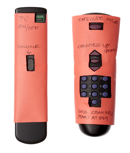
Here’s an example of an attempt to rescue a person who’s confronted with an unfamiliar set of remotes. The owner of the gear was away for the weekend and decided to help the friend who was coming to stay. She wrapped the remotes in paper to hide the redundant buttons and labeled the useful ones in plain language. What a thoughtful host! How sad that the design was bad enough to need the bandages!

Understanding how to use a TV remote is made easier by a friend
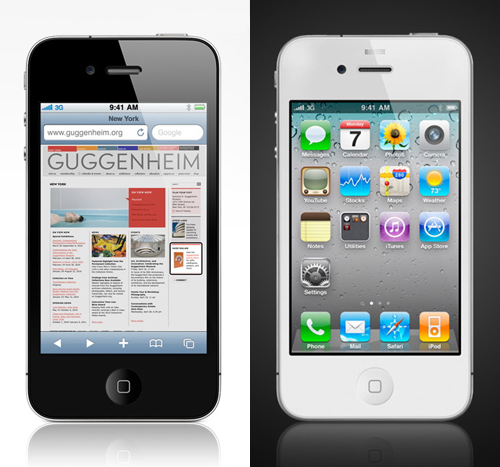
What a contrast between the bad design of those traditional remotes and the good design of the iPhone! Both are designed to be held in the hand and operated with fingers or thumbs. Both are dealing with a potentially confusing level of complexity, but the iPhone handles it elegantly with a flick and a tap, presenting the controls that are wanted for individual applications only when they are relevant.

The new iPhone 4 from Apple
The iPhone 4 has just been launched with a crisper screen, faster chip-set and some great new features, for example FaceTime, which adds video to phone calls with picture-in-picture that can be set up with a single tap. It’s nice to see the Guggenheim Museum featured as the first example on the Apple website. The classic spiral design by Frank Lloyd Wright feels close, as it’s only two short blocks down fifth avenue from where I sit writing this in the Smithsonian’s Cooper-Hewitt, National Design Museum.