This is the second interview in Chapter 4 in my new book, Designing Media

Bruce Nussbaum, September 2008
Bruce and I were speaking at the same design conference in the fall of 2008 at the Arizona Biltmore hotel, which is dubbed “The Jewel of the Desert” and resplendent with Frank Lloyd Wright-influenced architecture and beautiful grounds. I recorded an interview with him under a magnificent tree in one of the green enclosures in the garden. He seemed to relish being so removed from the hubbub of his everyday life in Manhattan.

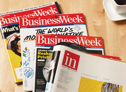
BusinessWeek magazine and the print version of Inside Innovation
As a managing editor for BusinessWeek, Bruce has become a leading voice in design and innovation in the world of business. After more than a decade as a page editor, he launched the Innovation and Design channel online and the NussbaumOnDesign blog in 2005. The following year, he founded IN: Inside Innovation. In the inaugural issue, he declared a goal of making a meaningful difference in the difficult journey toward building innovative business cultures, hoping to inspire, to provoke, to teach, and to be a trusted advisor and guide. He also structured IN as a community, linking to the Innovation and Design site, with its blogs, columnists, metrics, and stories. 
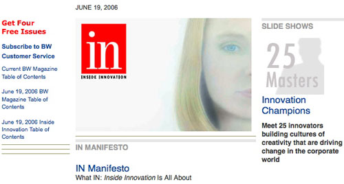
Online Version of IN: Inside Innovation
Bruce has been a leader in bringing an online version of BusinessWeek into being in tandem with the print version, and has a deep understanding of the comparative values of physical and virtual media. He demonstrates that content can belong happily in both the physical and virtual worlds, although the material must be presented appropriately to highlight the attributes of each medium. An article written for the printed page of a newspaper will be presented with a different tone and style for an online blog, and adjusted again for a Twitter feed. 
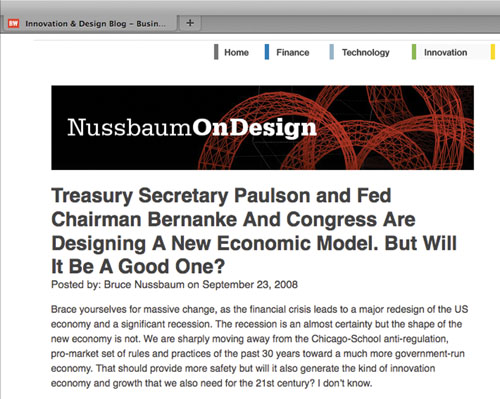
Bruce's blog
Good communication design comes from a synthesis of all of the attributes of the media as well as the content. Magazine designers know by experience how best to lay out an attractive page, combining rich, high-resolution images with easy-to-read typography for articles and salient type for headlines, pullouts, quotes, and sidebars. When translating the same story to the Web, the images need to be smaller, the text shorter, and the pagination structure different, but you have the chance to add a new dimension by including links, animated diagrams, podcasts, and videos. Bruce developed a dynamic and interactive approach to the online offerings, with a conversational design style that promoted dialogue through comments and blogging and leveraged partnerships with other organizations outside the BusinessWeek fold. I like his description of blogging as a “borgy brain thing,” which I take as akin to “dancing with a lot of random people at the bar"; this contrasts starkly with his work as a commentator when he was a page editor for the magazine.