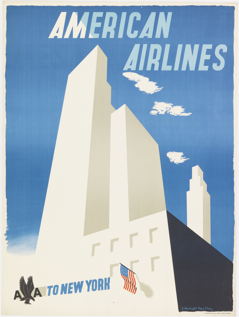
Or, perhaps, not actually a proportional half-and-half. Edward McKnight Kauffer’s series of posters for American Airlines focuses on the destination (such as Chicago or Niagara Falls) rather than the air travel itself. From this perspective, being there is more than half the fun.
Kauffer was born in 1890 to a low-income family. His artistic inclinations, however, earned him the opportunity to tour Europe for study. While in school at the Art Institute of Chicago, Kauffer attended the Armory Show of 1913 where he was able to view the expanse of art history from Classicism to European Romanticism to modern painting in the styles of Fauvism, Cubism, Expressionism, and Abstraction. The influence of this experience on his career would prove immeasurable, particularly his introduction to Cubism. At the outbreak of World War I, Kauffer relocated from the United States to England; his largest and most recognizable body of work dates from this period.
In his graphic work, he fuses modern art with commercial intent to inspire consumerist desire. If we put on our horn-rimmed Sterling-Cooper spectacles, we can see in American Airlines: To New York that the New York skyline is abstracted to a few blocks, pale and almost ghostly against the blue sky. The perspective is streamlined and the atmosphere is flattened, reflecting the geometric approach of Cubism.
Do you see an airplane? If so, adjust the prescription in those glasses: there isn’t one. This airlines advertisement emphasizes the destination rather than the journey while implying that air travel is so easy you don’t even have to think about it. The point of view of the buildings looks up at them from the street rather than down from a soaring aircraft. Instead of highlighting accommodations or stressing the luxury of airline service, this poster emphasizes the monumental marvels of the modern city. The abstraction of the images supports this concept in its generalized, almost mythologized form. Without specific details, this can be anyone’s fantasy vacation.
