There are many ways to celebrate an anniversary. To commemorate a decade of working together as the design duo Non-Format, Kjell Ekhorn and Jon Forss did not opt for the traditional gifting of tin, pewter, or aluminum. Instead, they pooled their creative energies towards a personal project that drew upon their shared love of David Bowie.
Founded when Kjell and Jon were both living in England, Non-Format is a creative direction and design firm. The name Non-Format was derived from an article in the popular design magazine Emigre about the future demise of the DVD and the impending “mythical non-format” that would replace it. The team shares both a personal and professional passion for music.
For their 10th anniversary, Non-Format decided to create a limited-edition set of two posters examining David Bowie’s discography. As any die-hard fan of Bowie’s 1977-79 Berlin Trilogy of albums will know, one of the pop icon’s closest collaborators in the late 1970s was the legendary musician, composer and record producer Brian Eno. In a famous excerpt from his diary, Eno muses about the possibilities of looking at something on a spectrum of two extremes. He refers to this as axis thinking. Axis thinking, he explains, can apply to both the lighthearted and the serious. A haircut, for example, is rarely “neat” or “shaggy,” but somewhere between the two. After the Berlin Wall fell, Eno argues, the polarities of communism and capitalism were “revealed to conceal a host of possible hybrids.”
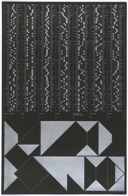
For Eno, axis thinking was a method that could be used in the music studio, but Non-Format chose to use the system to retrospectively examine Bowie’s musical output. To do so, Kjell and Jon collaborated as they have for much of their partnership, with the aid of the internet, as Kjell now lives in Norway and Jon lives in Minnesota. They began by categorizing each of Bowie’s albums against pairs of extremes. The album Scary Monsters, in their estimation, is more Bridge than Tunnel and more Scissors than Rock, and the album Station to Station is more Fight than Flight and more Heart than Head. To illustrate this categorization, Non-Format then designed a simple series of mixers and sliders, echoing the equipment that Eno might have used in the recording studio to “describe each Bowie album within Non-Format’s own framework of extremes.”
Non-Format designed a custom typeface to feature David Bowie’s name at the bottom of each poster. Like the polarities that frame each axis, the letterforms suggest another balance of extremes, with razor-thin lines morphing into full geometric forms within each individual character.
The poster above covers the albums from 1976-84.
Caitlin Condell is the Assistant Curator in the Department of Drawings, Prints & Graphic Design at Cooper Hewitt, Smithsonian Design Museum.
This poster was part of the 2012 exhibition Graphic Design: Now in Production, co-organized by Cooper Hewitt, Smithsonian Design Museum and Walker Art Center. You can find the exhibition catalogue at shop.cooperhewitt.org


One thought on “Less Ziggy, More Stardust”
Rikke Petersen on August 17, 2016 at 10:48 pm
Is it posibel to buy this poster?