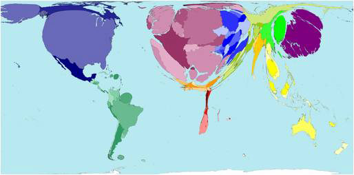
Most maps are built around representations of geographical land mass. Worldmapper show us something different. This collaborative team of cartographers from the University of Sheffield and the University of Michigan is exploring the uneven effects of globalization. Rather than depict how much land a given territory occupies, each map shows how a social or economic activity—from emigration to cell phone use—is distributed across the globe.
Called a cartogram, each map is like a global pie chart. The maps divide the world into 200 territories (191 United Nations countries plus a small number of disputed areas). An algorithm changes the scale of each territory in relation to its dominance in that category. The population map, which provides a basis for comparison, scales each territory to reflect its share of the world’s total population. This is what different countries might be shaped like if land were evenly distributed to each person on Earth. China and India are the largest territories, and the U.S. is comparatively small.
Maps of Internet use show a different picture. At the beginning of the twentieth century, most of the world’s Internet users were located in the United States, Western Europe, and Japan, making these regions appear disproportionately large in relation to other areas. By 2007, the geographic picture had changed considerably, with countries including China, India, and Brazil swelling dramatically in size. Over 700 different cartograms can be viewed and downloaded at Worldmapper.org, where data sources for each map are meticulously documented and explained.
