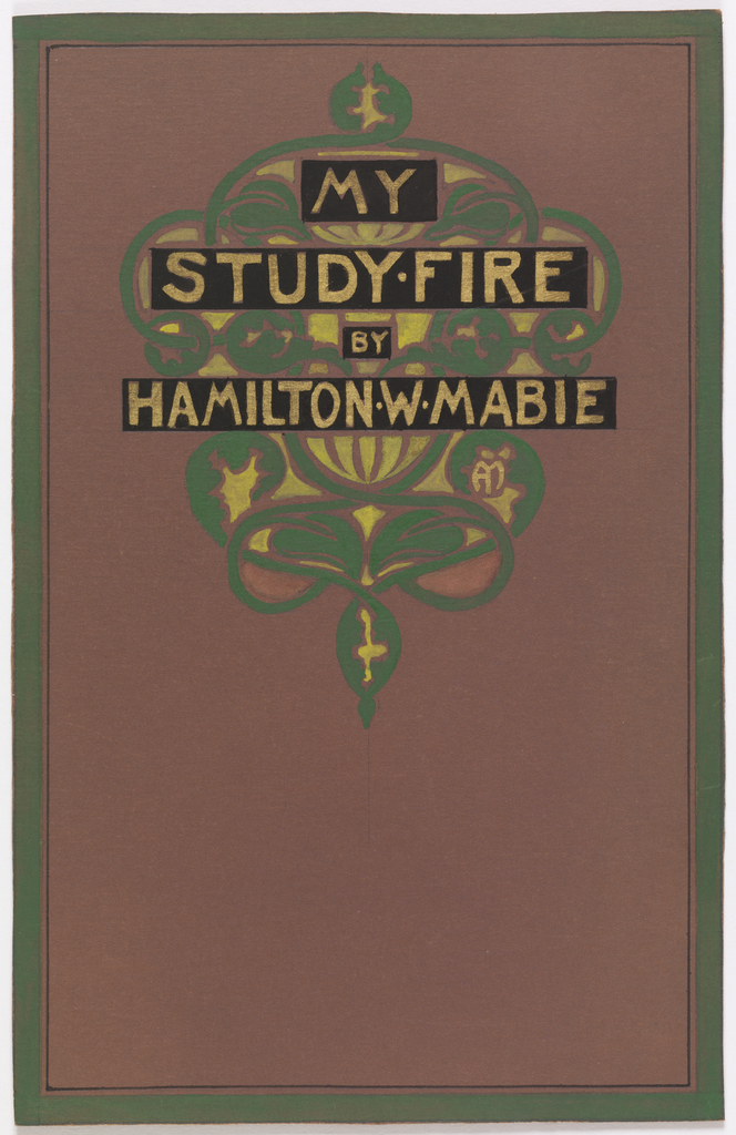
This sketch for a book cover by Alice Cordelia Morse (1863-1961) is a far cry from what book covers look like today. With its organic forms and handmade attributes, My Study Fire is an example of the late 19th-century characteristic Arts and Crafts/Art Nouveau style in America.
Alice Morse studied drawing at the Woman’s Art School of the Cooper Union for the Advancement of Science and Art (1879-83 and 1889-91). During the late 19th to early 20th centuries, women designers were trained in applied skills that would be beneficial both to their professional independence and to the manufacturers who would eventually employ them.[1] Women were placed by schools, like Cooper Union, into the employ of local businesses, such as Tiffany & Company, which only hired unmarried women to design for their stained-glass window studio. Morse had studied under John LaFarge at Cooper Union and it is believed, through this connection, she retained a job at Tiffany’s.[2] After five years at the stained-glass design studio, Morse outgrew the work and made a decision that would dramatically change her life: to pursue an independent career in book-cover design. For many, designing publishers’ bindings was not such a leap from stained-glass windows. Book covers and windows have defined borders that limit the artwork to a single focus.[3] Furthermore, the late 19th century saw a resurgence in handmade and artisan objects, making book-cover design one of many commercial objects that were revived with the advent of the new style.[4]
Morse’s book-cover designs incorporate characteristics of the Arts and Crafts movement, Art Nouveau, Rococo, and Classical periods and even have some Eastern influences. These designs demonstrate her versatility. As seen in My Study Fire (1943-33-1-9), Morse combines the curves of the Rococo with the symmetry and organic arrangement of Art Nouveau which had grown out of the Arts and Crafts movement. For the book cover 1943-33-1-5 (below), she applied blue gouache in a pattern that is reminiscent of wrought iron gates, with a floral scheme and a row of delightful S-curves typically characteristic of the Rococo style.

Drawing, Design for a Book Cover, ca. 1896–1903. Designed by Alice Cordelia Morse. 1943-33-1-5.
This versatility made Morse a unique designer. Once she set out on her own, she received steady commissions from some of the most renowned publishers, such as Dodd, Mead & Company, Charles Scribner’s Sons, and G. P. Putnam’s Sons.
The cover of My Study Fire was commissioned by Dodd, Mead & Company (see image below). The author, Hamilton Wright Mabie (1846-1916), was a writer of children’s books and fairytales, but he also enjoyed reflecting on life. In this book, first published in 1890, Mabie considers life and offers comfort through moral and ethical opinions. Morse’s cover design for the book appears on the 1899, 1901, and 1904 editions.[5]

Book Cover: My Study Fire, by Hamilton W. Mabie, ca. 1899; Alice C. Morse (American, 1863-1961). Image courtesy of Mindell Dubansky.
The final cover evolved significantly from the sketch in the collection of the Cooper-Hewitt. While the symmetrical aspect of the design is the same, the components are different. The finished cover is in monotone gold and features one large central tulip from which grows lengthy leaves that draw the eye upward toward the cartouche (the empty space for the title) that is formed from vines bearing small tulips with curled tips. Morse’s sketch for the cover, on the other hand, is more colorful. A knotted continuous green vine meanders its way through leaves over a central yellow scalloped floral motif, terminating at finials. Gold text on black bands cover parts of the design, and the artist’s monogram can be found inside one of the curled tendrils on the right.
The considerable variation between the drawing and the final book cover can be attributed to the process used by Dodd, Mead. Publishers typically asked designers to produce two or three sketches for each commission. The publisher would select one design which was then prepared as a finished colored drawing by the designer. The designer had to specify colors and materials, and once these costs were accepted or modified, production of the cover would begin.[6] Therefore, we can assume that the Cooper-Hewitt sketch was one of at least two different options offered to the publishers.
In the 1890s, handmade book cover designs had reached their zenith in popularity, but by the first decade of the 20th century, publishers began looking to less expensive means of attracting book buyers. Gold-stamped cloth covers were rejected in favor of illustrative ones printed on paper that was seen as more modern and economical.[7]
The book covers Morse left, distinguished by their eclectic style, remain as some of the boldest and assertive designs produced by women of the period.
[1] Mindell Dubansky, The Proper Decoration of Book Covers: the Life and Work of Alice C. Morse, with essays by Alice Cooney Frelinghuysen and Josephine M. Dunn (New York: Grolier Club, 2008), 10.
[2] Ibid., 11.
[3] Ibid., 12.
[4] Ibid., 33.
[5] Ibid., 83.
[6] Ibid., 36.
[7] Ibid., 19.

2 thoughts on “The Book-Cover Designs of Alice C. Morse”
Mindell Dubansky on August 8, 2014 at 1:07 am
Hello Karen, I recently found a new book cover that has a design very similar to one in your collection. I think it will help you date your drawing. See alicemorse.blogspot.com to see the posted yesterday. The book’s title is ‘Land O’ the Leal’. There is a photo of your drawing in the post.
Mindell Dubansky on August 8, 2014 at 1:08 am
I meant “post dated yesterday”