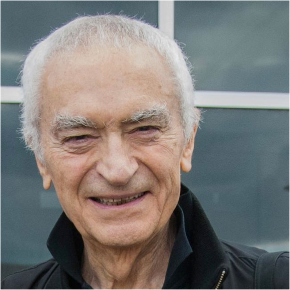
From the moment Massimo Vignelli started his career in Italy in the mid-1950s, he forged a rigorous philosophy that transformed the international language of design for print, products, and environments. Over the decades, debates about design’s cultural function bubbled and boiled around him. Confronting the upheavals of Pop, post-modernism, deconstruction, and the digital age, Massimo didn’t change his methodology so much as polish it into an ever sharper, more refined instrument. His ability to stay modern in a post-modern world sealed his reputation as one of the great designers of our time. As his career advanced, Massimo’s work and ideas became more relevant, not less. He remains a towering and untarnished design hero, not only to his peers and to the generation who started their own careers in his offices in the 1960s, 70s, and 80s, but to designers just entering the field now, who view the elegant man in the modernist menswear with almost mystical reverence.
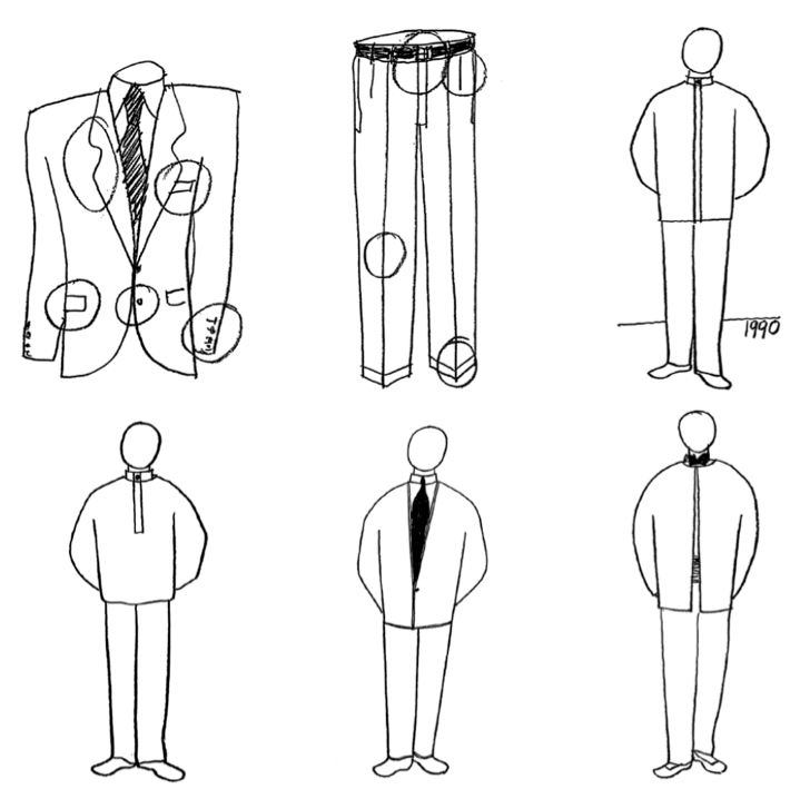
Massimo Vignelli, drawings for Design Vignelli clothing line, 1990
Massimo Vignelli’s career is inseparable from that of his equally gifted wife, Lella Vignelli. The couple married in 1957 and opened their first firm together in Milan in 1960. While both were trained as architects, Lella continued to focus on three-dimensional design, while Massimo focused on graphics. Together, they could move across disciplines with astonishing grace. In 1964 the Vignellis left Italy for New York City, where Massimo co-founded Unimark International. Specializing in corporate identity—a field encompassing print, signage, interiors, and wayfinding—Unimark quickly expanded to become one of the world’s largest design firms. In its early years, Unimark required employees to wear white lab coats—an idea hatched by Massimo, who had a keen interest in enhancing the dignity of design professionals. In 1992, Massimo and Lella would launch their own functional clothing line (Design Vignelli), which offered a universal solution to the problem of men’s and women’s fashion, with its extra parts and ever-changing silhouettes. Although the Vignellis’ priest-like garbs didn’t find a broad market, they became part of the couples’ signature personal style.
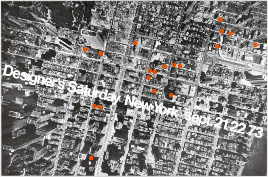 Poster, “Designer’s Saturday, 1973”, 1973 Offset lithograph on white wove paper. Collection Cooper-Hewitt, National Design Museum. Gift of Lella and Massimo Vignelli. 2009-42-2.
Massimo left Unimark in 1971 to co-found Vignelli Associates with Lella. The Vignellis’ work shaped New York City in profound ways. Massimo designed numerous posters, journals, and books for architects and architectural associations—indeed, a certain era of New York architecture speaks the language of Vignelli, using forthright Helvetica, upright Bodoni, warm, approachable Century Expanded, and gridded layouts articulated with horizontal bars.
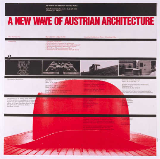
Massimo Vigneilli, Poster, “A New Wave of Austrian Architecture”, 1980 Offset color lithograph on paper. Collection Cooper-Hewitt, National Design Museum, 1991-69-83.
Massimo’s modernist innovations sometimes provoked controversy. His 1972 subway diagram for New York City took inspiration from the abstracted transit guides that had been used for decades in London and Tokyo. Emphasizing relationships among subway lines, Massimo’s diagram eliminates extrinsic information and distorts the city’s built geography in favor of revealing connections. Vignelli’s new urban order infuriated some outspoken New Yorkers, and the MTA replaced the iconic map with clunkier, more conventional graphics in 1979. The wayfinding system he created for the New York subway (with Bob Noorda at Unimark) remains in use today. The simple sans serif numbers and letters enclosed in colored circles helped unify New York’s once competing train lines into a single network. The signs are seen and used by millions of people, generating an unforgettable signifier of the New York experience.
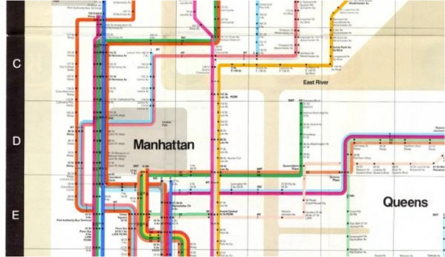 Massimo Vignelli, New York City Subway Map, 1972
Throughout his career, Massimo raged against typographic excess. In his view, a graphic designer should be able to solve nearly any communication problem with no more than five typefaces. (Later, he loosened his list to a dozen). The industrial revolution had unleashed an unholy cacaphony of fonts, made worse by the information overflow of the twentieth century. This typographic deluge yielded what Massimo called the “biggest visual pollution of all times” (Vignelli Canon). If everyone in the early 90s who called themselves a “desktop publisher” were a doctor, he complained, we would all be dead by now. (This might be true, if you think about it.) Massimo’s appearances in Gary Hustwit’s film Helvetica (2007) are among the movie’s most memorable moments. Chastising those who think that every thought or feeling warrants its own unique typeface, Massimo intoned that you don’t need letters that look or sound like a dog to represent the word “dog.” He liked to compare a great typeface to a musical instrument, which can be used to play any song in the hands of a skilled designer; Helvetica is “just like a piano, the more you play it, the more you learn how to play it and the better player you become” (http://bigthink.com/videos/we-use-way-too-many-fonts).
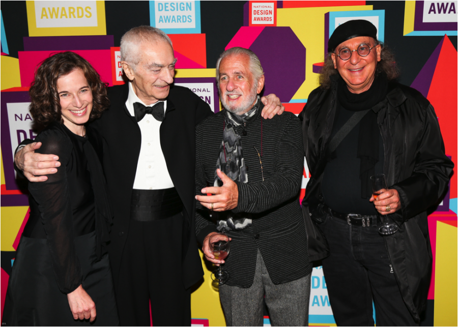
Lisa Strausfeld, Massimo Vignelli, Richard Saul Wurman, and Robert Greenberg, 2012 National Design Awards Gala, Cooper-Hewitt, National Design Museum, Smithsonian Institution, October 17, 2012. Photo: David X Prutting/BFAnyc.com
Cooper-Hewitt bestowed the National Design Award for Lifetime Achievement on Massimo and Lella Vignelli in 2003. We are proud to include many works by the Vignellis in our permanent collections and library. In 2012, Rochester Institute of Technology (RIT) established the Vignelli Center for Design Studies, which houses an extensive archive of the couple’s work and holds public exhibitions and programs. Massimo always believed in the value of design history. He was a supporter of museums and their role in education and preservation. He was a great friend to this museum. We will miss him with all our hearts.
