Everyone has a favorite color, but how often are our conscious thoughts trained on those inclinations for various tints and hues? Our careless observation of the essentials of design was of paramount importance to Josef Albers, a German artist and color theorist whose lessons at the Bauhaus, Black Mountain College, and Yale focused on overcoming his students’ careless habits of observation picked up over a lifetime by returning to these basic elements. He sought to “open eyes” with his classes by bringing out the correlation between formal arrangement and underlying structure with a focus on the experience of education rather than producing mature pieces. His classes on color specifically emphasized observation techniques that brought hierarchies of visual order to the fore of consciousness.
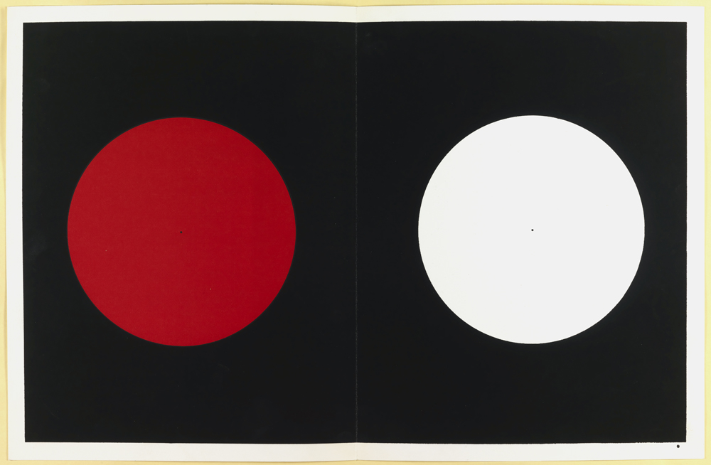
The above image, plate V-III-1 from Albers’ book Interaction of Color, will be featured in our reopening exhibition Making Design. Stare for 30 seconds at the center of the red circle then switch your attention to the white circle. The color you now see is the afterimage of the red and is a simultaneous contrast. The green-blue you see is complimentary to the red/red-orange color and is likely produced as a side effect of fatiguing the red-sensitive parts of the human eye.
Albers joined the faculty of Yale in 1950 as Chairman of the Department of Design. While at Yale, Albers developed Interaction of Color, which has become one of the most influential books on color theory joining the ranks of Aristotle, Newton, and Goethe. Using flat, geometric planes of solid color, Albers demonstrated how colors interact through comparison and contrast to one another establishing that all color is seen in relation to the colors of its surroundings. Albers also showed how the illusion of depth and space can be established through the arrangement of color. This work is still relevant today, even through our website where you can read about an experimental feature to replace the generic “no image” or “image not found” graphic with “Albers Boxes” indicating with concentric squares the department, period, and type of object working from the outermost square inward.
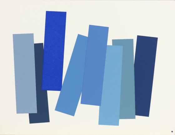
Plate V-3 from Interaction of Color by Josef Albers
This plate, V-3, shows eight shades of the same color presented in equal shape and quantity on the page, each chosen to represent one tone most typical of the hue. The bluest-blue is marked by its vertical, raised placement, but the larger composition is designed to expose the viewer’s personal preferences and prejudices for color. Which hue jumps out for you?
Lauren Eames was an intern with the Cooper Hewitt, Smithsonian Design Library, Summer 2014. She is working on her B.A. in Religious Studies at the University of Chicago.

