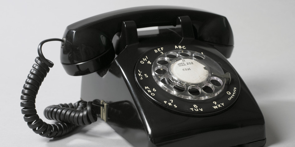
Henry Dreyfuss’s earlier Model 302 was a beautiful sculptural object, but it had usability problems. The triangular profile of the handset caused the device to turn when cradled against the shoulder—the design didn’t account for people’s intuitive desire to talk hands-free. Dreyfuss addressed this issue with the Model 500, introduced in 1949. To create the next-generation device, Dreyfuss’s design team and the engineers at Bell Labs started by working on the handset. They studied measurements of over two thousand human faces to determine the average space between the mouth and the ear. They gave the Model G handset a flattened, squared-off profile, fondly calling it the “lumpy rectangle.” The new handset was smaller, lighter, and less likely to turn in the hand, and it stayed in place when cradled against the shoulder. The designers derived this homelier but more functional object from human habits and anatomy rather than from an abstract play of angles and curves.
The phone’s rotary dial is a complex point of human contact. When first introduced, the Model 500 took longer to dial than the older model. John E. Karlin, an industrial psychologist at Bell Labs, moved the numbers and letters from inside the finger holes to outside. The change prevented the graphics from rubbing off over time and kept them visible while the dial turned. Karlin also placed a white dot inside each finger hole to give users a visual target. According to Dreyfuss, these simple “aiming dots” reduced dialing time by seven-tenths of a second.
A Model 500 telephone and other objects by Henry Dreyfuss appear in the exhibition Beautiful Users, 12 December 2014 – 26 April 2015.
Ellen Lupton is Senior Curator of Contemporary Design at Cooper Hewitt, Smithsonian Design Museum and Director of the Graphic Design MFA program at Maryland Institute College of Art.
