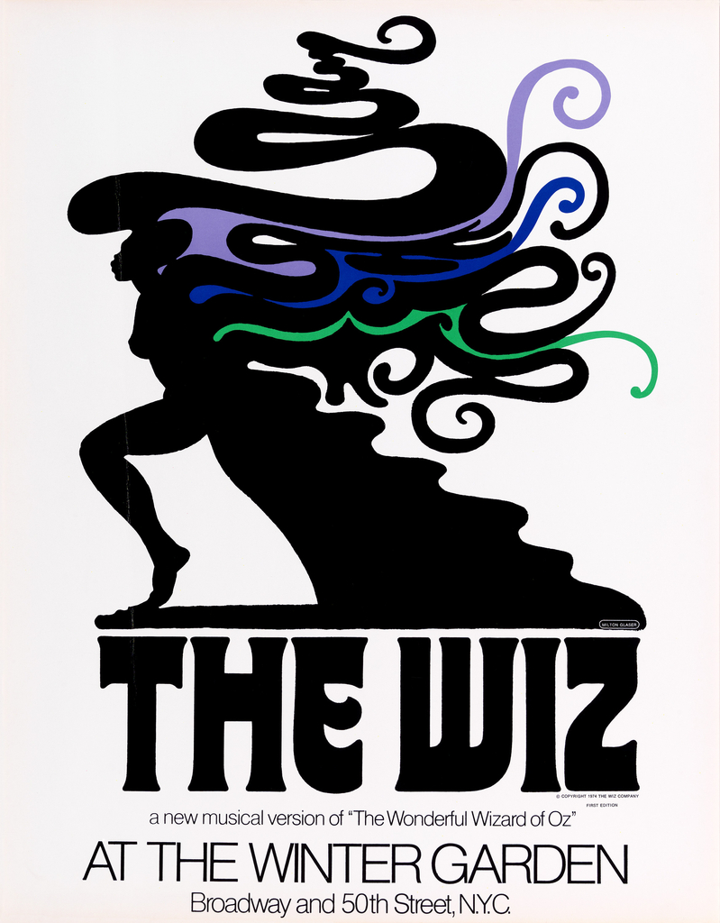
Long before Wicked was the popular alternative to L. Frank Baum’s 1900 novel and the 1939 MGM film The Wizard of Oz, there was The Wiz. Subtitled “The Super Soul Musical ‘Wonderful Wizard of Oz’,” The Wiz, created by Charlie Smalls and William F. Brown, utilized the beloved characters from L. Frank Baum’s original novel, particularly Dorothy and her yellow-brick-road-skipping gang, but gave the story a Motown-inspired, soul score. According to Smalls: “The Wiz is intended as a new kind of fantasy, colorful, mysterious, opulent and fanciful. It was also obviously meant to be a fantasy for today—very modern, a dream dreamed by a space-age child” (1). The musical opened on Broadway in 1975, playing for 1,672 performances (2). The subsequent 1978 film adaptation starred Diana Ross and Michael Jackson, featuring the popular songs “Ease on Down the Road” and “Home”.
In a review of the original production, the New York Times praised the design of the show: “It is the over-all style of The Wiz that gives it its over-rising impact. It has all been very carefully conceived and shaped…The visual aspect of the production—with handsomely stylized settings by Tom H. John and vibrantly colored and wackily imaginative costumes by Geoffrey Holder—offers a fresh and startling profile” (3). In association with this fantastical on-stage design, Milton Glaser was tasked with creating a visual identity that not only diverged from the musical’s iconic source material, but also represented the show’s added cultural influence. To do this, Glaser chose to depict a simple human profile. This was of course not a foreign composition to him, having created the geometric profile of Aretha six years earlier and the colorful curls of Dylan two years prior to that. True to form, he embellished the figure with a flurry of revivalist, Art-Nouveau-inspired curves, creating an exuberant silhouette.
As the face of The Wiz, the mysteriously ambiguous woman’s assertive, defiant step supplants the rosy-cheeked, Caucasian complexion of Judy Garland, emblazoned on the film’s original 1939 poster and synonymous with the story due to the film. It is clear that Ms. Garland will not be singing about any rainbows in The Wiz. But the heart of the story—the elaborate coming-of-age journey—is clearly exemplified in the figure’s distinctive sense of motion. The whiplash curves trailing the figure abstractly depict the infamous tornado that transports Dorothy to Oz and also suggests the journey at the thematic core of the tale. Similar curves can be seen in costume designer and director Geoffrey Holder’s sketches for the costume of the tornado, brought to life in the production by an ensemble of dancers. Glaser’s appropriation of the Symbolist mysticism of Art Nouveau gives a magic flourish to this new “exotic” retelling of the classic American fairytale.
In 2003, theater revisited the jolly ol’ Land of Oz with Wicked, the musical adaptation of Gregory Maguire’s 1995 novel of the same name. Costume designer Susan Hilferty described this “new” Oz as “a world as if a chunk of earth had broken off in 1911 and gone off into space and then created a culture from what they knew from 1911” (4)—not far off from Charlie Smalls’ vision for The Wiz. But instead of the funk-infused directive, Hilferty stuck to the tale’s period roots, borrowing Edwardian silhouettes and incorporating whacky riffs as homage to industrial-age America that inspired L. Frank Baum to originally dream up the Land of Oz. And while Wicked may be theater’s reigning force in Oz, it somewhat borrows its graphic personality from The Wiz. Designed in-house at the theatrical marketing firm Serion Coyne, Inc., the sly grin and coy whisper of the popular heroines on Wicked’s poster—one figure, of course, in profile—similarly serve to visually simplify the complex narrative into a few flat fields of color, creating striking imagery. While it has been somewhat persuasively argued that the attention to Elphaba’s skin color in Wicked is not a commentary on race due to the lack of a broader socio-cultural history concerning the character (5), the design of these posters, through the characters, distance these respective productions from existing notions of “Oz” in the popular imagination—united in content, but differentiating through character and design.
1. Clive Barnes, “’The Wiz’ (of Oz),” The New York Times the Times of the Seventies: The Culture, Politics, and Personalities That Shaped the Decade, ed. Clyde Haberman (New York: Black Dog & Leventhal, 2013), 222.
2. As part of an inaugural exhibition, the Smithsonian’s National Museum of African American History and Culture will be displaying some of the original Broadway costumes from The Wiz, demonstrating the cultural significance of the show, wonderfully discussed recently in Smithsonian Magazine: http://www.smithsonianmag.com/smithsonian-institution/tinmans-hat-from-the-wiz-offers-hint-musicals-beating-heart-180953718/?no-ist.
3. Barnes, “‘The Wiz’ (of Oz),” 222.
4. Erin Blasco, “Five questions with Susan Hilferty, costume designer for ‘WICKED,’” O Say Can You See? Stories from the National Museum of American History, November 30, 2012, http://blog.americanhistory.si.edu/osaycanyousee/2012/11/five-questions-with-susan-hilferty-costume-designer-for-wicked.html.
5. Stacy Wolf, “‘Defying Gravity’: Queer Conventions in the Musical Wicked,” Theater Journal vol. 60, iss. 1 (March 2008): unpaginated.
Matthew J. Kennedy is one of a precocious few who, at eight years old, could claim his favorite department at the Art Institute of Chicago to be European Decorative Arts. He received his master’s degree from the Parsons/Cooper Hewitt graduate program, pursuing research focused on the intersection of design, popular culture, and his recreational passion of theater. He currently handles image rights and licensing for the Cooper Hewitt’s publishing projects.
