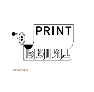
Letterpress, introduced in the fifteenth century, employs individual elements of wood or lead cut into letterforms, rules, and ornaments and pieced together to form a composition. Held together in a rectangular frame known as a chase, the elements that receive the ink are raised above the rest of the surface. When ink is applied, it coats only the raised surfaces, which transfer the ink to the paper when the type is run through a press. The aesthetic of letterpress is thus derived from the underlying grid, into which typographic elements are assembled. For centuries, letterpress was used almost exclusively to reproduce text, and intaglio printing (engraving and etching) and woodcut were used to reproduce images. A woodcut made the same thickness as the type (called type high) can be printed alongside letterpress type.

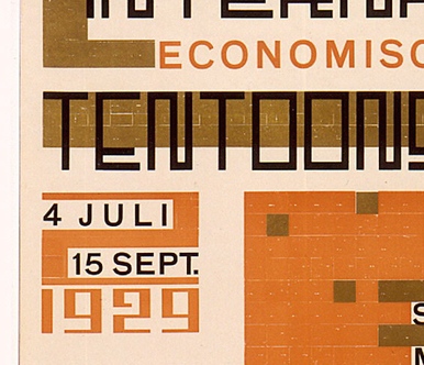
In the 1920s and 1930s, avant-garde designers adopted this traditional method of printing, but manipulated the qualities of letterpress to create a radically new aesthetic. Dutch architect and graphic designer Hendricus Wijdeveld produced the poster Internationale Economisch-Historische Tentoonstelling in 1929 using letterpress. Wijdeveld created a mosaic of stylized letterforms and opulent fields of burnt orange and gold by tightly piecing together geometric elements drawn from a printer’s type case. If you look closely, you can make out the individual elements that comprise the full forms.
Caitlin Condell is the Assistant Curator in the Department of Drawings, Prints & Graphic Design at Cooper Hewitt, Smithsonian Design Museum.
The exhibition How Posters Work is currently on view at Cooper Hewitt through November 15, 2015. You can learn more at the exhibition homepage and find the book How Posters Work at SHOP Cooper Hewitt. #HowPostersWork

