For their poster publicizing dancer Eunme Ahn’s performance of Three Questions on Death, Sulki & Min designed text in a style that recalls stenciled letters, their nod to the impermanence of the performance held before the opening of the Asian Arts Theatre, Asian Culture Complex in Gwangju. Cloudlike bubbles, culled from poster designs advertising earlier events, are layered beneath the text, recalling traces of past performances.

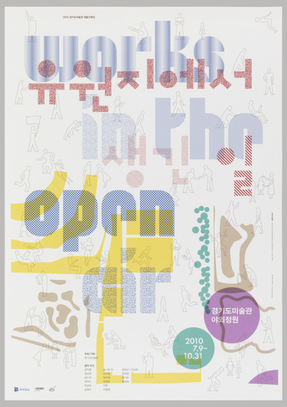
Poster, Works in the Open Air, 2010. Designed by Sulki & Min: Sulki Choi and Min Choi for Gyeonggi Museum of Modern Art (Ansan, South Korea). Offset lithograph. 84 × 59.4 cm (33 1/16 × 23 3/8 in.). Gift of Sulki & Min, 2014-21-3.
Layers of text in two languages are rendered in patterns of dots, stripes, lines, and textures in this striking poster designed by Sulki & Min to promote an outdoor exhibition held at the Gyeonggi Museum of Modern Art in Ansan in 2010. The English language translation of the exhibition title, “Works in the Open Air,” is quite different from the literal translation of the Korean title (“Whatever happened to the theme park”). The patterns can be seen through one another, creating an illusion of transparency. The overall composition suggests an open field or landscape with no single center point. The designers were interested in incorporating the idea of porosity and transparency into their poster design, drawing on modernist references: Gerd Arntz’s human figures for the Isotype system occupy the background of the poster, while the letterforms are derived from Josef Albers. The buildup of layers maintains a sense of airy space evocative of the exhibition’s theme.

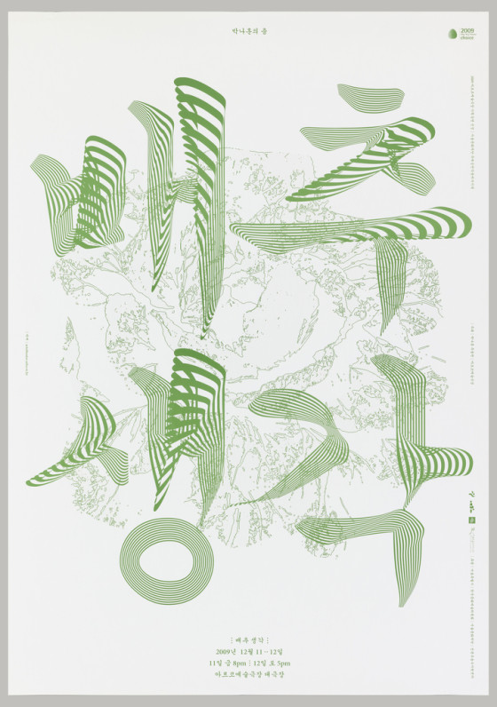
Poster, Cabbage Thoughts, 2009. Designed by Sulki & Min: Sulki Choi and Min Choi.Offset lithograph. H × W: 84 × 59.4 cm (33 1/16 × 23 3/8 in.). Gift of Sulki & Min, 2014-21-2.
This poster was designed to promote a performance entitled Cabbage Thoughts, given by the Korean dancer Park Na Hoon and his company in 2009. Sulki & Min designed a typeface that creates letterforms out of layered curving bands. The resulting characters give the illusion of depth, which is heightened by their being printed in shiny ink. Beneath them is a sketchily rendered image of a cabbage, the primary ingredient in the Korean national dish kimchi and an important symbolic reference point for the dance production.

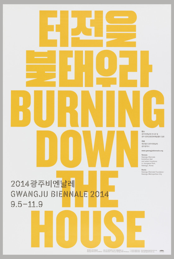
Poster, Gwangju Biennale 2014, 2014. Designed by Sulki & Min: Sulki Choi and Min Choi.Offset lithograph. 93.9 × 63.6 cm (36 15/16 × 25 1/16 in.) Gift of Sulki & Min, 2014-21-5.
For the tenth Gwangju Biennale, Sulki & Min strove to evoke the art festival’s provocative theme:“Burning Down the House.” The designers created a typographic system featuring three different weights and five different line breaks. Used together, the system allowed the design to cover as much surface area of the poster with as much text as possible. The designers also redrew the Korean characters, modifying some of the more traditional conventions, allowing them to work seamlessly with the Latin characters.
Caitlin Condell is the Assistant Curator in the Department of Drawings, Prints & Graphic Design at Cooper Hewitt, Smithsonian Design Museum.
The exhibition How Posters Work is currently on view at Cooper Hewitt through November 15, 2015. You can learn more at the exhibition homepage and find the book How Posters Work at SHOP Cooper Hewitt. #HowPostersWork
