In the forward to Letters from the Avant-Garde, a slim yet unique volume edited by Ellen Lupton and Elaine Lustig Cohen focusing on the stationery of European designers, Cohen discusses her experience as proprietor of Ex Libris, a bookstore specializing in avant-garde print materials. Founded in 1979 by Cohen and her husband, Arthur A. Cohen, the shop sold various types of printed matter, from notes and letters to books and sundry ephemera–including a selection of letterheads. While the sheets were displayed and sold alongside books and other collectable works on paper, many bearing the names of some of the most influential and well-known typographers of the avant-garde–Piet Zwart, Herbert Bayer, Kurt Schwitters, among others–the letterheads, Cohen recounts, rarely sold; “Perhaps stationery was considered too commonplace by many collectors,” she speculates. A letterhead is, no doubt, commonplace, an object people see so frequently that they often overlook it entirely. Yet as a champion of the letterhead, Cohen declares that its small-scale and functional restrictions makes it “one of the most challenging design problems.” [1]
When Paula Scher designed the identity for Manhattan Records in 1984, she was faced with the task of conveying the essence of two enigmatic phenomenon: music and Manhattan. Searching for a solution, Scher recounts how she “leafed through The Art of New York to figure out how a painting of a building could be manipulated to conform to all the various needs demanded by an identity for a record label, without becoming another trademark jammed into a corner.” [2] Finding Piet Mondrian’s Broadway Boogie-Woogie (1942-43) offered the ideal opportunity. A simplified map of Manhattan, the painting uses a system of rectangles in the Dutch artist’s “universal” primary palette. Taking Mondrian’s work as inspiration, Scher designed an adaptable identity system that could be applied to the wide variety of printed materials distributed by Manhattan Records, from record labels to album sleeves–and, yes, even a letterhead.

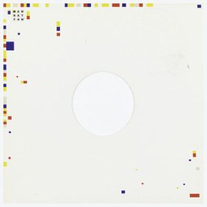
Record album sleeve, Manhattan Records, c. 1987. Designed by Paula Scher. Lithograph on paper. Gift of Paula Scher, 1996-88-3-b
Scher’s subdued design for the letterhead features the Manhattan Records three-by-three gridded logo in the upper righthand corner surrounded by an asymmetrical assortment of red, blue, and yellow squares. Below, along the foot of the page are accenting yellow, red, and blue squares organizing the address and phone number. The solution seems to be a simple one, however, like Mondrian’s paintings themselves the overarching system is more complex than one would assume. When comparing Scher’s letterhead to the album sleeve she created a few years later in 1987, it becomes clear that different mediums require diverse solutions; while the larger area of the record sleeve allows for more color and more squares, a more liberal and “exciting” scattering of elements along the outer edges, the letterhead is restrained for the task at hand. Just as the sleeve’s bare center allows the record’s colorful label to stand out, the letterhead’s quiet design removes distractions from the written message.
When viewed as part of an overall design solution, the letterhead tests a designer’s ability to adapt an identity. As a piece of utilitarian design, the letterhead must represent its owner while providing a comfortable reading environment. Such a prompt forces the designer to use a small space to simultaneously brand the sender and satisfy the needs of the receiver; the challenge becomes saying both the most and the least in the loudest yet quietest manner.
Carlin Soos is a rising second year Master’s student at the Bard Graduate Center and a graduate intern in the Department of Drawings, Prints, and Graphic Design.
[1] Ellen Lupton and Elaine Lustig Cohen, Letters from the Avant-Garde (New York: Princeton Architectural Press, 1996), 7.
[2] Paula Scher, Make it Bigger (New York: Princeton Architectural Press, 2005), 71.
