The Citibank logo is a familiar sight to every New Yorker. On the average ten minute walk through midtown Manhattan you might encounter the iconic red umbrella logotype half a dozen times, the friendly san serif letters decorating bank buildings, ATMs, and rentable bikes. The current Citi logo was designed in 1998 by Paula Scher, a principal at Pentagram, when Traveler’s Group merged with Citicorp, prompting the independent corporations to seek a unifying brand identity. By evoking the Traveler’s umbrella within the shortened name, Scher smoothly harmonized aspects of both companies into one visual.
This current fusion replaced a Citibank logo created in 1975 by Dan Friedman for the New York design agency Anspach Grossman Portugal. A collection of sketches housed in the Cooper Hewitt’s Drawings, Prints, and Graphic Design department reveals the various iterations produced by Friedman as he worked towards his final concept. Nearly the complete design, the bottom of the two marks display an oblique san serif typeface with a compass rose, a graphic holdover from the old identity. Prior to 1975 all official identities used the company’s retired name, The First National City Bank of New York, as seen in a 1962 bronze medal found in the collection of the New York Historical Society. Having long been referred to by both employees and clients as the short and sweet “Citibank,” Friedman’s redesign marks the official institutional switch. The use of simple, straightforward geometric shapes and the removal of excess visual noise draws on Modernist foundations acquired by the designer during his time at the Ulms School and Basel School of Design.
After leaving Anspach Grossman, Friedman accepted a position at the newly founded Pentagram studio. Although the work environment of Pentagram differed strongly from traditional Mad Men-style New York agencies, Friedman found the dialogue between designers frustratingly limited, leading him to critically reflect on contemporary corporate design culture. He admits in a 1994 interview with Eye magazine, “In the 1960s I saw graphic design as a noble endeavour, integral to larger planning, architectural and social issues. What I realised in the 1970s, when I was doing a major corporate identity projects [sic], is that design had become a preoccupation with what things look like rather than with what they mean. […] And we have deceived ourselves into thinking that the modernisation service we supply has the same integrity as service to the public good.” He declared in a manifesto-like manner, “Modernism forfeited its claim to a moral authority when designers sold it away as corporate style.”[1]
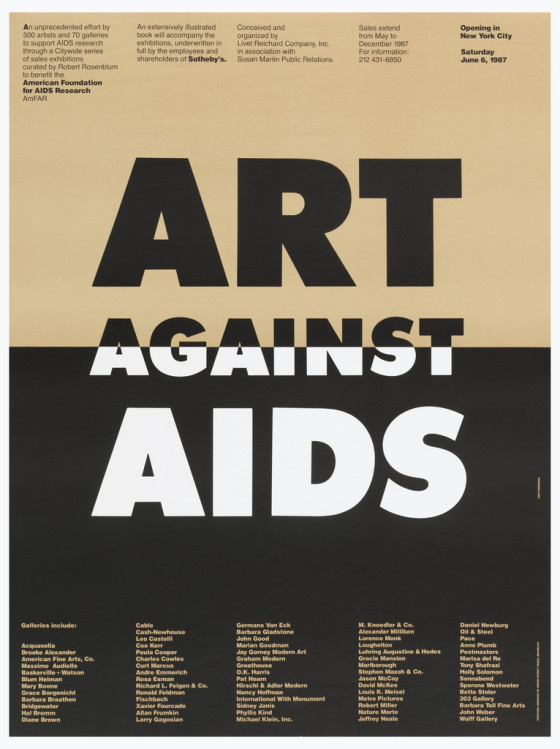
Leaving Pentagram in 1984 after five years as an associate, Friedman became increasingly more and more involved in New York City’s vibrant art and music scenes. The substantial HIV/AIDS activism centered around New York City during the 80s offered for Friedman, who himself was living with the virus, an opportunity to align his design with activist causes through projects such as Art Against AIDS. In 1994, a year before his death, Friedman published Dan Friedman: Radical Modernist, in which the designer grapples with his modernist roots and progressive values. As a guide, he offered twelve tenants for whom he labels the radical modernist, including, “Try to express personal, spiritual, and domestic values even if our culture continues to be dominated by corporate, marketing, and institutional values.”[2] Friedman’s activism had not replaced his Modernist roots, rather it questioned their use and challenged their capabilities.
Until his death, Friedman strongly believed that Modernism could be rescued from capitalist corporate confines and applied to social causes. “We should try once again to be fun-loving visionaries; we should return to a belief in a radical spirit – the idea that design is something that can help improve society and people’s condition.”[3] The evolution of Friedman’s work and theory acts as a reminder that, in many cases, the reduction of a designer’s practice down to a “before” and “after” is dangerous; Friedman did not simply start as a Modernist and end as a Postmodernist, but fused values and approaches from both camps as his career evolved. Friedman demonstrates how designers may deviate from types of simplistic, progressive linear narratives, returning to and adjusting previously held beliefs during their lifetime, ebbing and flowing throughout their careers.
Carlin Soos is a Master’s student at the Bard Graduate Center and a graduate intern in the Department of Drawings, Prints, and Graphic Design.
[1] Peter Rea, “Reputations: Dan Friedman,” Eye Magazine, http://www.eyemagazine.com/feature/article/reputations-dan-friedman
[2] “”Be Radical:” Dan Friedman’s 12-point Modernist Agenda Still Utterly Relevant After All These Years,” AIGA, http://www.aiga.org/Be-Radical–Dan-Friedman-s-12-point-Modernist-Agenda-Still-Utterly-Relevant-After-All-These-Years/
[3] Ibid.

