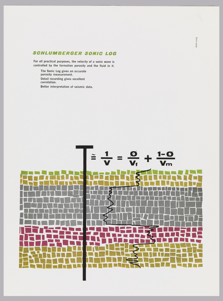
At first glance, this graphic field of squares looks almost like an abstract painting. Although this advertisement targeted scientists, designer Elaine Lustig Cohen captures the attention of laypeople and experts alike. Created in 1958 for the oilfield services company Schulberger, the ad promotes the company’s Sonic Log, a device for the identification of soil properties. At the center of the composition, a boldly printed formula indicates the highly technical subject of this advertisement. But even if this equation doesn’t mean much to you, Lustig Cohen’s composition of graphic elements reveals the function of the Sonic Log. The vertical line of equation’s letter “T” plunges into the variegated layers of stylized soil, whose playful colors conjure the formation of strata. A zigzagging line evokes the signal that the device receives. By stylizing these mechanical and geological elements, Lustig Cohen creates a legible and lively design, whose bright colors and clean lines would have been a refreshing departure from the diagrams and schematics typical of contemporary science advertising.
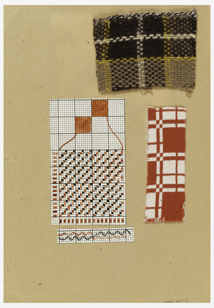
After establishing herself as a pioneer of mid-century American design, Lustig Cohen developed a fine art practice. As both an artist and designer, she has consistently engaged the materials and methods of modern art movements like Constructivism and Dada.[1] The Sonic Log ad demonstrates this, bringing together seemingly incompatible elements of art, science and technology in a cohesive composition. In her monograph on the designer, Aaris Sherin, called Lustig Cohen “a collagist at heart,” and praised her ability to create singular works inspired by everyday materials.[2] Cooper Hewitt is fortunate to have some of the design materials that Elaine collected for inspiration. Although it’s difficult to draw direct connections between these materials and specific Lustig Cohen designs, they offer a visual narrative of her design inspirations. Below, the textile samples demonstrate her interest in pattern and texture.

Samples And Charts (Germany), ca. 1930; Designed by Margarete Willers (German, 1883–1977); paper, cotton, wool; H x W: 30 x 21 cm (11 13/16 x 8 1/4 in.); Gift of Elaine Lustig Cohen; 2000-20-3

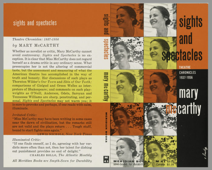
Book Cover, Sights and Spectacle: Theatre Chronicles, 1937-1956, by Mary McCarthy, ca. 1957; Designed by Elaine Lustig Cohen (American, b. 1927); USA; lithograph on paper; 18.4 x 22.9 cm (7 1/4 in. x 9 in.); Gift of Tamar Cohen and Dave Slatoff; 1993-31-18
Grid structures similar to those in the textile diagrams recur throughout Lustig Cohen’s body of work, as in this cover design for a book by author Mary McCarthy. The cover’s composition evokes the sample charts Lustig Cohen collected. The contrast between the crisp grid and the warm color palette creates an interesting visual effect, combining rigidity and softness to reflect McCarthy’s unique sensibility. Smiling from leafy portrait photos, McCarthy’s friendly expression contrasts with the cover’s strict geometry. A similar tension appears in Lustig Cohen’s textile charts, between the samples’ soft texture and exacting weave.
![Both covers have a series of vertical lines and dashes and a single line in black. There are four rows of dashes. The authors and title imprinted across the top in black and green ink: BY JOHN M. JACOBUS, SR. [black] Philip Johnson [green]/ MAKERS OF CONTEMPORARY ARCHITECTURE; down the center as spine vertically in green and black ink: Phillip Johnson [green] BY JOHN M. JACOBUS, SR. George Braziller [black].](https://www.cooperhewitt.org/wp-content/uploads/2016/05/OTD_LC-Johnson-700x412.jpg)
Book Cover, Bookjacket for “Philip Johnson, Makers of Contemporary Architecture” by John M. Jacobus and George Braziller, 1962; Designed by Elaine Lustig Cohen (American, b. 1927); USA; lithograph on off-white wove paper; H x W: 26 x 44.5 cm (10 1/4 x 17 1/2 in.); Gift of Tamar Cohen and Dave Slatoff; 1993-31-50

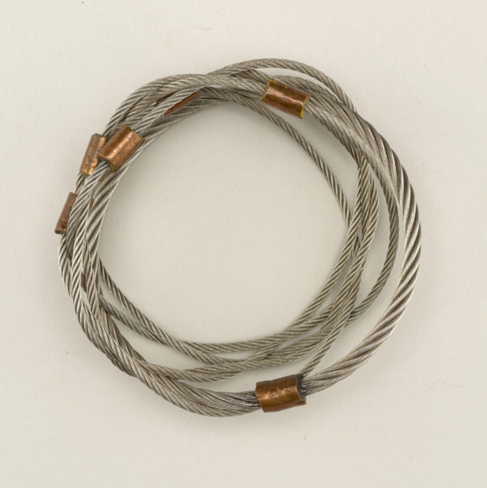
Bracelet (USA), 1973; Designed and made by Kenneth Snelson ; steel wire, brass, copper; di.: 9.5 cm (3 3/4 in.); Gift of Elaine Lustig Cohen, 1997-59-4
This wire bracelet that Lustig Cohen used to wear suggests her experimental integration of various visual languages into a single work. Like the Sonic Log ad, the bracelet fuses conflicting qualities—utilitarian, industrial materials adopt an ornamental function as a fashion accessory.
These and other gifts from Lustig Cohen are resources for designers, students, and scholars to better understand her design process. They allow us to sneak into her creative mind, granting perspective on what she saw as a “world so full of inspiration.”[3] This comment certainly indicates creative associations between her personal collection of artifacts and her design.
Sakura Nomiyama is a student in the M.A program in the History of Design and Curatorial Studies program offered jointly offered by the Parsons School of Design and the Cooper Hewitt, Smithsonian Design Museum. She is a curatorial intern in the Drawings, Prints & Graphic Design Department of the Museum.
[1] Aaris Sherin, Elaine Lustig Cohen: Modernism Reimagined (Rochester, New York : RIT Press, 2014), 39.
[2] Ibid.
[3] Lustig Cohen in discussion with Sherin, March 4, 2013, in Elaine Lustig Cohen, 39.

One thought on “Elaine Lustig Cohen’s World of Inspiration”
Penny House on May 16, 2016 at 6:48 am
Mary McCarthy must be rolling over her in grave to be identified as a “feminist author and activist.” This is truly wrong, no matter how women felt about her work. You are distorting her work. (I am a feminist and used to be rather an activist, so it’s not that I disapprove, but it’s not right to appropriate the past to suit the present.)