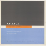
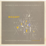
Alvin Lustig was one of the most influential graphic designers of mid-20th century America, despite the unfortunate brevity of his career. Well-known for his designs of books, book jackets, and magazines, Lustig also designed several record jackets for albums of classical and concert band music. Four such albums bearing Lustig’s design are featured in Cooper Hewitt’s collection, including Mark Warnow’s Sound Off.
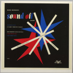
Warnow’s album was named after the United States Military’s “Sound Off Chant,” which is featured on the album. It also includes military marches, patriotic compositions like “Stars and Stripes Forever,” and recordings based on the U.S. army’s WWII-era “Sound Off” radio program. When looking at Lustig’s design, you can almost hear the star-shaped blasts of color—as though splashes of paint are being shot from a military bugle.
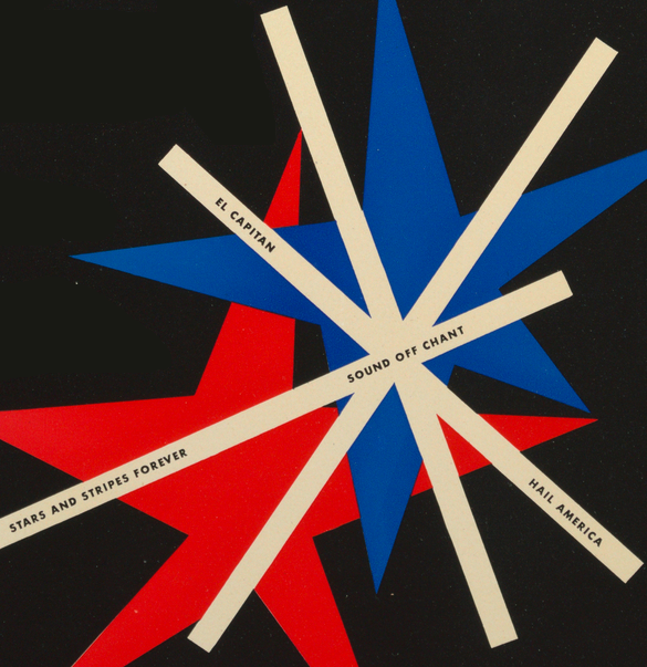
Close-up of stars on Lustig’s cover
Mark Warnow’s Sound Off was first released in 1944 on Coast Records and again on Capitol in 1949. After its re-release, Billboard magazine called it “contrived flag-waving stuff presented in typical unimaginative radio style.”[1] Alvin Lustig may have disliked the music just as much as Billboard did, but he was tasked with visually representing it, no matter how uninventive and nostalgic it may have sounded.
Lustig succeeds in representing the patriotic music in the way he approaches color and shape. It is logical that he chose red, white and blue to echo the colors of the American flag. While the majority of the text is written in Futura font, the title “Sound Off” is in Allegro. In terms of shape, not only do the stars evoke “Stars and Stripes Forever,” they also work to visually suggest the music of the album. The stars’ asymmetry and sharp angles create a sense of movement—they look like explosions of sound booming from a horn. Although Lustig’s design precedes the height of the pop art movement, one can imagine a star in his design accompanied by onomatopoeic text, like the whaams, varooms and bratatats of Roy Lichtenstein paintings. Similar references to the American flag and its colors could be found in the works of Jasper Johns or Robert Rauschenburg.
While the red and blue stars are in the background, three overlapped white strips are configured in a star pattern in the foreground. The reason for this layering seems clear—the black text of the song titles is most visible against a white background and the shape of the strips creates a tighter frame for the text than that of a five-point star. Lustig’s decision to pair nostalgic music with such a fresh-looking graphic is innovative. Although his design fits well with the militaristic music and patriotic lyrics of the album, the design does not try to emulate the nostalgic quality of the music. Perhaps the strength of Lustig’s design is that he took music that Billboard considered dated and paired it with a modern, compelling visual.
Jeremy Witten is a curatorial intern in Cooper Hewitt’s Drawings, Prints and Graphic Design Department. He is currently studying music at the University of Alberta in Canada.
[1] “Mark Warnow’s Sound Off.” The Billboard, February 12, 1949. 35.

