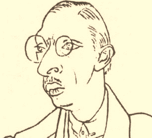
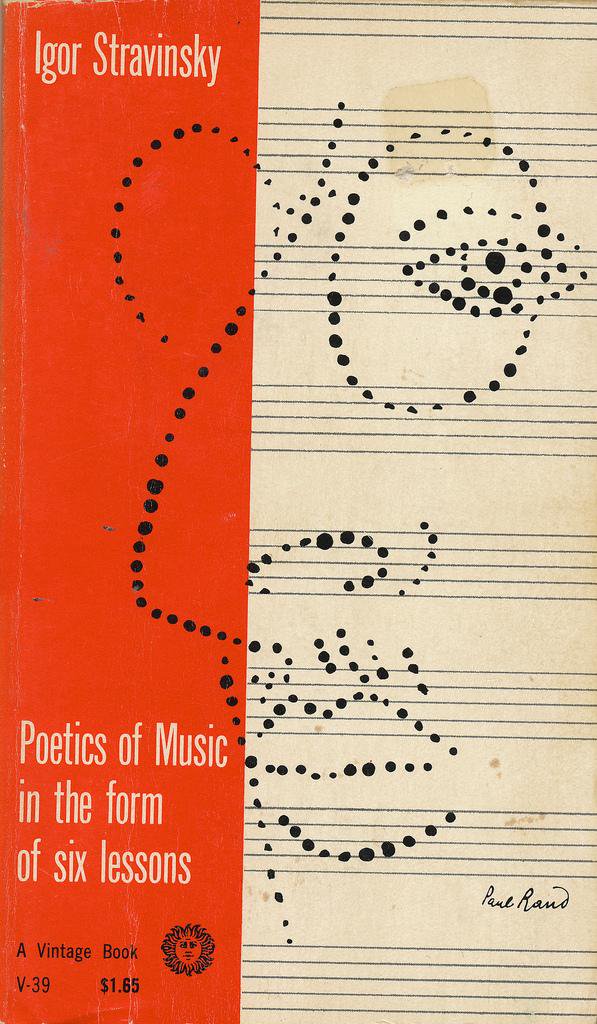
Paul Rand was an influential American graphic designer well known for the logos he created for IBM, UPS, ABC and other corporations. His 1947 book Thoughts on Design is considered a seminal text on graphic design. The poster above shows something different from Paul Rand’s oeuvre. It’s not a neat and compact corporate logo; instead it is an example of Rand’s playful breakdown of line and form in a depiction of Russian composer Igor Stravinsky. Rand’s composition is unmistakably reminiscent of a sketch that Picasso drew of Stravinsky in 1920.

Section of Picasso’s sketch of Stravinsky (Public Domain)
The poster in Cooper Hewitt’s collection was created from the cover Rand made for a 1956 edition of Stravinsky’s Poetics of Music in the Form of Six Lessons published by Vintage Books. Interestingly, Picasso’s sketch of Stravinsky was used for other editions of the same book. Rand’s dotted sketch of Stravinsky is unique for several reasons. The sheet music background of the illustration is a nod to Stravinsky’s work as a composer—but aesthetically, it allows for an interesting interplay between the flatness of the sheet music and the multidimensional composition. The angles of Stravinsky’s nose and jaw line make it look like his head is turned. The eye faces the viewer while the rest of Stravinsky’s visage is angled to the left in partial profile. The addition of the orange book cover flap adds another layer of depth to the picture; the flap covers the spot where Stravinsky’s right eye would be, so imaginative viewers might visualize his right eye beneath the flap, perhaps subconsciously linking it to the familiar Picasso drawing.

Rand’s illustration takes on more meaning when put in the context of Stravinsky and his musical work. Rand’s sketch was made roughly forty years after Stravinsky’s ballet The Rite of Spring debuted in Paris in 1913. Although it became one of Stravinsky’s best known works, the ballet was noted for its experimentation with tonality and dissonance, and it was initially not well received. The New York Times called the premiere a failure, reporting that the theatre lights had to be turned up and that the manager of the theatre had to “take means to stop hostile demonstrations” as the ballet went on. [1] For a composer who “introduced fierce dissonance and driving rhythmic propulsion as an alternative to a melodic center,”[2] it is fitting that Rand’s depiction captures the interplay between Stravinsky’s wild creativity and the strict structure of sheet music. Parts of Stravinsky’s face are out of proportion with each other. The sketch of Stravinsky appears almost unfinished, with implied form through the dots. This rough depiction of Stravinsky sits in perfect contrast to the straight lines of the sheet music. Indeed, the rigid lines of the sheet music imply structure and order. The visual interplay of these two opposing forces work well to capture the dissonance found in compositions of Stravinsky’s such as The Rite of Spring.
Paul Rand’s decision to draw with dots on sheet music certainly suggests Western music notation, which uses dots and stems to represent the notes in a composition. But even though some of Rand’s dots intersect with the lines on the staff, you’d have to get extra creative if you wanted to try “play” this sheet music. Cooper Hewitt’s collection contains several pieces of sheet music that can be seen here.
Jeremy Witten is a curatorial intern in Cooper Hewitt’s Drawings, Prints and Graphic Design Department. He is currently studying music at the University of Alberta in Canada.
[1] “Parisians Hiss New Ballet.” The New York Times, June 8, 1913.
[2] Budman, Lawrence. “Featured Composer Igor Stravinsky (1882-1971).”
