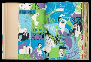
“Where It’s At” is not only the title of this gloriously psychedelic wallpaper but also how someone in 1968 would have described the United De Soto wallpaper company in Chicago. A division of DeSoto Industrial Coverings, Inc., United De Soto stood out for its technical innovations, being the first American company to use fluorescent pigments and among the first to use Mylar in their wallpapers. Their greatest success came in the 1968 with their Bravo line of wallpapers, subtitled “Young Ideas for the New Generation” a glorious mix of psychedelic floral, Neo-Victorian, Art Nouveau revival, Op Art, and Pop art papers. Marketed explicitly to youth, the papers not only used the latest styles but were meant to be incredibly easy to apply, clean, and take-down, as indicated by the title of this sample book “The Instant Put-On.”
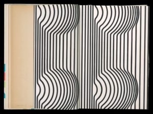
United De Soto’s youth appeal could also have come from the cheekiness of its ads. “Within eyeshot of these words,” says one ad in a 1968 Chicago Tribune, “there should be a picture that looks like [a] a seismographic study of quadruple earthquakes in downtown Rangoon or [b] two of the Gabor girls trying on the same awning-striped dress….What it is precisely, is one of a group of new wallpapers that are printed upon, and evidently march to, a different drum. If you’re looking for cabbage roses, this is not your garden.” The above description refers to the pattern Way Out, one of the Bravo line’s Op art patterns which, as the review further says, is “the one they say is Way In.”
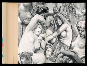
The level of bravado seen in this ad is matched by the titles of many of the other patterns in the line, which included the aforementioned “Where It’s At”, “Dr. Livingstone, I Presume” another Op art paper featuring zebras, tigers, and leopards, and “The Secretary Pool,” a pile-up of Victorian lithograph nudes.

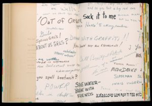
Other patterns include Nitty Gritty, a graffiti pattern, Dead End, a cluster of traffic signs, Pick-a-Dilly, Oom-Pah-Pah, Strip-Strap, Be-Dazzled, and Kicky, described as “a pictograph of three schools of psychiatry in mortal combat.” Sadly there does not seem to be an example of Kicky in the Cooper Hewitt’s sample book. What examples of patterns that do exist in the Cooper Hewitt’s collection show how United De Soto clearly had its finger on the pulse of late 60s taste, and there isn’t a style of the time that isn’t represented in this sample book. The Bravo line feels just as fun and irreverent now as it was fifty years ago.
Nicholas Lopes is a student in the History of Design & Curatorial Studies graduate program at the Cooper Hewitt, and is a Master’s Fellow in the Wallcoverings Department.
Sources:
http://archives.chicagotribune.com/1968/11/24/page/415/article/buy-line
Lesley Jackson, Twentieth-Century Pattern Design (Princeton: Princeton Architectural Press, 2002), 164-165.

2 thoughts on “Where It’s At”
Bogframe on March 19, 2020 at 7:38 pm
I have been looking to find the source of “The Secretary Pool” for decades! My uncle wall-papered a room in our summer house with it and I’ve been wanting to get my hands on a roll ever since!
Robin on November 22, 2022 at 4:54 pm
I have a roll of wallpaper on canvas that is similar in style to nitty gritty- it’s covered in off graffiti saying like “Betty Crocker was a flour child” in shades of black, brown, and orange, which I found in my parents attic, alongside another few odd rolls of Monticello by DeSoto wallpaper. I’d love someone to get in touch and talk about them!