A major proponent of “New Typography” in the United States, Dan Friedman received his formal education in Basel, Switzerland under Armin Hofmann, an influential educator and designer whose students disseminated the Swiss Style of graphic design in the late 1960s. Though Friedman’s portfolio had earned him teaching positions at Yale University and SUNY Purchase upon his return to the US in the early 1970s, he quickly left academia to work as a designer in New York City.
Hired in 1975 as the Senior Design Director at Anspach Grossman Portugal, Inc., a firm specializing in corporate identity, Friedman created what he referred to as “reasonably coherent systems” for corporations. He was given a complex project within a year of joining the firm: the development of a new identity for the First National City Bank of New York, whose name had recently been shortened to Citibank. In addition to redesigning the logotype by simplifying the compass rose of previous versions, Friedman produced the Citibank Corporate Identity Manual, which provided detailed specifications for the implementation of this new identity in stationery, forms, signage, advertisements, and promotional material issued by the bank.[1]
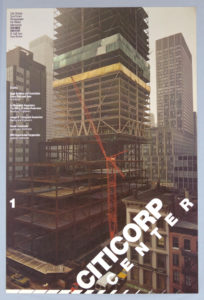
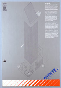
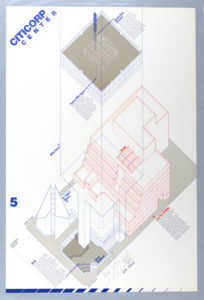
In need of modern headquarters to match its sleek new graphic identity, Citibank broke ground on a skyscraper on Lexington Avenue that same year. Friedman designed everything from the barricade around the construction site to this poster, one in a series of eight intended to function as a cohesive unit to promote Citicorp Center’s wealth of retail, office, and public space. The poster presents a bird’s eye, axonometric view of the unusual base of the skyscraper. Working within the constraints of the site, which required that St. Peter’s Church remain on the corner of 54th street, Hugh Stubbins and William le Messurier, the architect and engineer, had ingeniously raised the 59-story structure 115 feet above both the church and the street with the aid of four massive support columns. The vaulted base allowed Citibank to take advantage of zoning laws which permitted the construction of taller buildings in exchange for the development of public spaces within the site.[2] As indicated in Friedman’s poster, a separate low-rise building (in red) would contain an airy public atrium and additional retail and office space, while a large public plaza (in blue) nestled directly underneath the skyscraper would host cultural events and exhibits.
Friedman’s design blends influences as varied as Hofmann’s Swiss typography, the orthographic renderings of Theo van Doesburg, and the graphic style of Bauhaus modernism to produce a remarkably legible poster. The various architectural elements, rendered in simple lines and utilizing color as a distinguishing characteristic, are readable despite the complexity of their layers. Dense blocks of text, justified to the left in a sans-serif typeface, clearly describe the intended use and inherent advantages of each space. The diagonal orientation of the architectural rendering and text echoes the iconic 45-degree crown of the skyscraper, and the oblique new logotype at the upper left corner further reinforces the modern identity of Citicorp.
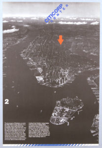
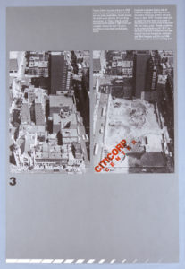
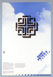
Each of the eight posters incorporates these new design elements while highlighting a different aspect of the center, including a discussion of the dining options, potential exhibitions and musical performances, and the benefits of modern interiors and environmental design aimed at corporations in need of office space.
Though his designs for Citicorp were successful, Friedman’s work with large-scale corporations left him disillusioned. As he lamented in his 1994 book Radical Modernism, “It has become apparent that these visual identities are often a kind of packaging, that they reflect a preoccupation with the way things look more than with what they mean.”[3] After a stint at Pentagram in the early 1980s, Friedman focused on working more intimately with smaller clients, including his friend Keith Haring, until his death in 1995.
[1] ‘Dan Friedman, New York: Arbeiten aus den 70er Jahren, Throwing out work from the 1970’s’ in: Typografische Monatsblätter, Schweizer Grafische Mitteilungen, Revue suisse de l’Imprimerie, 1981, issue 1, 1–24
[2] Sam Greenspan, Roman Mars, Joel Werner, et. al. “Structural Integrity.” 99% Invisible. Podcast audio, April 15, 2014. http://99percentinvisible.org/episode/structural-integrity/
[3] Dan Friedman, Dan Friedman: Radical Modernism (New Haven: Yale University Press, 1994), 123.
Ria Murray is a graduate student in the History of Design and Curatorial Studies program offered jointly by the Parsons School of Design and Cooper Hewitt, Smithsonian Design Museum. She is a Fellow in the museum’s Drawings, Prints & Graphic Design Department.

