Design is for public consumption. Its process is collaborative and frequently involves many iterations of an idea before the best solution is found. This is why contests in design come about so naturally. Design competitions date all the way back to 448 BCE when the city of Athens decided to construct a war memorial on the Acropolis. This decision followed the Greco-Persian war and the watershed Battle of Marathon in Athens. Not all design competitions follow landmark events though.
The Cooper Hewitt, Smithsonian Design Museum’s Library has acquired a set of publications, Pencil Points reader: a journal for the drafting room. This architecture-focused publication, released monthly from 1920-1943, comes tucked neatly inside a countless number of trade related advertisements. In each issue, there is the section “Here and There and This and That” which allows for entry into one of the four categories of a monthly competition. The categories include a sketch or drawing, poetry, cartoons, and miscellaneous. The selected winner from each category has their winning entry published in the catalog and receives $10.
Pencil Points competitions revolve around architecture and innovative challenges presented by the endless possibilities of design and the imagination. Here are some of the design contests featured in the copies residing at the Cooper Hewitt, Smithsonian Design Museum’s Library;
“Bigger and Better Built-In Ashtray Competition” (June 1928)
A call to design a “Bigger and Better Built-In Ashtray” yielded many complicated and multifaceted submissions. These were the top three prizewinners. The most complex design is the system that utilizes a shotgun to remind the household smoker that their ashtray, located in the basement, is full.
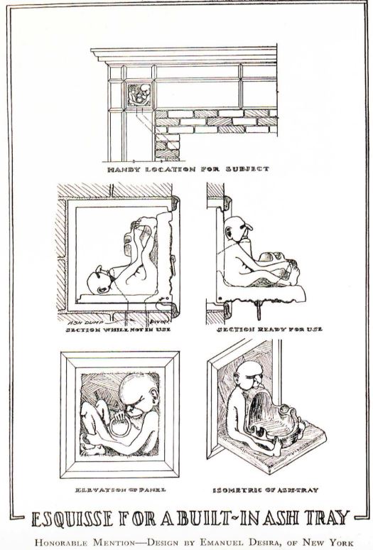
An Honorable Mention for its concealed tile sized design.
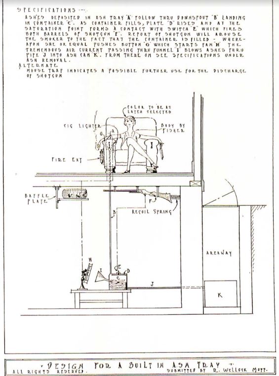
The grand prize winner with a much more complicated design.
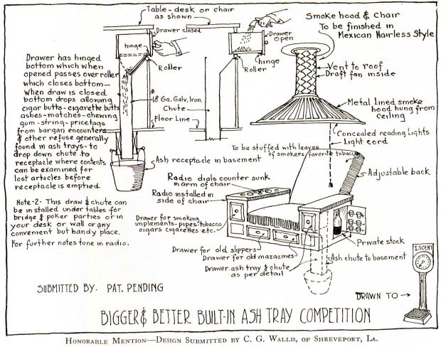
An honorable mention for another smoking chair with features like drawers, a mini bar, and vent.
“The Salvador Gloop Competition for a Palanquin” (October 1931)
This competition revolved around one editor, E.C.L., having their wisdom tooth removed. The challenge was to design a palanquin to display the soon to be removed tooth. The designs were exotic, beautiful, and befuddled. The temple of the wisdom tooth that won the competition was truly a monumental way to remember the molar.
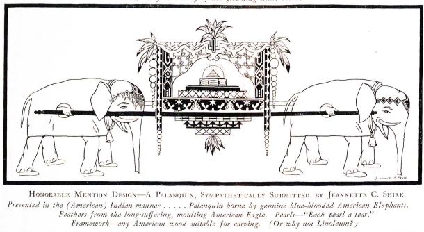
An honorable mention humorously intended to be designed with American products.
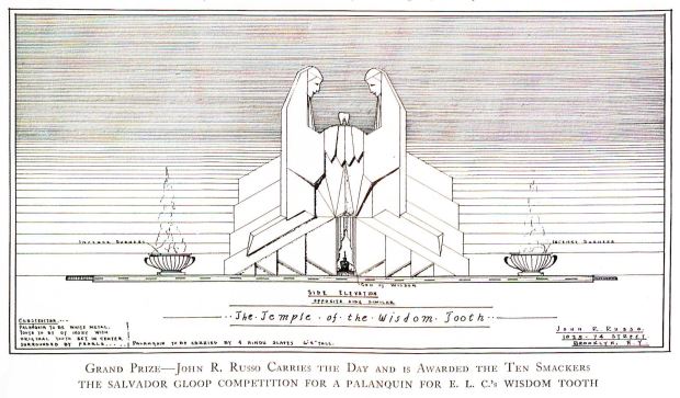
The grand prize winner for how the wisdom tooth can be carried off in style.
There is also a continuous spread of humorous cartoons, poems, or jokes in the Pencil Points competitions. They poke fun at the changing trends in architecture, draft room culture, and architects perpetual want to design and plan.
Here is an example of how the purveyors of the trade are reacting to a new trend of buildings with metal facades.
Another examines the draftsman’s desire to design and plan well beyond the task at hand as the unemployed architect turned apple salesman.
“Future House to be of Metal” (June 1931)
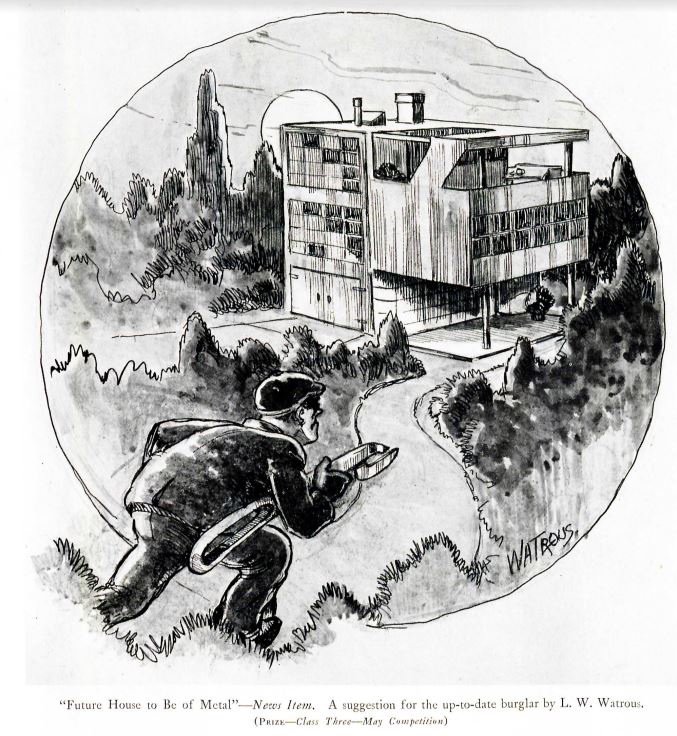
A cartoon submission about the future of architecture.
“The unemployed draftsman becomes an apple salesman” (January 1931)
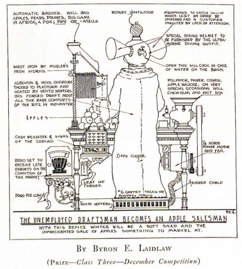
A cartoon to show the detail and effort a draftsman expend on a seemingly simple job.
Margaret Gaines is an MA candidate in the History of Design and Curatorial Studies program offered jointly by Parsons School of Design and the Cooper Hewitt, Smithsonian Design Museum. She holds a work-study position at the Cooper Hewitt, Smithsonian Design Museum Library.
One thought on “Pencil Points Design”
Claudia Phelps on April 9, 2018 at 11:43 am
Very cool post.
Thanks for using BCE
“one editor, E.C.L., having ‘his’ wisdom teeth. . .”