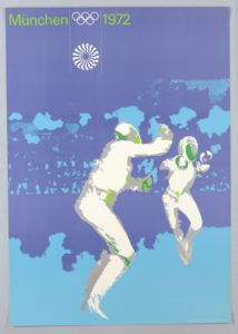
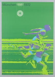
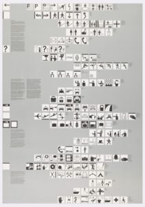
For the organizers of the 1972 Munich Olympic Games, the event presented an opportunity to redefine global perceptions of German identity. It was seen as a chance for Germany to distance itself from the dark memory of the 1936 Games in Berlin, staged under Hitler’s rule. A primary objective for the 1972 Games, as scholars Kay Schiller and Christopher Young have stated, was to use graphic design to translate “progressive ideas regarding freedom and participation in West German society and democracy.”[1] Adding to the political pressures enveloping the games, as a condition for receiving the winning bid, the International Olympic Committee mandated that the Munich organizers strive to use the 1972 Games to allay Cold War tensions, and instead promote an international sense of inclusivity.
Overseeing the Games’ visual identity was the typographer and graphic designer Otl Aicher, who was appointed Design Commissioner in 1966. Aicher worked on the Munich Olympics’ design for six years leading up to the Games and embraced the Committee’s directive towards inclusivity and international cooperation. By the time the Olympic torch had been lit, Aicher had become a household name, thanks in part to the success of his contemporaneous work for Lufthansa, Braun, and Hans Gugelot.[2]
The visual identity Aicher developed for the Munich Games was predominately rendered in vivid greens and blues. He deliberately avoided using red and black in an attempt to further disassociate the 1972 Games from the fascist imagery of the Nazi regime showcased at the 1936 Berlin Olympics.
Attempting to strip his design of national identifiers and sociopolitical associations, Aicher instead shifted the focus to the dynamic motion of the heroic (almost exclusively male) athletic body. The Games’ posters use photographs of athletes in moments of triumphant and victorious action, modified by applying a bright, contrasting color scheme. The resulting pictorial effect coats each scene in a brilliant veneer that conceals explicit displays of nationalism and instead emphasizes universal human accomplishment. Rather than relying on text to communicate this sentiment, Aicher formed these images of athleticism into the metaphorical face of the Games, hoping to draw athletes, visitors, and spectators alike into the welcoming and compassionate spirit he was attempting to construct.
This image-forward approach was incorporated into every visual component of the Games, from tickets and signage to souvenir trinkets and official uniforms. Perhaps Aicher’s most effective design for the Munich Games was a system of pictograms created so that spectators could navigate the Games without relying on a written language. Aicher designed abstracted, stick-figure icons for each sporting event (as well as many cultural events) that could be universally understood by a multi-lingual audience.[3] These symbols and icons were easily recognizable, conveying information in a form of expression that was not hindered by the limits of traditional communication. In attempting to create a sense of global inclusivity through the graphic systems of the Munich Olympics, Aicher thus pioneered a method of communication—still used today—which transcends languages and borders through an adept application of semiotics and design.
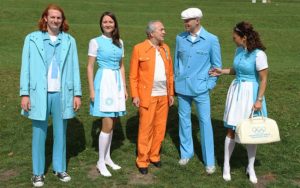
Image of volunteer workers at the Munich Olympic Games in 1972, wearing uniforms designed by Otl Aicher. Image courtesy Henning Schlottmann via Wikimedia Commons.
Of course, the graphic design program devised for Munich remains bound up in the legacy of events that unfolded at the Games themselves. The very hostilities that Aicher hoped (perhaps naively) his designs would dissolve are today unquestionably at the center of any history of the 1972 Olympics. While antagonism between political adversaries played out peacefully across the Games’ sports arenas,[4] an extremist, anti-Israel terrorist group took advantage of the international spotlight, kidnapping and murdering eleven members of the Israeli Olympic Team and a West German police officer. The horrific attack continues to veil the Munich Olympic Games.
Although the sociopolitical strife that led to this violence persists to this day, Aicher’s graphic program for the Games has received more attention in recent years—his design for the Games appeals to both design scholars and historians interested in the performance of politics at such events. Such reconsiderations of history through the lens of graphic design focus our attention on design’s ability to act as a platform for cross-cultural dialogue, both in the time of its making, and for years to come.
Kristina Parsons is the E. McKnight Kauffer Cataloguer in the Drawings, Prints & Graphic Design Department at Cooper Hewitt, Smithsonian Design Museum.
[1] Kay Schiller and Christopher Young, “Motion and landscape: Otl Aicher, Günther Grzimek and the graphic and garden designs of the 1972 Munich Olympic Games,” Urban History, vol. 37, no. 2 (2010): 274.
[2] Moreover, Aicher was well-regarded in the design community following the establishment of Hochschule für Gestaltung, a design school founded to build upon Bauhaus principles and approaches to design.
[3] Aicher was inspired in equal measure by Otto Neurath’s notion of the “isotope,” and Masaru Katsumi’s sign system for the 1964 Games in Tokyo. Ellen Lupton, “Reading Isotype,” Design Issues, vol. 3, no. 2 (1986): 56
[4] At the 1972 Olympic Games, American swimmer Marc Spitz took home seven gold medals, seven world record titles in a record-breaking performance. As the story goes, Spitz purportedly misled the entire delegation of Soviet swimmers to believe his infamous facial hair was actually more hydrodynamic, prompting a sudden rise in mustachioed swimmers from the USSR, and further fueling the competitive attitude between the US and the USSR.

Photograph of Swimmer Marc Spitz at the Munich Olympic Games in 1972. Image courtesy of Giorgio Lotti via Wikimedia Commons.

