Tobias Frere-Jones, winner of the 2019 National Design Award for Communication Design, is one of the world’s leading typeface designers, creating some of the most widely used typefaces, including Interstate, Poynter Oldstyle, Whitney, Gotham, Surveyor, Tungsten, and Retina. He started designing letterforms in 1986 at the age of 16 and became a professional type designer in 1990. He established his own type design practice, Frere-Jones Type, in New York in 2015. He has taught type design at the Yale University School of Art since 1996 and at the School of Visual Arts since 2014, and has lectured in the United States, Europe, and Australia. Frere-Jones has written on type history and theory and contributes commentary to a range of publications.
The National Design Award recipients will be honored at a gala dinner and ceremony Thursday, Oct. 17, in the Arthur Ross Terrace and Garden at Cooper Hewitt.
What three adjectives define “good design” to you?
Decisive: Before anything else, good design starts with clear intentions.
Self-aware: This could be a sense of humor, or a sense of responsibility. Either way, it’s a kind of humility.
Informed: Know what it’s made of, and who it’s made for. Be clear about your role and your effect.
Who is a designer, historic or working today, that you would invite to a dinner party?
Typeface designer William Addison Dwiggins: he had a rare skill in detaching himself from expectations. It made him resourceful and inventive like few other designers, and also funnier.
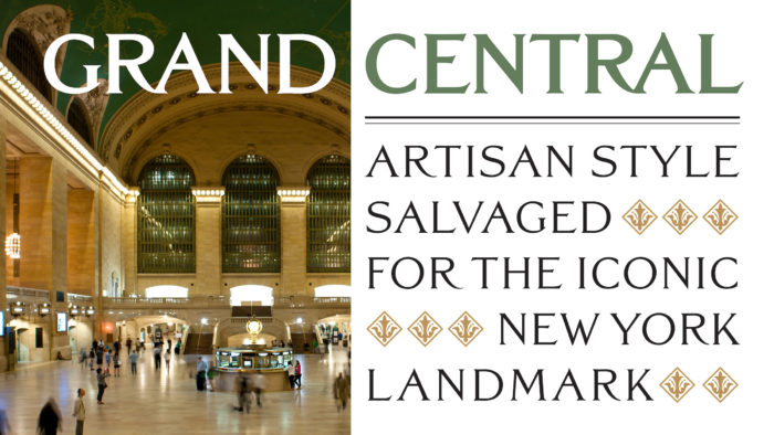
Tobias Frere-Jones, Grand Central (1998). Photo: Courtesy of Tobias Frere-Jones
A typeface designed during the renovation of Grand Central Terminal to keep new signage in harmony with the existing American beaux-arts lettering style and also comply with the Americans with Disabilities Act of 1990.
What inspires you when you’re feeling stuck?
The city itself, and not just its typography. Its history is written in the ground under my feet, and in the air around me. There are stories in the paths of the streets, in the shapes of the buildings, in the curves of the shoreline. All I need to do is step back and translate.
What do Cooper Hewitt and the National Design Awards mean to you?
It’s the recognition of esteemed colleagues, of course. There isn’t anything higher or grander than this. But it also means that I’ve been identified as a representative of the craft. So, I also take it as a call to action to explain my craft to a wider audience and to pass on what I can to young designers.
How did you get your start in design?
A long sequence of lucky breaks, many of which I didn’t understand or notice at the time. I had begun training in the family tradition of writing, but had developed a passion for abstract painting. I found an unlikely intersection of these two disciplines in typeface design. I didn’t understand just how obscure this field was, and that instruction would be so hard to find. But through professors at RISD, I was able to make my first contacts in this field.
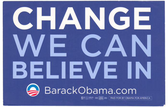
Tobias Frere-Jones, Gotham (2000–2009). Obama Rally Sign Graphic Design: Sender LLC. Photo: Courtesy of Tobias Frere-Jones
Gotham celebrates the robust but nameless genre of lettering that appears in public spaces throughout New York. Frere-Jones surveyed Manhattan block by block to record and study this style of lettering, which has been made by engineers rather than designers. A photographic archive of a craft that was quickly vanishing with gentrification became the central reference in preserving the flavor and expanding the range of these “outsider” forms.
How has mentorship influenced your career?
It’s no exaggeration to say that I wouldn’t have a career without mentoring.
I learned on the job, working under or alongside practicing professionals. I was guided through real projects and took lessons from real mistakes. My first mentor, David Berlow, also gave me the space to develop my own approach and agenda.
Looking over your body of work, is there one design project that holds personal significance for you?
I try to extract some lesson or further understanding from every project. Every one forms another piece of my ongoing education, so it’s hard to choose. But Retina does feel different from the others. Its ideas draw on my earliest experiments, my first days of understanding how reading works.
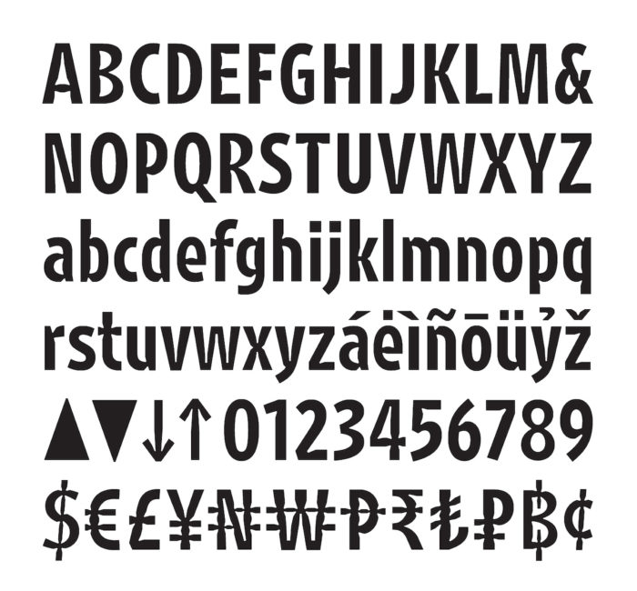
Tobias Frere-Jones, Retina (2000–2016). Photo: Courtesy of Tobias Frere-Jones
Retina began as a commission for the stock listing of the Wall Street Journal. Turning to past experiments, it was questioned how much information we need to interpret a letter. For Retina, the unique features of each letter were enlarged, so each one could be small yet unmistakably itself. By embracing and amplifying these differences, Retina cooperates with the reader’s eye rather than challenging it. Notches and tapers anticipate the “squeeze” of ink that can obscure overall shapes and hinder the reader.
What are your words of advice to the next generation of designers?
Learn how to explain yourself and defend your decisions. Clarify your own thinking, both in writing and in public speaking, and you will make yourself a better practitioner. And in time, you can become a mentor to others.
About the National Design Awards
Cooper Hewitt’s National Design Awards is the only annual program of its kind, bringing national recognition to the ways in which design enriches everyday life. Launched at the White House in 2000 as a project of the White House Millennium Council, the National Design Awards were established to promote design as a vital humanistic tool in shaping the world. Twenty years later, the National Design Awards continue to honor and support excellence, innovation, and lasting achievement in American design. Cooper Hewitt continues to broaden access nationwide to the vision and work of the country’s design leaders through National Design Week and NDA Cities, inspiring people of all ages to engage with design and design thinking.
In celebration of the 20th anniversary of the National Design Awards, Target will offer free admission to all visitors of Cooper Hewitt during National Design Week, Oct. 12–19, to make design accessible to all. Target will also sponsor a series of Cooper Hewitt programming broadening access to the vision and work of the country’s design leaders and inspiring people of all ages to engage with design and design thinking.
