Rick Valicenti is a legendary graphic designer, whose career spans the transition from analog to digital design production. Rick spoke with Cooper Hewitt curator Ellen Lupton about his design process over Zoom on October 23, 2020. Edited for clarity and length.
Ellen Lupton: Rick, where are you?

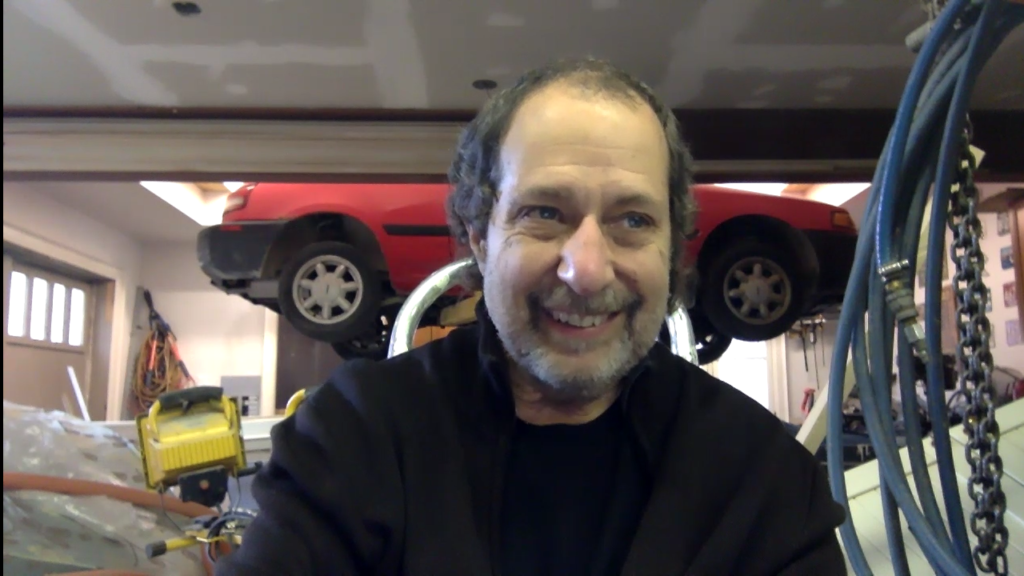
Rick Valicenti, screenshot from a Zoom call. Rick is smiling and wearing a dark sweater. Behind him, a red car is suspended in the air for repairs.
Rick Valicenti: I am in a garage in Toronto. This is the second day of a fourteen-day quarantine as we prepare to visit my mother-in-law, who is ninety-three years old and in assisted living. We are quarantined in a studio apartment above our friend’s garage.
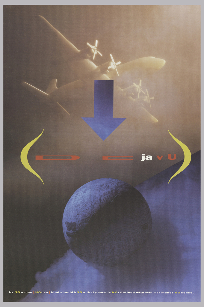
I created this poster at the start of the 1990 Gulf War war. The poster was for a lecture at the Alberta College of Art, sponsored by Gilbert Paper. When asked to make a lecture poster, I thought “How do I ignore that we just started a war?” My own narrow version of history was the Vietnam war. In college, my draft card number was ninety-eight in a year they called number ninety-three or ninety-five. I wondered, “Man, did I dodge that? Should I have participated in that?” You carry those conflicted emotions if you missed the draft by good luck in the lottery, not bone spurs. The theme of my poster is deja vu, baby! Here we go again! There is a reference to world peace in the typesetting along the bottom.

Poster, Deja Vu, 1990; Designed by Rick Valicenti (American, b. 1951); Offset lithograph on textured white wove paper; H x W: 91.3 × 61 cm (35 15/16 in. × 24 in.); Gift of Ken Friedman; 1997-19-226
EL: How was the image was created?
RV: The image is a photograph created by myself, photographer Corinne Pfister, and her assistant, Michael Pappas. The three of us were just uncorked. We found a model of a World War II bomber, we found a globe, we got some dry ice, we hit some water on it, and we got ourselves fog. Turn on the colored gel and we are done! Shoot a four-by-five color transparency, and it is over. Lay some type down and you got a poster.
Picture the great travel posters by A. M. Cassandre and E. McKnight Kauffer. Their illustrations teetered right on the edge of modernism. You can feel Herbert Bayer in the Bauhaus colliding with these illustrators. They got modernism and geometry but they could not shed themselves. So, they brought this other flare, this illustrative painterly flare. How could I do that? I am not one of those guys. Can Paul McCartney sing Little Richard? No, not really! But he did his version and that is cool. Scream your heart out, man. So, this poster was me doing that—creating a painterly illustration with a camera.
It never mattered to me whether an idea was rendered illustratively or photographically. My ineptitude at illustration allowed me to develop another talent, which is working behind the camera as a director. You do not have to be the guy who clicks the shutter or the person who fills the airbrush. This is the directorial mode of photography. How can we use photography to play in a different realm? Advertising has learned how to do that. How does graphic design do that? We saw Herbert Matter, László Moholy-Nagy, Man Ray, and Nathan Lerner do that. They all used the tools of the moment. I am inclined to use tools of aptitude, which means if you do not have much of an aptitude for it, but you sure like it, try it!
EL: Tell me about your poster for the opera Tannhäuser.
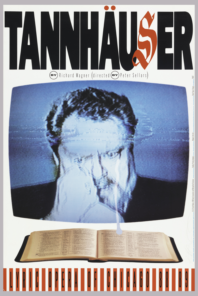
RV: It’s 1988, and I’m on my own as a designer. I’m doing a poster for Chicago’s Lyric Opera, a there’s no budget. Peter Sellers is directing Tannhäuser. I meet with Peter and he is enamored with a picture of Pentecostal evangelist Jimmy Swaggart, crying on TV after he was caught visiting a prostitute in a place with striped awnings.
That photograph is black and white. Swaggart is on TV, crying. Sellers says, “This is my character.” So, I say, “Would I be able to videotape the baritone or the lead tenor and photograph the monitor?” He says, “Sure!” So, that is what we did. I blew up the image of the singer’s face. Underneath, I stretch the photo of the Bible to fill the space. Wow, you can stretch a picture! Now, what can I do with the type? I specify some Gothic type from Ryder Type Gallery. I had them stretch the type to fit the space. But, I say, leave a space for the “S” because a three-letter word that begins with an illuminated letter is sex. And then I add a couple of red dots for the umlaut.

Poster, Tannhäuser, 1988; Designed by Rick Valicenti (American, b. 1951); Lithograph on paper; 91.5 × 61.1 cm (36 in. × 24 1/16 in.); Gift of Rick Valicenti; 1995-73-3
I was as close to the director’s subject matter, his subject matter, as I could be by reenacting it and then using the poster as a document of his point of view. This design was not an affectation. It was pulling the cords and playing those chords that Peter was working with, but doing it through the medium of graphic design. That is when I really could feel a tingle inside, and that is what I wanted to go for in the future. If I do not hit that tingle, then the design is not reverberating strong enough. It does not have everything in play. Something is out of tune. That was a very seminal piece for me.
EL: You were talking about stretching the photograph. Did you stretch the type, too?
RV: We were right at that transition from analog to digital. I was still dependent on the typesetters. Their equipment allowed them to set your type and then fill the space that you defined. I could say, “I have X amount of inches leftover in height and width. Please take this spec and make it fit.” Today, we do that falling out of bed, but back then, you had to explain what you wanted with tracing paper and a red pencil. I would draw the shape I needed to fill, and pencil in the type.
EL: The stretched type is distorted: the horizontals are thicker than the verticals. Was that effect considered ugly at the time?
RV: Oh, yes, those people. Even today, there are those people. You are one of them, I think. I go there, too. There are moments for respecting the beauty of the type designer’s intent, absolutely. But sometimes there is a silly putty moment. It is like filling a pizza pan with pizza dough. You have to work it into the corners.

One thought on “Deja Vu: 2011 NDA Winner Rick Valicenti Recalls Two Iconic Poster Designs”
Chris@TTL on November 12, 2020 at 1:36 am
Pretty great image. I wouldn’t have expected it to have originally been from physical objects and a photograph. Love that WW2 bomber.
Great story behind the art.