Graphic design serves a powerful role in establishing the visual identity of theatrical performance. Cooper Hewitt’s collection offers highlights of graphic design for the work of Black playwrights and composers. Narratives addressing riots and rage; exploring triumph, history, and oppression; or featuring funk, soul, and divas interact with typography, image, and space to tell a story.
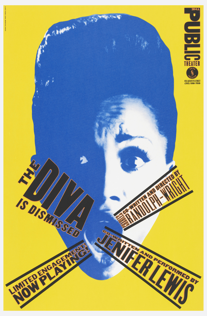
The Diva Is Dismissed (1994)
By Jenifer Lewis and Charles Randolph-Wright
Poster, The Diva is Dismissed, 1994
Designed by Paula Scher (American, born 1948)
Co-written and performed by Jenifer Lewis (American, born 1957)
Co-written and directed by Charles Randolph-Wright (American, born 1956)
Client: The Public Theater (New York, New York, USA)
Screenprint on paper
117.2 × 76.8 cm (46 1/8 × 30 1/4 in.)
Gift of Paula Scher, 1996-88-17
“Imperious and sharply funny, with a brassy pop-gospel voice and hard-edged good looks, [Jenifer] Lewis suggests a composite of Tina Turner, Grace Jones and Bette Midler. Why isn’t she as famous as they?” asked a New York Times review of The Diva Is Dismissed. And that’s apparently the question actress and comedian Lewis humorously posed in her autobiographical one-woman show. As a true diva might demand, the dominant imagery on the poster is the diva’s face, the image of Lewis drawn from promotional photography for the show. Paula Scher focuses her characteristic expressive typography into both a dismissive “x” as well as a visual trumpet for Lewis’s lament.
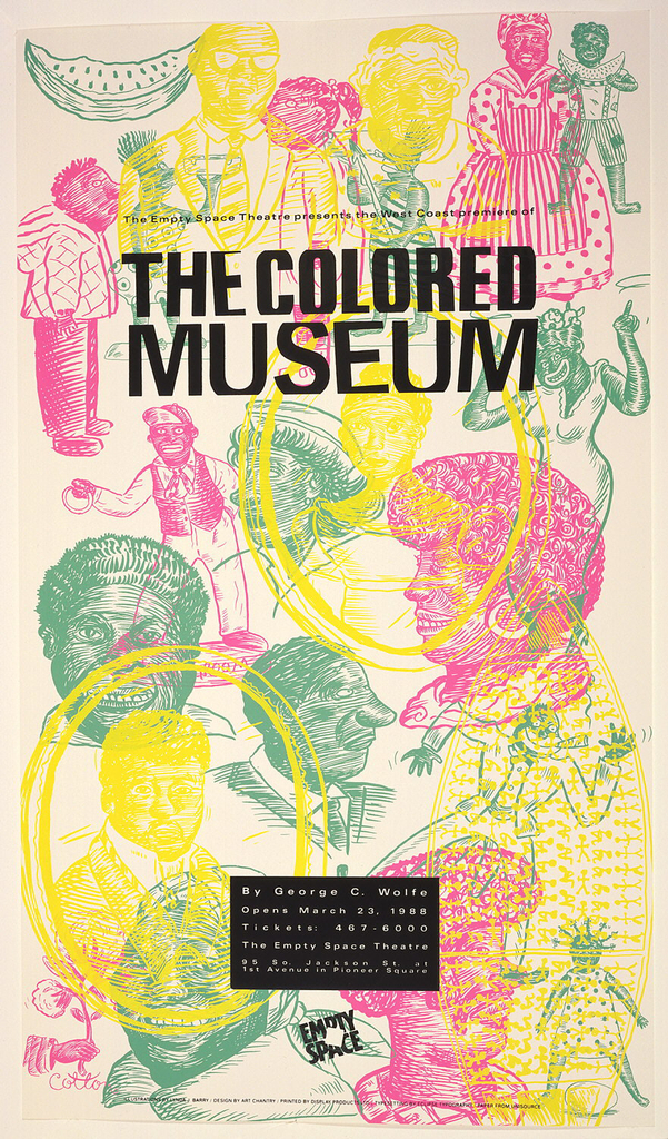
The Colored Museum (1986)
By George C. Wolfe
Poster, The Colored Museum, 1987–88
Designed by Art Chantry (American, born 1954)
Cartoonist: Lynda J. Barry (American, born 1956)
Written by George C. Wolfe (American, born 1954)
Client: The Empty Space Theatre (Seattle, Washington, USA, 1970–2006)
Offset lithograph on paper
75.1 × 43.5 cm (29 9/16 × 17 1/8 in.)
Gift of Art Chantry, 1995-69-39
The Colored Museum is a 1986 play by acclaimed writer, director, and producer George C. Wolfe in which he satirizes African American identities in the 20th century. Presented as a sequence of 11 “exhibitions” on a gallery-like set, much of Wolfe’s commentary—“that tears at the very fabric of racist America”—stems from the contrast of Black participation in modern life, particularly contemporary entertainment media, with the dark history of oppression and trauma in the United States.
Art Chantry’s poster for a 1988 staging of the play at the Empty Space Theatre in Seattle, Washington, capitalizes on the array of characters and personalities presented in the play with overlapping figures, nodding to history by referencing various styles of historical clothing.
Cooper Hewitt also has in its collection the cover design for the published script of the play, which similarly uses an artificial color palette.
Fucking A (2003)
By Suzan-Lori Parks
Poster, Fucking A, 2003
Designed by Paula Scher (American, born 1948)
Written by Suzan-Lori Parks (American, born 1963)
Directed by Michael Greif (American)
Client: The Public Theater (New York, New York, USA)
Screenprint on paper
116.8 × 76.2 cm (46 × 30 in.)
Gift of Paula Scher, 2013-25-5
Rage radiates from this intense fusion of word and typography. Suzan-Lori Parks’s Fucking A, inspired by Natianiel Hawthorne’s novel The Scarlet Letter, focuses on the fight of Hester—branded with “A” for abortionist—to reunite with her imprisoned son amidst oppressive and unjust power structures in their town. The busy lines of red in the design scream of frustration and fury.
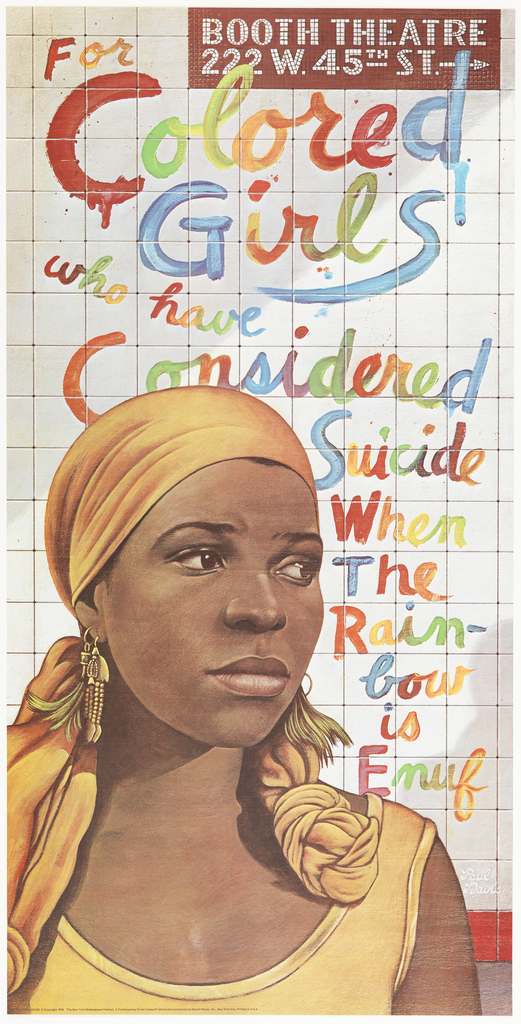
For Colored Girls Who Have Considered Suicide / When the Rainbow Is Enuf (1976)
By Ntozake Shange
Poster, For Colored Girls Who Have Considered Suicide / When the Rainbow Is Enuf, 1976
Designed by Paul Davis (American, born 1938)
Written by Ntozake Shange (American, 1948–2018)
Directed by Oz Scott (American, born 1949)
Lithograph on paper
116.8 × 58.6 cm (46 × 23 1/16 in.)
Gift of Unknown Donor, 1980-32-981
“And this is for Colored girls who have considered suicide, but are moving to the ends of their own rainbows.” — Ntozake Shange
Stories told by Black women on themes from love to abuse to friendship intertwine in Ntozake Shange’s inventive choreopoem (a series of poems set to music and dance). The seven female characters are referenced by the color of their garments—Lady in Red, Blue, Purple, Yellow, Brown, Green, and Orange—and Paul Davis incorporates this rainbow into the play’s title, fluidly scrawled across a New York subway wall amidst Shange’s (pictured in portrait) thoughtful gaze.
The Wiz (1974)
By Charlie Smalls and William F. Holder
Poster, The Wiz, 1974
Designed by Milton Glaser (American, 1929–2020)
Music and lyrics by Charlie Smalls (American, 1943–1987) and others
Book by William F. Brown (American, 1928–2019)
Directed by Geoffrey Holder (Trinidadian American, 1930–2014)
Lithograph on wove paper
50.8 × 40.7 cm (20 × 16 in.)
Gift of Sara and Marc Benda, 2009-12-26
The Wiz took Broadway by storm—both by nature of its plot-driving tornado and its cultural reimagining of the classic Wizard of Oz. In addition to its energizing, Motown-inspired score, director and costume designer Geoffrey Holden inspired an otherworldly aesthetic through extravagant shapes and unexpected materials. In the poster, Milton Glaser captures this fantastical adventure to the Land of Oz in a bold flurry of art nouveau–inspired curves.
Read more about this poster on Cooper Hewitt’s Object of the Week and explore Geoffrey Holder’s costume designs, along with other Wiz ephemera, at the Smithsonian National Museum of African American History & Culture.
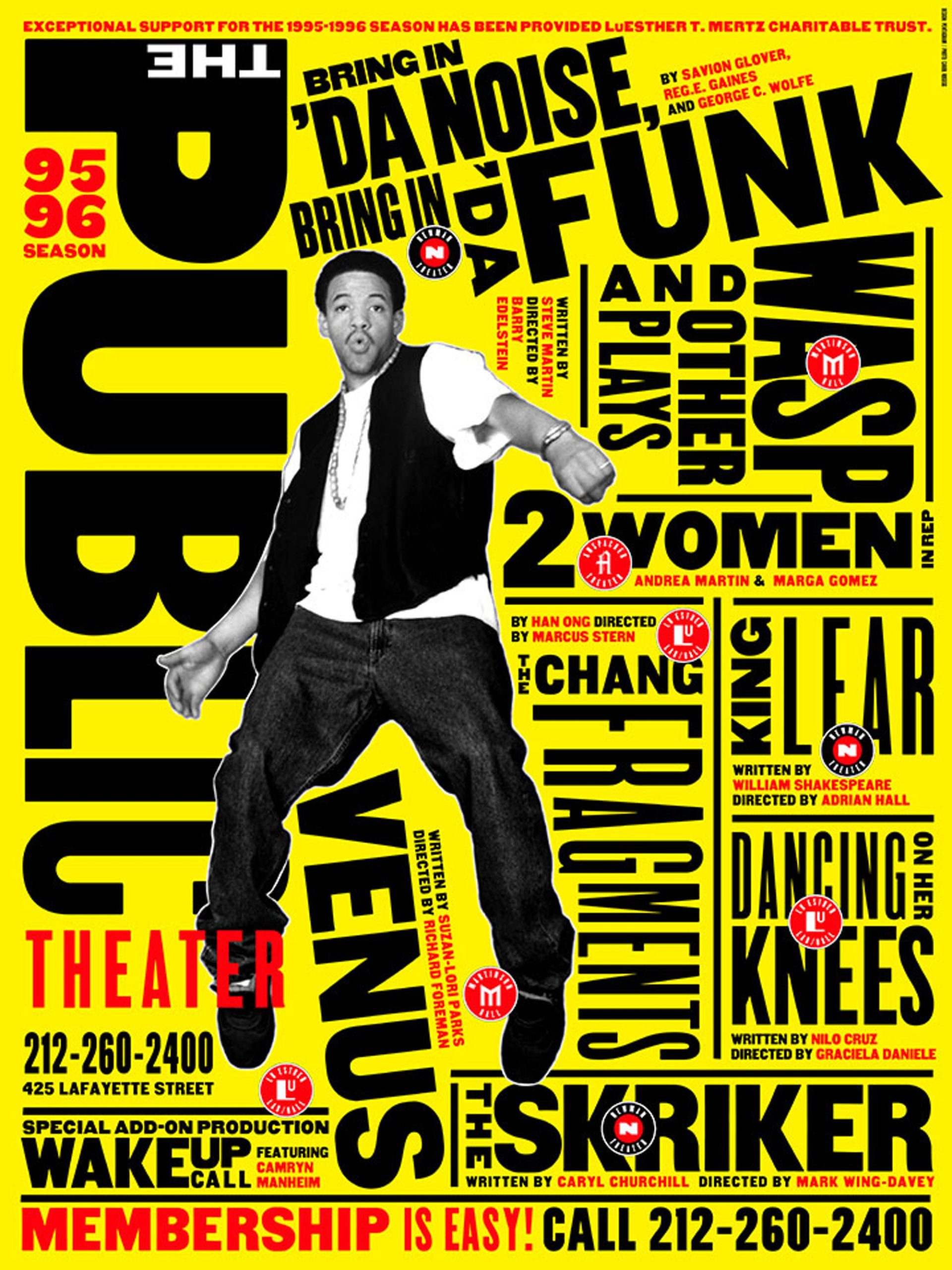
The Public Theater 95 / 96 Season (1995)
Poster, New York Public Theater / Bring in ‘da Noise / Bring in ‘da Funk, 1995
Designed by Paula Scher (American, born 1948)
Client: The Public Theater (New York, New York, USA)
Lithograph on paper
152.4 × 114.3 cm (60 × 45 in.)
Gift of Pentagram, 1997-99-2
The ‘95 / ‘96 season at the Public Theater, under the artistic direction of George C. Wolfe, featured the premiere of the Tony Award–winning musical Bring in ‘da Noise, Bring in ‘da Funk. Conceived of and directed by Wolfe, with choreography by Savion Glover, the musical employs tap dancing to convey Black history from slavery to the present. Imagery of Glover in athletic dance poses interacting with dynamic, seemingly responsive typography, took center stage in an array of designed materials for the production, which transferred to Broadway from the Public and ran for 1,135 performances.
Fires in the Mirror: Crown Heights, Brooklyn and Other Identities (1992)
By Anna Deavere Smith
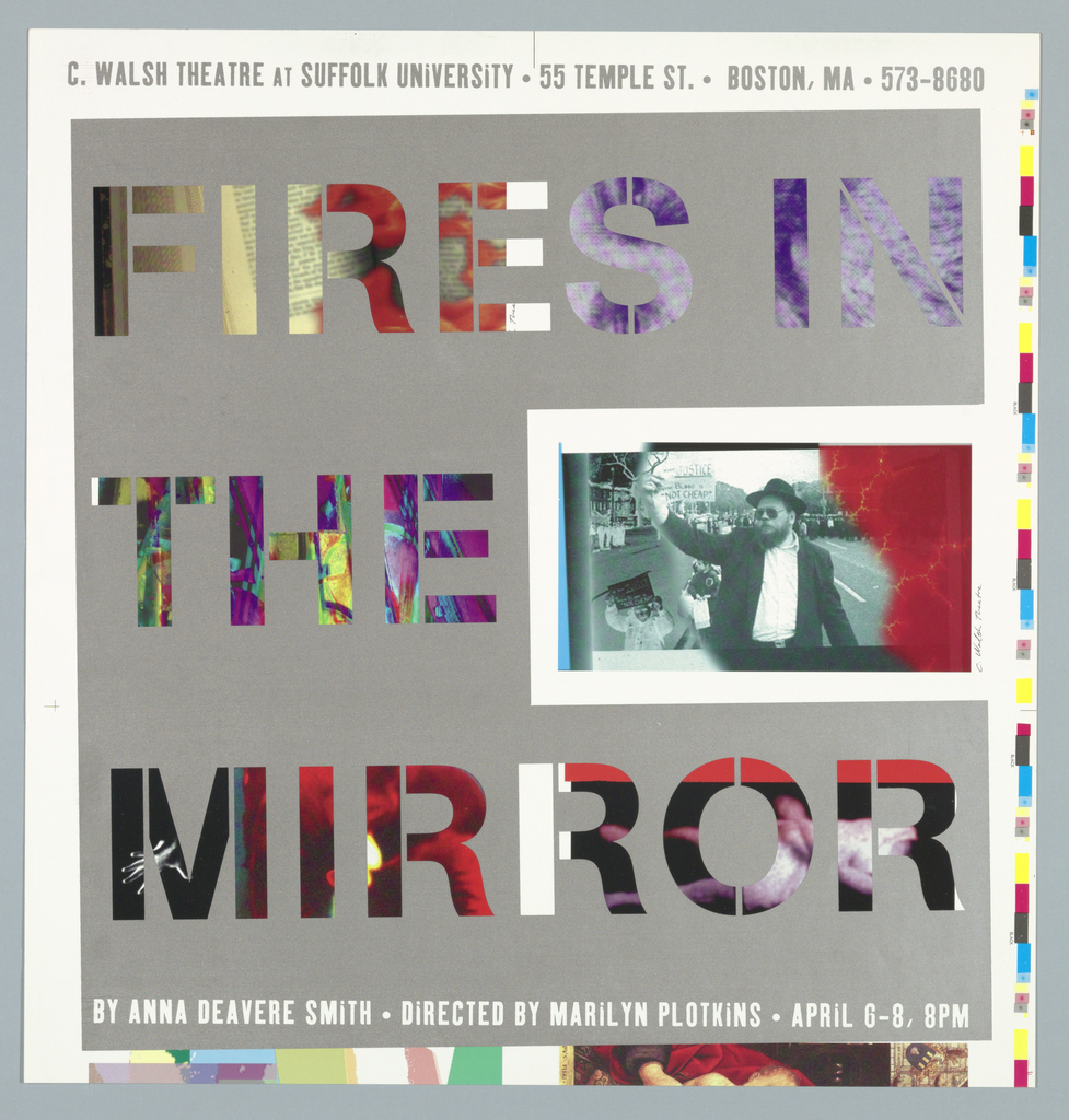
Poster, Fires in the Mirror, 1996
Designed by Paul Montie (American, born 1965)
Anna Deavere Smith (American, born 1950)
Directed by Marilyn Plotkins (American)
Client: C. Walsh Theatre at Suffolk University (Boston, Massachusetts, USA)
Offset lithograph and screenprint on white glossy paper
50.2 × 48.3 cm (19 3/4 × 19 in.)
Gift of Farenheit, 1997-164-1
Fires in the Mirror is a nonfiction play by Anna Deavere Smith that addresses the Crown Heights riot that occurred in New York City in August 1991 between Black and Jewish communities of that neighborhood. Performed by one actor, the script is taken directly, as a documentary-style play, from transcripts of interviews by Smith conducted with people involved in the riots, as well as artists, politicians, and thinkers on the issues exposed through the conflict.
While the play originally premiered in New York in 1992, Paul Montie’s poster promotes a 1996 production staged at the C. Walsh Theatre at Suffolk University. Montie plays on the words of Smith’s poetic and fragile title, suspending the letterforms in gray while the letters’ interiors rumble with photographic imagery and color.
Venus (1996)
By Suzan-Lori Parks
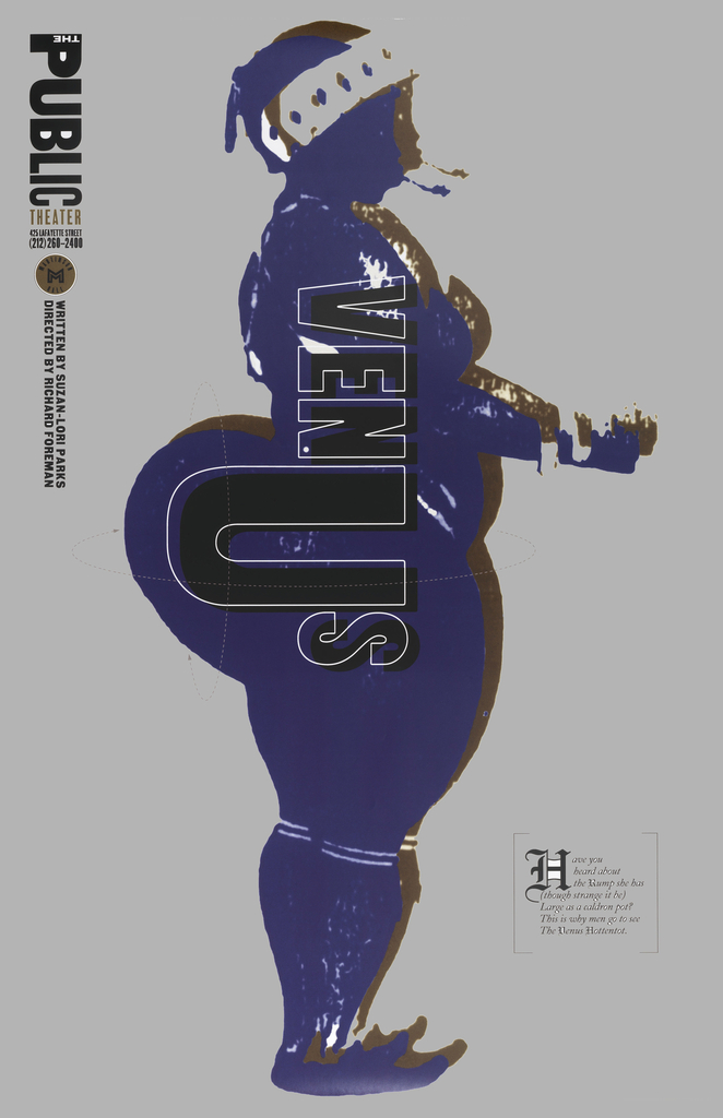
Poster, Venus, 1996
Designed by Paula Scher (American, born 1948)
Written by Suzan-Lori Parks (American, born 1963)
Direct by Richard Foreman (American, born 1937)
Client: The Public Theater (New York, New York, USA)
Inkjet print on paper
116.8 × 76.2 cm (46 × 30 in.)
Gift of Paula Scher, 2013-25-8
In Venus, Suzan-Lori Parks takes an often-fictional approach to the life of Saartjie Baartman (often referred to as “Sarah”), an African woman who became an entertainment phenomenon in the 19th century due to the objectification of her body by white Europeans. The placement and exaggeration of typography on this poster reinforces this objectification while the pictured figure’s contemporary hair styling hints at critique beyond the story’s historical setting.
Matthew Kennedy is Cross-Platform Publishing Associate at Cooper Hewitt and has extensively researched designs related to theater in the museum’s collection.
![On a black ground, red lines in a scratching pattern, deeper scratching that compose words: FUCK- / ING / A. Lower margin: BY SUZAN-LORI PARKS / DIRECTED BY MICHAEL GRIEF [Public Theater logo, lower right].](https://www.cooperhewitt.org/wp-content/uploads/2021/02/81044_7ea6d9ecfb943250_b.jpg)
![Tan poster with central image in black of a woman in profile, walking to the left, with abstract swirls in black, violet, blue and green radiating off her head and back, reminiscent of smoke. What appears to be the train of a dress takes the form of stairs or waves underneath these swirls. Below, text in large black letters: THE WIZ / [in smaller letters:] a new musical version of 'The Wonderful Wizard of Oz'/ AT THE WINTER GARDEN / Broadway and 50th Street, N.Y.C.](https://www.cooperhewitt.org/wp-content/uploads/2021/02/35444_62c97653468e4d11_b.jpg)
