This article is part of a series of Design Retrospectives on the prototypes commissioned by Cooper Hewitt’s Interaction Lab as part of Activating Smithsonian Open Access. It was written by Zander Brimijoin, Creative Director and Partner at Red Paper Heart. Experience the Art Clock through your web browser, and help source times of your own!
The Concept
We were particularly excited about the challenge to create a compelling experience using the vast Smithsonian Open Access catalog because of the combination of quality and depth of imagery and information. As we considered how to make use of it, we started by coming up with unusual ways to experience a catalog—to feel it on an emotional level. We talked about ideas like having users journey through pure color, make mashups combining two items together, wear the items or be the items somehow, or even make shadow puppets that would match to objects in the database.
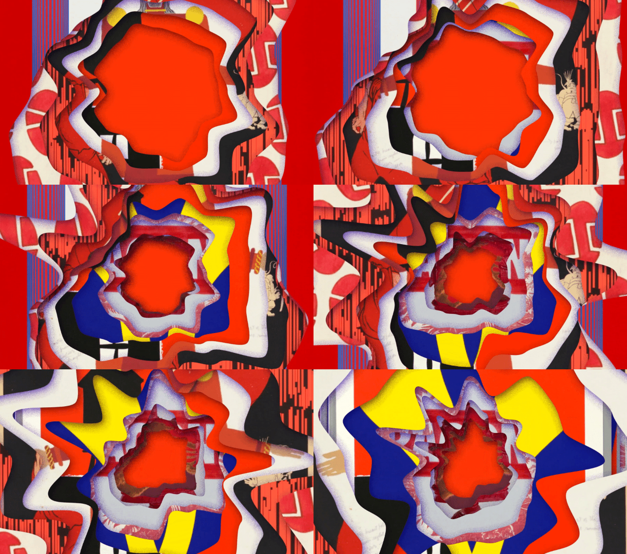
Early concept prototype combining multiple open access objects in shifting kaleidoscopic color fields
Early concept prototype combining fragments of open access images with object details off to the side
Then, after spending time with the collection, something about it brought up a memory I had from college.
In an art history course, a friend of mine taught me a memory mnemonic where you stare at an artwork until you can imagine the date in the forms. For example, if you are trying to memorize that a painting of dancers is from 1942, you might imagine that their body positions look almost like a four and a two. Then, when you are asked to write the date on the exam, these numbers just seem to pop out at you from the image, and if you are like me, your grade goes way up. More than just improving my grades, I found that the process of imagining something within these artworks unlocked a special connection to them, so that later when I’d see them in museums, it felt like reconnecting with an old friend.
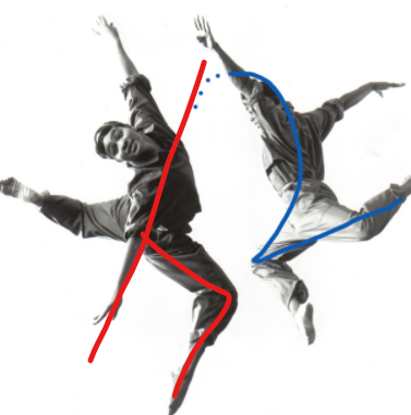
Finding letters and numbers in the dancers’ body shapes
When our designer Jiwon Ham shared the idea of a clock that would show an object or piece of art every second, I thought of those numbers in the paintings in my head. I realized we could use the same idea to create the clock. Instead of showing an arbitrary collection image every second, we could show a specific piece of art or object whose visual forms looked like the current time.
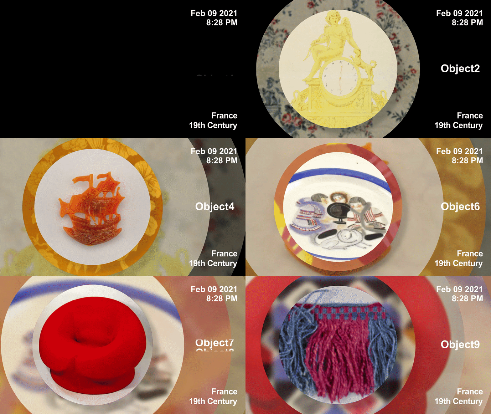
Prototype concept that rotated through images every second
The Design
After we identified our concept, the first thing we did was develop models for different kinds of clocks: an analog clock where you would see the clock hands within each collection image, a digital clock that would form the numbers from a collage of multiple images at once, and an analog clock that would match angles within the images to the clock hands. We presented all of them to the ASOA challenge as our overall concept, and we very happily received the funding to develop one of them into a working prototype.
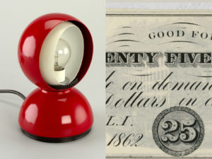
Digital clock prototype that finds number shapes in images
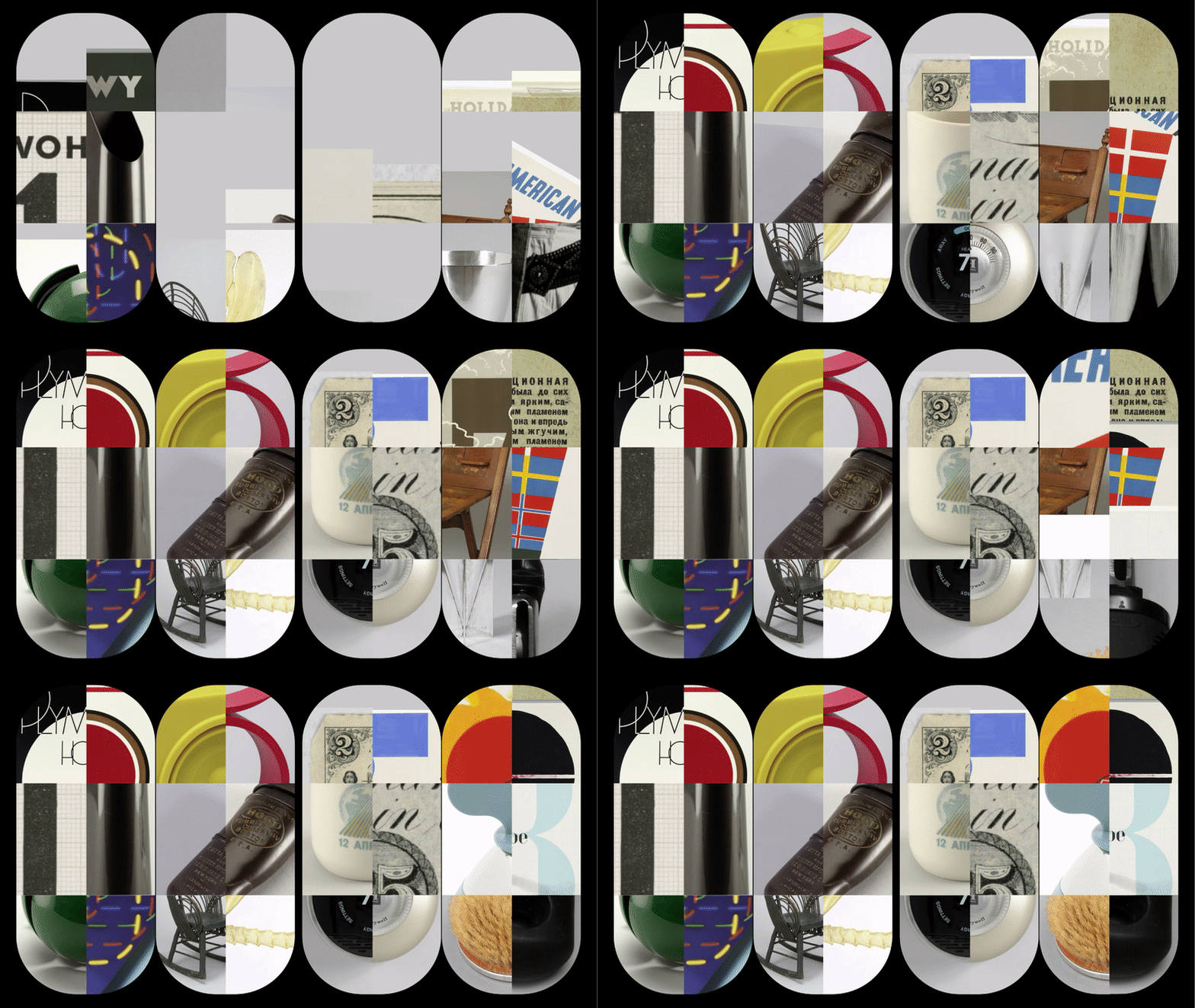
Digital clock prototype that creates number shapes with image collages
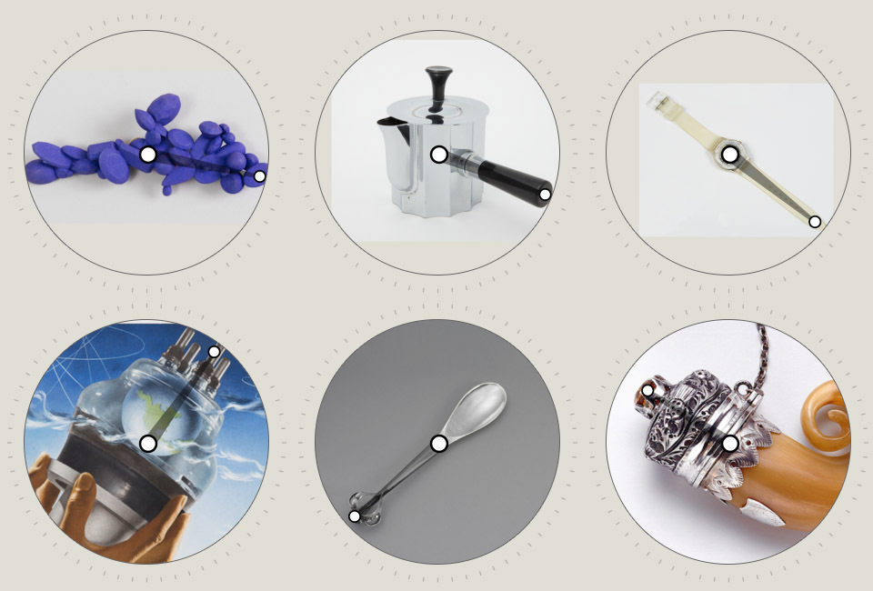
Analog clock prototype that identifies clock hands in shape
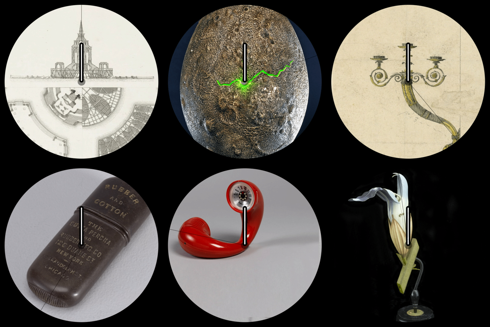
Animated analog clock prototype showing relationship between clock hands and open access images
We then had to decide which of our ideas to pursue. Both the digital and analog clock concepts were quite lovely, but when forced to choose between them, we liked how expressive the analog clocks were in concert with the images. Rather than using the images to make up the shapes of numbers, as the digital displays did, the analog clock hands could integrate themselves into body positions, or angles, or objects, lending you another way to see the clock forms and the images alike.
With that decided, we set out to design our prototype. Much of the process was about getting out of the way of the art and objects. We had to keep scaling back the clock part of the design in order to let the images themselves be the clock. In that spirit, we decided to place the minute hand on the edge of the design, letting the minute hand in the art take center stage. That way, the design actually succeeds or fails as a clock based on how well the images match the clock forms.
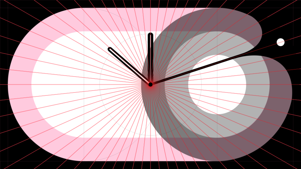
Exploring designs for the clock face
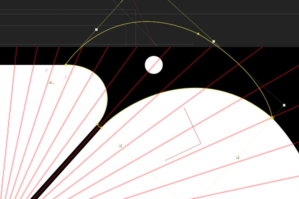
Detail of clock face design exploration
We also needed a design that was going to be quite flexible, so the clock could live on a phone, a monitor, or even a watch. So, we took our original circular design and expanded it to fill wider canvases, where circles would push outward. We designed the face to have a liquid look, with a fluid notch that changes curves as it moves around the clock.
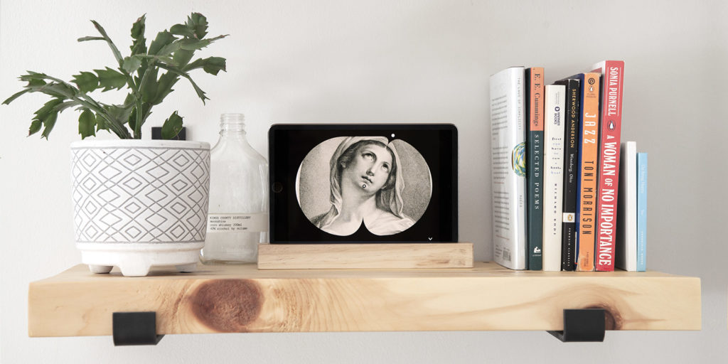
The finished Art Clock displayed on a tablet
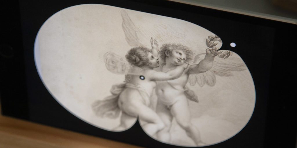
Detail of the finished Art Clock
As we refined the design, we kept removing lines and shapes that covered the art. In our final design, the black shell falls away and becomes a frame for the image that it presents.
The Prototype
The single biggest piece of this project was figuring out a process for gathering the images for the clock. We decided the best approach would be to have users go through the catalog themselves and identify matches with clock angles, then submit them to our database. We therefore needed a method for identifying clock hands within the piece or art or object, submitting the matches, and establishing guidelines to distinguish between good and bad matches. We knew that we would have to explain this process either to a computer or to a user, so it couldn’t be too complicated or restrictive.
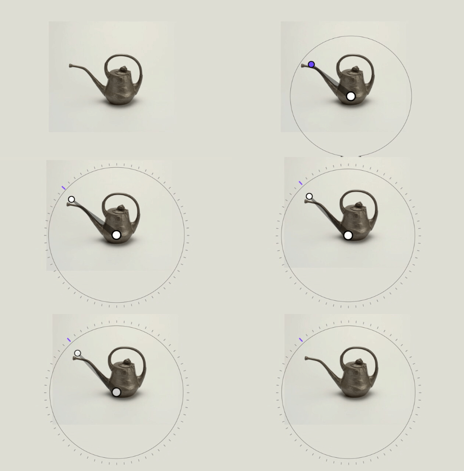
Prototype concept for crowd sourcing time selection
The first method of image tagging we came up with was to invite the user to draw the minute hand on an image, which would then automatically scale the clock. But in practice we found that this was not user-friendly, because once you drew your line on the image it was quite confusing to go back and change anything if the results didn’t turn out right.
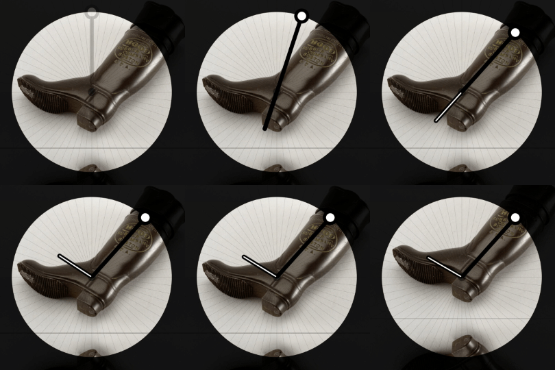
Prototype concept for crowd sourcing time selection
So, we arrived at a more familiar Playskool-clock-meets-Instagram interface, where you drag the clock hands around the clock face to match the angles to the image, and then shift the placement of the image for proper cropping inside the clock face.
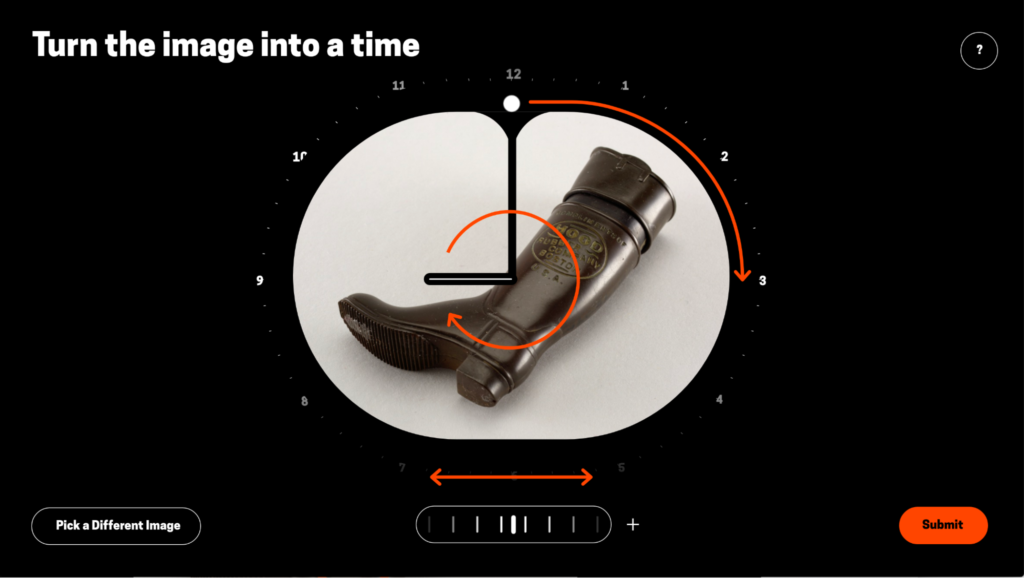
Iterating on crowd sourcing tool
We were happy with that method, but of course it’s one thing to design a tool for internal use, and another thing to make it understandable and usable to others. It takes a number of iterations, adding guides and removing steps.
We were really fortunate that Cooper Hewitt was invested in making these prototypes accessible to everyone, including users of assistive technology. We worked through a number of scenarios, such as allowing mouseless interactions and setting up the right tags for screen readers. The changes we made to accommodate these specific groups ultimately made the design and code clearer for all. Another major benefit of Cooper Hewitt’s support was the opportunity to do user testing, which we rarely get access to, and which showed us that we needed to be less cute and way more plain and direct in our design.
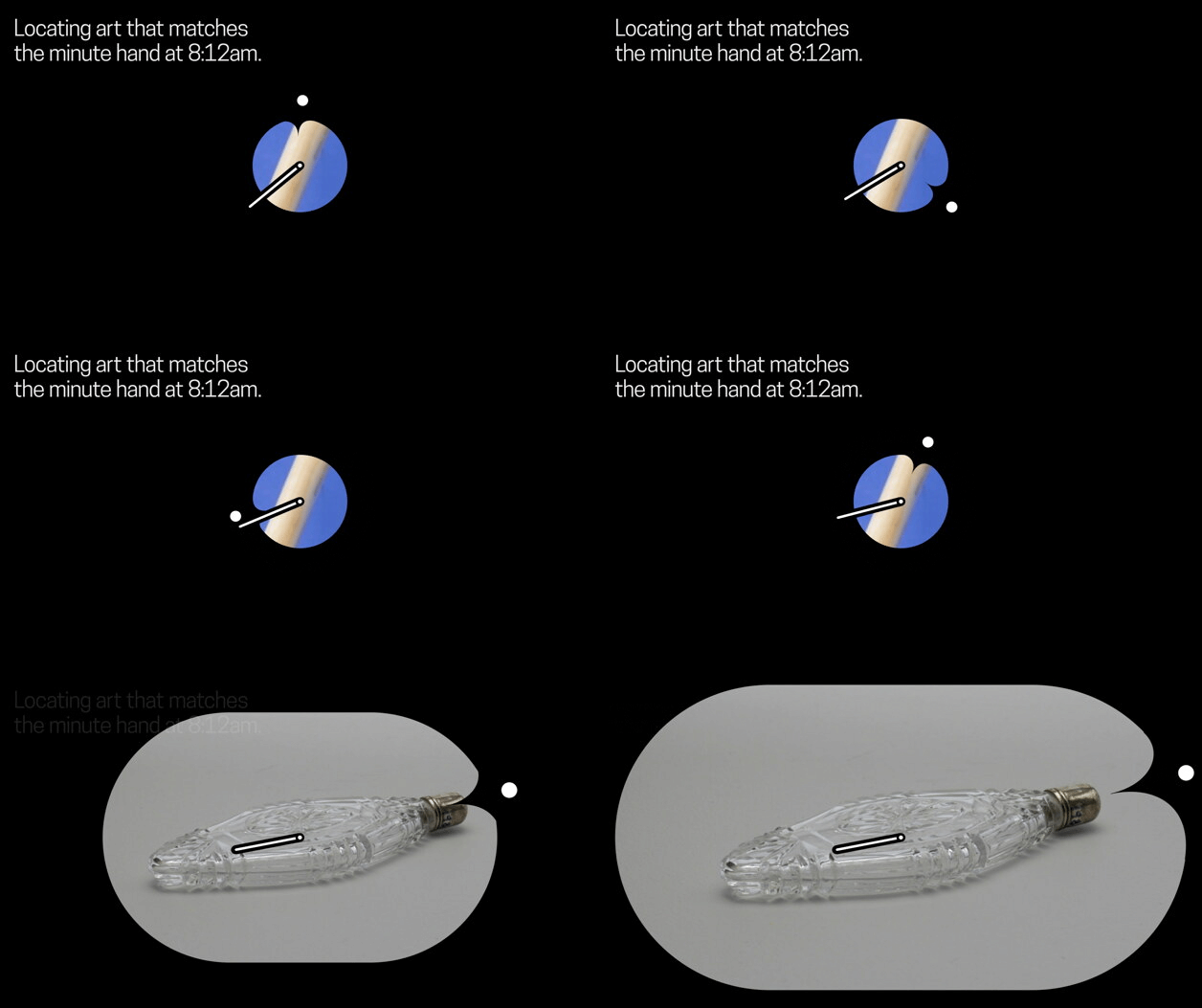
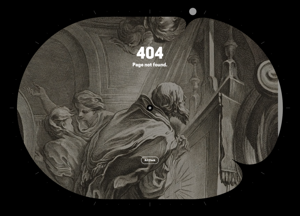
A visual pun for 4:04pm
We also enjoyed lavishing time on designing loading screens, tool tips, and extra details with care. For instance, even though almost no one will see this visual pun, the “404: file not found” page displays the time 4:04 p.m.
The Result
The result of this project will ultimately depend a lot on what imagery users find and tag. It will take some time to see it develop, but I’ve been pleasantly surprised so far.
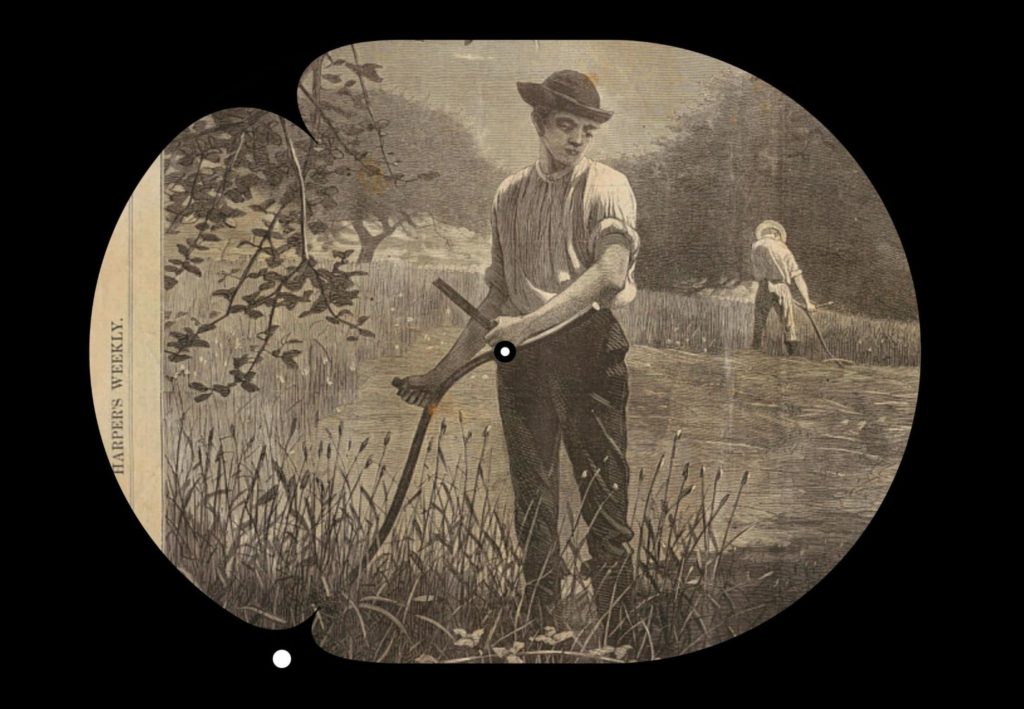
I have strong opinions about what makes a good image choice for this clock and what makes a bad one. My favorite images are ones that work equally well as art and as clock hands, such as a painting or object with rich detail, with a composition that flows entirely along two strong angles. If it’s too spare, it’s boring to look at. If it’s too complicated, it doesn’t tell the time. I also like a minute hand that is long but ends right before the edge of the clock and an hour hand that is short. My least favorite image results are ones made by someone mindlessly or dutifully just aligning the hands to any angle they can find in a picture, instead of finding the main angle and working from there.
But my opinions are not the only ones that matter. We have designed the user experience of the clock not only to encourage the results we want, but to allow users to challenge our assumptions of what “good” means.
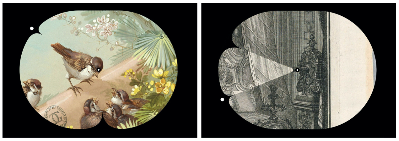
How people find angles in images is subjective
This crowdsourcing aspect is important, because it reduces the personal biases of our team and allows the results to be more about how the general public sees the angles in art, instead of how we see angles in art. This more robust angle information might even be valuable for other projects in the future. The most interesting results come when we aren’t in control. We get to see what people perceive as an angle. Is it a look, is it the middle of an object or the edge? Why are particular angles less common and others more?
And of course, we are already seeing patterns emerge in the images people have chosen.

We noticed right away that people tag a lot of, well, people. Clock hands are just an abstraction of arms and hands anyway, so it seems natural for people to choose and tag images portraying arms and hands more than any others. These images also read really well as times, because body positions demand your attention more than the position of a tree limb or the slope of a mountain.

People seem to agree on angles found in human bodies more than other kinds of images
People tend to agree more about human body positions and are more likely to disagree about other imagery.
Where these patterns get really interesting is when you see certain moods, objects, or subjects cluster around certain times. Different times are different angles, and thus they have different compositional and emotional feelings to them. And you start to see how these feelings emerge around particular times of day.

At the beginnings of hours, you get a lot of items being proudly held up—weapons, flags, musical instruments—giving them a high-energy feeling.

In contrast, in the middle of the hour you get elements of support—legs, canes, hunched figures—signifying low energy.
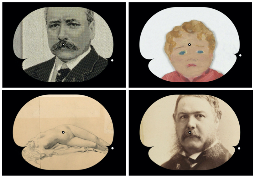
My favorite time so far is 8:18, what I’ve been calling mustache time. Its droopy symmetrical shape tends to make for interesting results.
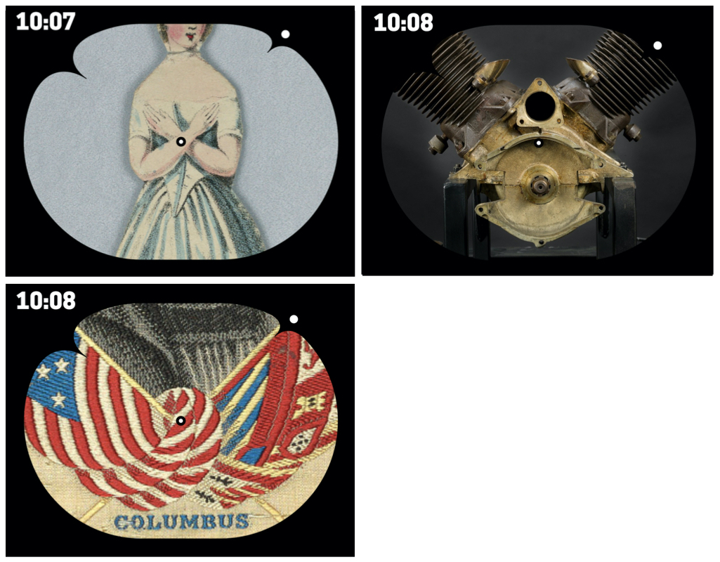
I also like the crisscrossed and outstretched shapes that 10:07 brings.
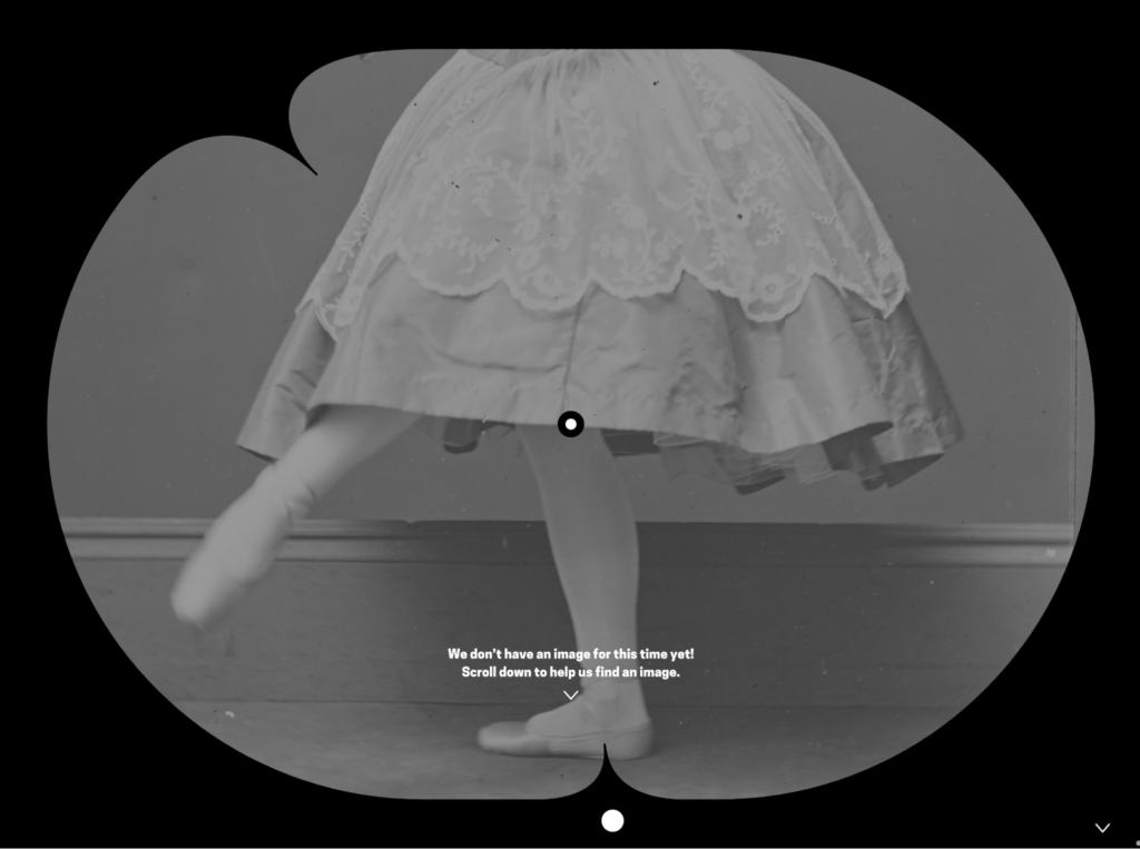
There is still so much left to find, of course. Since Art Clock launched, users have found over 600 of the images needed to fill in every minute of the day. However, that leaves about a hundred still undiscovered to date.
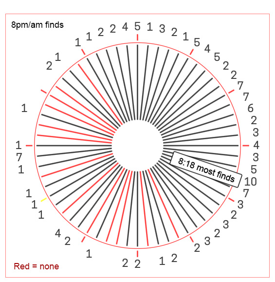
A chart that show missing and found times for the 8 o’clock hour.
So, try your hand at finding those pesky last ones. They mostly consist of slightly off angles, such as 1:33, which has two hands that are just off the 45 and 90 degree angle. My guess is that when a photographer or painter has an angle that is just a hair off kilter they can’t help but correct it, which means you see it less often in art. Anything pointing left, such as the minute hand between 4:41 to 4:45, is also less common, possibly a right-handed bias. Certain angles might just be very rare in art, and taggers also may not look for them, as they are not memorable clock positions.
Your participation in generating time matches is the most important part of the project. With a large body of users scouring the collection for these times, people discover artworks they wouldn’t normally and end up making a connection to them. In the process, I hope you think about why certain objects are always photographed at the same angles, why painters position figures in certain ways, and whether certain angles create emotion. You might even find a new piece of art you love.
And if you find the very last missing time, I’ll buy you a drink.
About the Author
About Activating Smithsonian Open Access (ASOA)
Created by Cooper Hewitt’s Interaction Lab and made possible by Verizon 5G Labs, Activating Smithsonian Open Access fosters a new approach to activating museum collections by expanding access to deep engagement for people of many abilities and interests worldwide, and supporting creative technology teams in the process. Each team received $10,000 to build a functioning prototype of a new digital interaction that enables play and discovery with 2D and 3D digitized assets from the Smithsonian’s Open Access collections and will retain ownership of all intellectual property developed from the program.
About Cooper Hewitt’s Interaction Lab
The Interaction Lab is an embedded R&D program driving the reimagining of Cooper Hewitt’s audience experience, across digital, physical, and human interactions. Since its Fall 2019 launch, the Lab has injected new ideas into the museum’s work through internal workshopping and strategy, a highly participatory public program series merging interactive design and museum practice, and a commissioning program that engages the design community as creative collaborators in creating the next wave of the Cooper Hewitt experience.