Written by Adriana Burkins
A bright orange or yellow triangle may cause you to pause, while a black line in the shape of a ribbon may cause you to reflect. The simplest visual elements—line, shape, and color—can be combined to convey some of the most critical messages and even the most complex emotions in a succinct visual form. Give Me a Sign: The Language of Symbols at Cooper Hewitt, Smithsonian Design Museum celebrates the 50th anniversary of the Symbol Sourcebook: An Authoritative Guide to International Graphic Symbols (1972) and encourages visitors to reflect on how the tiny images on our screens, signage, and clothing evolve, keep us safe, and help us to better understand and communicate who we are.
The exhibition explores the legacy of the Symbol Sourcebook. This resource, developed by the office of Henry Dreyfuss, sought to equip designers and manufacturers around the world with a unified glossary of common or already-in-use symbols to ensure that their signs, machinery, etc. spoke the same visual language. The project, which required around 3,000, mostly hand-drawn symbols, was a true labor of love for Dreyfuss and his team. It was also a remarkable example of the power of collaboration and crowdsourcing. In 1969, the team sent out an initial questionnaire to 750 various organizations in countries around the world asking for symbols, and, in 1970, a second, more comprehensive questionnaire, titled “Our Search for Symbols,” was widely distributed to more readers. The publication team received thousands of responses and continued to receive responses even after the release of the Symbol Sourcebook in 1972.
We at Cooper Hewitt wanted to know what an updated Symbol Sourcebook, created in 2024, might include. What symbols are significant to us today and our lived experiences? What new symbols have been created, and what is still missing? To inspire visitors to create something new, Give Me a Sign features contemporary case studies exploring how designers of all backgrounds are using symbols to fill in gaps in representation, as well as how communities are collectively redesigning outdated symbols. There is even a display highlighting the evolution of the clenched fist, whose significance has withstood the test of time.
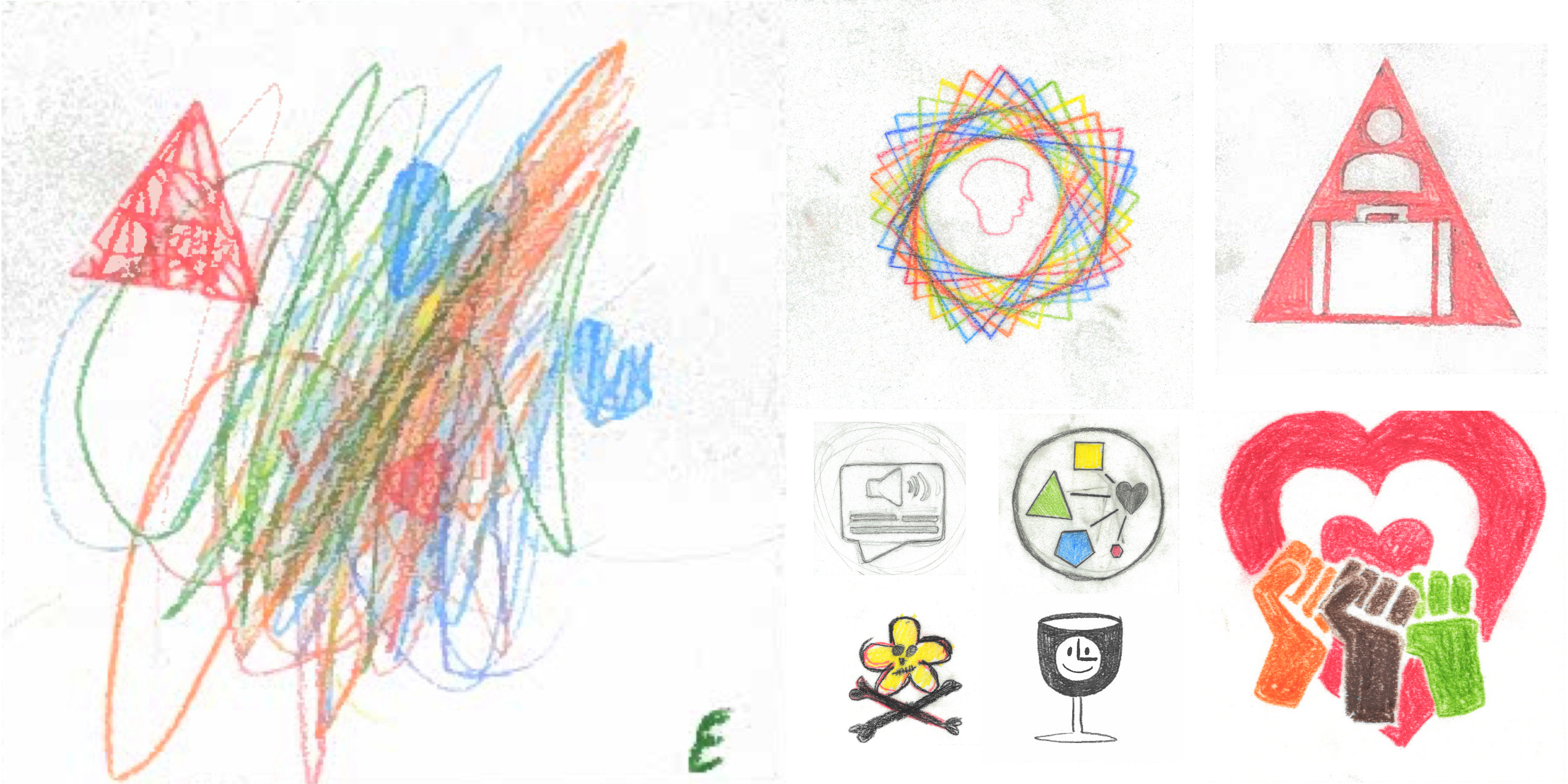
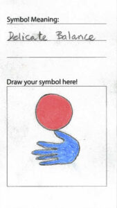
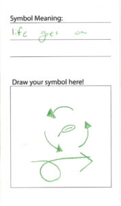
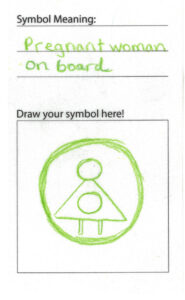
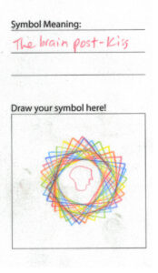
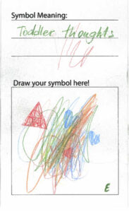
So, what might museum visitors—supplied with some drawing tools, design tips, and prompts—create in a gallery? Hundreds of symbols communicating everything from heartbreak, optimism, burnout, and joy, and even answers to a decades-old design problem. Inspired by the exhibition’s guiding questions, we’ve collected and categorized a small handful of visitor submissions to see the similar and disparate ways that line, shape, and color can be used to communicate what’s important to us in the present and for the future.
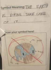
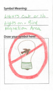
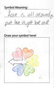
How do symbols communicate shared beliefs?
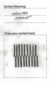
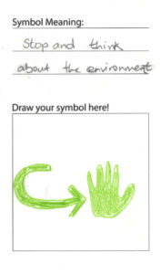
Many submissions reveal a love and concern for our planet and its future, as well as a desire for connection, understanding, and commonality.
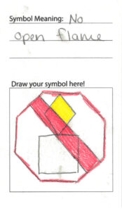
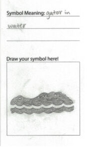
How do symbols instruct and keep us safe?
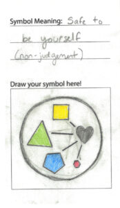
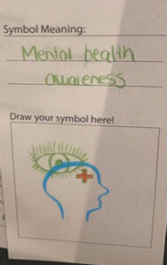
Visitors’ submissions below explore both symbols meant to keep us physically safe, as well as symbols that encourage us to consider and care for our mental health.
PHYSICAL SAFETY
SELF-REFLECTION
How do symbols communicate who we are?
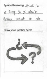
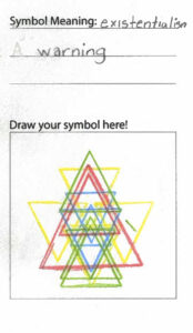
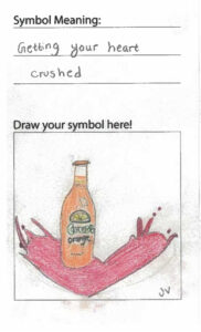
Many submissions highlight the power of symbols to communicate shared experiences. Visitors experimented with outlines of arms to depict grief, overlapping shapes to reference themes ranging from philosophical concerns to a desire to fit in, and the juxtaposition of positive and negative space to represent the ups and downs of relationships.
DIFFICULT EMOTIONS
RELATIONSHIPS
How do symbols evolve and communicate multiple meanings?
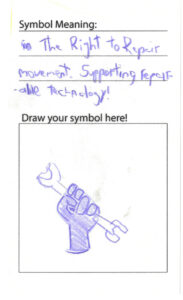
The “Discipline” section of the Symbol Sourcebook, covering everything from Astronomy to Vehicle Controls, is organized alphabetically. There is also a section called “Graphic Form” that breaks symbols into categories based on their shape, including the hand and fist as a way of referencing how symbols can be influenced by our anatomy and common gestures. Visitor submissions here demonstrate instances of how a single shape can be used to communicate a variety of meanings depending on the context.
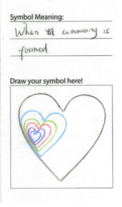
How do symbols reflect collaboration?
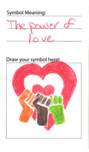
For many visitors, layering with colorful, simple shapes was the best way to express community, collective power, and collaboration.
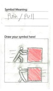
Can you design a symbol of Push and Pull?
As one of the design problems that stumped even the seasoned Dreyfuss team, some visitors tried their hand at depicting “push” and “pull.” We’ve also included a few examples from the archive from senders as young as 11.
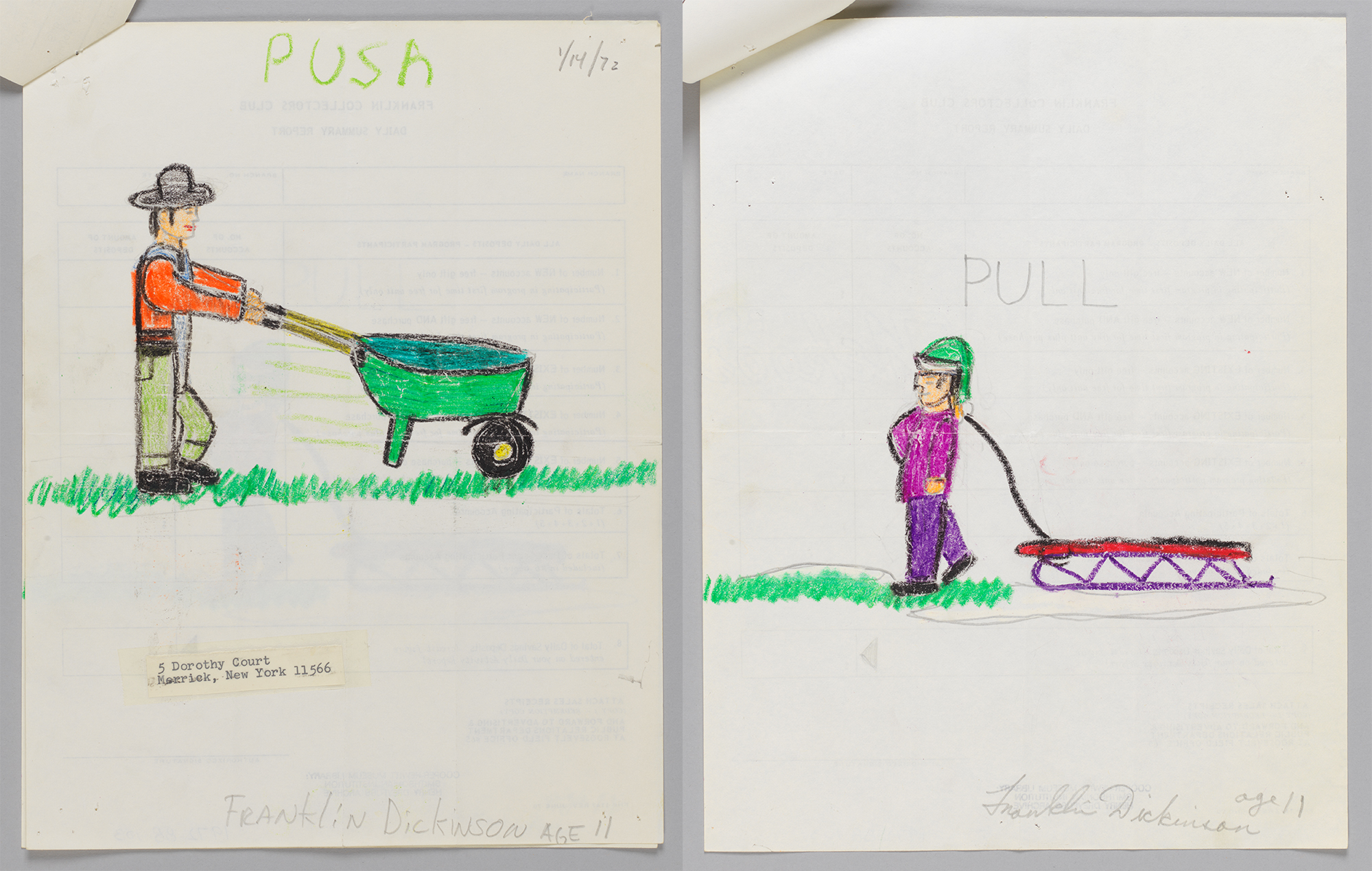
Design Drawings, Symbols for Push and Pull, 1972; Designed by Franklin Dickinson (American, born 1961); Crayon and graphite on recycled paper; H x W: 27.9 × 21.6 cm (11 in. × 8 1/2 in.); Henry Dreyfuss Archive, Gift of Henry Dreyfuss, 1972-88-1-4/5
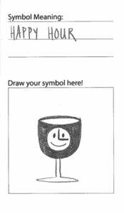
What else can be represented with symbols?
Here are a few extra submissions exploring experiences that range from the magical to the frustrating, and everything in between.
“I hope that the countless people and organizations who have already contributed information will continue to do so, and that they will be joined by new enthusiasts who are introduced to the importance of symbols through this Sourcebook.” — Henry Dreyfuss, 1972
Though it sought to connect us globally through a shared visual language, the Symbol Sourcebook wasn’t meant to be the final say on symbols that existed and mattered. Instead, it aimed to present a snapshot of its time to help influence the future. As Give Me a Sign investigates, symbols aren’t meant to be static tools, nor are they meant to be cold, impersonal images only meant for wayfinding and safety. We as users have the power to give them meaning and adapt them to our needs and experiences.
Now, it’s your turn. We want to hear from you and see what symbols you see around you, what symbols might be missing, and what symbols are important to you. How might you design a symbol to communicate an expression, a cause you care about, or even a place that you love? Join us in the galleries with a pencil and paper and get to drawing!
The exhibition Give Me a Sign: The Language of Symbols is on display at Cooper Hewitt through August 11, 2024.
Adriana Burkins is the Education Manager for the Lewis Latimer House Museum where she oversees the museum’s educational offerings. Adriana has worked in museum education for nearly ten years in various museums including the Georgia O’Keeffe Museum in Santa Fe, New Mexico, the North Carolina Museum of Art in Raleigh, North Carolina, and Cooper Hewitt, Smithsonian Design Museum. During her time at Cooper Hewitt, Adriana worked as a co-curator for the Give Me a Sign: The Language of Symbols exhibition, in addition to serving as an Education Associate managing the logistics behind educational programs that introduced audiences of all ages to design. Adriana received her MA in Art History at the University of North Carolina at Chapel Hill and her BA at Meredith College.
