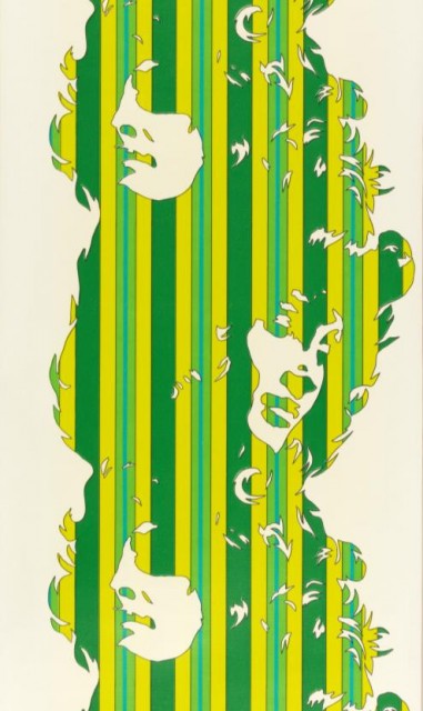
Beauty is an interesting take on a stripe design. The design is composed of thin stripes in brilliant shades of green creating silhouettes of women’s faces, alternately facing left then right. The overall effect is a wide stripe or column of green against a white background. Papers of this sort are used to create a very mod interior, frequently pasted on a single focal wall, offset by the remaining walls in white with coordinating furnishings.
The designer, Werner Berges, was one of the leading figures in German pop art. He began his formal training at the University of the Arts, Bremen in 1960, studying commercial art with an emphasis on fashion design. He then attended the Academy of Fine Arts in Berlin where he studied painting. This is where he began working with figures, the female figure in particular. Browsing images of his artwork online, his work clearly captures his fascination with the female form, and he draws on his fashion design training. His figures are posed and perfectly coiffed, long flowing hair surrounding faces turned to the perfect angle, as might be seen in fashion plates. Many of these works were done in oil colors or gouache pigments but he also made silk-screen prints. His artwork frequently reduces the female body to simple forms where the figure is combined with a range of circle or stripe patterns. The figure is shown in silhouette, either against the brightly colored and patterned background, or composed of these graphic patterns against a white ground. This later format is the approach used in his wallpaper design for Xart walls in 1972. The wallpaper was flexograph-printed meaning it was printed on a machine with rubber rollers which impart a textural finish to the pigments. The Museum has this paper in two colorways, the green shown and also with red stripes.
