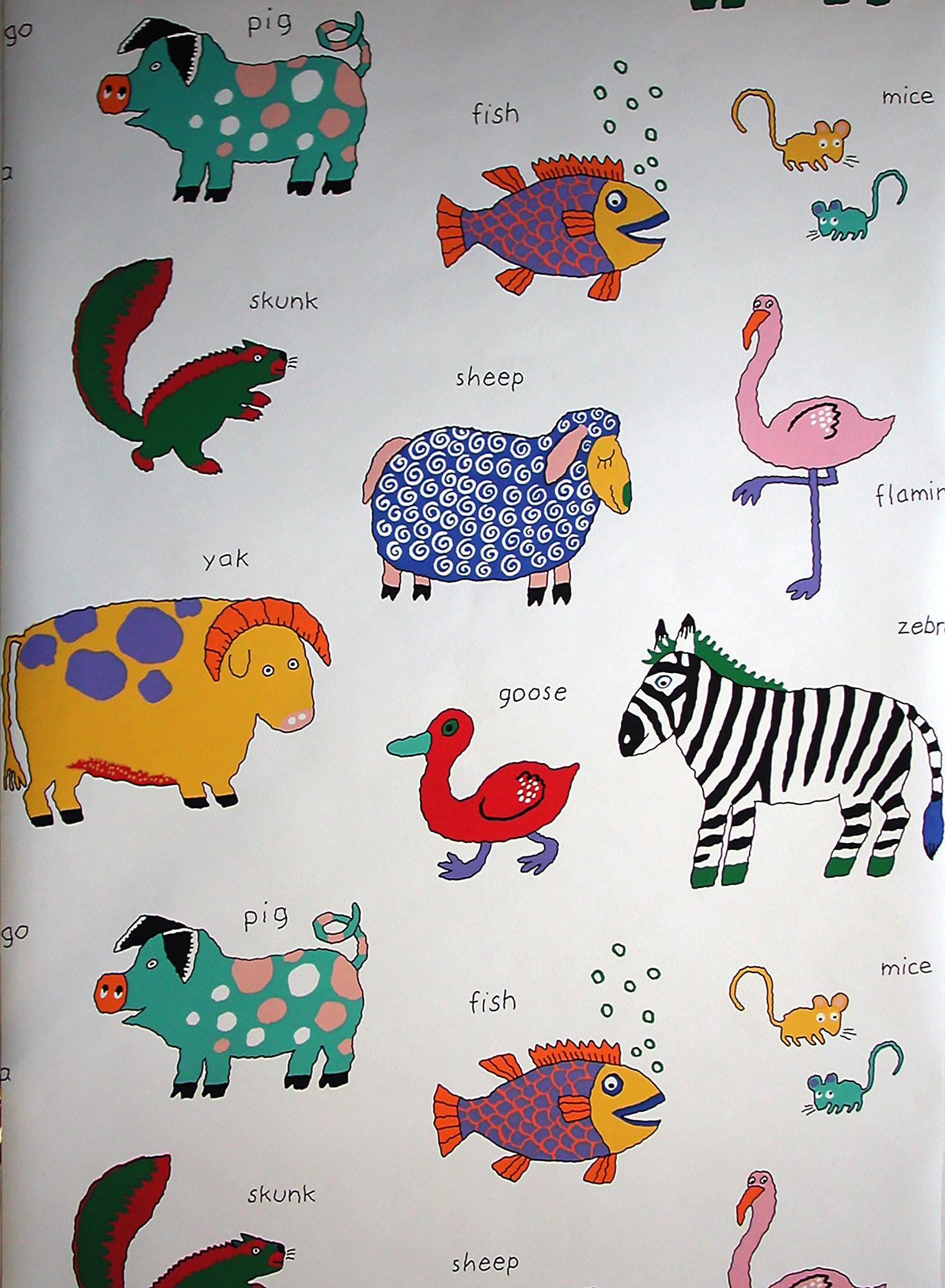
This children’s wallpaper combines both new and old thoughts on designing wallpapers for children. Introduced in the 1870s, children’s wallpapers were designed to be instructional, to engage children and help them learn. From the late 19th century until the early years of the 20th century, wallpapers were meant to be an interactive way for children to learn. Wallpapers designed to amuse children did not appear until the early 20th century, with Mickey Mouse being the first comic strip character to appear on wallpaper in the early 1930s.
Designers were encouraged to draw familiar objects and animals in a realistic fashion that would be easily recognizable by children. It was quite common for wallpapers to illustrate known works of literature or nursery rhymes, and wallpapers were frequently printed with lyrics or verses from the stories. Adults or siblings could then point to an illustration and tell the child a story, similar to reading out loud from a book.
This design contains many well-known and familiar animals, both wild and domestic. While the animals are all drawn bearing characteristics of the real animal and would be quickly recognizable, the realism stops there. Each is colored and patterned in a fantastic fashion, from the blue sheep with pinwheel curls, the turquoise pig with pink and white spots, and the green and red skunk, all of which add a touch of whimsy and humor while also making the paper more visually attractive. The name of each critter is spelled out in bold letters above. The brightly colored and patterned animals pop against the stark white ground, creating a strong contrast that would easily engage a child’s attention.
Gregory Herringshaw is the head of the Wallcoverings Department at Cooper Hewitt, Smithsonian Design Museum.
