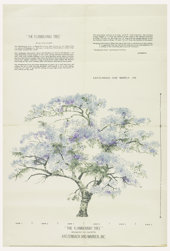
A very novel idea in the mid-1950s is the running-over-onto-the-ceiling idea of this mural design. Lanette was a prolific textile and wallpaper designer and I think this concept is unique to her work. Murals were very much in demand in the years following the Second World War, following in the footsteps of the block-printed scenic wallpapers in vogue during the first half of the nineteenth century, with some updates. Scenic wallpapers were usually produced in larger sets, 24-32 panels, where for really large rooms the last panel matches up with the first allowing the design to be continuous. These later murals usually contained far fewer panels, maybe 3-6 and were designed to occupy a smaller wall area. If one so desired the first panel usually matched with the last so multiple sets could be used to cover a large wall or encircle a room. The printed pattern was normally contained at the bottom of a long panel, usually twelve feet in length which would then be cut to accommodate varying ceiling heights. The Flamboyant Tree works in a different fashion. The printed height of the design is eleven feet so in a room with an eight foot ceiling the paper would run up the wall with the top three feet carrying over onto the ceiling. I imagine this would be on par with vertical stripes that visually increase the height of the ceiling. The viewer’s eyes would inherently gravitate towards this majestic tree and follow the dense flowers and fern-like foliage up to the very tips.
In case you are wondering why one would want pattern on the ceiling keep in mind that it was still fashionable to paper your ceiling at this time. Ceiling papers were still being used at least until the mid-1950s, though definitely on a downward trend. They were commonly found in wallpaper sample books at this time though in increasingly smaller numbers than earlier in the century. I think Lanette’s idea of carrying the mural pattern onto the ceiling was acknowledging this fact while not giving up on the concept entirely.
