Aim—pull—release! This archer draws back his bowstring and prepares to shoot. Peering into the distance, he points his arrow off the poster’s printed page. But designer Richard Roland Holst leaves no doubt about his target: a bullseye hovers just above his head, bearing the Dutch words for “Livelihood.” In this poster promoting the Labor Board (Raden van Arbeid), Holst’s archer aims for a better life for working men and women. The fortifications of social security rise up around him in a stylized wall, labeled with benefits like “Widows’ and Orphans’ Funds” and “Old Age and Disability Pensions”—all protections provided by the Board.
Holst was a member of the Dutch Social Democratic Worker’s Party (SDAP), and the husband of a prominent socialist poet. His political views were shaped by the teachings of William Morris, a British designer and activist for whom socialism carried the promise of artistic renewal. Describing Morris’ influence in her autobiography, Holst’s wife Henriette writes, “Capitalism had not only condemned the masses to a life of joyless toil, to ignorance and degeneration, it had also made the world ugly, murdered the beauty of nature as well as that of the old cities, and it had killed the spirit of community without which art cannot exist.”[1] Her husband’s poster, then, is a graphic throwback to better times, its medieval archer invoking a pre-industrial ideal of communal life. But however grim Holst’s view of the present, his challenge was to make worker’s rights relevant to the contemporary viewer. By placing his archer in a stylish frame of interlocking, geometric forms, he ushers him into the twentieth century. Like the archer’s arrow, Holst’s design points toward progress.
Holst’s appeal for worker’s rights is typical of socialist posters of the 1920s, but his visual rhetoric strays from the Party line. Where many of his designer colleagues favored macho mechanics and factory workers as poster subjects, Holst made the archer an unlikely emblem of modern labor, far removed from the mechanized toil of the industrial workplace. With his anachronistic outfit and outmoded weapon, this archer might be mistaken for a mythical hero, and he perches within his enclosure as if behind an arrowslit in a medieval castle wall. By dispensing with twentieth-century signifiers, Holst transforms the labor struggle into a timeless crusade.

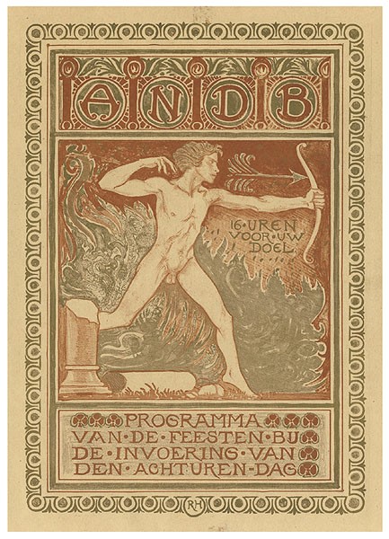
Richard Roland Holst, Cover for the General Dutch Diamond Workers’ Union (ANDB) “Program of Celebrations for the Introduction of the Eight-Hour Work Day (Programma van de feesten bij de invoering van de achturendag).” 1919.
This is one of several Holst designs to feature the archer; just a year earlier, a similar marksman appeared on Holst’s pamphlet commemorating the 8-hour workday, seen above. Though the archer lends these designs historical gravitas, he is only loosely affiliated with the worker’s cause. Holst’s ostensibly eccentric choice reflects wariness about industrialization, which he felt abstracted work into mundane, repetitive, assembly-line tasks. The archer’s poise, technique, and perfect aim embody a kind of skilled labor that Holst saw slipping into the past. This nostalgia was aesthetic, as much as economic—Holst scorned the abstract, geometric art of groups like the Dutch De Stijl, on grounds that their non-objective designs were themselves de-skilled. He saw their work as a consequence of capitalism, and accused them of a “mechanization of the spirit.”[2]

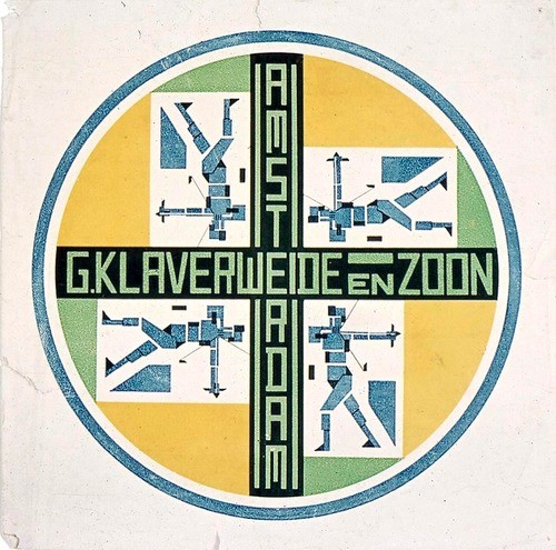
Theo van Doesburg, Design for G. Klaverweide & Son Gouda Cheese (Goudsche Kaas), 1919.
De Stijl artists responded in kind, disparaging his old-fashioned approach to revolutionary design. One of the movement’s leaders, Theo van Doesburg, exchanged insults with Holst in the press, but his disdain is most evident in one of his designs. Van Doesburg practiced commercially, and when commissioned to create a new package for a brand of Gouda cheese, he turned Holst’s signature archer into a logo.[3] On Van Doesburg’s package, four identical archers rotate around a central axis. Liberated from visual ties to history and tradition, these archers’ form is their function—each of their bodies becomes a letter ‘K,” invoking the Dutch word kaas, or cheese. Van Doesburg takes aim at traditional design, stripping away Holst’s symbolism to create a direct new language of signs. Reduced to rectangular segments, his archers’ bodies are abstract and anonymous, far removed from the folk heroism of Holst’s design.
Virginia McBride was the 2014 Peter Krueger curatorial intern in the Department of Drawings, Prints, and Graphic Design at Cooper Hewitt, Smithsonian Design Museum. She recently completed a degree in art history from Kenyon College.
[1] Johanna C. Prins, “Henriette Roland Holst-van der Schalk (1869-1952),” Caans-Acaen 11, no. 2 (Fall 1990): 43.
[2] Richard Roland Holst in his address to the Rijksacademie after assuming its directorship, 1918, quoted in Michael White, De Stijl and Dutch Modernism (New York: Manchester University Press, 2003): 88.
[3] White, 86-87.

One thought on “Designers Take Aim”
Evan Klaverweiden on February 2, 2021 at 4:48 pm
Do you have any additional information on the Klaverweide en Zoon cheese company. My great grandfather was on of the original three brothers that owned the company. My great grandfather and his brother came to America in 1863 and fought in the Civil War just after the Battle of Gettysburg. Thank you in advance for your assistance!
Rev. E. Glenn Klaverweiden