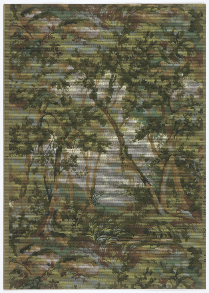
This is another landscape paper that has been given a slightly different treatment. The viewer is looking through a dense grove of trees, into a clearing of some sort, followed by more trees in the distance. The colors in the foreground are darker and more saturated, getting lighter as they recede into the distance, creating a wonderful sense of depth. I like to think of these designs as being secret gardens, your own personal space that no one else will see in exactly the same way. You’re looking through a grove of trees into a clearing but because the background design is less distinct it leaves it to the viewer’s imagination to fill in the missing details. Is that a pond in the distance, maybe a babbling brook runs through the middle, or maybe it’s a meadow full of sunshine and birds chirping.
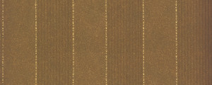
This design has been overprinted with a mesh of fine black lines in a diamond trellis pattern which softens and blurs the printed image. Papers given this effect are referred to as tapestry papers and became popular shortly after 1900 and remained fashionable into the 1920s. The driving force behind these patterns was probably the Colonial Revival movement. As you’ve heard me say before this paper would have been paired with another wallpaper, something printed in a more subtle manner, such as a tone on tone stripe or a solid ingrain paper, as shown below. Ingrain papers were colored in the pulp stage, so the color goes all through the paper as opposed to being printed on the surface. These have an appearance similar to felt and the slight irregularity in the surface coloring gave the design some depth and were given much higher regard than a flat painted wall. A common wall treatment at this time was the top two-thirds, bottom third. For a nine foot wall the bottom three feet would be one pattern, the upper six feet would be a different pattern.
