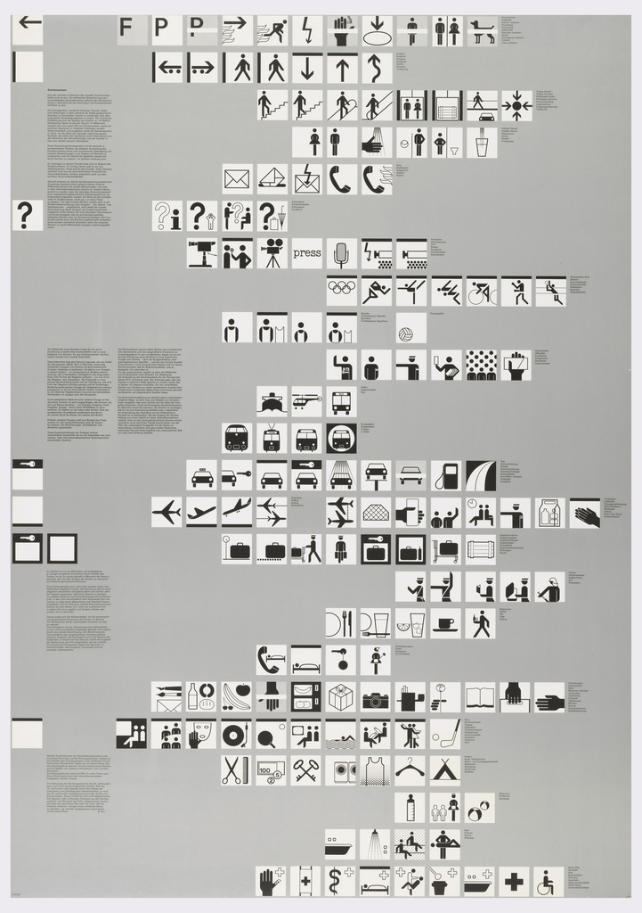
In 1966, the influential German designer, Otl Aicher (1922–1991), was hired to design the 1972 Munich Olympic Games’ iconography, language, and overall graphic scheme. By this time, Aicher had worked to modernize brands like Braun (1956–66) and Lufthansa (1962–64) and was a co-founder of the Ulm College of Design, a school established upon a post-war revival of the Bauhaus ideology and methodologies. Aicher’s work was greatly influenced by his political leanings; he was a fierce opponent of Nazi Germany and sought to create designs that embraced functionality and efficiency. The 1972 Summer Olympics were the second games held in Germany (the first were the 1932 Berlin Games, which had taken place under the Nazi Regime), and Aicher wanted the Munich Olympics to “maintain the positive aspects of Berlin while at the same time eradicating its negative connotations.”[1] The result was an inclusive visual language based on a series of pictograms that appeared in every Olympic text – from tickets to winners’ certificates.
This poster in the Drawings, Prints, and Graphic Design department of the Cooper Hewitt’s collection demonstrates Aicher’s penchant for geometric grids and lucid, graphic forms. Most notably, Aicher developed pictograms based on the twenty-one Olympic sports and other standard communicative signs. The design features 169 black and white squares against a uniform silver-gray background. The pictograms are formulated based on orthographical and geometric coordinates; rules and grids determine the proportions of heads, torsos, and features of male and female athletes. Text descriptions define Aicher’s universal symbols, keys to the city’s new visual language. Despite Aicher’s precision and adherence to a mathematical schema, the pictograms still speak to the movement and enjoyment of the games. Aicher elucidates these ambitions for the city’s graphic vocabulary, “The Munich Olympics should have an unforced character and be open, carefree, and relaxed. It is clear that this will give them an emphatically celebratory character. Celebratory not in the traditional institutional sense but in terms of playful improvisation.”[2] Aicher’s aesthetic vision for the 1972 Munich Games remains a paragon of urban graphic systems for its integration of vivid imagery with accessible, international communication.
Lily Gildor is a candidate in the MA History of Design and Curatorial Studies program offered at Parsons The New School of Design jointly with Cooper Hewitt, Smithsonian Design Museum. She is a Master’s fellow in the Drawings, Prints and Graphic Design department.
[1] Otl Aicher, quoted in, Kay Schiller and Christopher Young, “Germany on the Drawing Board: Architecture, Design, and Ceremony,” in The 1972 Munich Olympics and the Making of Modern Germany, 1st ed. (University of California Press, 2010), 99.
[2] Ibid.

One thought on “Faster, Higher, Stronger”
D Veeneman on July 23, 2021 at 12:03 pm
Berlin Olympics were 1936, not 1932