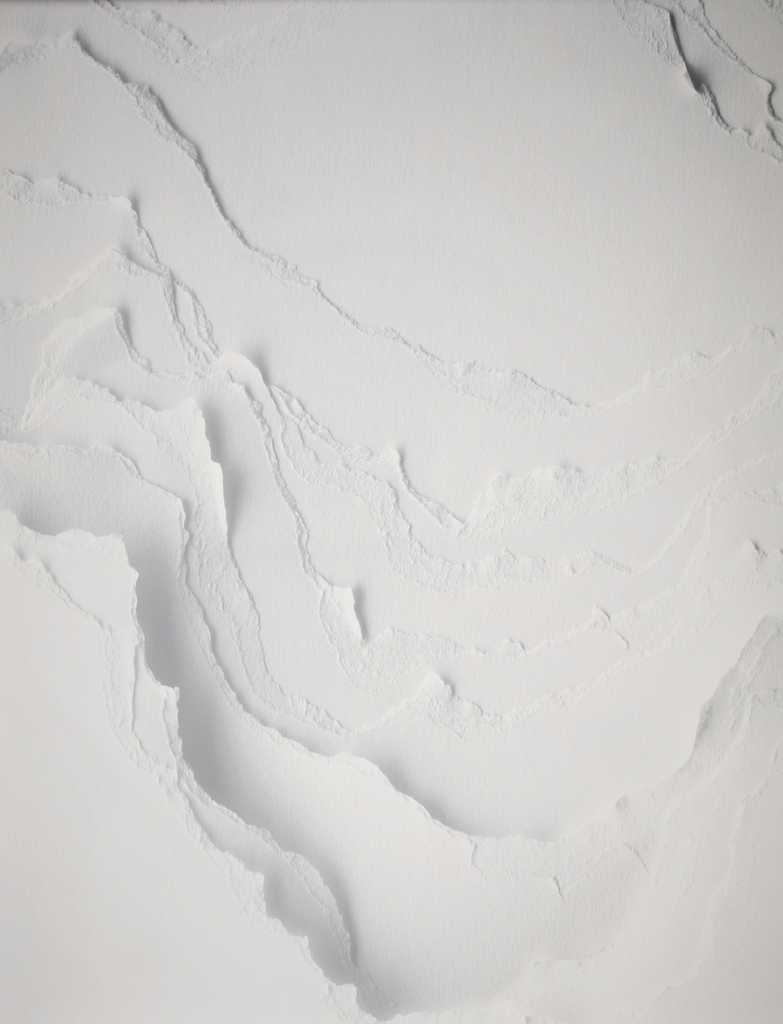
Topographies dazzles our eyes and walls with a trompe l’oeil effect that successfully tricks our senses—the seemingly three-dimensional surface is deceptively flat. To create the pattern, designers stacked multiple sheets of paper and tore away portions of the surface by hand, forming canyon-like valleys of various widths and depths. The wallcovering’s name refers to the...
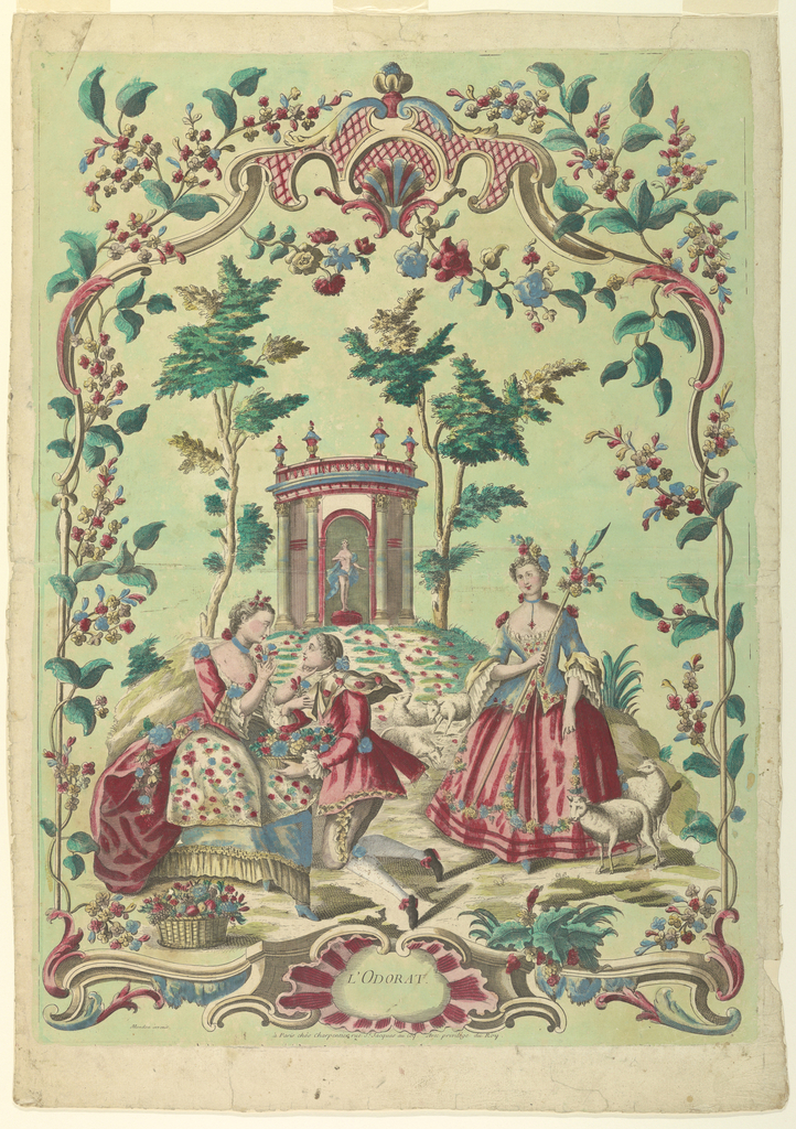
In celebration of our new exhibition The Senses: Design Beyond Vision, this Object of the Day post explores the multisensory experience of an object in Cooper Hewitt’s permanent collection. This bright, hand-colored print dated to about 1750 and signed by François-Thomas Mondon depicts a group of figures in a landscape composed of trees, flowers, and...
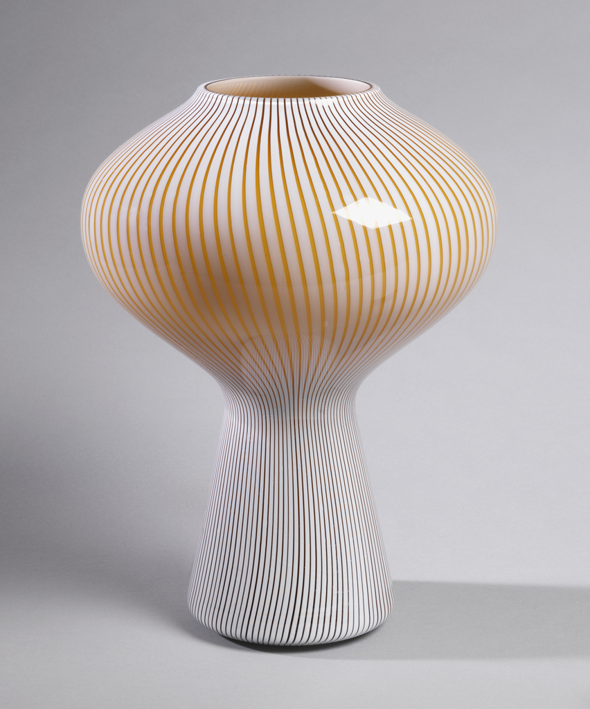
In celebration of our new exhibition The Senses: Design Beyond Vision, this Object of the Day post explores the multisensory experience of an object in Cooper Hewitt’s permanent collection. The invention of the incandescent light bulb in the nineteenth century not only advanced technology, but also design, especially into the twentieth century. This bulbous, blown...
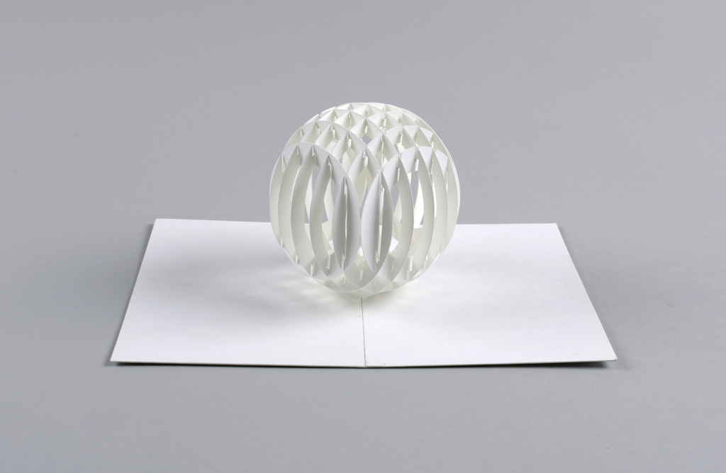
In celebration of The Senses: Design Beyond Vision, this Object of the Day post takes a multisensory approach to an object in Cooper Hewitt’s permanent collection. This cut and folded paper sphere created by Masahiro Chatani in 1980 is a complex example of “origamic architecture,” a type of kirigami (切り紙)—from the words kiru (to cut)...
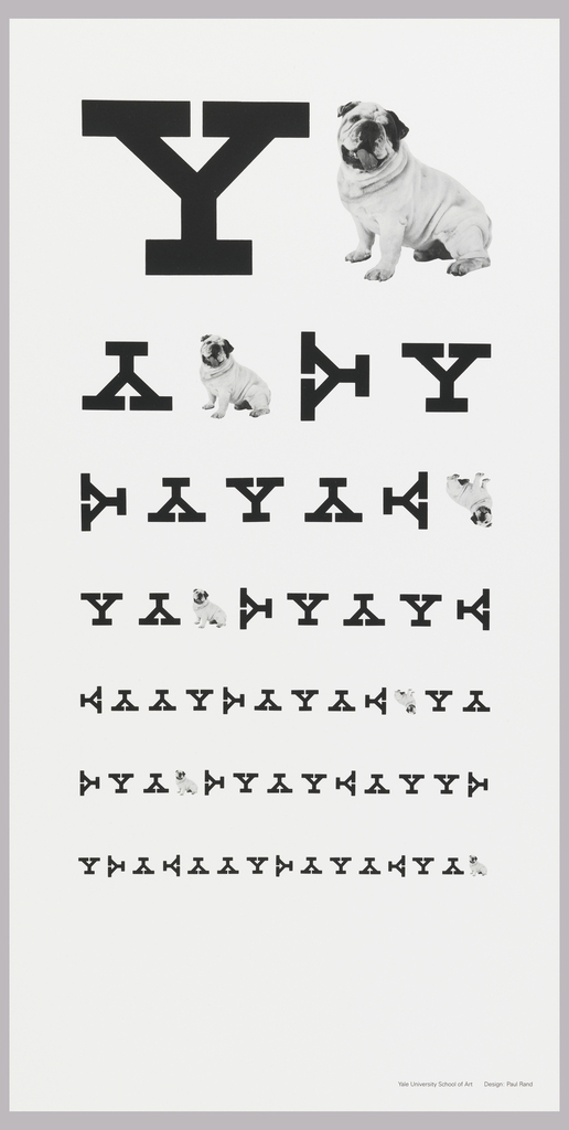
In celebration of our new exhibition, The Senses: Design Beyond Vision, this Object of the Day post explores the multi-sensory experience of an object in Cooper Hewitt’s permanent collection. In this poster, graphic designer Paul Rand plays with the iconography of eye charts to create a clever advertisement for Yale University. He incorporates the school’s mascot, an...
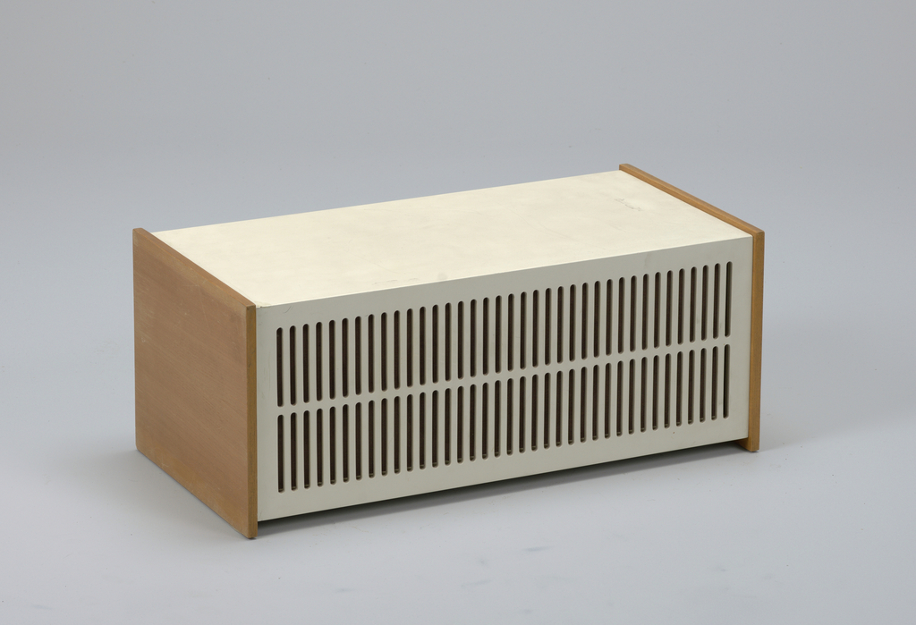
In celebration of our new exhibition The Senses: Design Beyond Vision, this Object of the Day post explores the multisensory experience of an object in Cooper Hewitt’s permanent collection. Dieter Rams, Chief Design Officer for German consumer products manufacturer Braun AG from 1961-95, designed the neutral and unassuming L1 speaker in 1957. Influenced by Braun’s...
