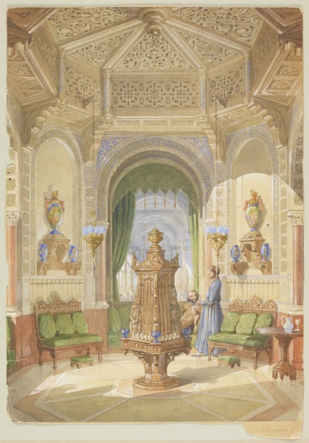
In honor of the opening of Romantic Interiors, 19th Century Watercolor Interiors from the Thaw Collection at the Beijing World Art Museum today in China, Cooper-Hewitt is featuring one of the most recent gifts from Eugene and Clare Thaw to the Museum. Design for a Smoking Room by French architect and set designer Léon Feuchère...
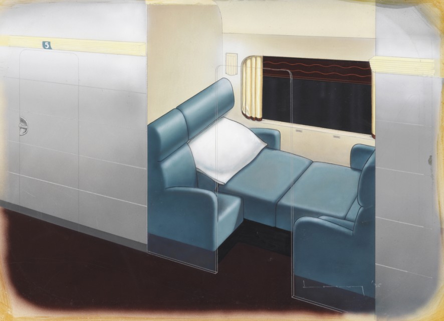
Of all of the pioneering industrial designers, including Norman Bel Geddes, Walter Dorwin Teague, and Henry Dreyfuss, Raymond Loewy is by far most well-known to the American public. His designs for the original Coca-Cola contour bottle and logo, the Exxon logo, and the Avanti car are icons of 1950s and 1960s design. Lesser known is...
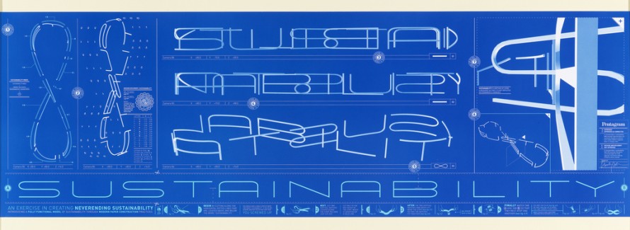
Paula Scher—the 2013 National Design Award winner for Communication Design—along with Marion Bantjes and Christopher Niemann have produced the first three in a series of twelve posters promoting the concept of Sustainability. The series, commissioned and art directed by William Drenttel and Jessica Helfand of Winterhouse Publications, features the interpretation of sustainability into conceptual graphic...
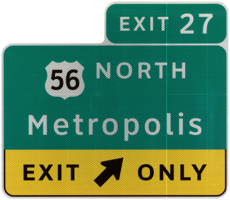
The Clearview typeface is a beautiful example of the way design helps to improve people's daily lives. A product of the design team of Donald Meeker and Chris O'Hara from Meeker Associates and type designer James Montalbano of Terminal Design, the Clearview project seeks to improve the readability of highway signage for drivers, especially those...
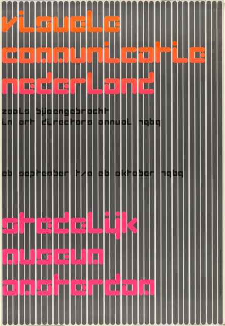
Visuele Communicatie Nederland (Visual Communications in the Netherlands) is one of designer Wim Crouwel’s best posters, created in 1969 for an Art Directors Club Annual exhibition at the Stedelijk Museum, Amsterdam. The Stedelijk Museum has been one of Crouwel's major clients. Trained as a painter at the Minerva Academy in his home town of Groningen,...
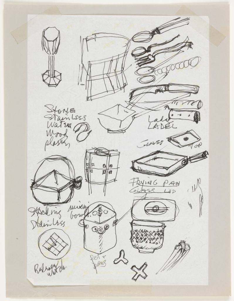
This drawing, by American designer Ward Bennett, shows the designer's mind at work for objects in a variety of media during the initial stages of creation. Here, Bennett has conceived an ambitious range of objects including cookware, kitchen utensils, and glassware. (We know from other materials contained in Bennett's archive that he consulted glass instruments...
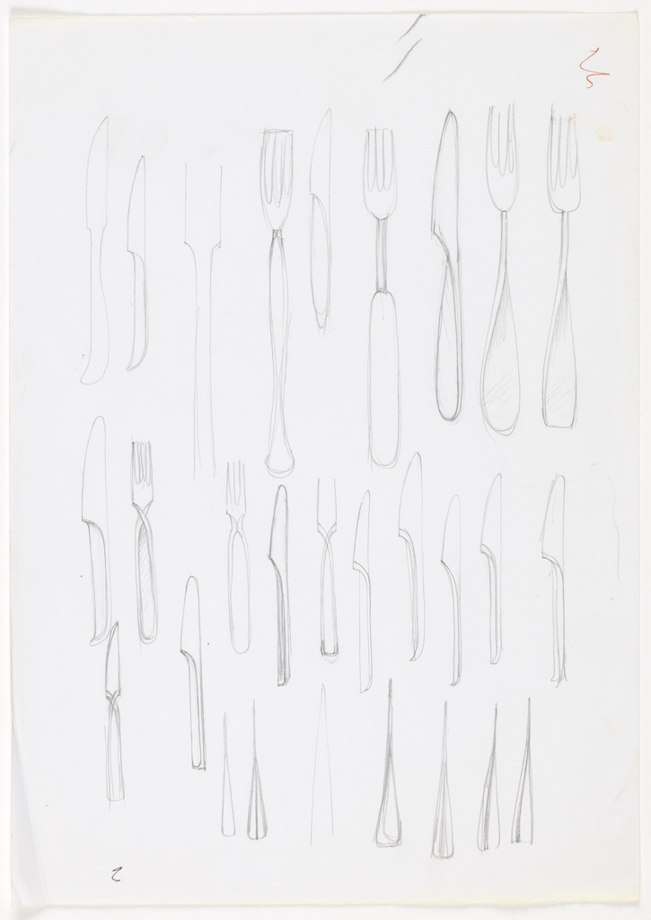
Gerald Gulotta became an established freelance designer of ceramics, glassware, silver and stainless steel cutlery during the 1960s and 1970s. His sleek, slender, elegant tabletop designs look as contemporary today as they did during the height of his career. The Drawings, Prints and Graphic Design department recently acquired seven Gulotta drawings of stainless steel flatware. Three...
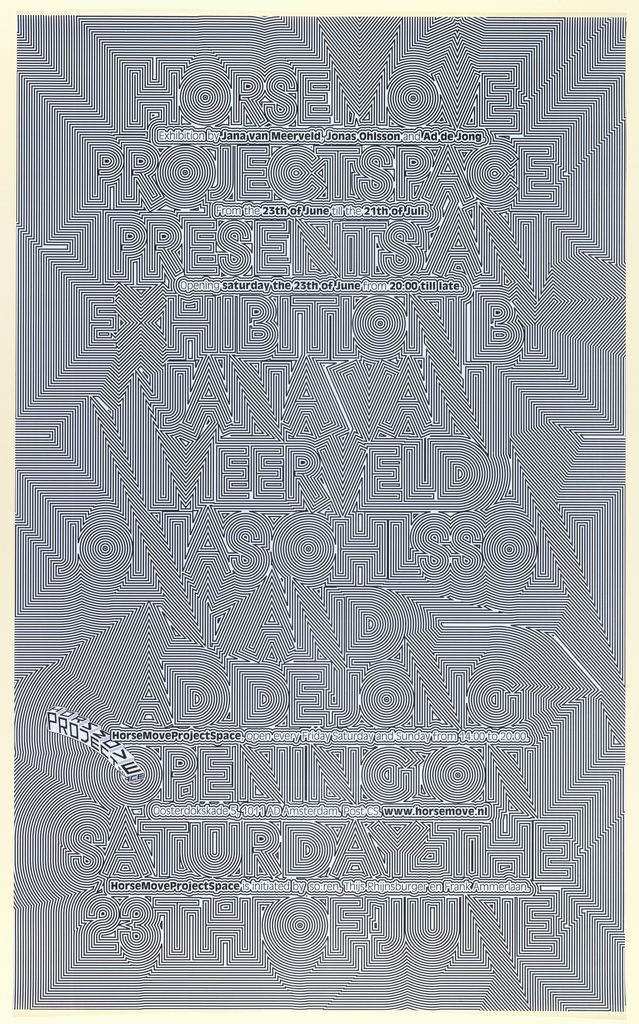
This exhibition poster by Michiel Schuurman for the HorseMove ProjectSpace explores optical disunity, utilizing computer technologies to create endless patterns of replication and visual complication. These computerized distortions obliterate the easy reading of the poster, which challenges the conceptual bias of the printed poster as a means for conveying information. The visual bombardment of the...
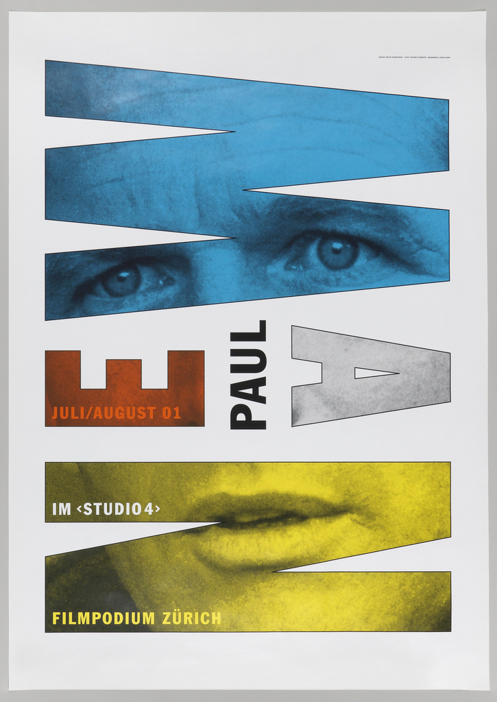
Ralph Schraivogel is a celebrated contemporary Swiss poster designer, whose work often plays with curving pattern, image, and type to create ambiguous spatial effects. The poster presented here, Paul Newman, Filmpodium Zurich, evolves from a quite different design aesthetic and tradition. This compelling poster has been compared to the inventive, puzzle like, modernist posters of...
