This poster, designed for the New York Subway Advertising Company, exemplifies the signature approach of American graphic designers Otis (Shep) Shepard and Dorothy Van Gorder—the poster prioritizes the image as text becomes peripheral to the overall message. It combines reductive, abstracted forms with ample airbrushing to create a dynamic arrangement. The pair met in 1927...
Before turning his attention to graphic design in the mid-1960s, Tadanori Yokoo (b. 1936) first trained as a painter and worked as a stage designer for avant-garde theater productions in Tokyo. By the late 1960s, however, he was best known as a graphic designer. His work drew international acclaim when it was included in the...
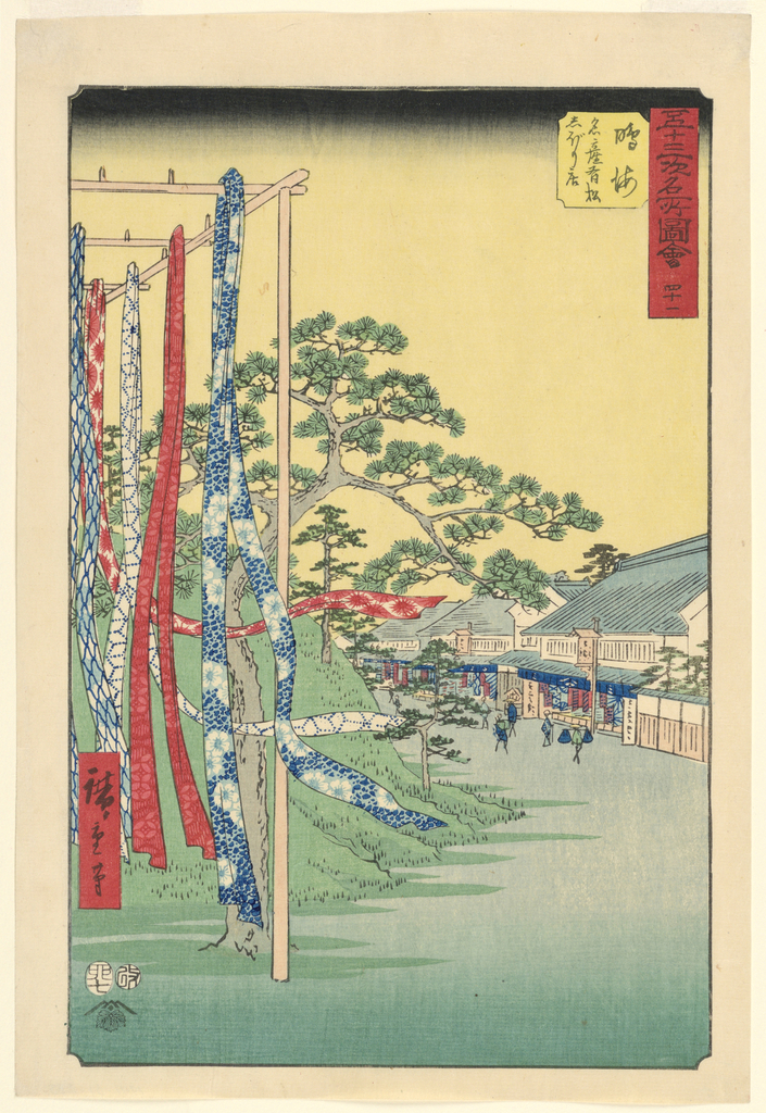
Though for centuries woodblock printing had been a prevalent method of inexpensively and widely disseminating religious texts in Japan, it was not until the eighteenth century that this technique blossomed to bolster the creation of pictorial compositions, more complex and richly colored than the written documents previously published. These prints, known as ukiyo-e, are both...
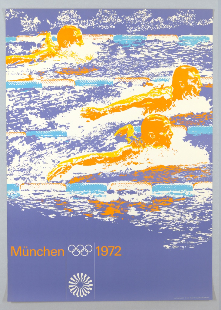
For the organizers of the 1972 Munich Olympic Games, the event presented an opportunity to redefine global perceptions of German identity. It was seen as a chance for Germany to distance itself from the dark memory of the 1936 Games in Berlin, staged under Hitler’s rule. A primary objective for the 1972 Games, as scholars...
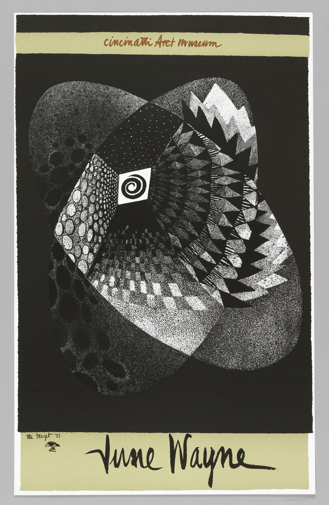
In celebration of Women’s History Month, March Object of the Day posts highlight women designers in the collection. In September of 1969, the Cincinnati Art Museum hosted a retrospective exhibition dedicated to the work of June Wayne (1918-2011). Although Wayne’s prolific design practice spanned multiple media, today she is especially celebrated for her work as...
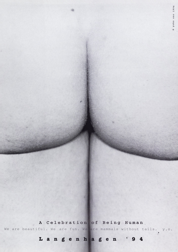
The direction for Film No. 4, an early work by Yoko Ono, began with simple instructions: “String bottoms together in place of signatures for petition for peace.” The 80-minute film, created in 1966-67, showcases a series of bare bottoms in the midst of walking. The images are accompanied by a soundtrack composed of interviews with...
In celebration of Women’s History Month, March Object of the Day posts highlight women designers in the collection. Today’s blog post was written by Kristina Parsons and originally published on March 17, 2014. Eiko Ishioka was a prolific and revolutionary designer. She contributed enormously to the fields of art direction, graphic design, production, as well as costume...
Hildreth Meière (1892-1961) was a distinguished Art Deco muralist, painter, mosaicist, and decorative artist often applauded for her defiance of normative standards against the professional success of females. In 1936 she wrote, “It drives me wild to be spoken of as ‘one of the best women artists’. I’ve worked as an equal with men, and...
San Francisco is the city veiled in fog, surrounded by the Pacific Ocean, known for its precipitous hills. Now, more often than not, the city is uttered in the same breath as Silicon Valley and skyrocketing rent prices. Those who have left their hearts in San Francisco at one time or another, may be astonished...
![Image features a poster for the New York Subway Advertising Company, encouraging businesses to purchase advertising space in subway stations or on trains. In the foreground, at bottom left, a single train's rail, rendered in perspective extends into a black, spiraling tunnel. At the vanishing point of the tunnel, a cluster of colorful, overlapping rectangles, meant to represent posters. Across the bottom, in black text: [New York Subway Advertising Company logo] RAILS TO SALES / SUBWAY POSTERS [a red line cuts through the center of "subway posters"]. Please scroll down to read the blog post about this object.](https://www.cooperhewitt.org/wp-content/uploads/2020/01/CHSDM-292880_01-000001-scaled.jpg)
![Poster for the 1968 exhibition at the Museum of Modern Art, “Word and Image: Posters and Typography from the Graphic Design Collection of the Museum of Modern Art, 1879–1967.” Across top margin in white text: WORD IMAGE WORD IMAGE WORD IMAGE [sic]. Below, on a black ground, four open mouths with pink lips, white teeth, and a red tongue arranged in a 2x2 grid. At bottom, red and blue rays emanate from a large, blue eye with a pink lid. Across bottom margin: THE MUSEUM OF MODERN ART, NEW YORK, JANUARY 24–MARCH 10 / DESIGNER TADANORI YOKOO COPYRIGHT © 1968 THE MUSEUM OF MODERN ART POSTER ORIGINALS LTD., NO. 89.](https://www.cooperhewitt.org/wp-content/uploads/2020/01/CHSDM-292887_01-000001-scaled.jpg)
