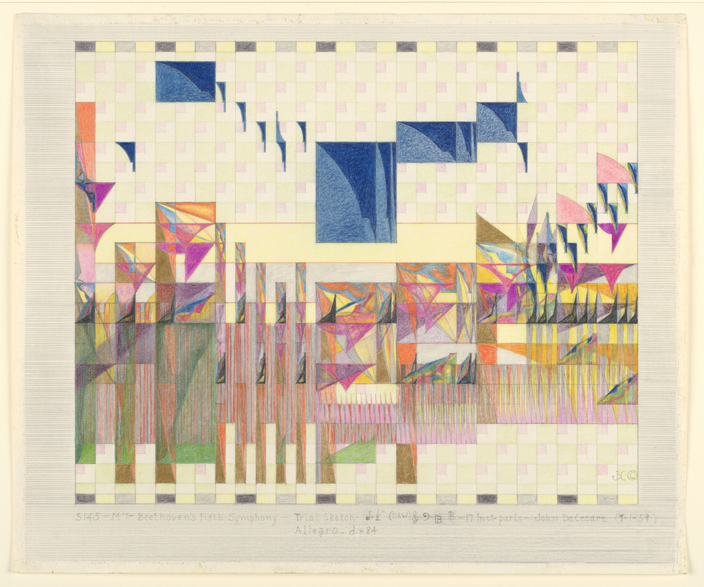
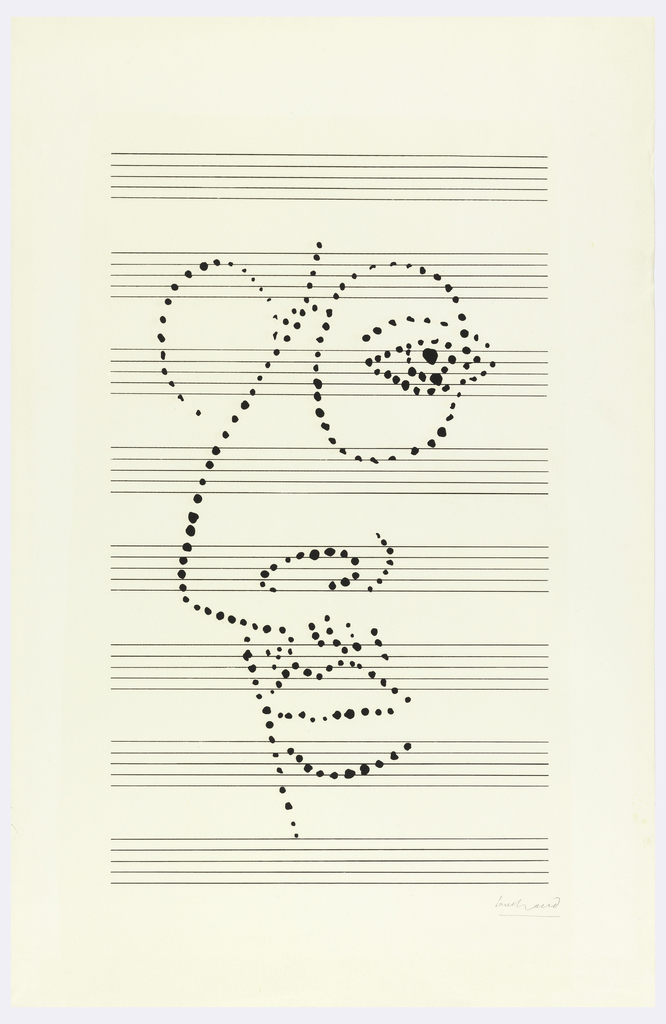
Many people try to play sheet music on the piano, but what about trying to play a drawing on the piano? The idea seems bizarre at first, but it’s central to a movement that began in the 1950s, where composers created “graphic scores” instead of typical sheet music. These graphic musical scores attempt to represent...
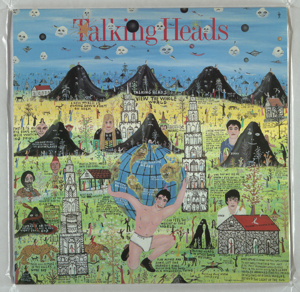
The Talking Heads are depicted alongside mountains, animals, and bell towers on the cover of their 1985 release Little Creatures. Lead singer David Byrne is Atlas, holding the globe, while the other band members are behind him. Graphic designer Tibor Kalman used a painting by Georgian folk artist Howard Finster as the basis of the...
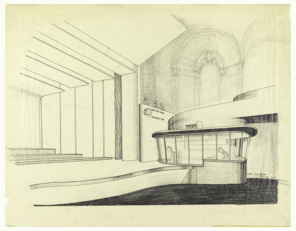
In 1937, Cooper Hewitt acquired blueprints and drawings made by Swiss-American architect William Lescaze. The drawing above shows Lescaze’s 1934 plan for the redesign of New York’s Avon Theater at 251 W 45th street. The original theater, designed by architect Eugene De Rosa, was known as the Klaw Theatre. The name changed to the Avon...
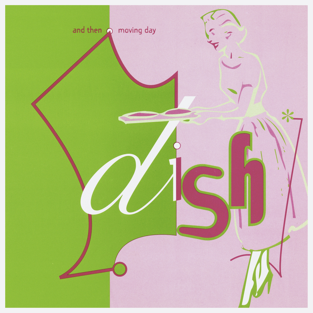
In July 2016, Town and Country magazine published an article called “Why Pink and Green is the Best Color Combination Ever.” One look at the design for the 1989 single released by North Carolina rock band Dish, and it’s clear that graphic designer Maura Dillon was thinking the same thing nearly 30 years before. The...
Paul Rand was an influential American graphic designer well known for the logos he created for IBM, UPS, ABC and other corporations. His 1947 book Thoughts on Design is considered a seminal text on graphic design. The poster above shows something different from Paul Rand’s oeuvre. It’s not a neat and compact corporate logo; instead...
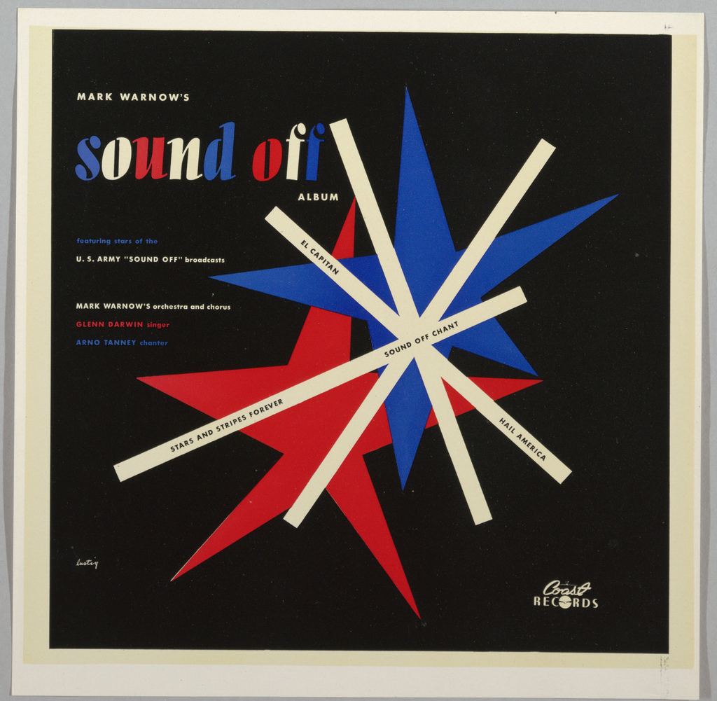
Alvin Lustig was one of the most influential graphic designers of mid-20th century America, despite the unfortunate brevity of his career. Well-known for his designs of books, book jackets, and magazines, Lustig also designed several record jackets for albums of classical and concert band music. Four such albums bearing Lustig’s design are featured in Cooper Hewitt’s...
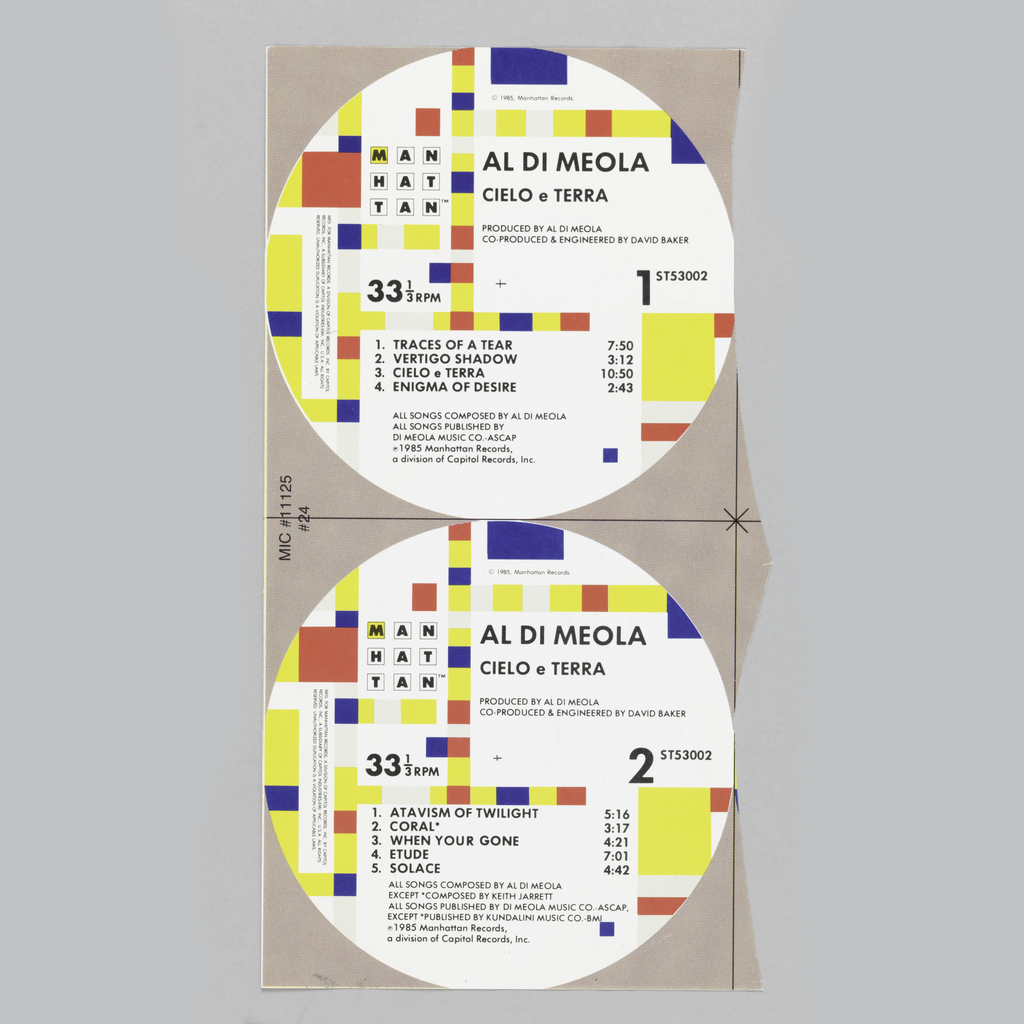
Graphic designer Paula Scher adapted Piet Mondrian’s 1943 painting Broadway Boogie-Woogie when she created the graphic identity for Manhattan Records in 1984. On each LP that Manhattan Records released, the design is printed on the center label of sides A and B. When reflecting on her decision to turn to Mondrian, Scher explained “the strongest...
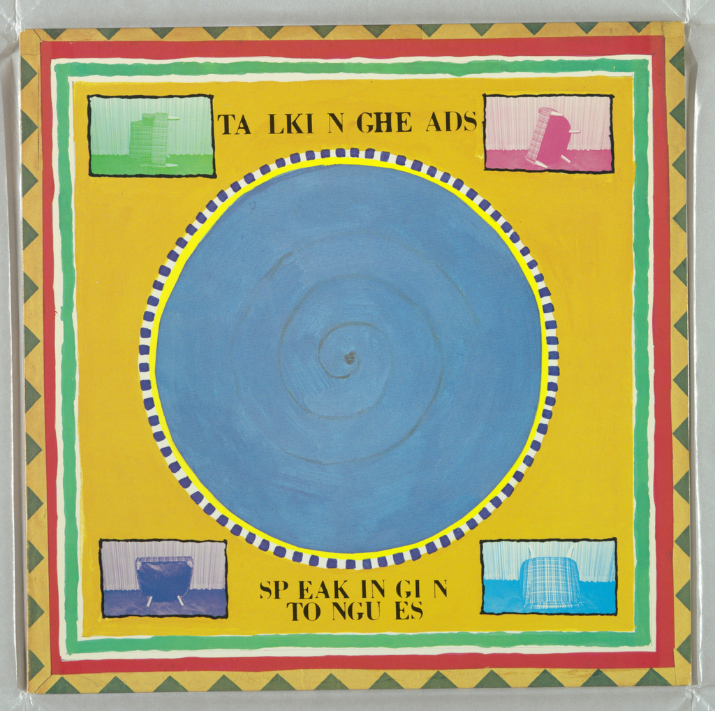
Graphic designer Tibor Kalman made a circle of blue the visual centerpiece of Talking Heads’ 1983 release Speaking in Tongues. The circle is seven inches in diameter, just like a 45 record. But while the graphic might evoke the standard format of singles from the ‘50s, ‘60s and ‘70s, it was actually inspired by the...
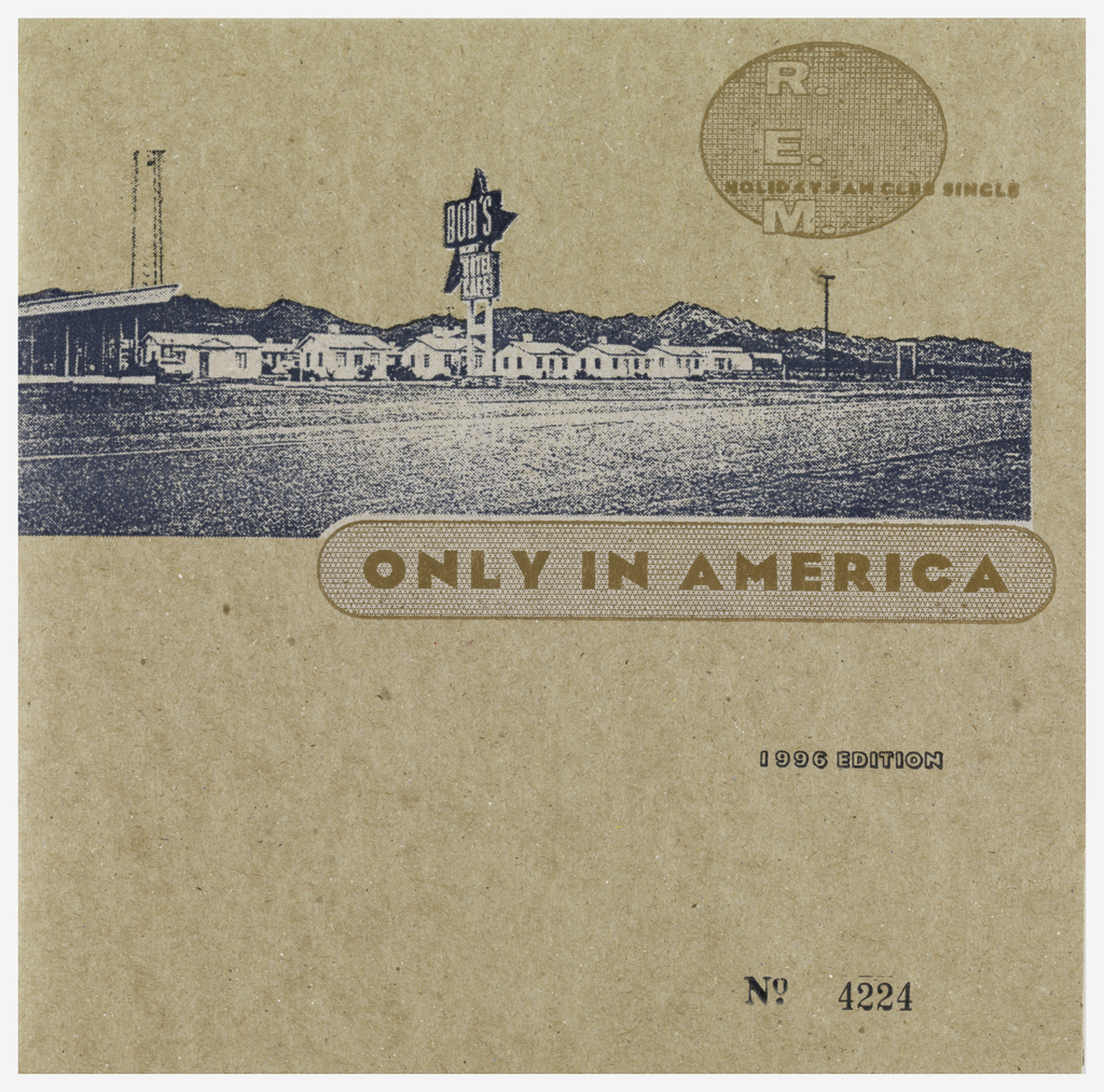
An altered photograph of a roadside motel is printed on a cardboard sleeve for R.E.M.’s 7-inch single “Only in America,” designed by Bruce and Karen Licher. The image of the motel is grainy, which complements the speckled cardboard on which it was printed. Although the grain makes it harder to read the motel sign, the...
