On Striving for Digital Inclusion
Museums provide robust content for people to interact with across digital platforms. As cultural organizations continue to develop more advanced experiences, it is essential that they consider all audiences during the creation of digital resources and tools. Digital accessibility ensures that people with disabilities have access to our online collections, website, and materials.
For visitors who use assistive technology, image descriptions allow for more equitable experiences in accessing digital content. Technologists, curators, communications staff, and other museum colleagues can all work to create more inclusive digital projects by using this document to author image descriptions.
Cooper Hewitt’s Guidelines for Image Description is a living document. The design tools here, like all creative resources, must continue to be tested in various environments and discussed broadly. These guidelines are created to be both comprehensive and responsive to provide guidance while maintaining fluidity to evolve. Paramount to this is the recognition that language is deeply rooted and understood through the context of the culture and society of its time. This practice must continue to be engaged with contemporary dialogues as image description inherently intersects with questions of race, gender, and identity.
If you are an alt-text or assistive technology user, accessibility advocate, or creative being who has experimented and found solutions or questions, please share with us at:
Cooper Hewitt Accessibility
Cooper Hewitt, Smithsonian Design Museum
CHAccess@si.edu
These guidelines were made through the dedicated work of Sina Bahram, President of Prime Access Consulting and Anna Chiaretta Lavatelli, accessibility advocate and museum professional. In conjunction with Freer|Sackler, and the Hirshhorn Museum and Sculpture Garden. With thanks to the Smithsonian Accessibility Program, and the Smithsonian Accessibility Innovation Fund.
With immense gratitude to the users, visitors, and cultural advocates who champion this work forward.
Ruth Starr, Accessibility Manager
Introduction
Image descriptions help visitors who are blind or have low-vision access the information contained in images. Description also makes it easier to find images through the image’s content as opposed to the caption or title of the object that it depicts. This document outlines types of descriptions, the structure of a description, and recommendations to help guide writing descriptions (with examples). The “Core aspects of description” can be used as a framework to write down all of your observations of an image, and the other sections can help you to enrich and refine your description.
These guidelines are written for image description specifically, but the concepts outlined can be expanded upon, considering the context of an image or—moving beyond the image of an object—to describing real-world objects, providing tours of exhibitions, live description of performances, or audio description of the moving image. Note that for these image descriptions in text form, you will use the second person, “you,” when using embodiment techniques of description, but for most other cases (and always in tours, audio description, and live description) the first-person plural, “we,” is preferred.
Definitions
Alt Text
Shortened from “alternative text,” this is a short visual description that provides a general sense of the content of an image. It is structured as a sentence fragment that indicates the most important content of the image; it is approximately fifteen words and contains no period at the end unless it is a complete sentence.
Example:
Portrait of former First Lady Michelle Obama seated looking directly at us
Long Description
A long description sets out to provide more extensive and detailed visual information. It can be thought of as the analog version of the sighted users’ lightbox view of an image as it provides a closer look at the image. Long descriptions can be anywhere from a couple of sentences to multiple paragraphs, written in complete sentences. The complexity of the image will contribute to the length of the description. Long descriptions should comprehensively describe the most important content of the image augmented by details.
Example:
A portrait painting of former First Lady Michelle Obama depicts her medium-dark skin rendered in grayscale. She is seated and wears a sleeveless halter-top style dress that flows outward beyond her feet extending past the edges of the painting. The dress is primarily white with various geometric patterned sections in grey and black. She sits with her left arm on top a crossed leg; her wedding ring is just visible. Her right arm is positioned with a bent elbow and her chin is propped on the back of her right hand. She looks on to the viewer with a calm and commanding gaze. Her long hair, parted in the center, flows wavy to shoulder length. Her left earlobe is exposed, revealing a diamond earring. The background is a solid pale blue.
Caption
A visible short text that explains the image or illustration and sometimes includes crediting information. Usually this information appears below or next to the image, and is accessible to everyone.
Example:
Michelle LaVaughn Robinson Obama, born 1964, Chicago, Illinois
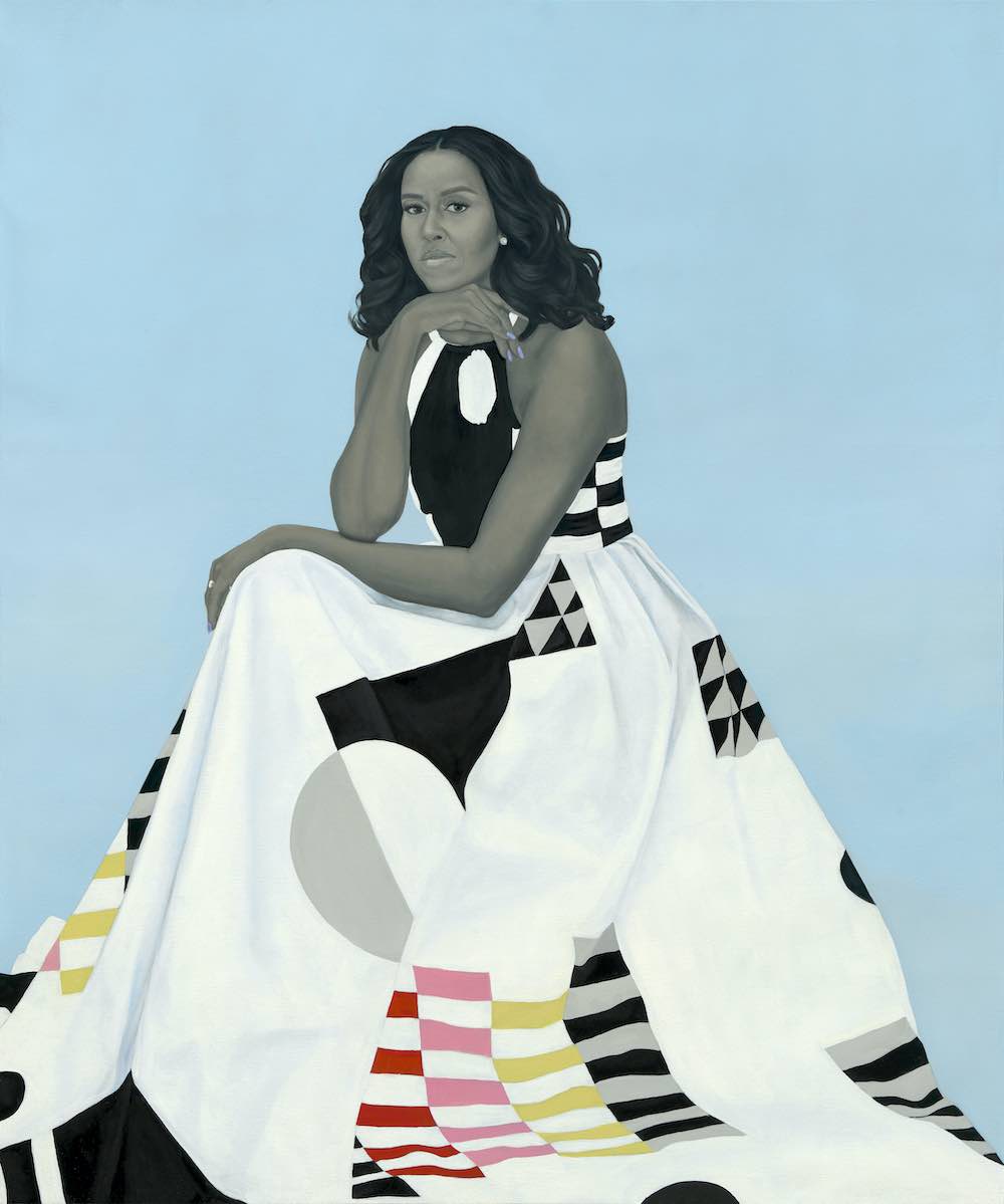
Structure
The structure of a description depends upon the type of description as well as the context it will be delivered in. Generally, descriptions should start with the most important content of the image and branch outward to describe the details that articulate the nuances of the visual content of the image. One should be conscious of the ordering of text and image elements to avoid spatial confusion. When uncertain or working with predominantly text images, it is preferred to read an image in a singular direction (top to bottom, left to right, foreground to background) so that the order of elements is one after another. When writing long descriptions a narrative structure may gradually reveal elements to build up an image in an exploratory way, but should still maintain a spatial order. For instance, content can be described in two passes, but in the same direction, to ensure you start with the most important information but maintain spatial order.
The style, length, and depth of information may vary across authors; this is okay as long as writers follow these recommendations. An image can be found in a number of contexts—an online collection, an in-gallery mobile application, or a decorative image accompanying general information, for example. This document is dedicated to guiding writers through the most complex image descriptions, long descriptions of objects in collections, and exhibitions.
Recommendations
1. General
- Do not repeat text already expressed in captions or other descriptions that are fully accessible. However, you may refer to or repeat information contained in a caption to elaborate on visual information (materials, medium, etc.).
- Avoid using phrases such as “This is an image of.” This type of lead-in is redundant and doesn’t contribute to understanding the content of an image. However, a lead-in that indicates the medium such as “A Painting of . . . ” is okay.
- Text within the image should be completely transcribed and shown within quotation marks.
- Avoid jargon or other kinds of privileged knowledge except where it is essential for describing an object. If used, the jargon term should be explained.
- Bringing interpretive knowledge to a description is not always preferred. Generally, the information in a description should be limited to what information can be seen when looking at the image. However, when interpretive knowledge aids visual understanding of the content it should be incorporated.
Example:
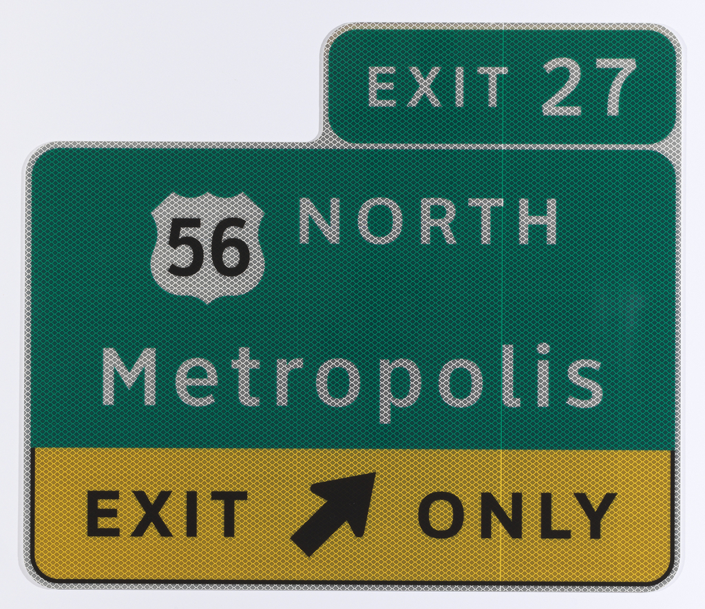
A reflective green highway sign with white text reads “EXIT 27” above larger text “56 NORTH.” The “56” is in an emblem denoting an interstate highway. Below that it says “Metropolis.” The lower quarter of the sign has a yellow background and black text that reads “EXIT ONLY” with a black arrow pointing diagonally toward the right between the two words.
Alt: Highway sign reads Exit 27, 56 North, Metropolis, Exit Only
Example 1:
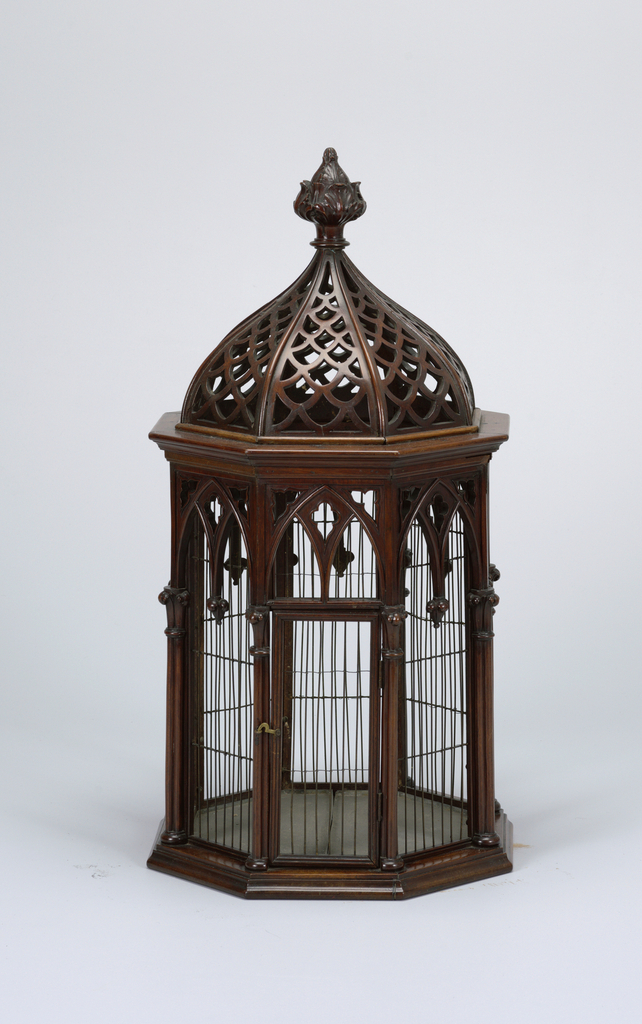
The top of this wood and metal wire cage is an ogee shape, like a Hershey’s kiss, and is crowned with a leafy finial. It is octagonal and the sides have decorative wooden ogee arches springing from clustered columns that form each edge of its eight corners. The side facing forward has a hinged door.
Alt: Octagonal wood and wire cage with carved decorative features
Example 2:
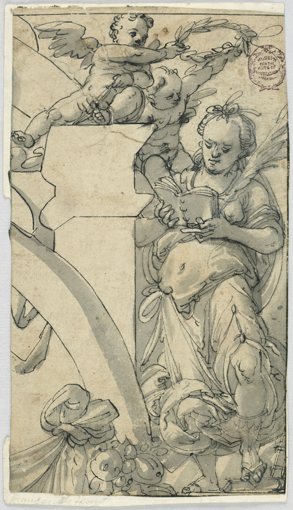
The suggestion of an arch on the left supports two putti, winged cherub babes, that hold a laurel wreath over a person reading a book. The forms are created from loose gestural black lines with dimensionality implied by washes of grey on the yellowed paper.
Alt: Two cherubs hold a wreath over a person reading
Example:
A blue rectangle features a blocky white line form representing a person in a wheelchair leaning forward with an arm extended back to show they are moving themselves forward without assistance.
Alt: Blue icon of person in wheelchair in forward motion

2. Core aspects of a description
- Subject
- Size
- Color
- Orientation and relationships
- Medium and style
Start with the element(s) that are critical to understanding the image. This is typically the first thing that strikes you about an image
Describe the scale of the elements within the frame and use the relational size of objects or persons to one another within an image. Beyond comparing elements with terms such as “smaller than” or “larger than,” it is also useful to relate objects to one’s own body or known objects to describe the physical presence of elements (more on embodied description in section 4).
Example 1:
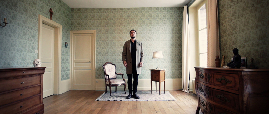
A video still of a light-skinned man with dark hair and a beard wears all black with a light grey overcoat. He is standing in a wallpapered room, directly across from us, just in front of the far wall on a small light-hued woven rug in between a small victorian armchair and end table with a lamp. He stands somewhat in front of the furniture making it appear slightly smaller than normal due to his tall stature and our perspective. The wallpaper is a light blue pattern with off-white trim and doors, a small crucifix sits atop the door frame of the closed door on the left wall. On the right a window that is larger than the door on the opposite wall, illuminates the room. There are two dark wood dressers in the foreground against the right and left walls that extend towards us. They frame the scene by occupying the lower right and lower left sides of the image. Atop the one on the left is a life-sized white human skull, and on the right a seated buddha not much larger than the skull.
Alt: Man stands across from us in a wallpapered room atop an area rug between a chair and end-table
Example 2:
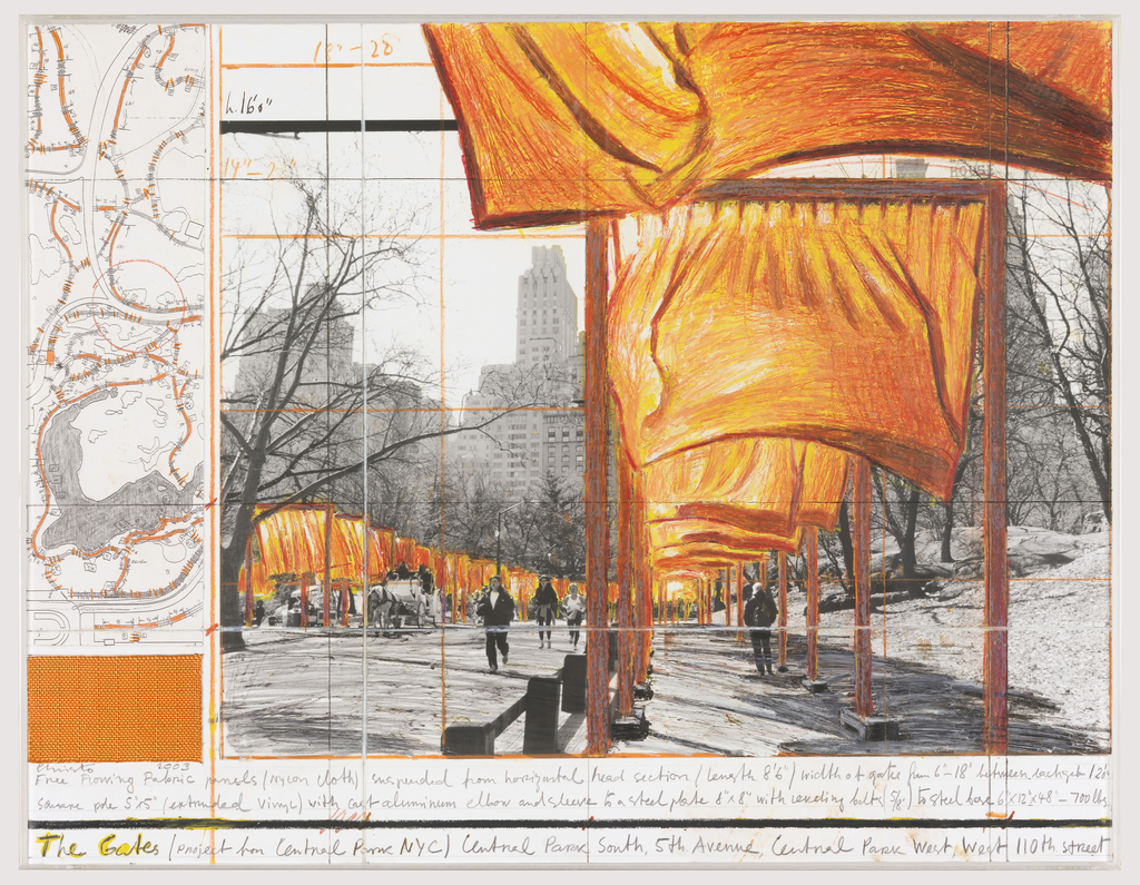
A small scrap of bright orange fabric is taped below a small narrow bird’s-eye plan of Central Park with orange lines indicating a winding path through the park. To the right of these items is a large black-and-white photograph taken in bustling Central Park in New York City. Drawn onto the photograph are orange structures with orange fabric hanging halfway down, the structures are gates one can walk through. They tower over the people in the photograph and grow in scale to accommodate our perspective, so that orange fabric in the foreground is looming over our head.
Alt: Collage features photo of Central Park and hand-drawn orange fabric hanging from gate structures
Identify the color of key elements using familiar names of colors: red, blue, yellow, green, orange, purple, violet, pink, brown, gold, silver, black, and white. Where specialized colors are used and important to the image, they should be identified, e.g., Carmine, cobalt blue, and teal. However, when used they will need to be explained using the familiar colors named above.
Example 1:
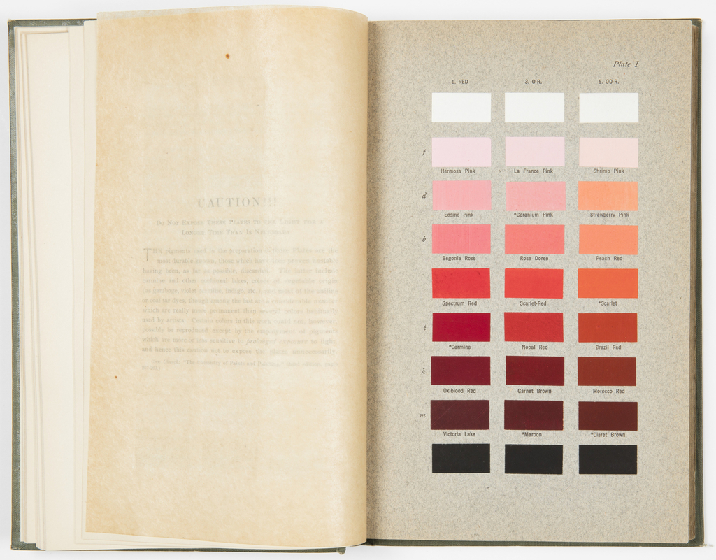
A book is open to a page featuring three columns of color rectangles. The top row is white and the bottom is black; between them are shades of dark red and red-orange that are increasingly brighter to the top row showing shades of light pink. The first column ranges from a very light pale pink to dark burgundy red with a bright neutral red in the center called “Carmine.” From lightest to darkest the colors are labeled Hermosa Pink, Eosine Pink, Begonia Pink, Spectrum Red, Carmine, Ox-blood Red, and Victoria Lake. The middle column is slightly warmer in tone and from lightest to darkest the colors are labeled La France Pink, Geranium Pink, Rose Dores, Scarlet-Red, Nopal Red, Garnet Brown, and Maroon. The third column is more orange-red and the colors from lightest to darkest are Shrimp Pink, Strawberry Pink, Peach Red, Scarlet, Brazil Red, Morocco Red, and Claret Brown.
Alt: Book open to page of color swatches in shades of red and pink
Example 2 (Alt):
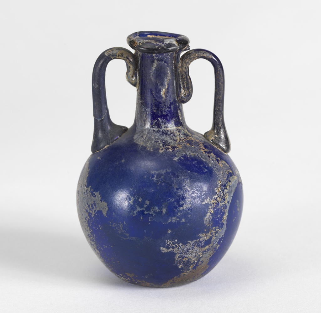
Round-bodied vase with two curved handles that flank a skinny cylindrical neck; it is cobalt blue–a deep medium blue
Example 3:
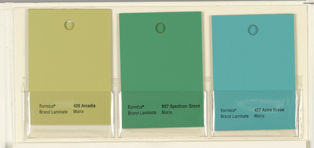
Three color swatches labeled “Formica® Brand Laminate Matte” feature the color name they represent; “426 Arcadia” is a dark yellow with green undertones, “897 Spectrum Green” is a bright grassy green with a slight blue tone, and “427 Astro Green” is teal—a bright blue-green.
Alt: Three color swatches of yellow-green, green and blue-green
Describe the orientation and relationships of image elements to one another. For instance, identifying the position of an object within the frame but also its location in relation to the viewer or key objects/persons represented, e.g., on your right is an object. When a person is the subject of an image, you can use them as a surrogate for the viewer to describe relationships (e.g., to their right), but this should be consistent throughout the description to avoid confusion. Identify if the image is horizontal or vertical when useful for understanding the image.
Example 1:
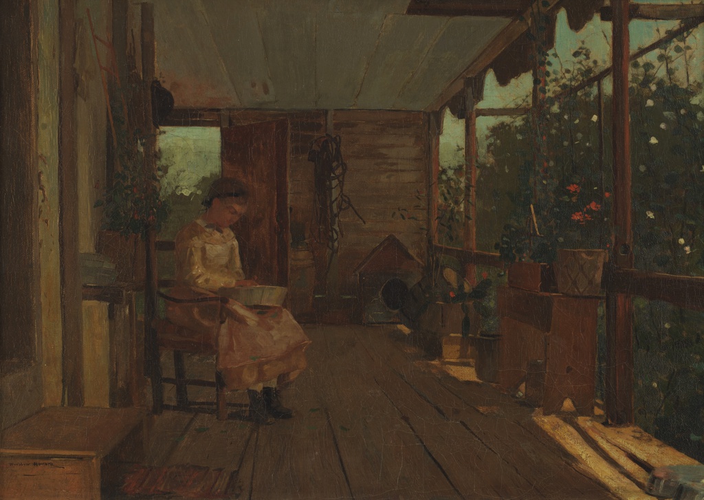
Loose painted brushwork illustrates a girl in a pink aproned dress and boots sitting in a chair on a wooden porch, shadowing her from the sun. She has a metal tub on her lap and looks down into it. To her left, flower pots and shelves are illuminated by sunlight sneaking in from the yard rendered in blocky shades of green on her left. Behind her an open door reveals vague brushwork of a green field and a blue sky.
Alt: Painting of a girl on a shaded porch
Example 2:
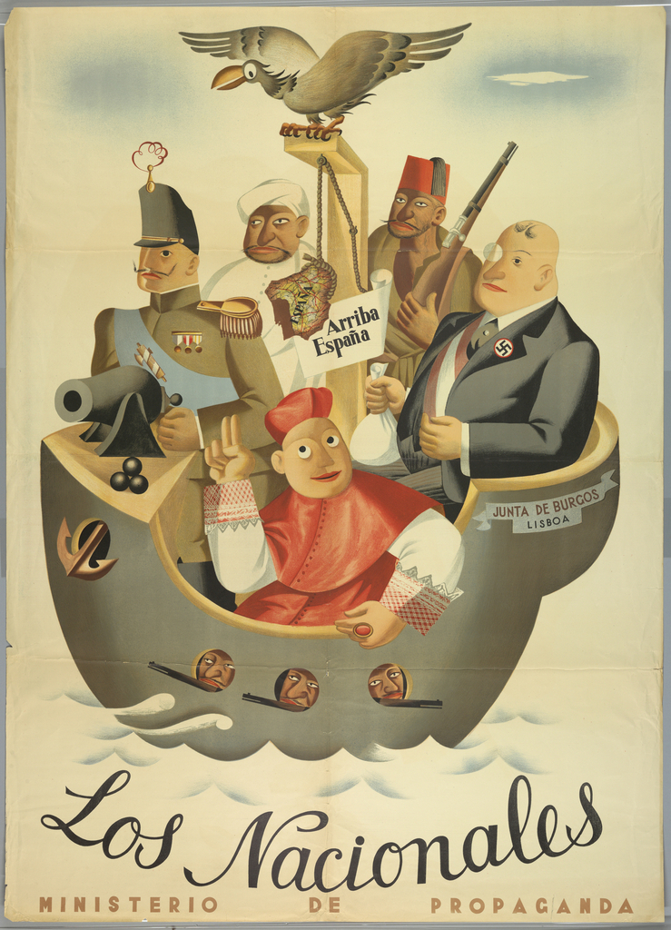
An illustrated cartoon poster of people on a boat above a script text reading “Los Nacionales” above small block letters reading “MINISTERIO DE PROPAGANDA.” The boat is a warship labeled “JUNTA DE BURGOS/ LISBOA,” (Burgos/Lisboa Militia) and contains five people representing the enemies of the revolution, denoted by stereotypical dress and rendering. Three light-skinned men are in the foreground. The first on the left is dressed as a decorated military general who mans a canon, to his left, our right, a cardinal representing the church, and on to his left, our far right, a man wearing a suit, monocle, and swastika pin holding a bag indicating he is a fascist/capitalist. Behind them, a medium-dark skinned man is in white wearing a turban, dressed as a Moor, and to his left, our right, a medium-dark skinned man holds a rifle and wears a traditional red fez indicating he is a Turk. In the center of the boat, a map of Spain and a sign that reads “Arriba España” (an expression of Spanish support during the Spanish Civil War) hangs from a gallows surmounted by a vulture. Three armed men peer from port holes on the body of the warship.
Alt: Illustration of people on a warship representing stereotyped enemies of the revolution in Spain
If a particular material, medium, or style is used it should be identified by name, but the physical qualities of it should also be described. The amount of emphasis on style and medium should relate to the importance of it for understanding the image. For instance, an Andy Warhol silkscreen heavily alters the way in which a portrait is visually understood, so the blocks of color and heavy black linework of the style should be emphasized. Consider the way lines are used to render the representational or non-representational content of an image versus a painted image or a photograph.
Example 1:
The suggestion of an arch on the left supports two putti, winged cherub babes, that hold a laurel wreath over a person reading a book. The forms are created from loose gestural black lines with dimensionality implied by washes of grey on the yellowed paper.
Alt: Two cherubs hold a wreath over a person reading:

Example 2:
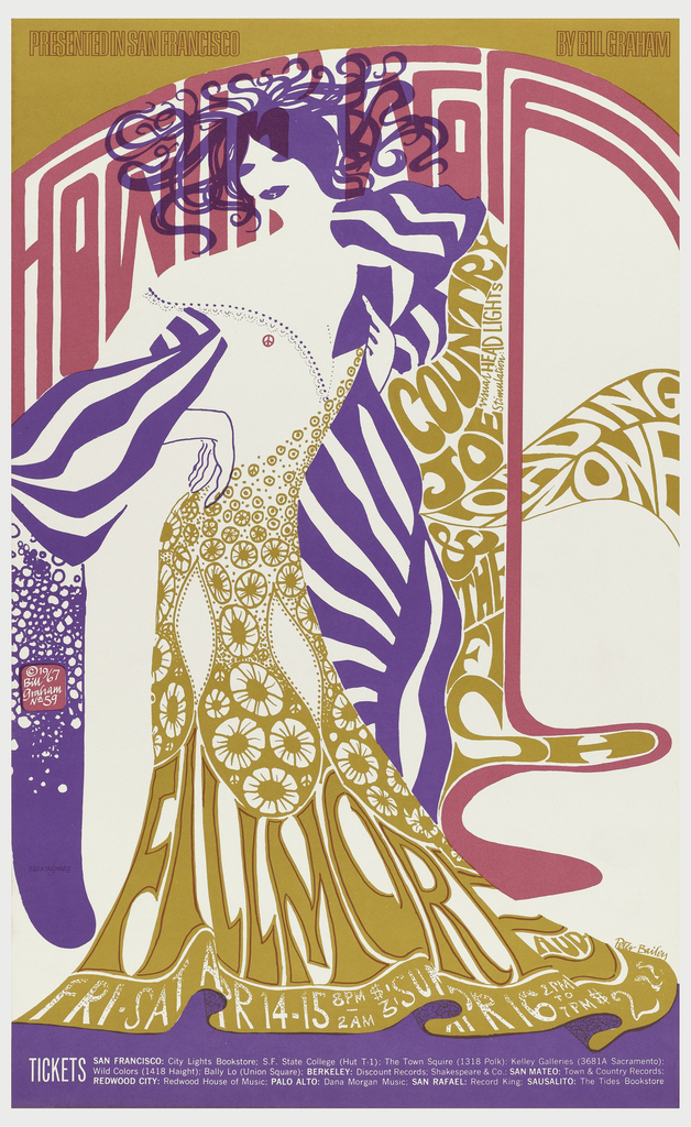
Poster for a 1967 concert composed of solid applications of three different colors on a white background: pink, purple, and mustard–a darker yellow. A simplified set of shapes in purple compose a person with hair that spirals out from their head and big lips; they wear a mustard dress made up of flowers and abstracted text that fills the outline reading “Fillmore Aud. / Fri Sat Apr 14-15 8pm-2am $3: Sun Apr 16 2pm to 7pm $2.” A peace sign in pink is strategically placed where a nipple would be. Behind the person, extremely vertically stretched, attenuated pink text reads “Howlin’ Wolf.” Flowing from their left side is mustard and white text reading “Country Joe / Loading Zone / & The Fish.” Along the top border, in red outline all-caps on mustard, is “Presented in San Francisco by Bill Graham” and the bottom border shows ticket listings in white on purple.
Alt: Illustrated purple person in a dress made of flowers and text stands amidst pink and yellow texts abstracted into psychedelic forms:
3. Describing people
One should identify the visual appearance of persons, especially when it is important to the understanding of the content of an image. Instincts for political correctness tend to inadvertently result in redacting information; it is a general rule that if you are able to see something it should be shared with those who cannot see it. The following guidelines support the description of human physicality. As this is an area of constant research and development it is recommended to regularly review and update these guidelines and glossaries of terms to sensitively describe people without implications of judgement.
- Physical features
- Age
- Gender
- Ethnicity and skin-tone
- Identification
When particular features are immediately noticeable, or mutually agreed upon salient features of a known person are visually present, they should be described. This is not only in regards to prominent features or physical stature, but also physical disabilities.
Example:
A birds-eye view of children on a playground structure on astroturf. The visible part of the structure is a blue platform between two yellow crescent-shaped benches facing inward. Four small blonde children sit on the right side holding onto a large yellow multi-handled structure. They face a child with darker skin of a similar size in a wheelchair on the other side of the handles. In the middle of the platform three slightly older light-skinned children have arms extended in various states of play next to light-skinned child of similar size buckled into a large electric wheelchair facing the kids holding their arms out. A girl with darker skin looks on smiling from the yellow bench on the left as she touches her head.
Alt: Group of children playing on an accessible playground structure

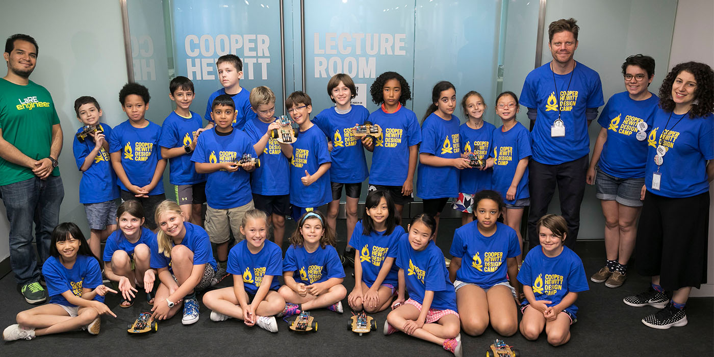
Describe the age of represented people in an image using terminology such as baby, toddler, child, youth, teen, young person, adult, older person.
Example (Alt):
Large group of youths and four adults pose smiling, all wear bright blue T-shirts that say “COOPER HEWITT DESIGN CAMP”
No assumptions should be made about the gender of a person represented. Although, where gender is clearly performed and/or verifiable, it should be described. When unknown, a person should be described using “they, them” and “person” and their physicality expressed through the description of their features, which inadvertently tend to indicate masculine or feminine characteristics. The use of masculine and feminine are problematic and should be avoided unless necessary for describing the performance of gender.
Example 1:
An illustrated pale blue convertible car with a very pointed nose and tail in profile view has its top down and a surfboard rests on the rear end of the car reflecting its shape. A blond light-skinned man wearing sunglasses turns his head away from us to look at a light-skinned blond woman standing on the far side of the vehicle leaning on the windshield with a flirtatious smile. She is wearing nothing but a skimpy red bikini and large sunglasses.
Alt: Pale blue convertible car with a surfboard on back; driver is a blonde man talking to blonde woman in a red bikini

(Gender is clearly performed in this image and is important to the content.)
Example 2:
Two people smile as they play with cranks and levers in a large-scale immersive white room with illuminated windows of brightly colored monochromatic close-up images. The person on the left, who is wearing a halter top, leans down to crank a lever as they look over their bare shoulder at the person on the right who pushes their long hair over their shoulder laughing while also turning a lever.
Alt: Two adults at play in an interactive installation
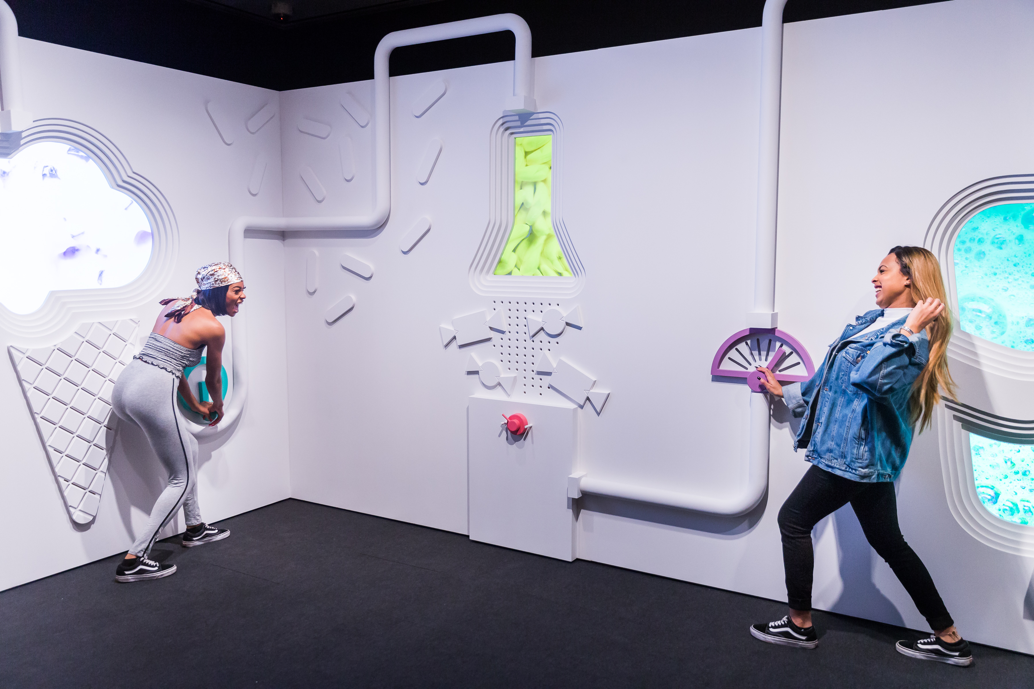
(We don’t know how these individuals identify so it is best to leave gender out and simply describe them.)
When describing the skin tone of a person use non-ethnic terms such as “light-skinned” or “dark-skinned” when clearly visible. Because of its widespread use, we recommend the emoji terms for skin tone as follows: 🏻 Light Skin Tone, 🏼 Medium-Light Skin Tone, 🏽 Medium Skin Tone, 🏾 Medium-Dark Skin Tone, 🏿 Dark Skin Tone. Also, where skin tone is obvious, one can use more specific terms such as black and white, or where known and verified, ethnic identity can be included with the visual information: Asian, African, Latinx/o/a (also see gender), etc.
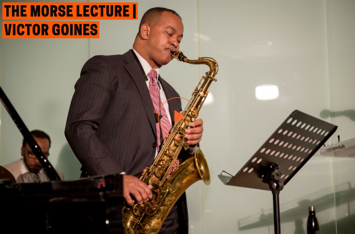
Example 1:
A medium-dark skinned man stands in front of a music stand in a pinstripe suit and a striped pink tie. His cheeks are puffed up as he blows into a brassy tenor saxophone that he holds with both hands as he presses its keys.
Alt: A man plays a tenor saxophone
Example 2:
An illustrated cartoon poster of people on a boat above a script text reading “Los Nacionales” above small block letters reading “MINISTERIO DE PROPAGANDA.” The boat is a warship labeled “JUNTA DE BURGOS/ LISBOA,” (Burgos/Lisboa Militia) and contains five people representing the enemies of the revolution, denoted by stereotypical dress and rendering. Three light-skinned men are in the foreground. The first on the left is dressed as a decorated military general who mans a canon, to his left, our right, a cardinal representing the church, and on to his left, our far right, a man wearing a suit, monocle, and swastika pin holding a bag indicating he is a fascist/capitalist. Behind them, a medium-dark skinned man is in white wearing a turban, dressed as a Moor, and to his left, our right, a medium-dark skinned man holds a rifle and wears a traditional red fez indicating he is a Turk. In the center of the boat, a map of Spain and a sign that reads “Arriba España” (an expression of Spanish support during the Spanish Civil War) hangs from a gallows surmounted by a vulture. Three armed men peer from port holes.
Alt: Illustration of people on a warship representing stereotyped enemies of the revolution in Spain

(Ethnic identity is clearly performed here, but also described.)
When describing an image of a recognizable person, identify them by name, but also describe their physical attributes. If an individual is not a public figure, and the context does not imply the importance of who is represented, it may not be appropriate to identify the individual.
Example 1 (Alt):
Portrait painting of former First Lady Michelle Obama depicts her medium-dark skin rendered in grayscale
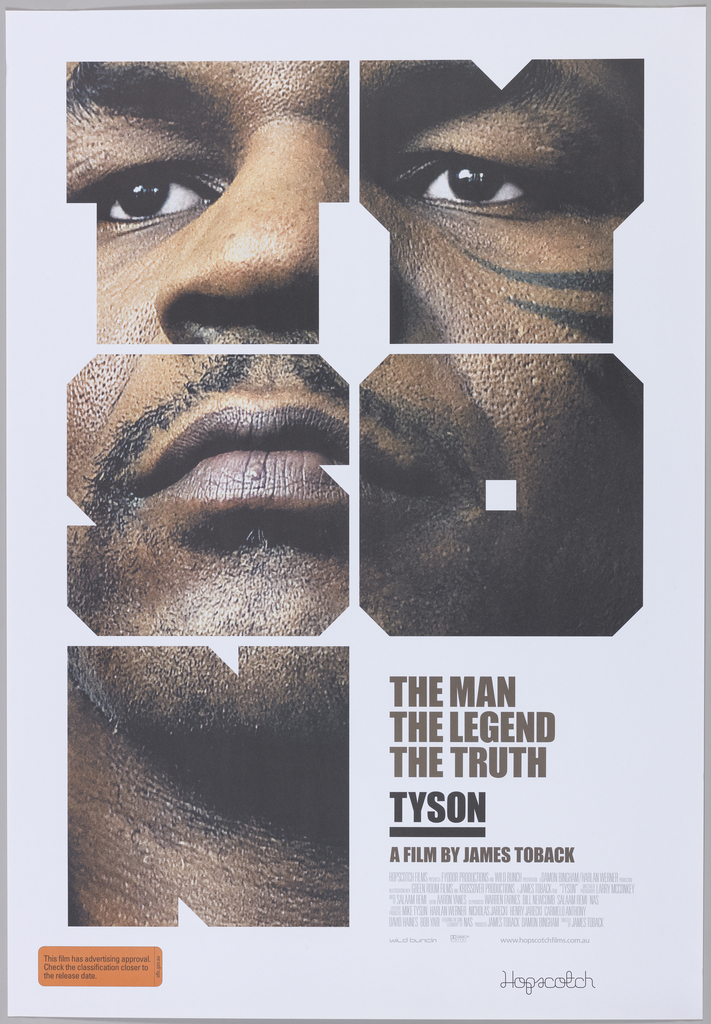
Example 2:
Mike Tyson looks out into the distance from large block letters that break up his image to spell “TYSON.” His medium-dark skin fills the parts of the image we can see completely. The black points of his face tattoo can be seen peeking in from the right side of the image. The subtitle reads “THE MAN THE LEGEND THE TRUTH TYSON A FILM BY JAMES TOBACK.”
Alt: Extreme close up picture of Mike Tyson masked by blocky letterforms spelling “TYSON”
4. Enriching description
- Alternative senses
- Reenactment and embodiment
- Metaphor
- Narrative structure
Using our senses beyond sight—touch, scent, sound, and taste—to describe elements of an image can make descriptions richer and more relatable.
Example:
A young fair-skinned woman in white Victorian dress rests in a hammock suspended in a lush green forest setting. She reads a book and her booted feet hang out of the hammock just above the lush forest floor. You can imagine the warmth of the sunlight that illuminates the edge of her legs and feet and creates a soft glow of bright green across the dense leaves that shadow the rest of her. The impressionist style of the painting is soft-edged, like a dream.
Alt: Young woman in a hammock reading
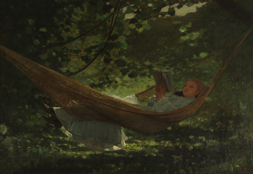
The sense of our own body can be a tool for explaining a figure’s position or the scale of an object. For instance, you can direct the reader to put themself into the pose or motion of a person depicted to provide an embodied understanding.
Example 1:
Create a loose fist with your hand so that your fingers float above your palm. Imagine that an object fills the negative space. As this object sits in your palm, your fingers rest in its soft grooves, as if it’s been molded to your hand. Its surface is smooth and full of continuously shifting depths. The object is rendered in a polished wood that would be slick to the touch.
Alt: Smooth abstract wooden form

Example 2:
This is a pair of nearly identical photographs for viewing the depicted sculpture in three dimensions with a stereograph viewer. The sculpture is a mostly nude woman draped in cloth that blows off of her as she leaps away from a sleeping figure below. You can imagine her position by raising and extending your left arm slightly above your shoulder across your body creating a twist with your torso; your right arm is also extended in that same direction. Now imagine taking a small leap so that your feet extend in the other direction as though you were leaping into the heavens.
Alt: stereographic photo representing a sculpture of a female form leaping from a sleeping woman
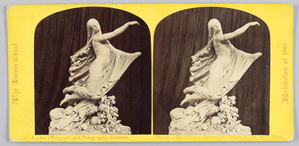
Use metaphor in description to enrich understanding of materiality and content through comparatives.
Example 1:
A small, round-edged rectangular metal form has a seam just below the top where it opens up to use the lighter. The surface is finely grooved like a comb.
Alt: textured metal flip-top lighter
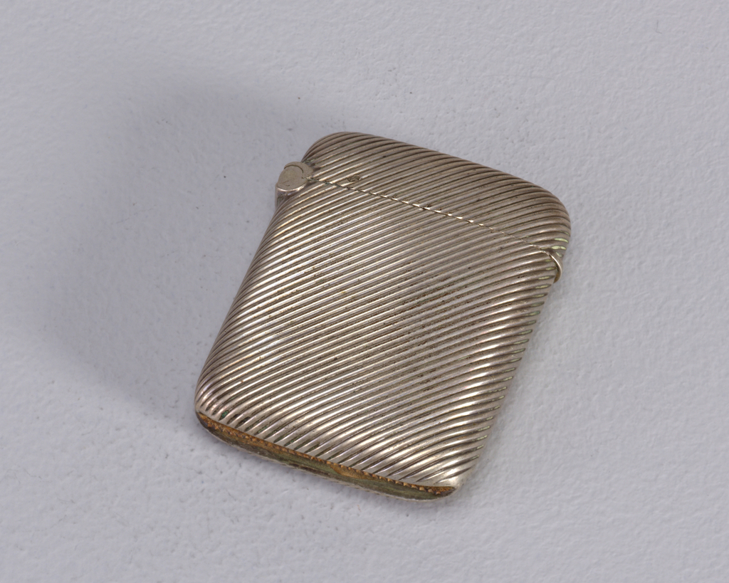
Example 2:
An intricately carved rectangular picture frame is broken into pieces. It is laid out to be pieced together like the start of a jigsaw puzzle where spaces are left for missing sections.
Alt: Fragments of an ornately carved picture frame
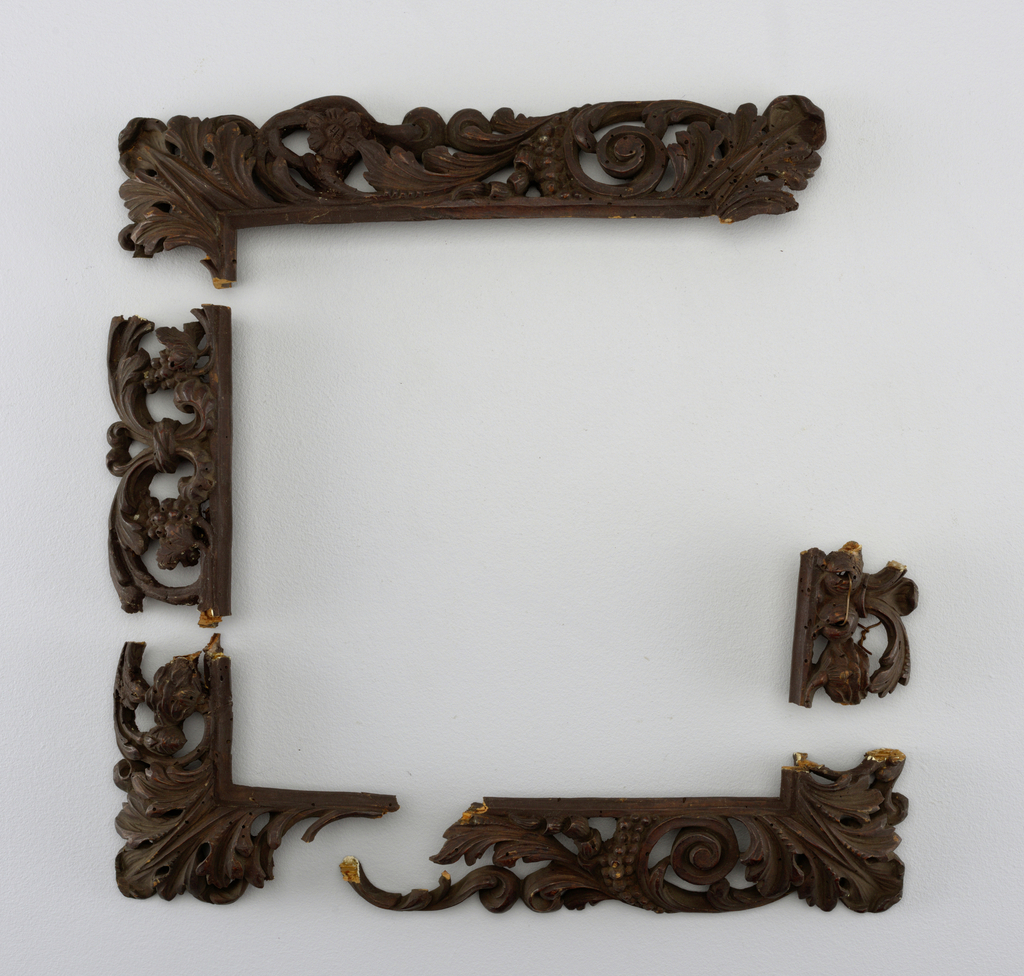
When writing a long description, one is free to use more poetic and narrative techniques to deliver a description that provides a sense of reveal, which parallels the writer’s sense of discovery when looking at an object more closely. For instance, an image at first glance may seem like one thing, but upon closer inspection reveals itself to represent something else. When writing long descriptions creating a structure that tells a story can enrich the experience for the user.
Example:
A scrolling framework twists and curls along the length of this piece of wallpaper in a dark muddy olive green on a white background. Winding along the curls of the decorative pattern are delicate fronds reaching outwards. They appear to be from a fern or palm tree. Between the framework and fronds is an unexpected sight: monkeys dressed in bright pink, blue, and green clothing are engaging in various activities. On the upper register of the repeating pattern two of them are gazing up; the one playing a lute-like instrument looks on at some blue butterflies while the other seems to be catching bubbles. Just below the two is another pair who are engaged in a sword fight from opposing sides of the frame, while the three on the lower half are all involved in their own pursuits. The monkey on the lower left side, wearing a pink frock and holding a palette, is painting a curl of the framework pink. On the lower right side, we see the monkey blowing the bubbles that would be caught by the bubble catcher in the next frame of the repeated pattern. And the crowning achievement of this motley group of monkeys is in the lower center—a monkey with its feet strapped to stilts walking a blue tightrope waving a green fan like a vaudevillian performer.
Alt: Ornate scroll forms support a group of monkeys in bright clothing engaged in various antics
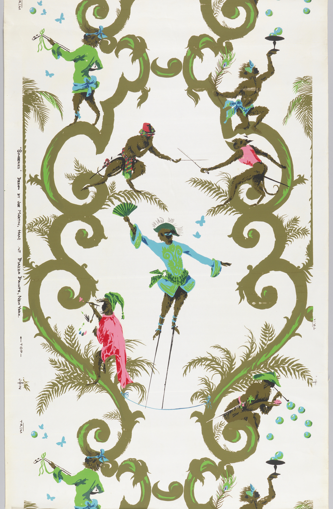
(based on the featured object article, https://www.cooperhewitt.org/2018/11/27/monkeying-around/)
5. Infographics/data visualizations
Graphic representations of data are used to convey specific information and it is important to maintain the legibility of meaningful information, therefore we recommend using The Diagram Center Image Description Guidelines. This is an indispensable set of guidelines for describing a number of data representation styles.
Resources
Art Beyond Sight Guidelines for Verbal Description
While designed for providing tours of art objects to visitors who are blind or have low-vision, these guidelines are an excellent starting point when learning about image description.
Diagram Center Image Description Guidelines
These guidelines provide great information about describing charts, maps, and technical images.
Poet Image Description Tool
A tool for describing images in ePub books produced by the Diagram Center.