2023 Winner, Finalists, and Honorable Mentions

Announcing the 2023 Winner!
Finalists Yoona (Sarah) Lee, Yoojung (Claris) Shin, Eleanor Lewis, and Rori Stanford attended a virtual Judging Weekend on June 10–11, 2023 where they learned more about design and presented their design ideas to an esteemed panel of judges: Irene, Au, Design Partner, Khosla Ventures; Kristine Johnson, Co-Founder, Executive Director of Design, Cognition Studio, Inc.; Yeshimabeit Milner, Founder & Executive Director, Data for Black Lives; Maria Nicanor, Director, Cooper Hewitt, Smithsonian Design Museum; and Eric Rodenbeck, Founding Partner, Stamen Design.
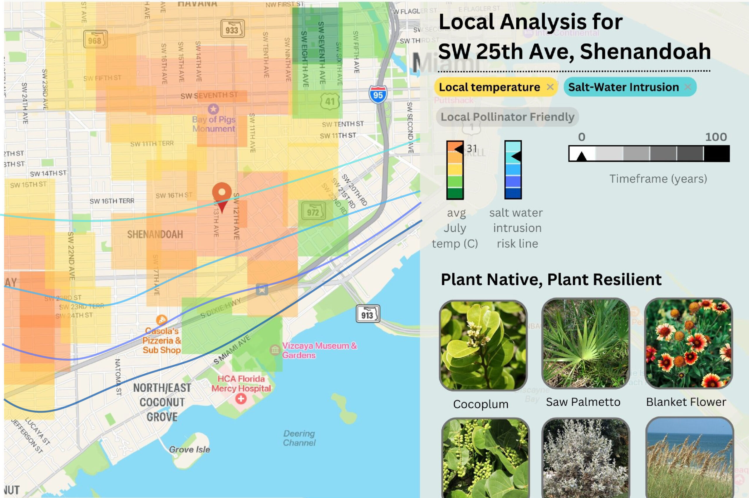
 Congratulations to Eleanor Lewis, graduating senior from Design and Architecture Senior High in Miami, FL, for being named the winner of the 2023 National High School Design Competition. Her project, Plant Resilient Miami, is a web-based tool that provides information on hyper-localized environmental conditions like heat and saltwater intrusion risk, and how they are projected to shift in coming decades. It uses this information to suggest native plant species that will be resilient to climate change, creating a greener Miami. Watch the presentations of the finalists and explore the projects of all the finalists and honorable mentions below.
MEET THE 2023 FINALISTS AND HONORABLE MENTIONS!
After reviewing 707 astounding entries from across the country, Cooper Hewitt is pleased to announce the finalists and honorable mentions for the 2023 National High School Design Competition. The 2023 competition invited teens to use design and data to support their community. Finalists will move on to the next stage of the competition full of inspiring mentoring activities. Finalists will attend an in-person Mentor Weekend at the MIT Norman B. Leventhal Center for Advanced Urbanism in Cambridge, MA. Finalists will then join a virtual Judging Weekend, where they’ll present their final designs to a panel of judges. Congratulations to the finalists and honorable mentions!
Eleanor Lewis, grade 12
Design and Architecture Senior High, Miami, FL
Teacher: Eric Hankin
I am visualizing the effects of climate change on plant life in South Florida. I designed the Plant Resilient Project’s website. It uses satellite data tracking heat islands and saltwater intrusion. Users can map where non-heat tolerant or saltwater tolerant plants will die off. This information can inform gardeners and architects on what they should plant where. My data is from heat island maps created by graduate student Oaklin Keefe using data from Landsat 8 imagery, thermal imagery analysis, and Normalized Difference Vegetation Index (NDVI) imagery analysis. I also used saltwater intrusion mapping from the NOAA South Florida sea level rise map. My website looks at a location to find plant species that will resist local environmental shifts caused by climate change. Other information, like how much saltwater intrusion can affect an area, is shown through simple graphics. Gardeners, architects, and city planners can use this website to create green spaces that improve communities in the short- and long-term. It also connects users with nearby native plant nurseries and informs them on plant care, and will help protect local biodiversity.
Yoona Lee, grade 11, St. Paul’s School, Concord, NH, and
Yoojung Shin, grade 10, Phillips Academy Andover, Andover, MA
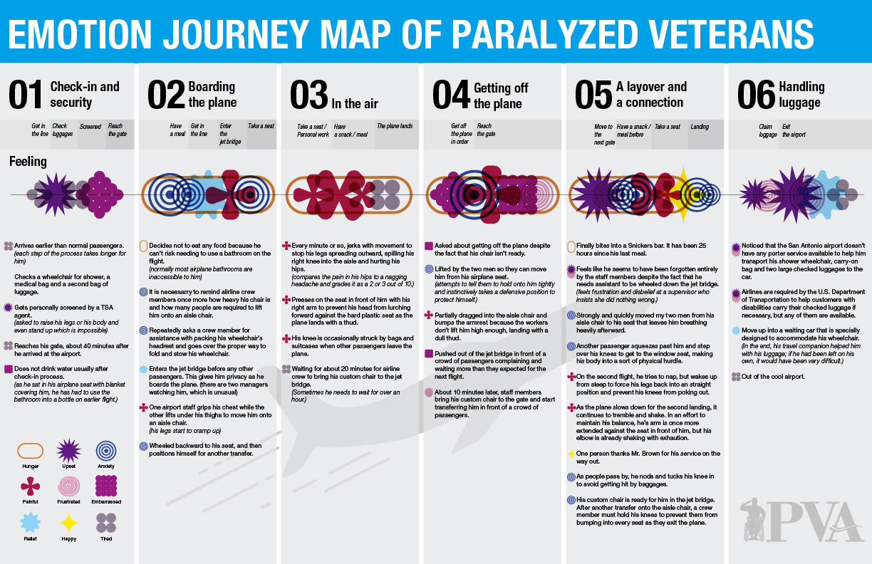
Our design visualizes the experiences of disabled veterans boarding airplanes. We used data from a New York Times article showing the hardships of Charles Brown, a paralyzed veteran. We created a customer journey map showing emotions of this veteran’s experiences when boarding an airplane. With this data visualization, we wanted to support Paralyzed Veterans of America. We represented each emotion that a disabled veteran may feel while boarding an airplane with a symbol. We analyzed each task and action during this process. We then created a pattern of overlapping emotions. This pattern becomes a sequence. Our infographic will help airplane users be more attentive and thoughtful toward all disabled fliers. Users can access this infographic through pamphlets or booklets placed in airplane seats.
Rori Stanford, grade 12
Bergen County Academies, Hackensack, NJ
Teacher: Scott Lang
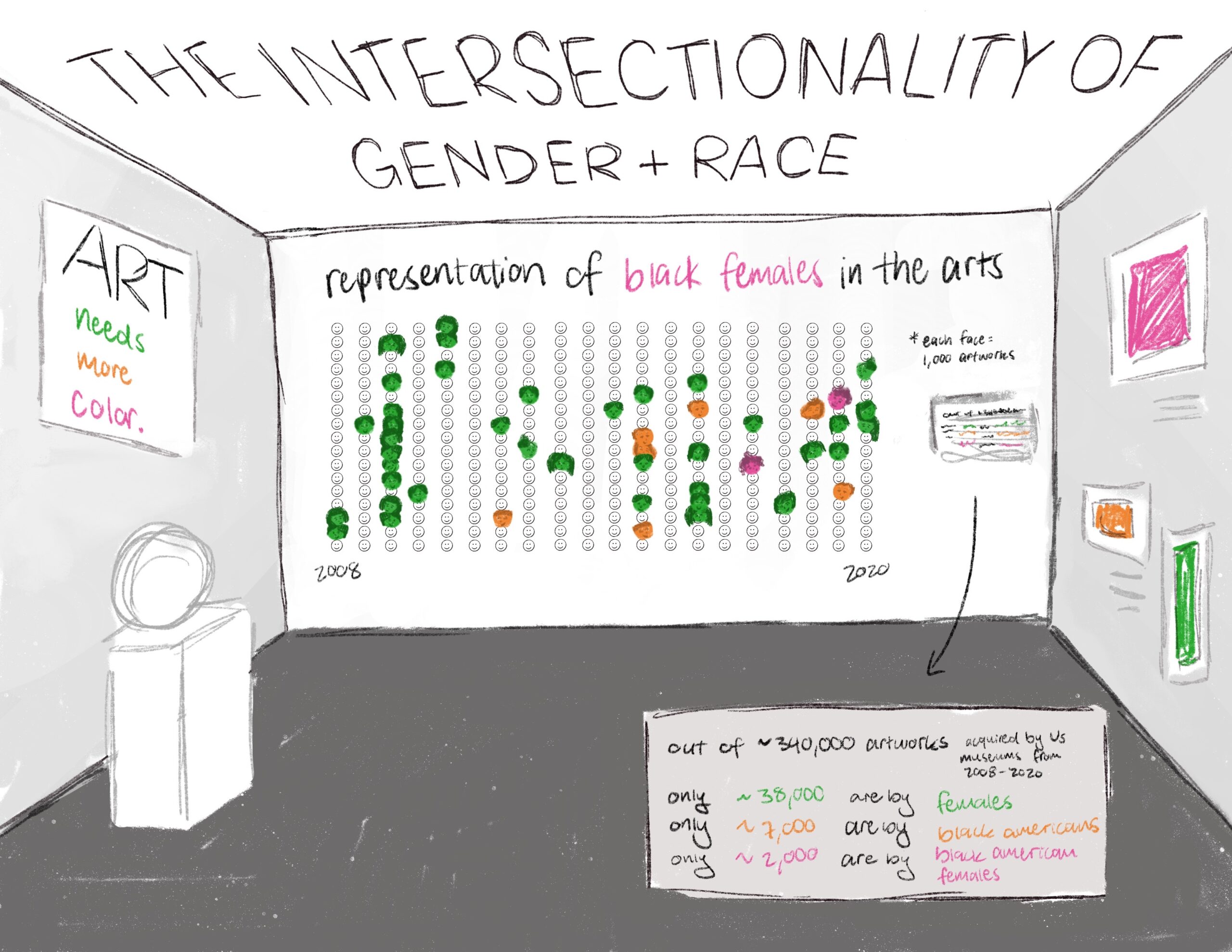
My data visualization covers the intersectionality of gender and race and specifically the lack of representation of Black women in the arts. I used data from the 2022 Burns Halperin Report. Racism and sexism still exist and individuals who experience both are hindered from making progress in this field. Making people aware of intersectionality could help change it. My design is a painted mural and key located in an art museum. Users can look from afar to see trends over time or walk closer. Each face represents 1,000 artworks. Green is for women, orange for Black Americans, pink for Black American women, and smiley faces for artists that are not women or Black Americans. This design educates artists and people interested in art on intersectionality. It would be displayed in art museums, so a user can experience my design by visiting a museum and observing. It will encourage people to talk about intersectionality, racism, and sexism today.
Aviya Afra, grade 11
Grauer School, Encinitas, CA
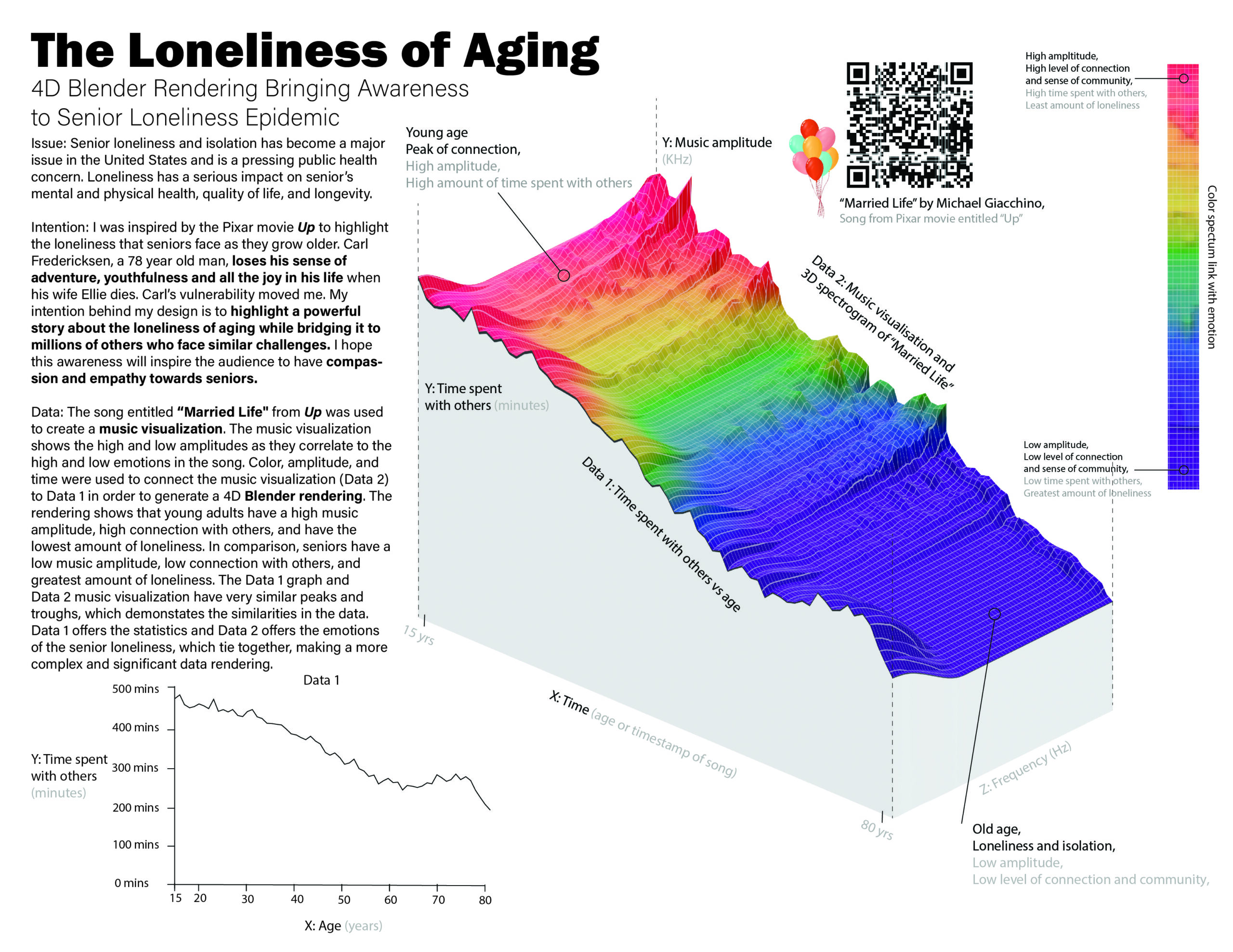
My design brings awareness to the loneliness and isolation epidemic that seniors face. It highlights a story that represents millions of seniors who lack friendship and companionship. The 4D rendering is comprised of two data sets. Data 1 shows the amount of time one spends with others throughout a lifetime from Our World in Data. Data 2 is a music visualization from a spectrogram extracted from the song “Married Life” by Michael Giacchino. I used color, amplitude, and time to connect Data 2 to Data 1 in my design. The color spectrum correlates to emotions of loneliness throughout one’s lifetime. The blues and purples represent feelings of loneliness and isolation in seniors. My design brings seniors together, providing them with the comfort that they are not alone in these feelings. It also inspires compassion and empathy in younger generations. This will raise awareness and motivate young people to connect with seniors. Regardless of gender, race, or religion, my design can bridge generations.
Sarah Basil, grade 12
Bergen County Academies, Hackensack, NJ
Teacher: Scott Lang
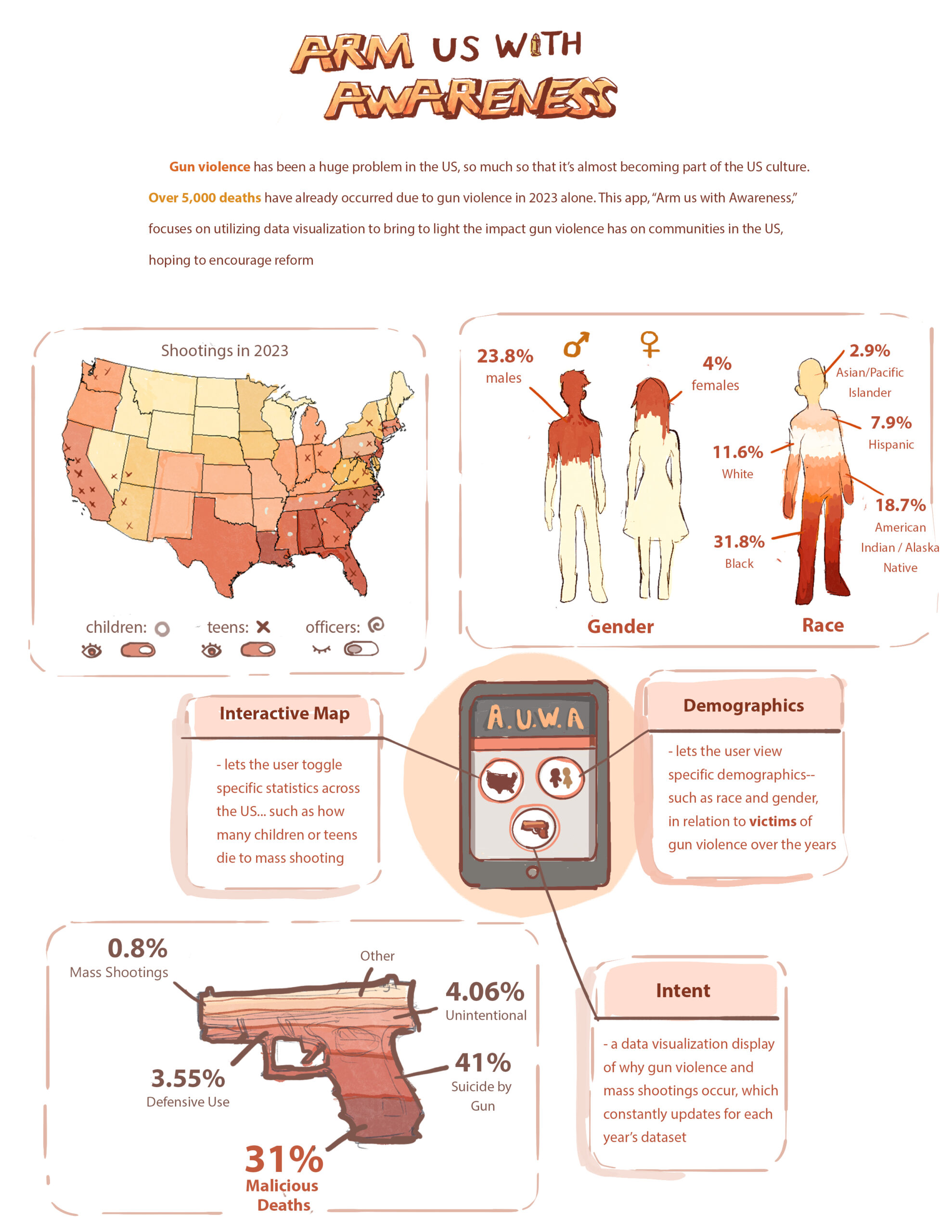
Gun violence is becoming more common. Anyone could fall victim to having their lives cut short by these tragic incidents. My design is an app called “Arm Us With Awareness” that addresses gun violence in the United States. It highlights important statistics, such as shooter intent and demographics of victims. I researched gun violence statistics in the United States through the Gun Violence Archive. I also used data from the Kaiser Family Foundation and the Centers for Disease Control and Prevention. My app displays different data visualizations of gun violence. I utilized a cohesive color palette and simple design. I used common symbols (gun pictograph, different people, identifying icons) to show the impact of gun violence on communities. Users can download the app to get updates and interactive graphics on gun violence. The statistics and interactive elements raise awareness on gun violence among communities.
Vera Giraudo, grade 10
Avenues The World School, New York, NY
Teacher: Gretel Schwartzott
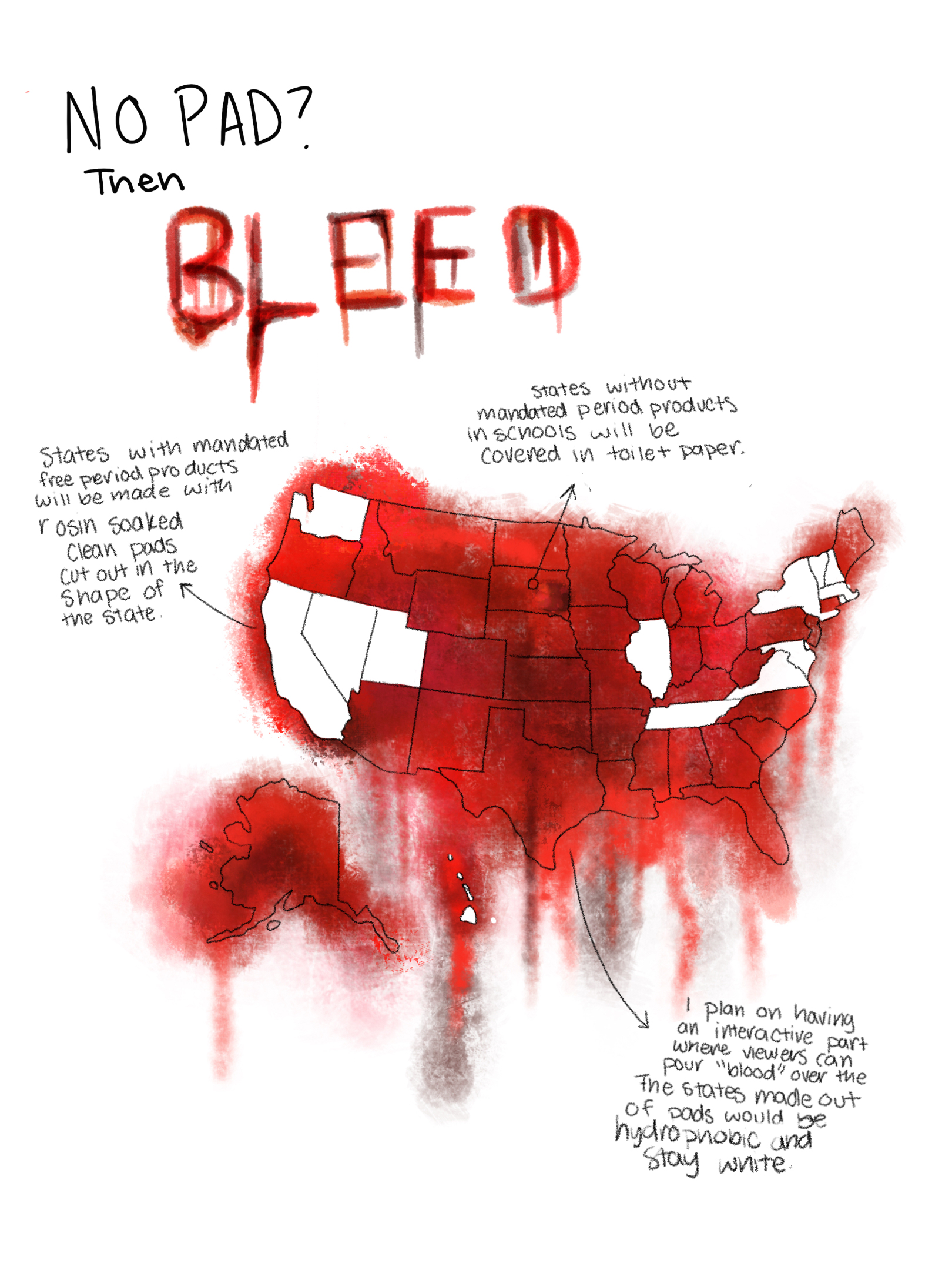
My design shows which states have mandated free menstrual products in schools. A study found that 80% of menstruating teens said they have missed class time because they did not have access to period products. One’s education should not be interrupted because there is no access to necessary health products. I found the data I used from the Alliance for Period Supplies. Data can also be gathered from each state’s legislation. I created a design that was visually striking to catch the attention of viewers. I did this by recreating a shocking material in my work: blood. An important part of my design is that the blood looks realistic and striking, while still normalizing period blood. Period poverty is a global issue that everyone, regardless of whether they menstruate, should care about. Non-menstruators do not face issues like these every day, so it is my goal to bring this issue to everyone. To do this I will display my piece in communal places.
Grace Guo, grade 11, and Jane Martens, grade 11
Carmel High School, Carmel, IN
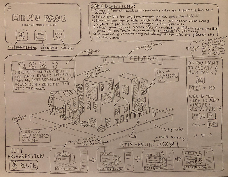
We are presenting data on social determinants of health (SDOH)— economic stability, physical environment, education, food access, community, and health care—in the context of a single city, over five decades. We will show audiences the impact of SDOH in a community. SDOH affect the conditions of every citizen with different outcomes and risks based on which SDOH are prioritized. We are primarily using data from the Office of Disease Prevention and Health Promotion at the U.S. Department of Health and Human Services, the World Health Organization, and the Centers for Disease Control and Prevention. The game layout of City Central allows players to act as a supervisor of city development and choose which SDOH to prioritize. The game layout will include a street view and map. An inventory will show what institutions are established. Pop-ups will show the city’s score based on SDOH metrics every five years. City Central will be an easily available online game with single and multiplayer options. Our design would educate audiences in an accessible way about the impacts SDOH have on even small communities. It shows local and national audiences how non-medical factors impact the health of individuals and communities and should be valued.
Amelia Kiefer, grade 12
Design and Architecture Senior High, Miami, FL
Teacher: Eric Hankin
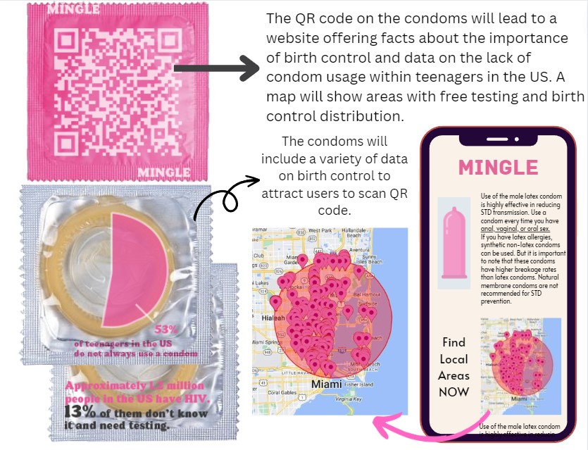
I am presenting data on the lack of condom usage and other birth control by students. I want to show students why birth control is so important by discussing the impacts of not using condoms, regardless of sexual orientation. This will help teenagers who lack proper sexual education. I found my data from news articles discussing how teenage birth control usage has dropped in recent years. I also looked at official government websites, such as the Centers for Disease Control and Prevention and the World Health Organization, that explain the importance of birth control. My design will include a pie chart on the packaging of condoms to show the consequences when they are not always used. This will entice students to scan the QR on the other side. It will share data and raise awareness that lack of condom usage can lead to an increase in STDs and pregnancy. A map will show locations offering birth control and testing. These condoms would be distributed to local high schools. The map can be expanded to other counties and states.
Tiffany Kurniawan, grade 9
Granada Hills Charter High School, Granada Hills, CA
Teacher: Jackie Ying
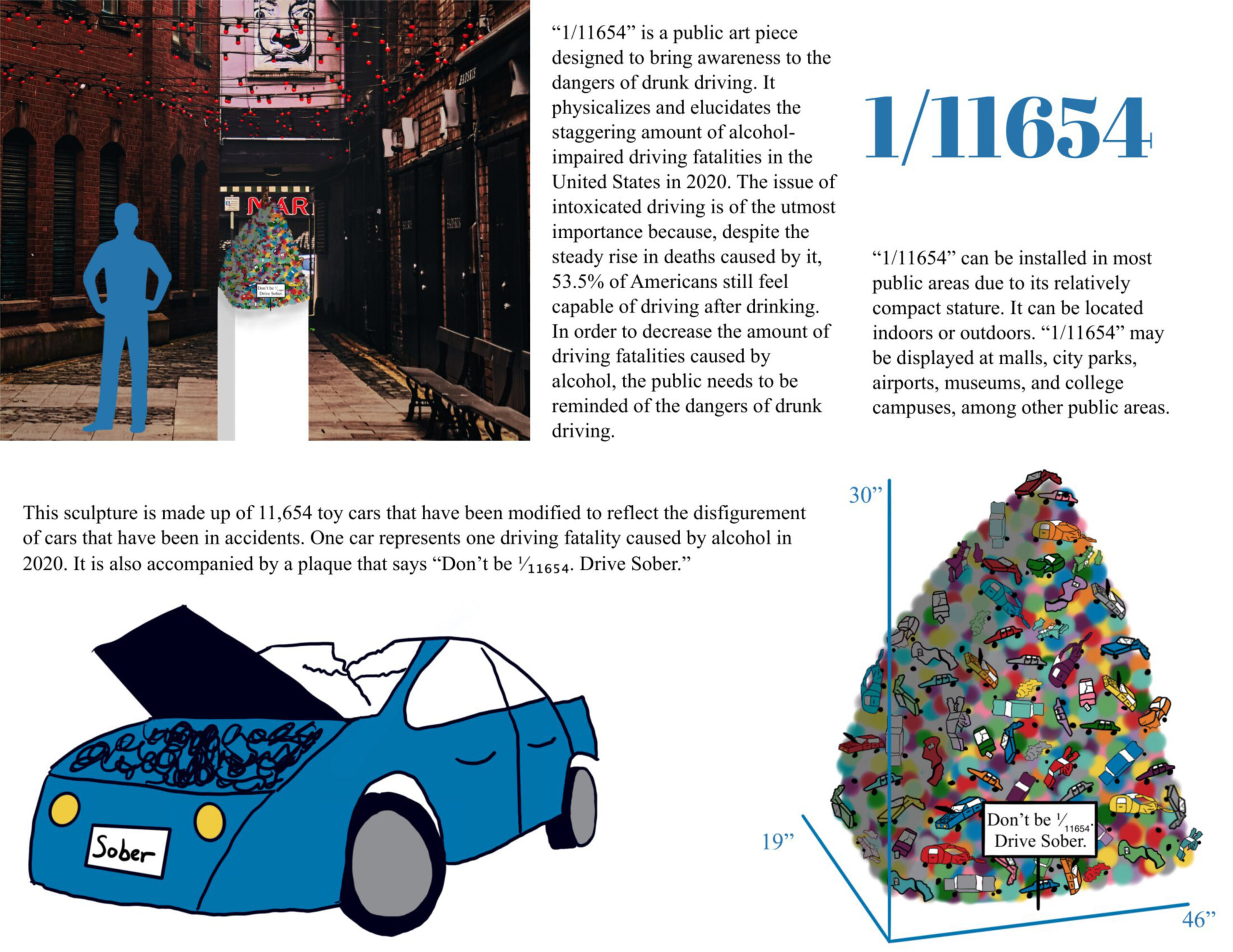
In 2020, 11,654 Americans died in alcohol-related driving accidents, which makes up 30% of all driving fatalities. Despite this problematic statistic, 53.5% of people believe that they are capable of driving after drinking. To decrease alcohol-impaired driving fatalities, people must understand the true horrors of drunk driving. The data I am visualizing is the National Highway Traffic Safety Administration statistics of motor vehicle crashes in 2020. The dataset includes an analysis of how behavioral factors, such as alcohol-impaired driving, affect fatality trends. Additionally, I used the American Addiction Centers’ website to learn about the attitudes and habits of drunk drivers. “1/11654” is a colorful public art installation that brings awareness to the risks of alcohol-impaired driving. This eye-catching design depicts each alcohol-impaired driving fatality as a 1/64 scale car, modified to reflect a post-collision car. The sculpture is accompanied by a plaque that says, “Don’t be 1/11654. Drive sober.” Through awareness, my design will help decrease the amount of people killed by alcohol-impaired driving. As the sculpture can be set in most public areas, it could make a worldwide difference.
Jaime Lai, grade 11
Dwight-Englewood School, Englewood, NJ
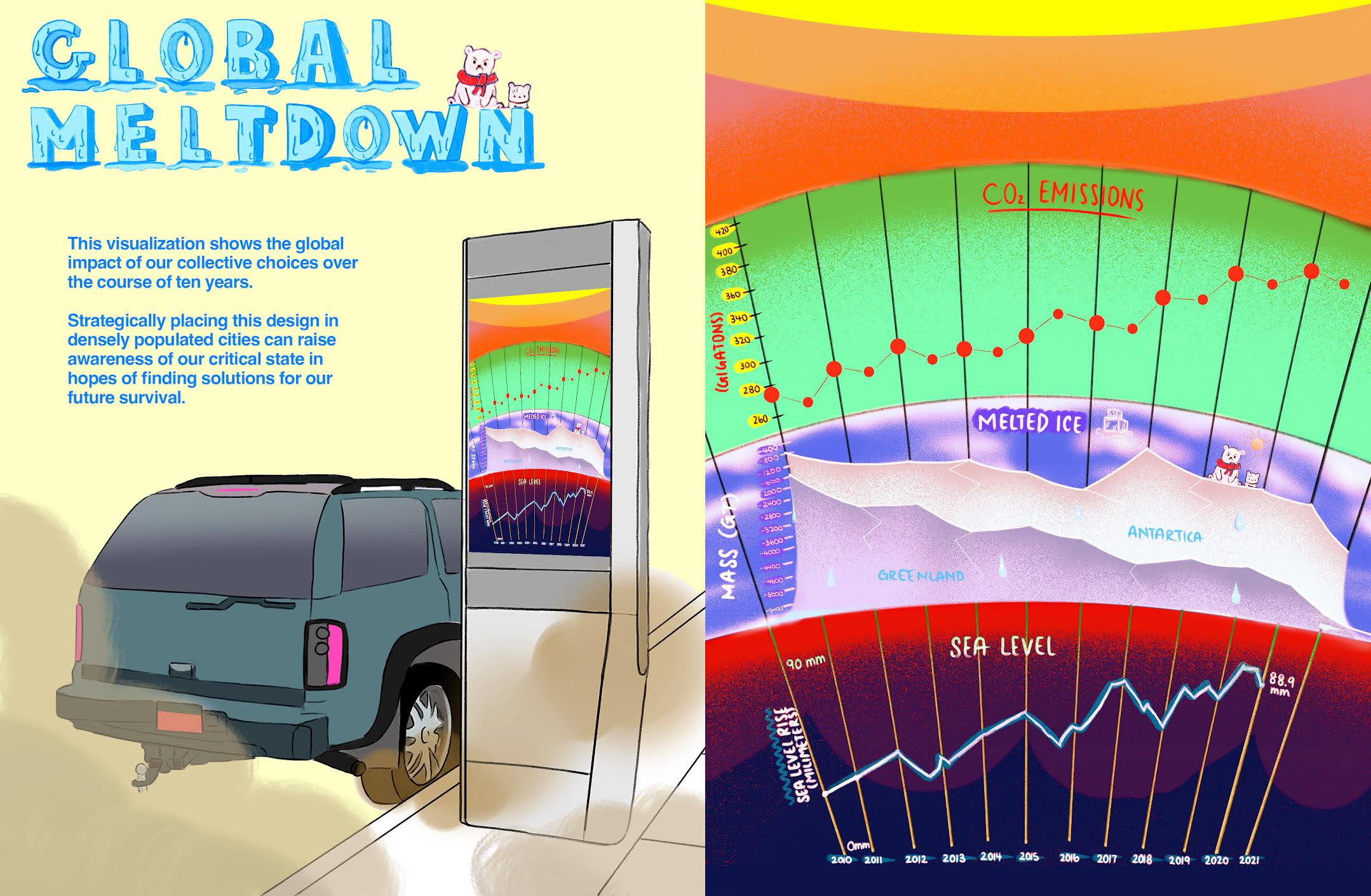
My data visualization shows the amount of CO2 emissions, glacier mass loss, and sea level changes over the past ten years. This shows the severity of climate change which affects so many forms of wildlife and our human population. My visualization can help raise urgency in reversing our collective mistakes. I researched various data sets from sources tracking CO2 emissions, glacier mass loss, and sea level changes from resources provided by NASA. My design consists of three parts: CO2 emissions, melted ice, and sea level. CO2 levels are measured in gigatons, ice mass in tons, and sea level changes in millimeters. All graphs are split into the years symbolizing the planetary scale changes over time. This design will be displayed on parking kiosks in busy cities where air pollution is severe. The visualization will make people more aware of the global impact of our choices and inspire them to find alternative energy sources and solutions.
Miller Roberts, grade 10
Westlake High School, Austin, TX
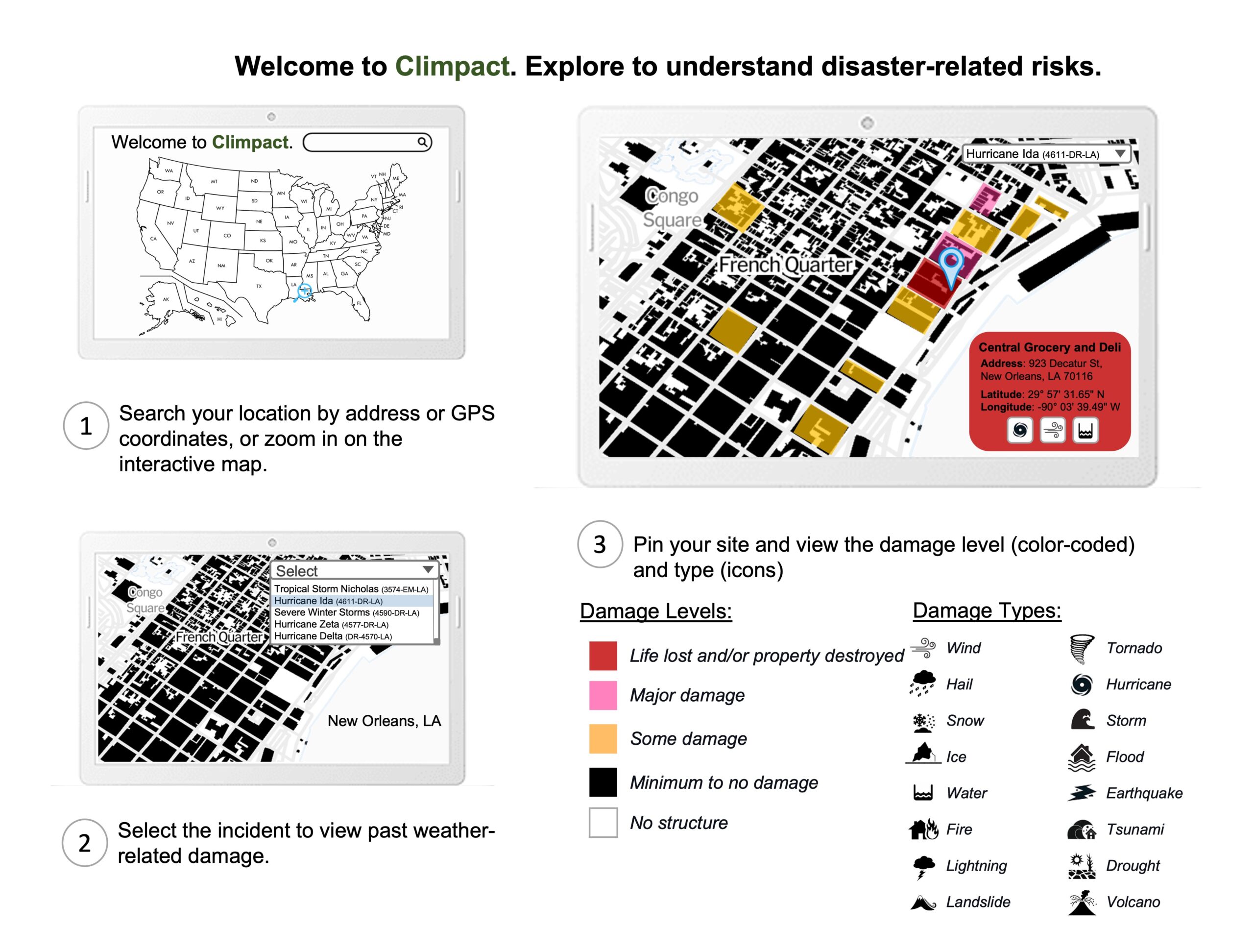
Climpact is an interactive mapping system that allows users to view locations and determine the impact of damage from past major weather-related disasters. I used data from open building footprints datasets in the United States. I looked at FEMA for data on natural disasters from 1953 to today. FEMA also shows information on support provided and scale of damage for natural disasters. In Climpact, you can select a location to update the map and display sites in the area and a related disaster list. Picking an incident refreshes the map to reflect the level and type of damage with color coding and icons. For example, choosing Hurricane Ida shows Central Grocery in red with the relevant icons. Users worldwide can make better decisions on where to live, study, work, and visit. Businesses and governments can determine where to invest and promote growth. They can also help deter people from moving to a specific area. Climpact increases climate change awareness by allowing users to interact easily with geospatial and weather event data.
Eiliyah Sarowar, grade 11
Bergen County Academies, Hackensack, NJ
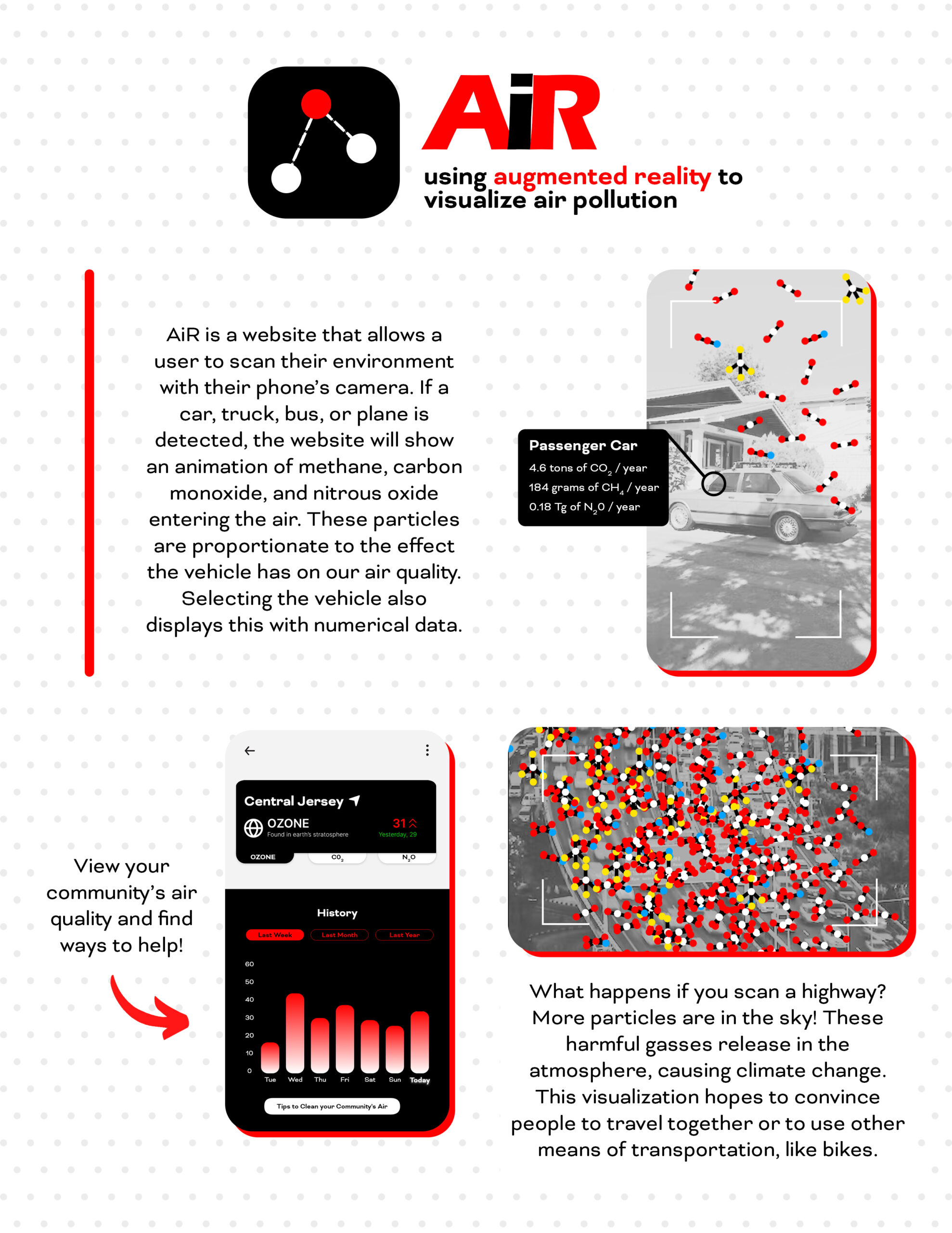
AiR presents data on vehicle emissions and their impact on the environment and climate change. My design calls attention to the harmful particles that enter our air. It aims to educate people on the negative effects common vehicles have on our planet. This is a problem that affects all life on earth. My design uses data on the greenhouse gas emissions of an average car from the U.S. Environmental Protection Agency. The data on the air pollution of Central Jersey is from New Jersey’s Division of Air Quality. AiR is a website that uses augmented reality to scan different vehicles and display an animation of air pollution. This shows users the normalized and invisible, yet damaging particles from cars or aircrafts that contribute to our atmosphere. For visually impaired users, the phone will emit rapid vibrations alongside the animation. This website will be free and accessible to anyone with a mobile device with a camera around the world. It will raise awareness of an important topic. My design will encourage people to consider other means of transportation, like carpooling or riding a bike.
Robin Suh, grade 9
Tenafly High School, Tenafly, NJ
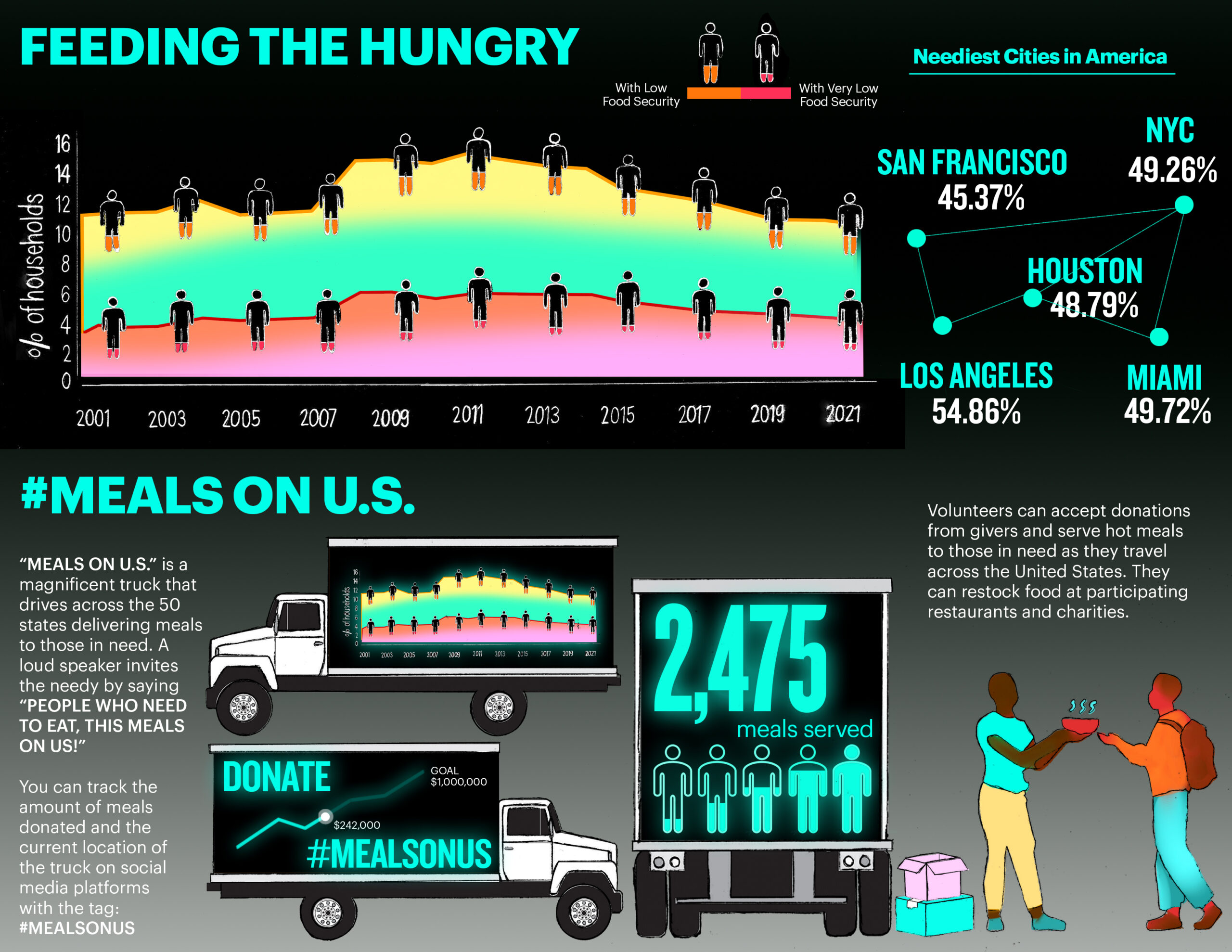
My data shows the percentage of households with low food security in the United States. This can help us understand the needs of others and provide a way to donate through a trackable food truck. I want to impact donors and recipients by providing awareness and methods to help. My main data is from a USDA Economic Research Service report on household food security. I also researched cities with the highest need to highlight the most critical areas in our country. My main graph shows the percentage of households with low and very low food security in the past 10 years. The figures representing the points on the chart are shown as orange and red empty human symbols indicating their critical condition. My design is displayed as LED screens on a traveling donation truck. The screens also show how many meals are delivered through my campaign called #MealsonUS. Users can track this information and the location of the truck through social media updates. This will encourage involvement in donating across the country.
Emma Wong, grade 10, and Alice Zhou, grade 10
Miramonte High School, Orinda, CA
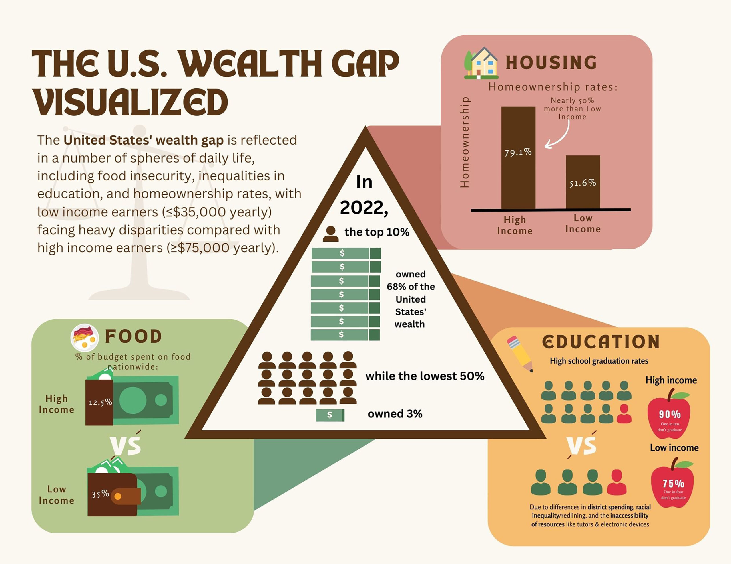
We visualized the large wealth gap in the United States. We compared low- and high-income populations’ food budgets, graduation rates, and homeownership. These elements of daily life are often taken for granted. We gathered our data from the National Center for Education Statistics, College Board, U.S. Census Bureau, USDA Economic Research Service, and Statista. The center triangle in our design shows the unequal national wealth distribution using icons of people and money. Three tabs show inequalities in food spending, homeownership, and graduation rates. Our design is a call to action. We want to highlight the huge effects of the national wealth gap. Visualizing our data in a digital, easily accessible model helps users better understand this information. Users will be inspired to learn more and advocate for policies that address the wealth gap and work toward an equitable society.
Katie Yang, grade 12
Paul Laurence Dunbar High School, Lexington, KY
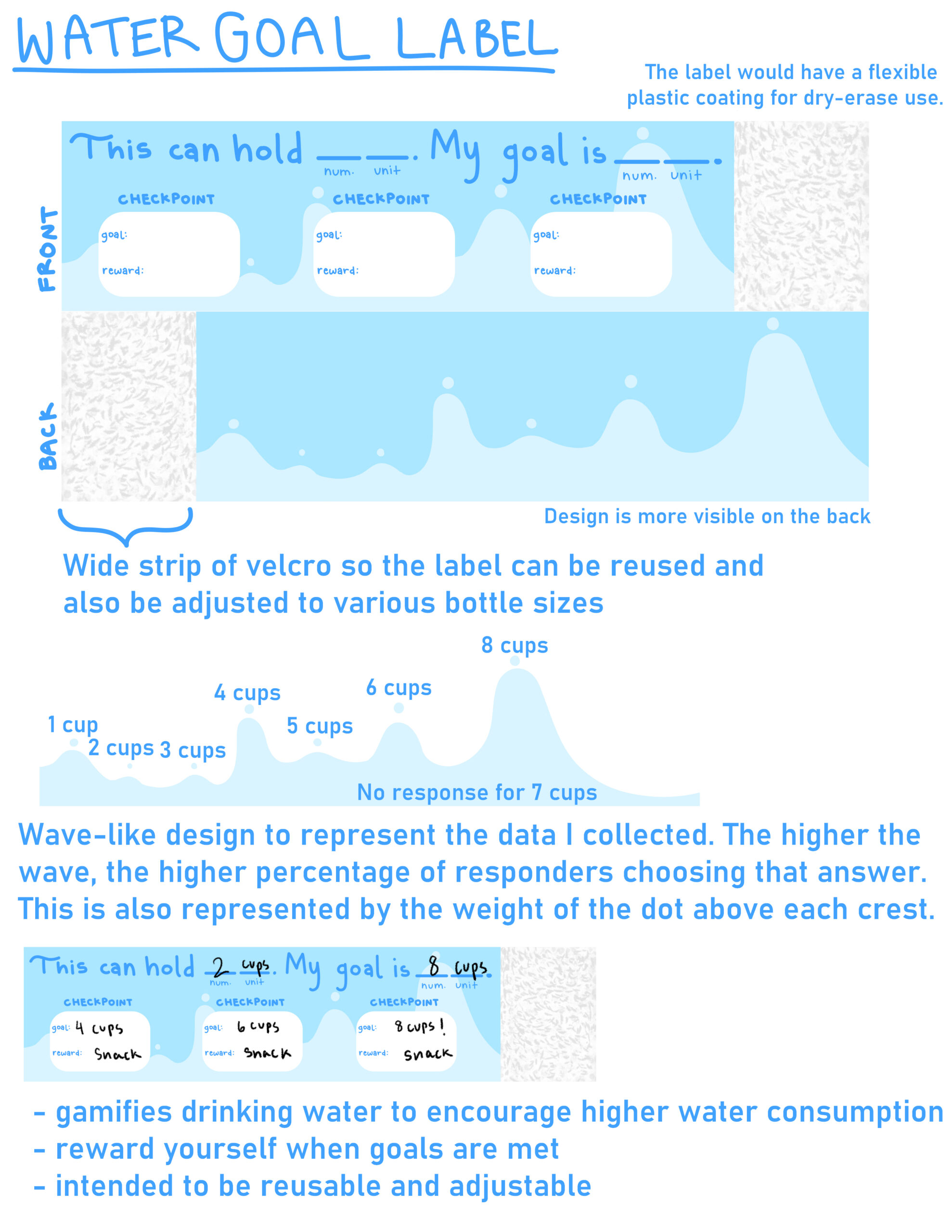
I am presenting data on the amount of water that teenagers in my community drink daily, from one to eight cups. The majority (66.6%) of survey responders drank less than eight cups daily. Maintaining your physical and mental health is important, especially during adolescence. Drinking enough water can help achieve this. I collected the data myself through a Google Form. Since I wanted to observe the water intake of teenagers, I sent the form to peers in my grade as well as a few who were not in my grade. My design is a water bottle label, with the background being my visualization of the collected data. Each wave is a certain percentage of responders, from one cup to eight cups. This gamified experience of drinking water with goals and rewards empowers people to get in the habit of drinking the daily recommended amount of water. The design is accessible to everyone and can be reusable. It can impact anyone who may need to drink more water.
