The worlds of design and writing collide in this exploration of published work by LGBTQIA+ individuals.
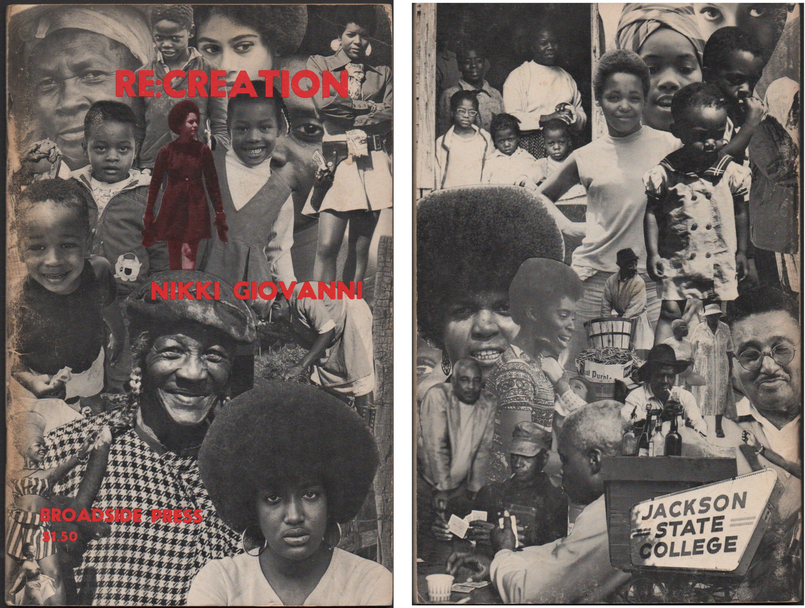
Broadside: A single sheet of paper printed on one side only. For centuries, broadsides were a popular ephemeral format for distributing news, announcements, advertisements, or commentary in the form of ballads. Between 1966 and 1975, Broadside Press in Detroit, Michigan published 81 books and dozens of poetry broadsides written and designed by Black writers and...
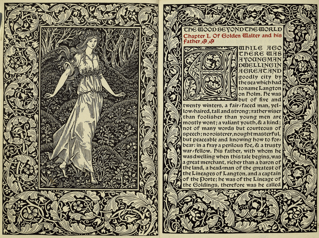
William Morris’s The Wood Beyond the World (1894) relates the adventures of Golden Walter, a man who seeks to escape his mundane life and sets out on a sea voyage, eventually gaining control of the kingdom of Stark-Wall and the love of a beautiful maiden. The book was published by the Kelmscott Press, a private...
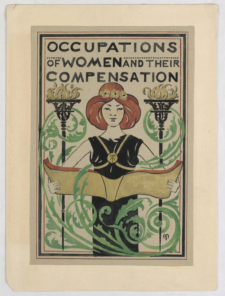
The career of Alice Cordelia Morse reflects the changing role of women in art and society in the late 19th century. Morse was able to achieve success in many artistic fields, designing book covers, illustrations, and stained glass, while also experimenting with other decorative media such as china painting and needlework. Although this title-page design was...
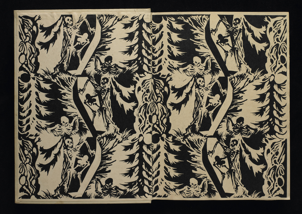
Arthur Rackham created this captivating endpapers design for Edgar Allan Poe’s Tales of Mystery and Imagination, published in London by George G. Harrap & Co. in 1935. The book brings Poe’s tales of horror and suspense—including such favorites as “The Tell-Tale Heart,” “The Cask of Amontillado,” and “The Pit and the Pendulum”—together with the expressive...
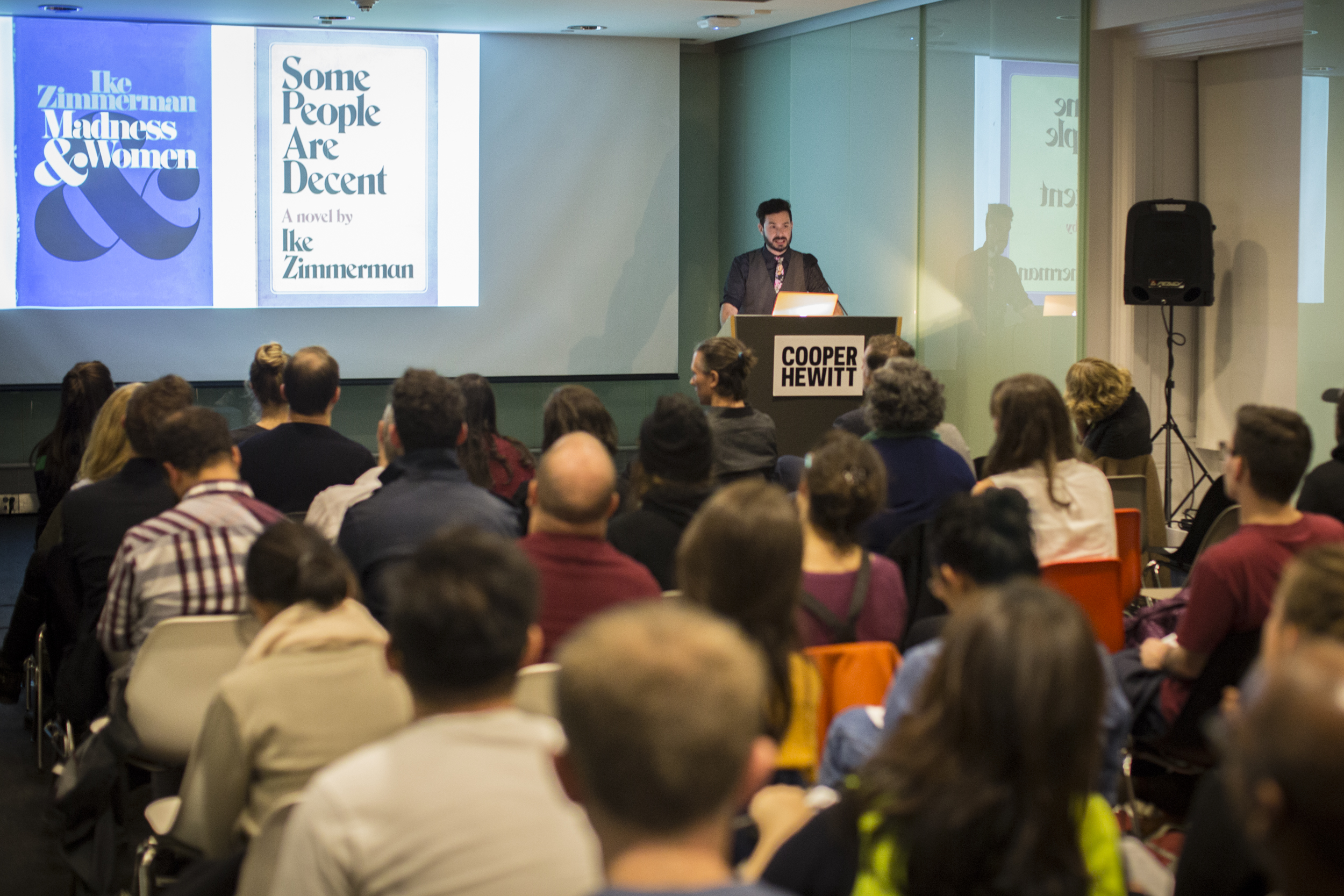
Test your knowledge and explore the role of storytelling in the design process in a delightful evening of short talks and trivial disputes. Cooper Hewitt curator Ellen Lupton discusses her new book, Design Is Storytelling, a guide to narrative thinking for designers. Also on deck: Peter Mendelsund, a brilliant graphic designer and prolific writer who brings...
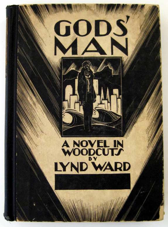
Cooper Hewitt Smithsonian Design Library librarian Elizabeth Broman discusses a 1929 American wordless novel.
Paul Rand was an influential American graphic designer well known for the logos he created for IBM, UPS, ABC and other corporations. His 1947 book Thoughts on Design is considered a seminal text on graphic design. The poster above shows something different from Paul Rand’s oeuvre. It’s not a neat and compact corporate logo; instead...
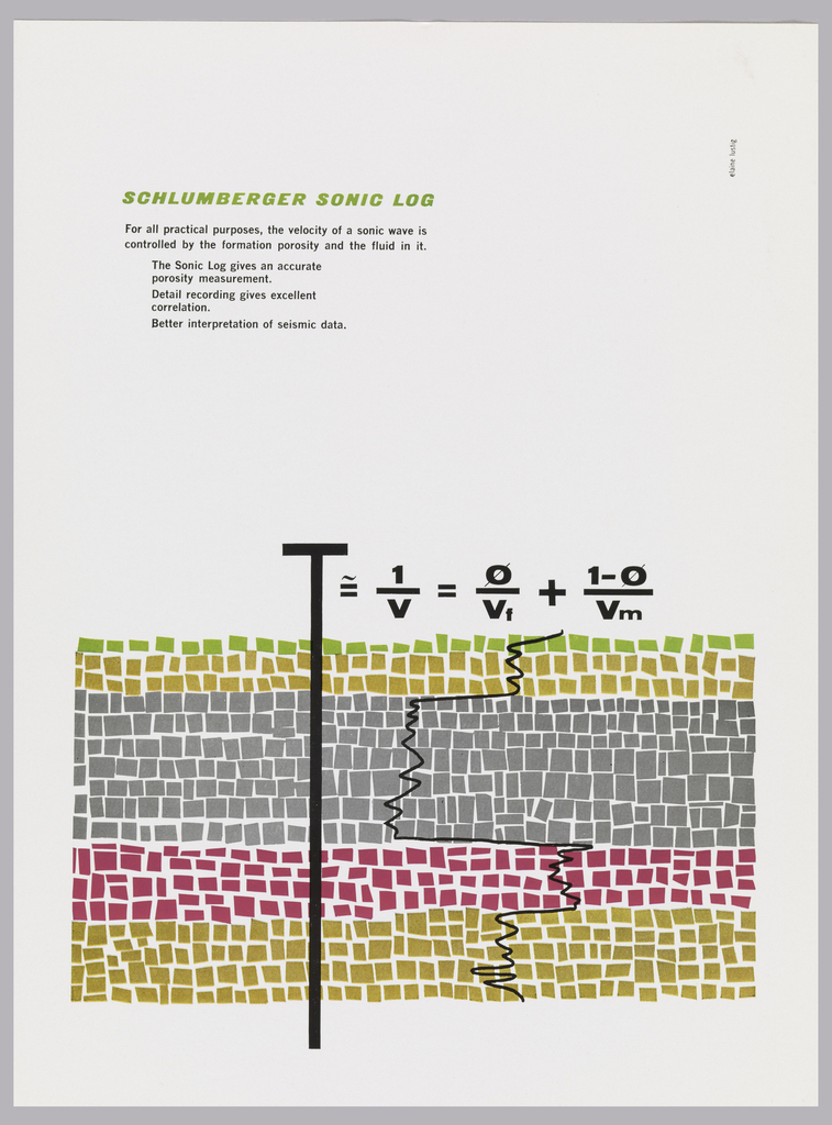
At first glance, this graphic field of squares looks almost like an abstract painting. Although this advertisement targeted scientists, designer Elaine Lustig Cohen captures the attention of laypeople and experts alike. Created in 1958 for the oilfield services company Schulberger, the ad promotes the company’s Sonic Log, a device for the identification of soil properties....
