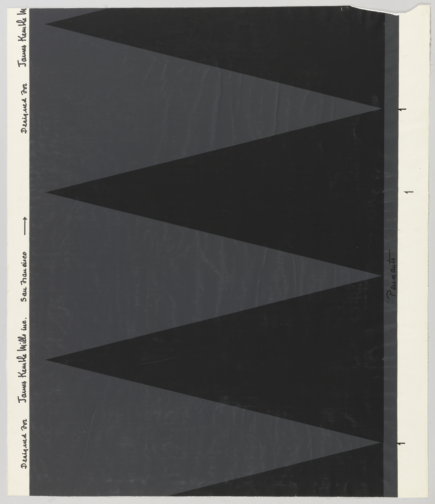
I came across this unusual mid-century paper that I thought was designed for use as a focal wall, a very common wall treatment of the period. Initially I passed it by, thinking it was not interesting enough for an Object of the Day blog, but then I found an advertisement in an Interiors magazine that...
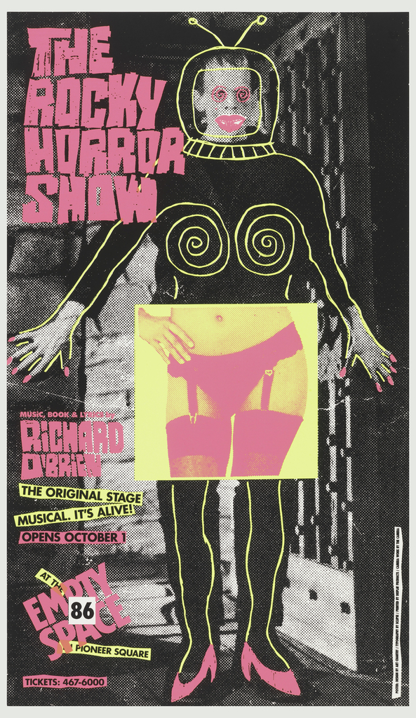
Art Chantry’s posters from the 1980s combine simple collage techniques with low-cost printing. Chantry often cut images out of magazines and catalogs, photocopying them to create high-contrast images that he could put together into arresting illustrations. Each poster uses mass media to comment on its own idioms. According to designer Art Chantry, this poster...
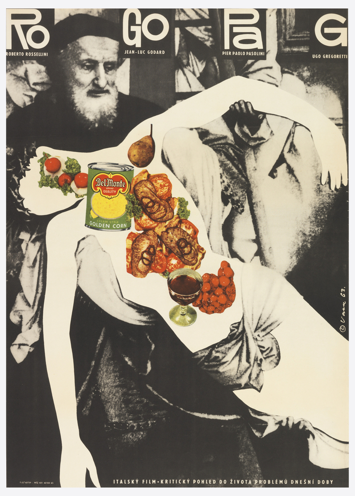
Since the Dada revolution, designers and artists have chopped up glossy magazines in their search for raw materials. To create this poster for a festival of contemporary avant-garde films, the designer cut away the body of Christ from a blown-up of a Renaissance painting. The blank space where the body used to be becomes a...


