The typography in Du Bois's data visualizations was composed of simple lines for efficient transcription and has inspired contemporary designers.
This week’s posts feature case studies from Cooper Hewitt’s Digital Collections Management Project, a conservation survey of born-digital and hybrid objects in the permanent collection. The two-year project was coordinated by an in-house team of conservators, curators, and registrar, and was conducted by digital conservation specialist Cass Fino-Radin and his team at Small Data Industries....
Responding to migrant deaths along the Arizona-Mexico border due to dehydration, minister Robin Hoover (along with former Navy engineer Tim Holt) designed a system for placing water in the desert. Their project, Humane Borders Water Stations and Warning Posters, is featured in the exhibition By the People: Designing a Better America, curated by Cynthia Smith, Curator...
“Data is always gathered at a certain time with purpose; and to be useful it must be mined, parsed, and presented. Each step of this process involves decisions about what to omit and what to prioritize. Yet the end result, the visualization, carries an authority, timelessness, and objectivity that belies its origins.”[1] – Peter Hall...
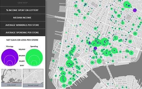
In 2012, math professor Laurie Rubel developed, with support from the National Science Foundation, the City Digits project to help high school students learn math by examining urban injustices in their own New York City neighborhood. Partnering with civic designer Sarah Williams, the team designed a set of place-based learning tools to integrate richer data...
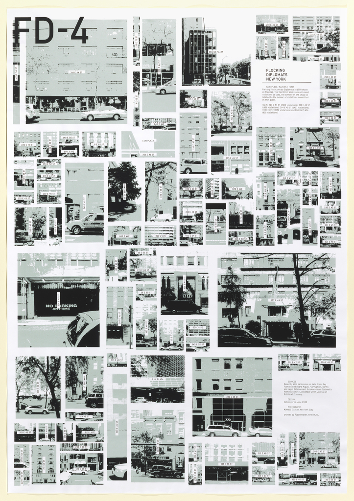
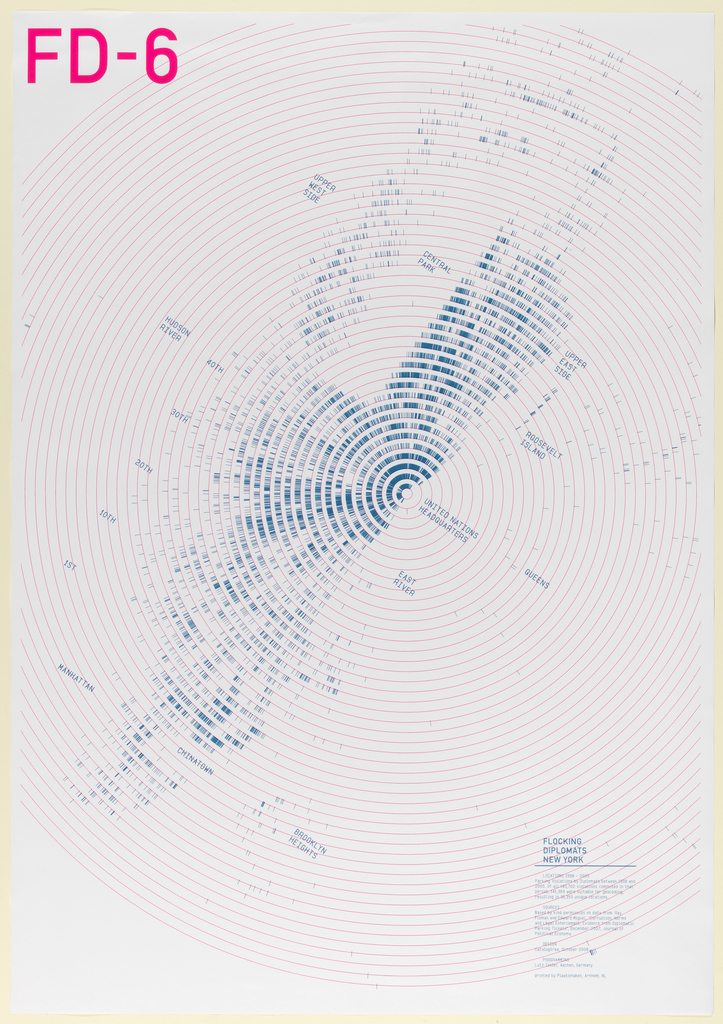
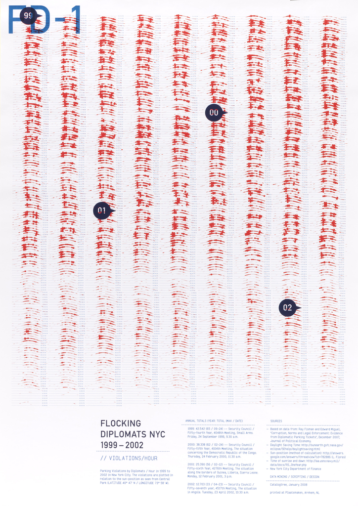
This is the last of six posters in the Flocking Diplomats series by Joris Maltha and Daniel Gross, founders of design firm Catalogtree. Each poster in the series of information graphics is a different visual representation of the same set of data, allowing the viewer to engage with the information through a different lens each time. Posters focus...
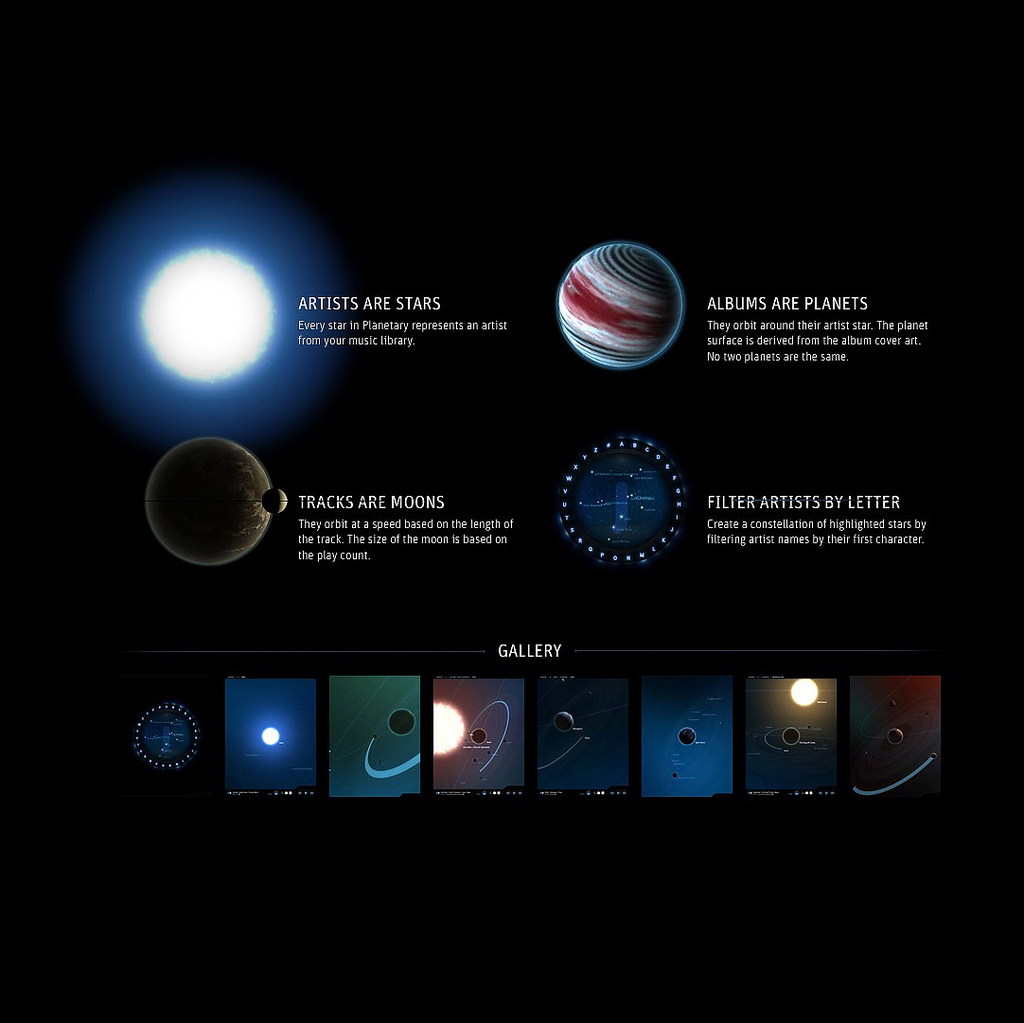
In 2013, Cooper Hewitt acquired the iPad music application Planetary, developed by Bloom Studio Inc., along with the underlying source code. The code was freely released to enable developers to build upon and incorporate it into other software design. Planetary represents an important branch of interactive data visualization, which was a first in the consumer...
Data visualization is the art and science of creating graphic representations of numerical data. The Flocking Diplomats series consists of multiple visualizations of a rich body of data concerning the parking violations of international diplomats in New York City. This conceptual project employs the poster as a research tool, much as “posters” are used in...
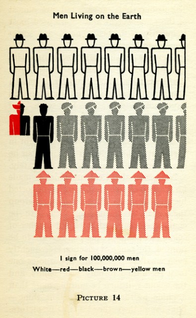
Without much thought or effort, I’ve been reading images inspired by Otto Neurath’s International Picture Language for most of my life. No doubt you too have encountered derivatives of these informative symbols which can be found across the globe and online, from airport signage to The Noun Project. Considered an early pioneer of infographics, Neurath...

