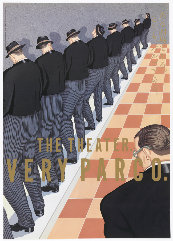
In celebration of Women’s History Month, March Object of the Day posts highlight women designers in the collection. Today’s blog post was written by Kristina Parsons and originally published on March 17, 2014. Eiko Ishioka was a prolific and revolutionary designer. She contributed enormously to the fields of art direction, graphic design, production, as well as costume...
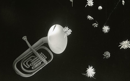
In last month’s Short Story, Matthew Kennedy paraded us through the theatrical follies of the Hewitts, as well as the vivid and varied theatrical design collection of Cooper Hewitt. This month, Emily Orr, Cooper Hewitt’s assistant curator of modern and contemporary American design, introduces us to the chic and imaginative world of store window displays...
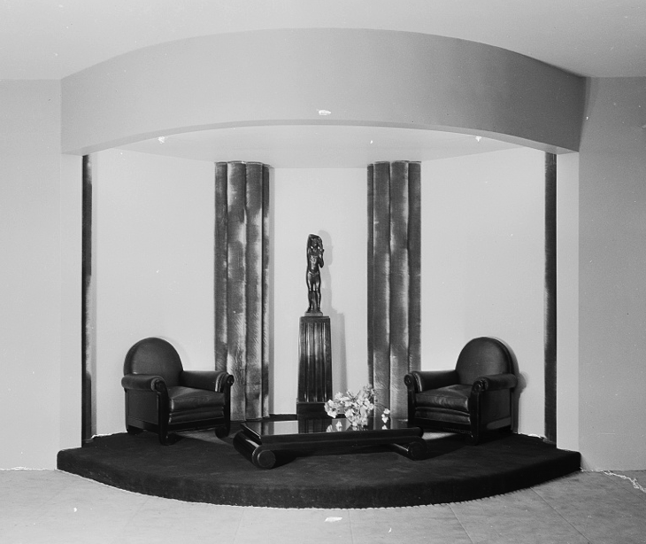
In the 1920s, the New York department store was an early promoter and exhibitor of European modernism and a distiller of these new styles for the American consumer. Good Furniture magazine reported in 1928 that “Lord and Taylor has taken a very definite step forward toward the actual placing of modern furniture in American homes.”[1]...


