lithograph

SORT BY:
Image of a red flying plane. Surrounded by small vignettes
What do you want to be when you grow up?
In 1940, with World War II already underway, it seemed inevitable that America would soon be joining the fight against the Axis powers. The U.S. Army Air Corps published this recruitment poster shown above. The imagery utilized by an unknown graphic designer romanticized participation in the academy’s cadet program. The montage of photographs showcase cutting-edge planes...
Image features red and black interlocking figures creating an all over pattern. Distinct figures include two that are upside down at lower left and right on either side of "83". Enclosed by a red border. Please scroll down to read the blog post about this object.
Designed for Fun
A favored hangout among the early 1980s East Village art scene, the Fun Gallery became home to some of the New York City’s most notable artists, including Keith Haring, Jean-Michel Basquiat and Kenny Scharf. This poster, designed by Haring in anticipation of his gallery debut in February 1983, exemplifies the artist’s unique ability to turn...
Full-page color illustration of giant tomato sitting in green armchair in room with floral rug in foreground, decorative wallcovering and window in background. Beneath image is text listing various musical groups.
Let’s Talk About the Tomato in the Room
When graphic designer Milton Glaser began designing for Kevin Eggers’ record company in the 1960s, it was called Poppy Records.  By 1978, the company had changed names several times, morphing into Utopia, then Atlantic Deluxe, and finally, Tomato Music Company.  (It later became known as Tomato Records).  The independent label featured an eclectic group of artists,...
A Painterly Warning
It seems only fitting that Anton Otto Fischer, an artist best known for seascapes, began his career working on merchant vessels and steam ships. After immigrating to New York, Fischer assisted the American illustrator A.B. Frost. This experience led Fischer to pursue an education in Paris, where he developed his personal design aesthetic. Fischer’s 1942...
A Bloody, Primal Scream
This gut wrenching poster, designed by the Polish graphic designer Jan Lenica, was produced to advertise the Polish National Opera’s 1964 production of Alban Berg’s avant-garde opera Wozzeck in Warsaw.  An icon of Polish graphic design, the poster was awarded a Gold Medal at the 1966 Warsaw International Poster Biennale, and is Lenica’s best known...
A group of three children in the center of a grassy lawn with a large shadow of a swastika looming over them. One of the boy stands while holding a toy plane while another in a paper hat holds up an American flag. A girl sits in front of them, holding a doll. In the lower margin is the text, "Don't Let That Shadow Touch Them / Buy WAR BONDS."
Throwing Some Serious Shade
In the midst of World War II, the war effort was reliant upon the purchase of war bonds by the American population. In 1942, the military could not hold off the encroaching armies without the support of Americans. Graphic designer Lawrence Beall Smith dramatically presented the necessity of war bonds to the public by showing...
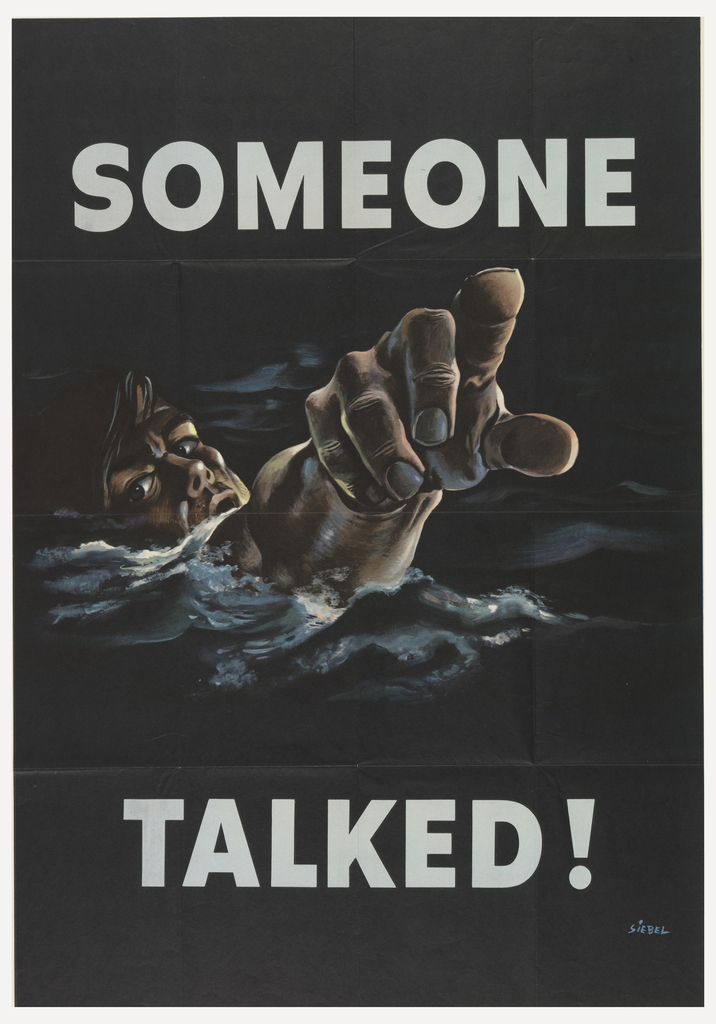
Text in the upper margin reads, "Someone" and in the lower margin, "Talked!" all in block capitals. In the center, a soldier is shown drowning in water, pointing his finger out at the viewer.
Loose Lips Sink Ships
During World War II, poster competitions were held to solicit designs, under particular themes, to assist in the war effort. This poster, designed by Frederick Siebel, was submitted to alert Americans to the urgency of national security. For this contest each poster was subject to the scrutiny of First Lady Eleanor Roosevelt, who acted as...
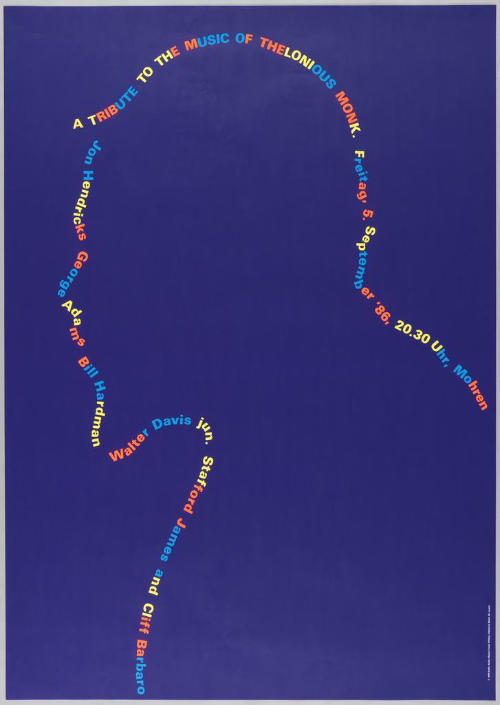
Dark violet poster featuring text in blue, oragne, and yellow. Text creates the outline of a man's silhouette. Text reads: "A TRIBUTE TO THE MUSIC OF THELONIOUS MONK. Freitag 5. September '86, 20.30 Uhr, Mohren. Jon Hendricks, George Adams, Bill Hardman, Walter Davis Jun., Stafford James, and Cliff Barbaro."
Blue Concert Posters
This poster, for a tribute concert to the music of Thelonious Monk at the Jazz Festival Willisau, can be categorized a few ways. It’s one of the 17 posters we have by Swiss graphic designer Niklaus Troxler (a Willisau native and jazz lover who first organized the jazz festival in 1975). It’s also one of the...
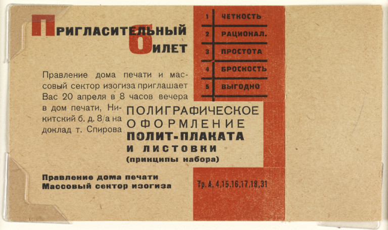
Invitation with black and red text in Russian on beige ground, with dividing red vertical rectangle.
Mainstream Modernism: An Open Invitation
Arresting typography and geometric precision distinguish these Soviet-era tickets, and illustrate the permeation of fine art into daily life in the USSR. The tickets reflect the influence of constructivism, an avant-garde movement characterized by the same angular abstraction evident in these designs. Here, bold blocks of color are poised in asymmetrical balance. As in a...