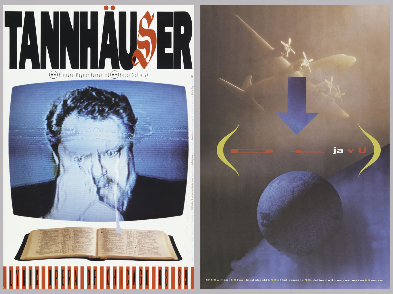
Rick Valicenti is a legendary graphic designer, whose career spans the transition from analog to digital design production. Rick spoke with Cooper Hewitt curator Ellen Lupton about his design process over Zoom on October 23, 2020. Edited for clarity and length. Ellen Lupton: Rick, where are you? Rick Valicenti: I am in a garage in...
In celebration of the milestone 20th anniversary of the National Design Awards, this week’s Object of The Day posts honor National Design Award winners. What does “typography” mean to you? Does the word stir up contempt for Comic Sans and Papyrus, or does it conjure a death match between Times New Roman and Helvetica? For...
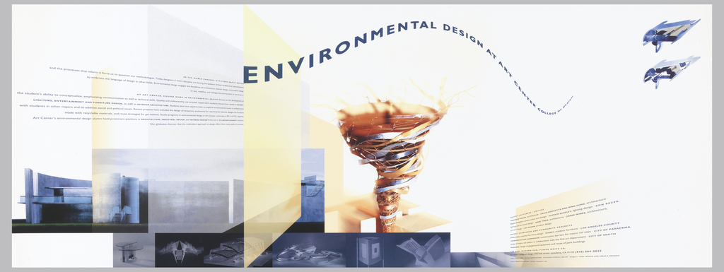
Today’s Object of the Day celebrates the winners of Cooper Hewitt’s National Design Awards. Honoring lasting achievement in American design, the Awards take place annually during National Design Week, with festivities for all ages celebrating design creativity and innovation. Today’s blog post was originally published on March 29, 2018. As design director for her alma mater, Art Center...
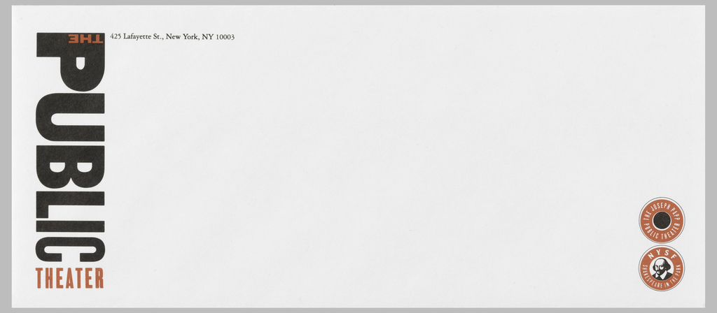
Paula Scher’s identity for New York’s Public Theater has become the ne plus ultra of graphic design. When it was created in 1994, no one had ever seen anything quite like it. With its bold red and black typography, the logo combined letters of different sizes, weights, and spacing, running vertically down the side of...
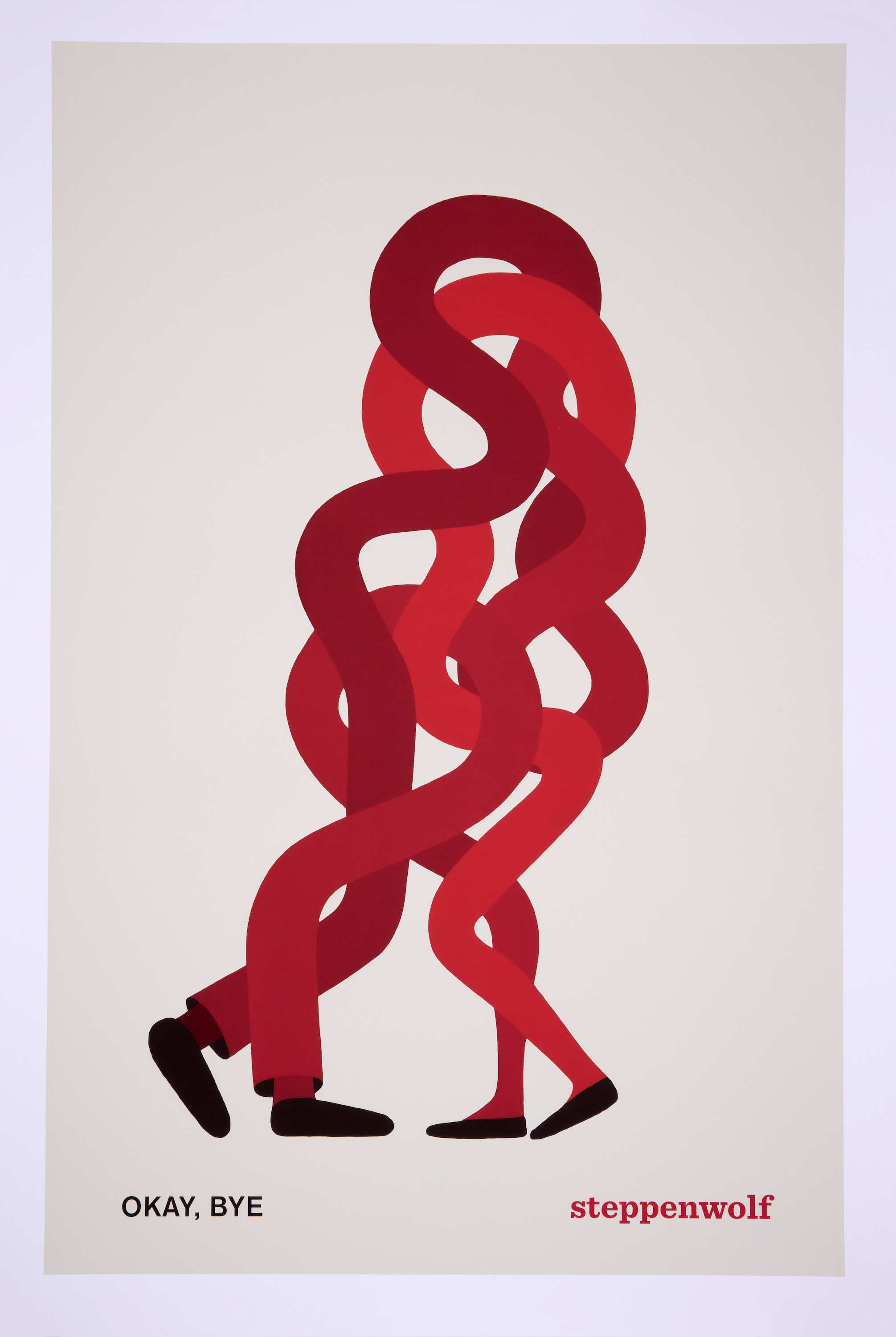
Graphic designer and visual artist Geoff McFetridge created this striking poster in 2015 to advertise the play “Okay, Bye” performed by the Steppenwolf Theatre Company in Chicago, Illinois. As with many of McFetridge’s designs, the poster uses bold colors and simple forms to communicate a visual riddle. Two pairs of black shoes distinguish the owners...
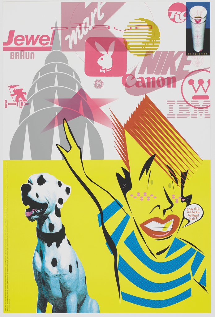
This poster by graphic designer Rick Valicenti is loaded with iconic commercial imagery. In 1994, Valicenti received the commission to design a poster introducing the Northstar and Broughton Printing Company’s new eight-color press. His resulting design is at once an advertisement for the new press as well as a provocation that questions the role of...
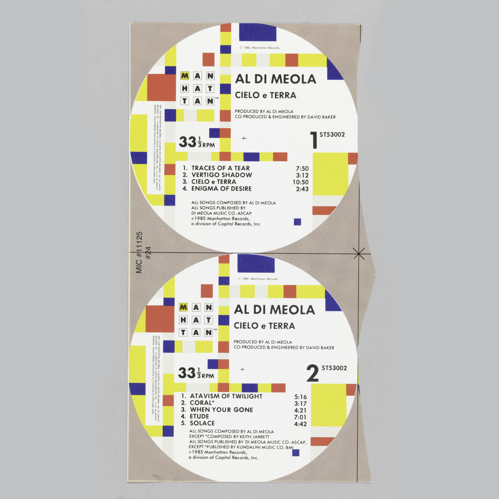
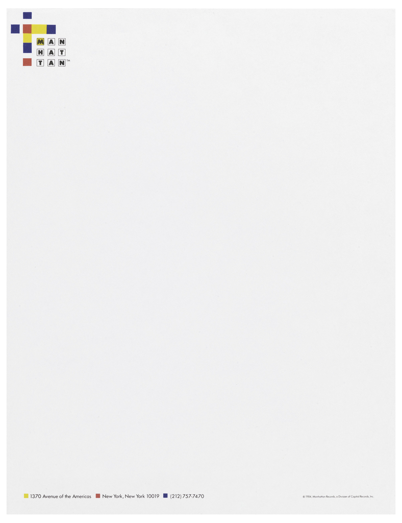
Graphic designer Paula Scher adapted Piet Mondrian’s 1943 painting Broadway Boogie-Woogie when she created the graphic identity for Manhattan Records in 1984. On each LP that Manhattan Records released, the design is printed on the center label of sides A and B. When reflecting on her decision to turn to Mondrian, Scher explained “the strongest...
In the forward to Letters from the Avant-Garde, a slim yet unique volume edited by Ellen Lupton and Elaine Lustig Cohen focusing on the stationery of European designers, Cohen discusses her experience as proprietor of Ex Libris, a bookstore specializing in avant-garde print materials. Founded in 1979 by Cohen and her husband, Arthur A. Cohen,...
The 2011 winner for Communication Design is Rick Valicenti. Rick’s graphics bristle with innovation, imagination, curiosity, and craft. He has been a leading presence in design as a practitioner, an educator, and a mentor. In 1988, he founded Thirst, a Chicago-based design collaborative devoted to art, function, and authentic human presence. The Communication Design Award...
