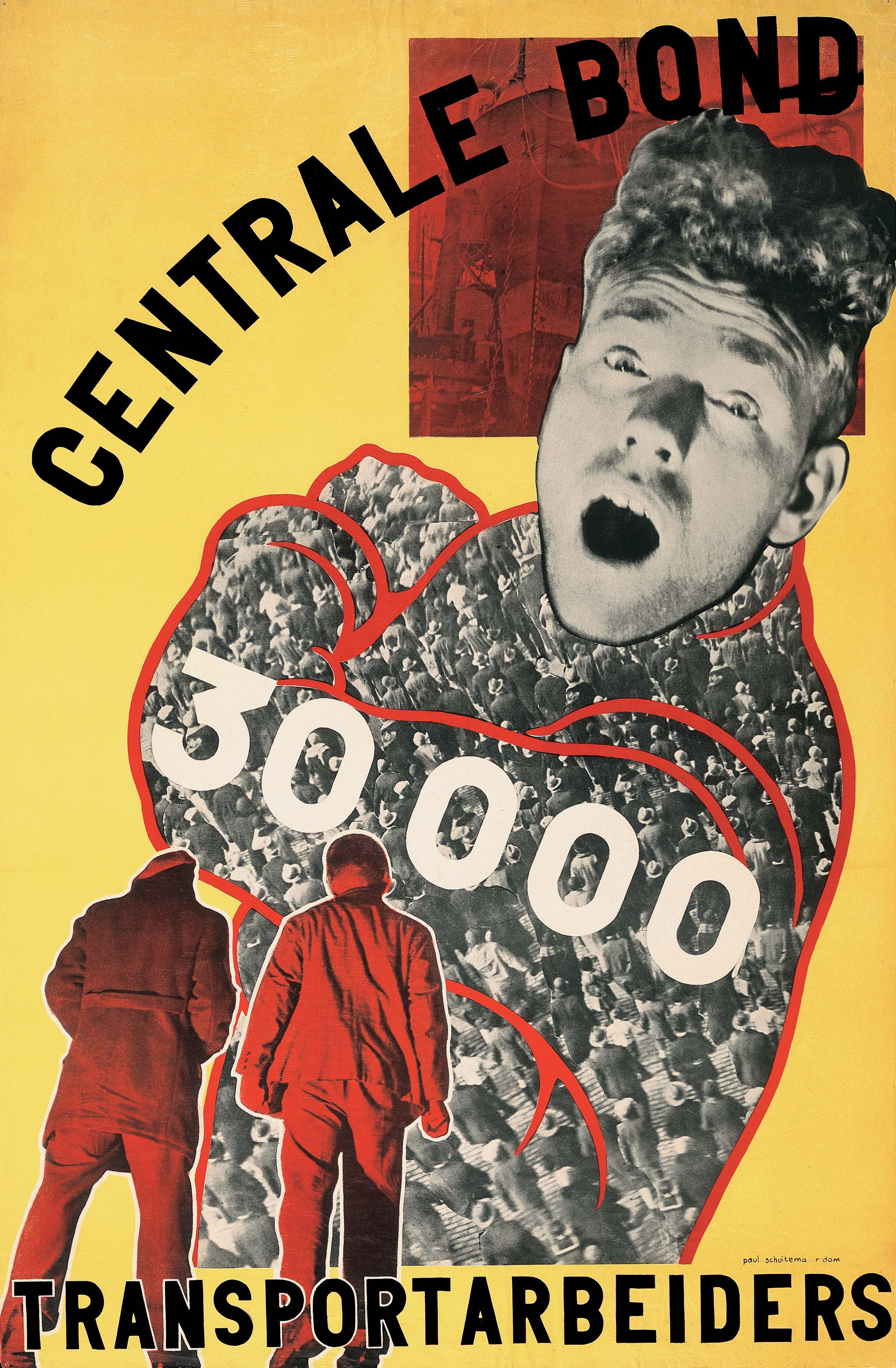
This rare poster was created in 1930 Paul Schuitema (Dutch, 1897–1968). The poster came to Cooper Hewitt in 2019 as a gift from Merrill C. Berman, one of the world’s most influential collectors of modern graphic design and a longtime collaborator with our museum. With this recent gift, Schuitema’s poster is coming home to Cooper...
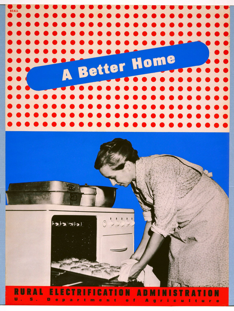
This blog post was originally published on January 8, 2014. By the 1930s, the vast majority of American urban dwellers had access to electricity in their homes and businesses. But those in impoverished rural areas were often not serviced by private electric companies, who believed that it was not cost-effective for them to invest in...
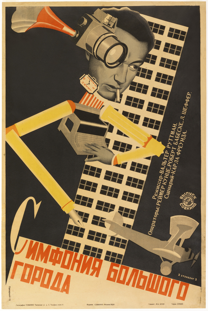
Caitlin Condell discusses this Russian movie poster that utilizes themes of modernity, Constructivism, urban imagery, and the avant-garde found in The Jazz Age: American Style in the 1920s.
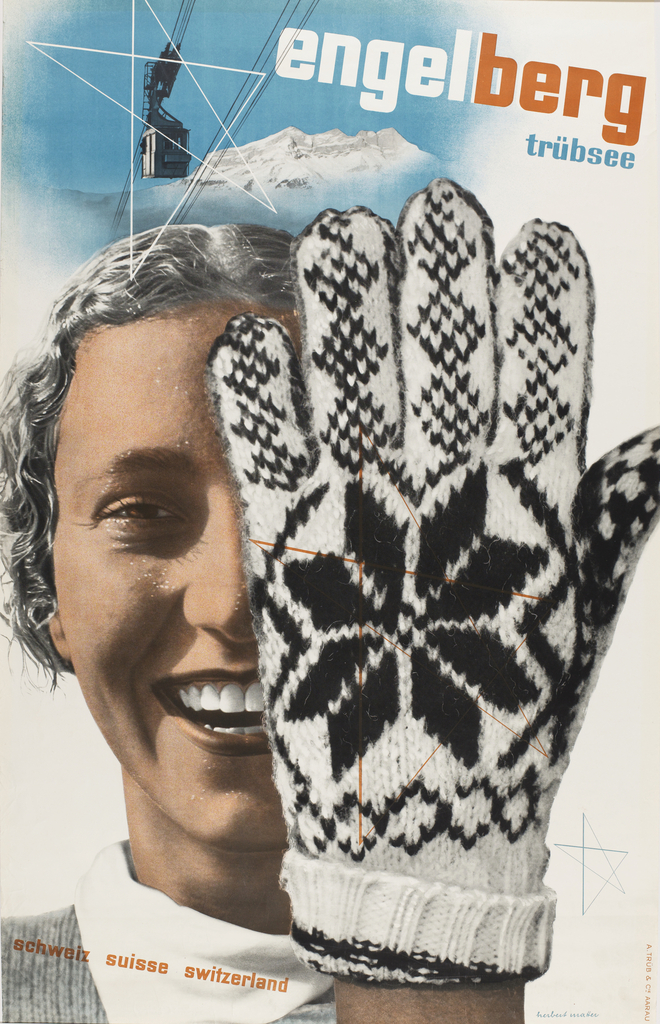
We can feel an image in our bones and muscles. We can also touch it with our skin (almost). The knitted wool glove in Herbert Matter’s Engelberg, Trübsee, Switzerland (1935) is so real we can almost sense it against our skin. Designers speak of “texture” as a basic design element, and yet this quality often...
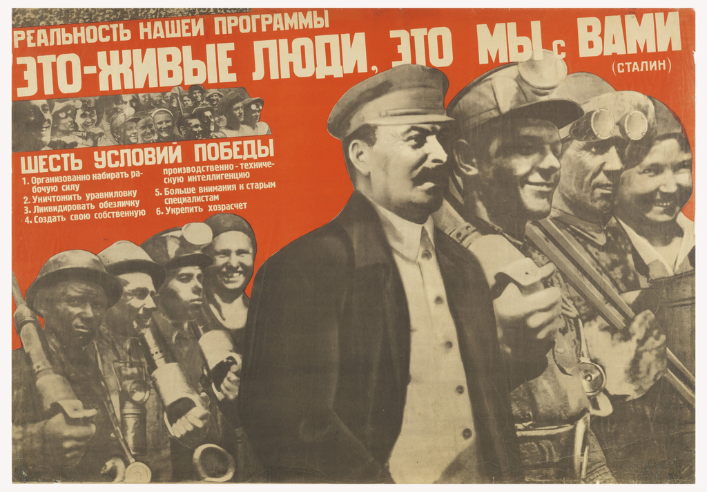
Although photography was invented in 1839, its impact on poster design remained relatively minor until the late nineteenth century, as traditional lithography and letterpress are incapable of reproducing shades of gray. A sea change in poster design arrived with the advent of the halftone process, which emerged fully in the 1880s. Halftone mimics the appearance...
By the 1930s, the vast majority of American urban dwellers had access to electricity in their homes and businesses. But those in impoverished rural areas were often not serviced by private electric companies, who believed that it was not cost-effective for them to invest in extending power lines into areas of the country that would...
