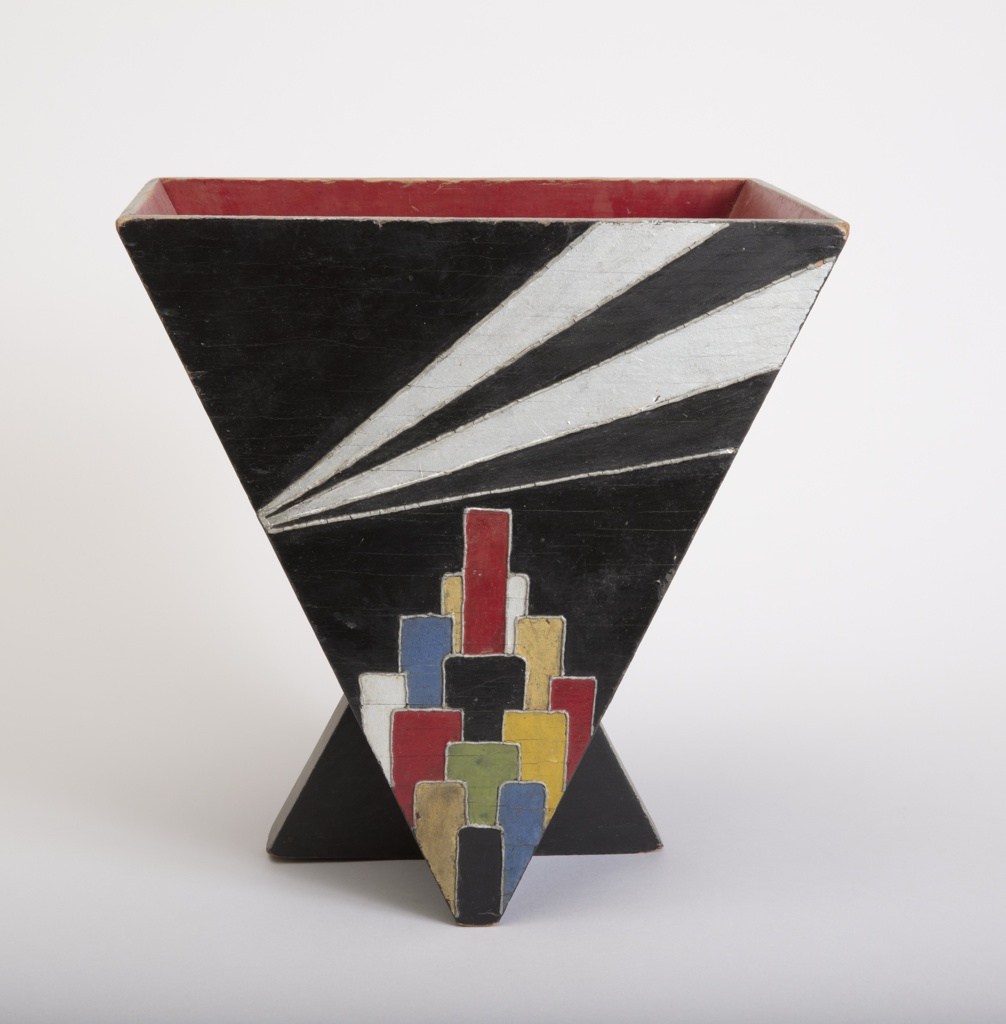
Tucked underneath a desk or in a corner of a room a wastebasket sits waiting to collect trash. While an often overlooked item of everyday life, it received the full attention of Donald Deskey. The designer, who established his career in New York in the 1920s, dedicated himself to reimagining the look of the American...
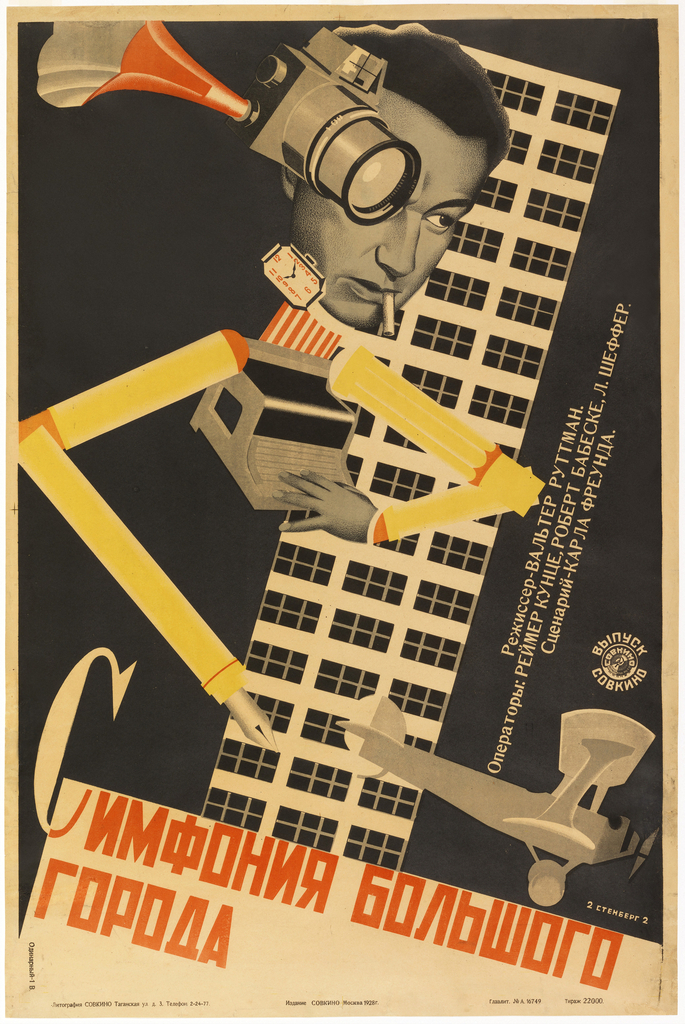
Caitlin Condell discusses this Russian movie poster that utilizes themes of modernity, Constructivism, urban imagery, and the avant-garde found in The Jazz Age: American Style in the 1920s.
Join curator Sarah Coffin for a Facebook Live tour of The Jazz Age: American Style in the 1920s.
A major proponent of “New Typography” in the United States, Dan Friedman received his formal education in Basel, Switzerland under Armin Hofmann, an influential educator and designer whose students disseminated the Swiss Style of graphic design in the late 1960s. Though Friedman’s portfolio had earned him teaching positions at Yale University and SUNY Purchase upon...
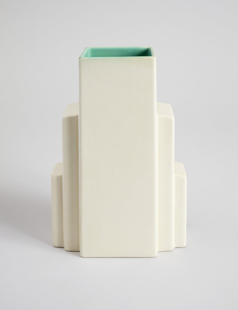
Even though the stamped marking on the underside of this vase reads “Coors Golden Colorado Pottery,” its coloring is not that of a pale ale. Rather, the exterior is painted with a cream-toned glaze, while its interior is coated in a light teal. This choice of matte glazing further calls attention to the stepped form...
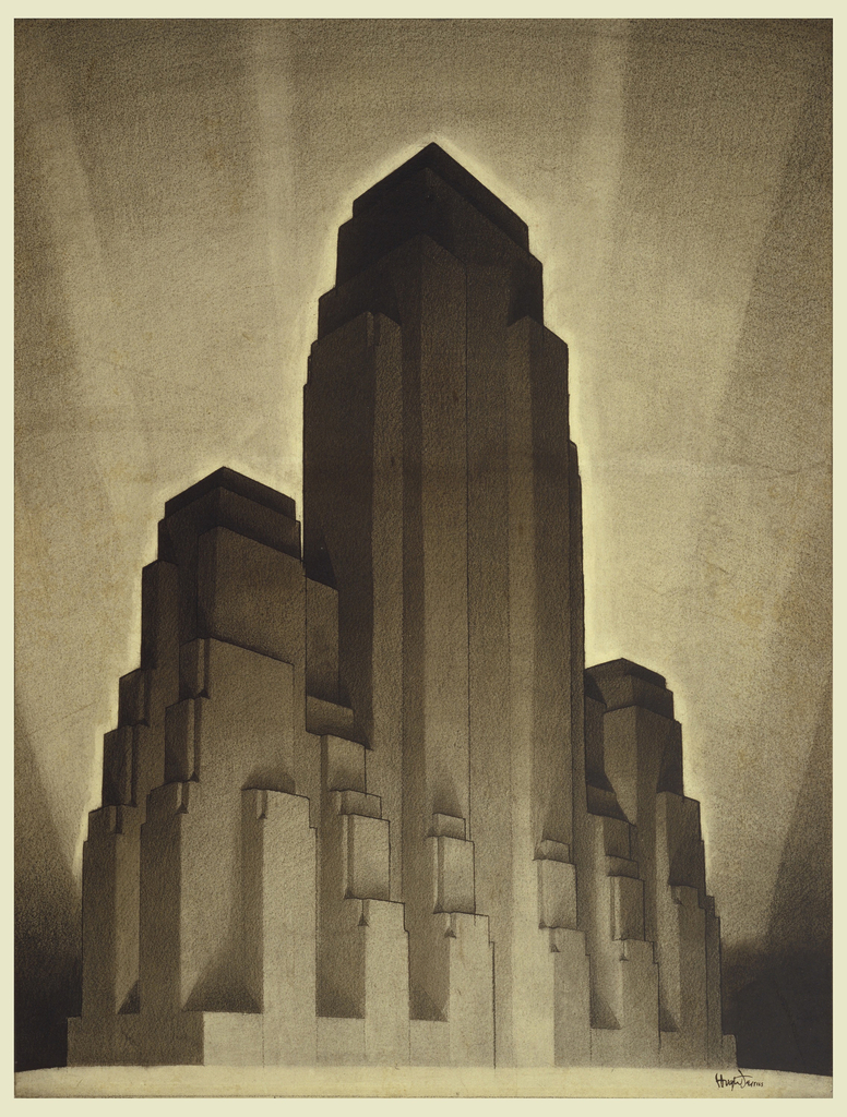
Gail Davidson discusses Hugh Ferriss's process for crafting a 1920s skyscraper under strict zoning laws.
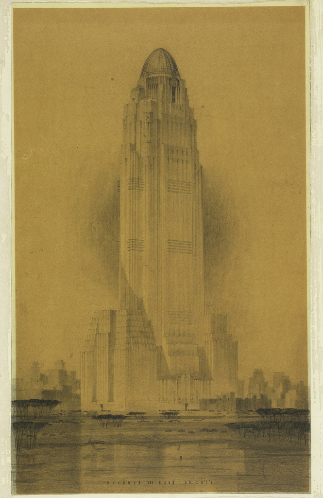
Ely Jacques Kahn's design for a skyscraper, now on view in The Jazz Age: American Style in the 1920s, demonstrates the power of the architectural drawing as an advertising tool.
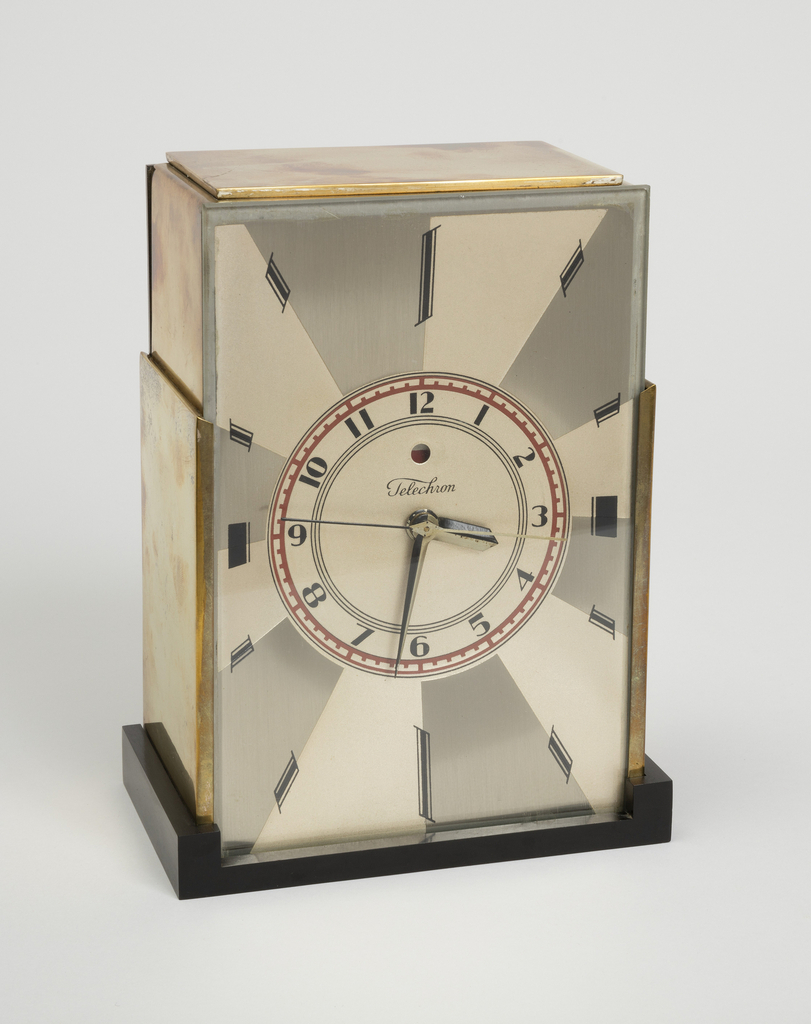
Now on view in The Jazz Age: American Style in the 1920s, Paul T. Frankl's "Modernique" clock design provided the perfect form for ingenuity in timekeeping.
Though it is frequently lauded as the tallest skyscraper designed by a woman in the world, Chicago’s Aqua Tower is worthy of praise beyond the gender of its architect, Jeanne Gang, a MacArthur fellow and winner of the 2013 National Design Award in Architecture. The key aspects of Gang’s LEED certified design, which explores the...
