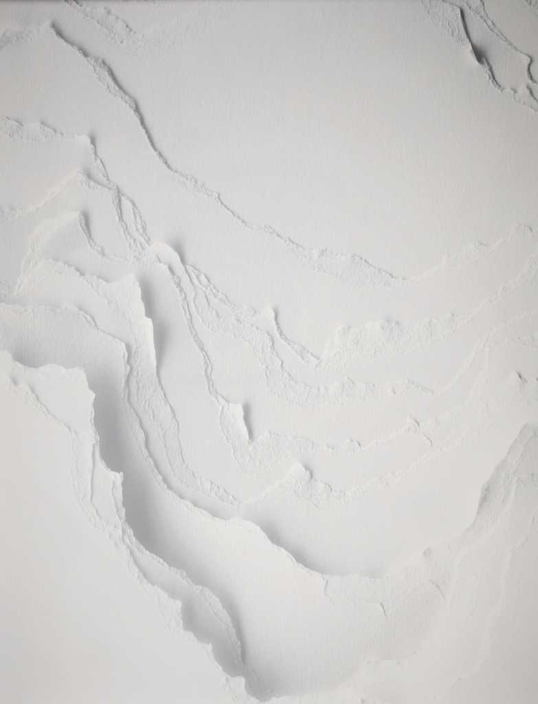
Topographies dazzles our eyes and walls with a trompe l’oeil effect that successfully tricks our senses—the seemingly three-dimensional surface is deceptively flat. To create the pattern, designers stacked multiple sheets of paper and tore away portions of the surface by hand, forming canyon-like valleys of various widths and depths. The wallcovering’s name refers to the...
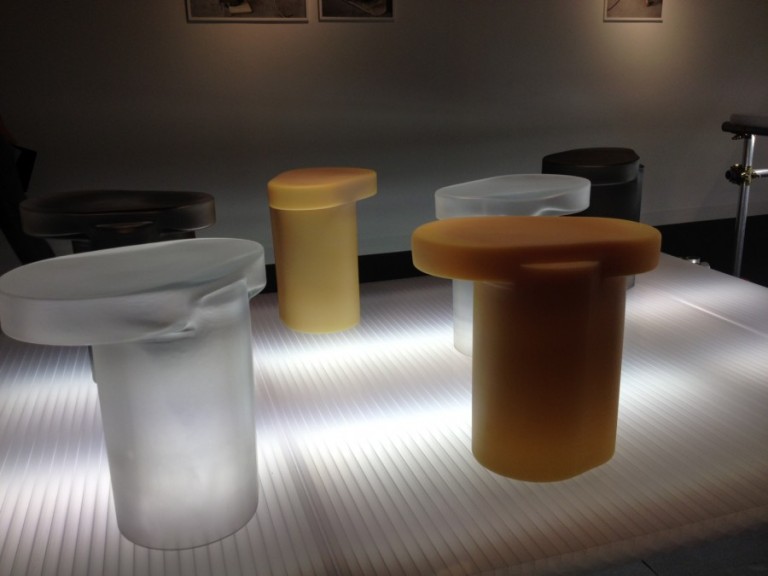
It is easy to miss the highlights when you don’t know where to look. At Design Miami/ 2012, there were many, and the guided tours I led sought to help visitors navigate the fair by taking a deep dive into the content, illuminating themes and historical continuity in the contemporary work. What follow are five...
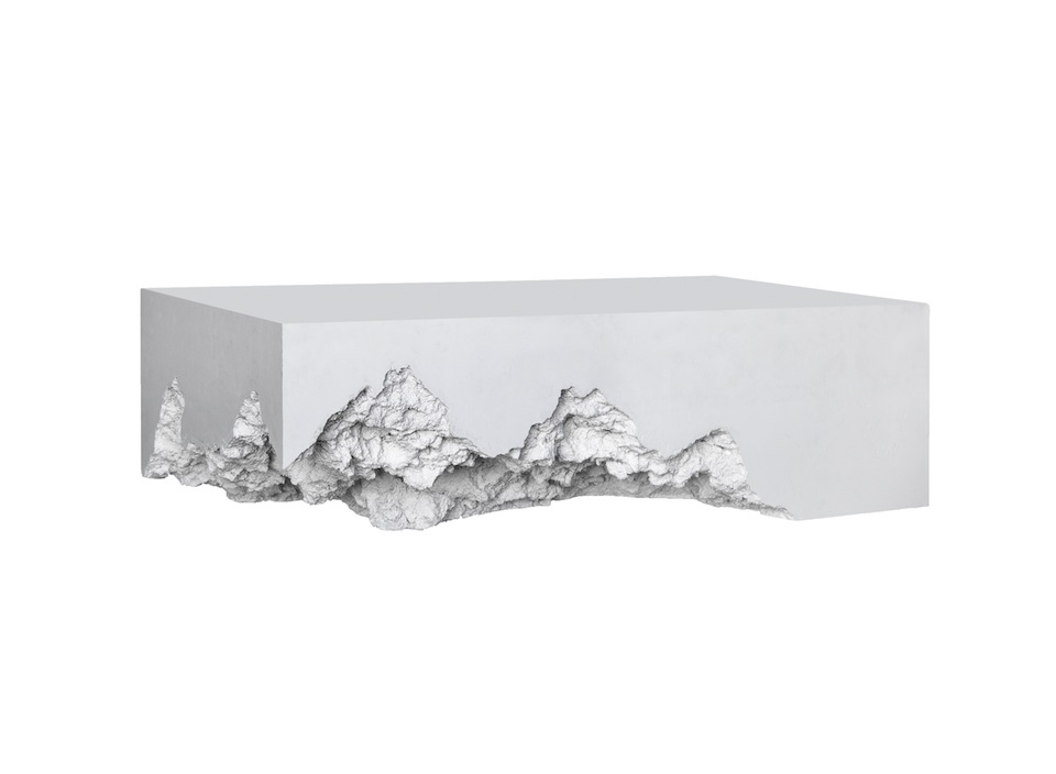
Float. Designed by Snarkitecture, 2012. Volume Gallery. As a curator focused on contemporary design, one of the things I seek out is trends. At this year’s Design Miami/, opening December 5th, one of many trends I’m already spotting is the unexpected. Designers are challenging our eye, whether through their material choices, forms, or program, confounding...


