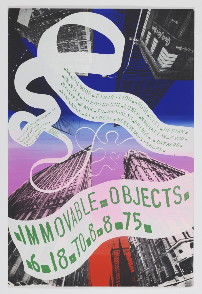
Keith Godard was playful, funny, irreverent, and smart. Decked out in dapper bow ties and bright red shoes, he brought bubbles of joy to every occasion. He and Studio Works, the company he founded in 1986, contributed mightily to life in New York City. His works are preserved in many museum collections, including Cooper Hewitt,...
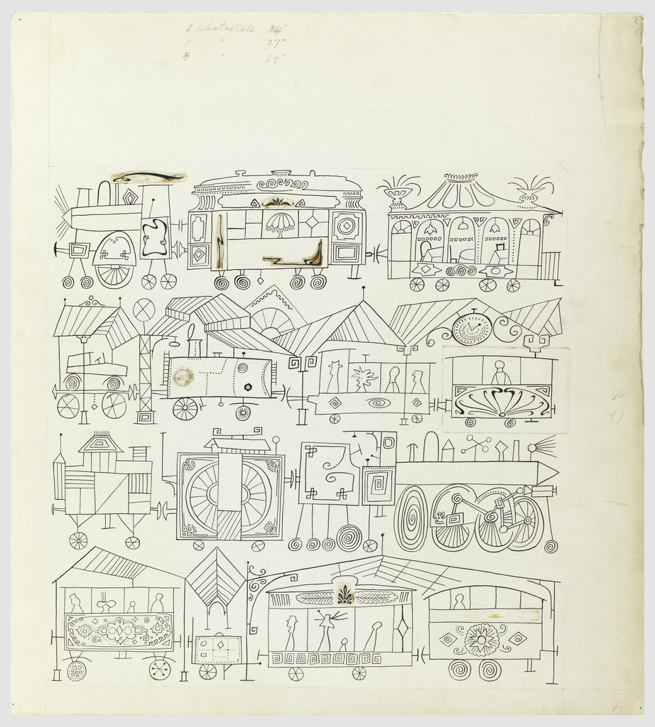
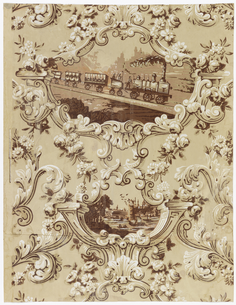
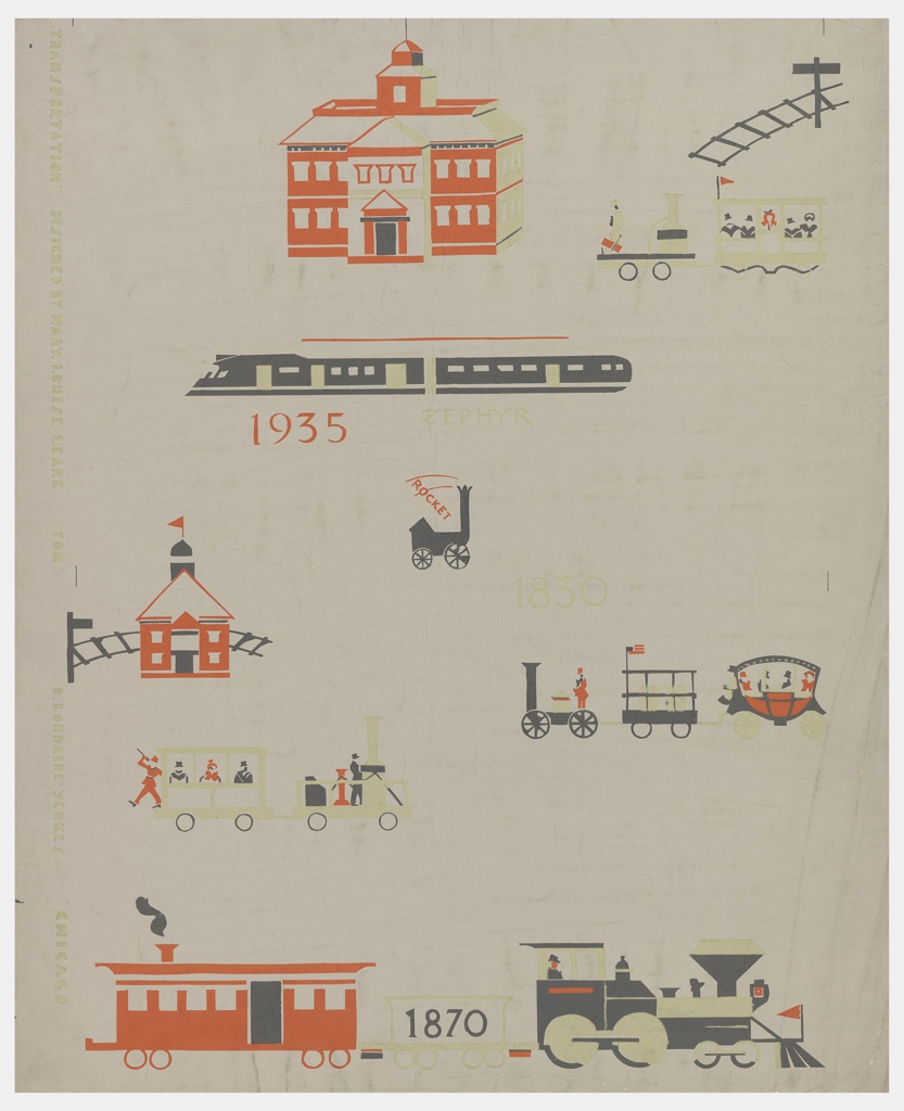
Welcome to the Object of the Week blog. This March, in celebration of Women’s History Month, each Monday a new post will highlight women designers in the collection. This wallpaper called Transportation traces the history of the railroad from 1830 to about 1938. The designer, Mary Louise Leake, was inspired to create this design after...
This poster, designed for the New York Subway Advertising Company, exemplifies the signature approach of American graphic designers Otis (Shep) Shepard and Dorothy Van Gorder—the poster prioritizes the image as text becomes peripheral to the overall message. It combines reductive, abstracted forms with ample airbrushing to create a dynamic arrangement. The pair met in 1927...
Born in Romania in 1914, Saul Steinberg once described himself as “a writer who draws.”[1] Steinberg fled Europe in 1941, settling in New York City by 1942. While living in the United States, he traveled widely and observed the world around him in a highly whimsical style with an eye toward criticism and satire. Steinberg’s...
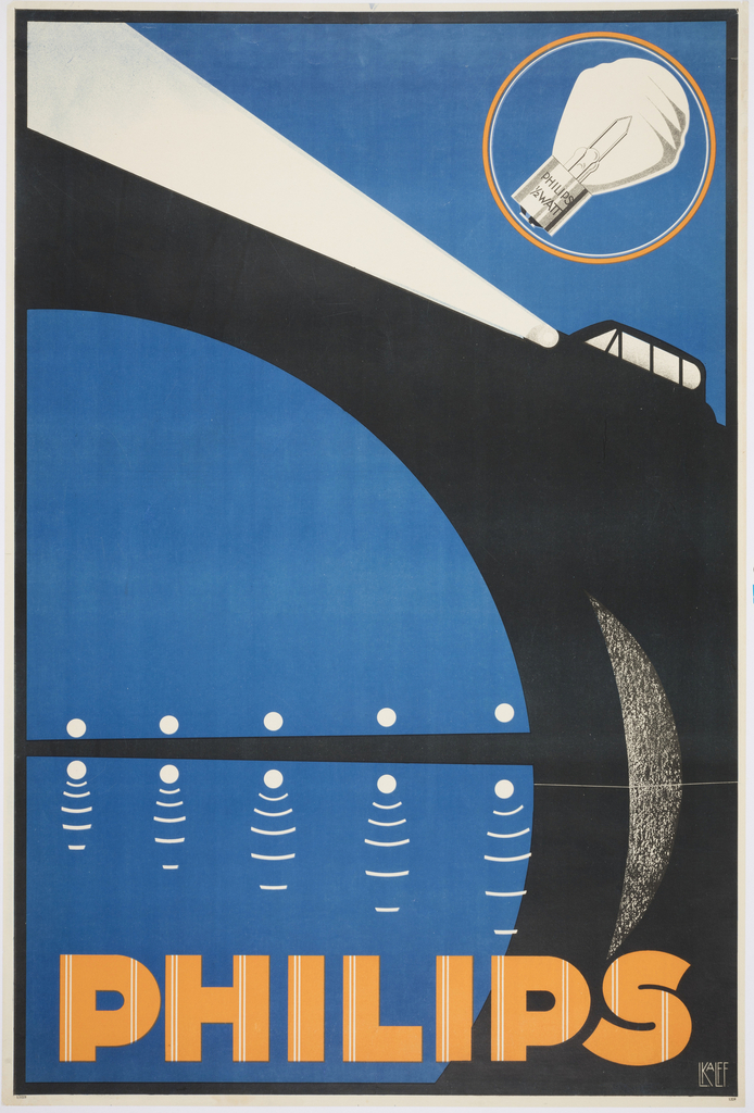
When Louis C. Kalff was hired by Philips in 1925, the company was one of the largest producers of lightbulbs in the world. Kalff created a brand identity for the company, including the iconic logo. For this poster, Kalff illustrated a car whose piercing bright headlights illuminate the scene. The stylized arcs and angles reflect...
Leading figures in design, transportation, and technology share their perspectives on the future of mobility.
Autonomous vehicles, electric cars, and ride-sharing applications are disruptive innovations that hold unknown outcomes for society.
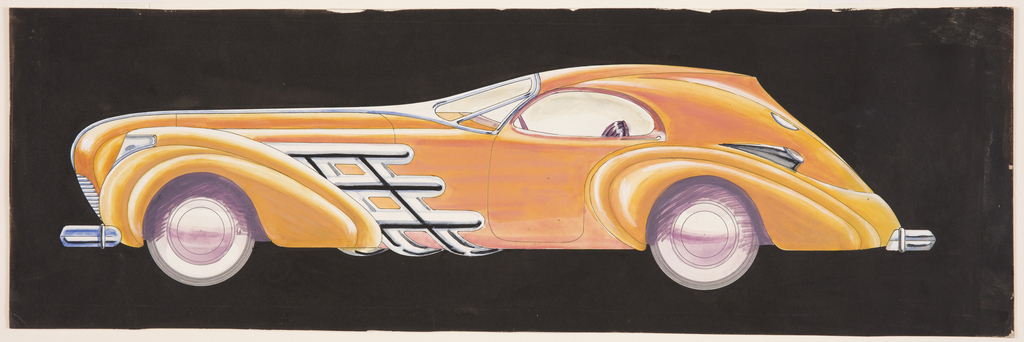
In the early 1930s, the General Motors Art and Colour division was emerging as the most innovative hub of automotive stylists. William McBride was a young man living in Chicago’s South Side, dreaming of fanciful and futuristic cars. As a boy, he “spent sixteen years learning how to design automobiles, to make them real. Cars...
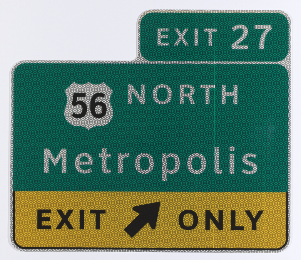
In celebration of the museum’s inaugural Cooper Hewitt Lab: Design Access taking place in the Barbara and Morton Mandel Design Gallery through February 15, we are highlighting innovative accessible design from the permanent collection. The Clearview typeface is a beautiful example of the way design helps to improve people’s daily lives. A product of the...
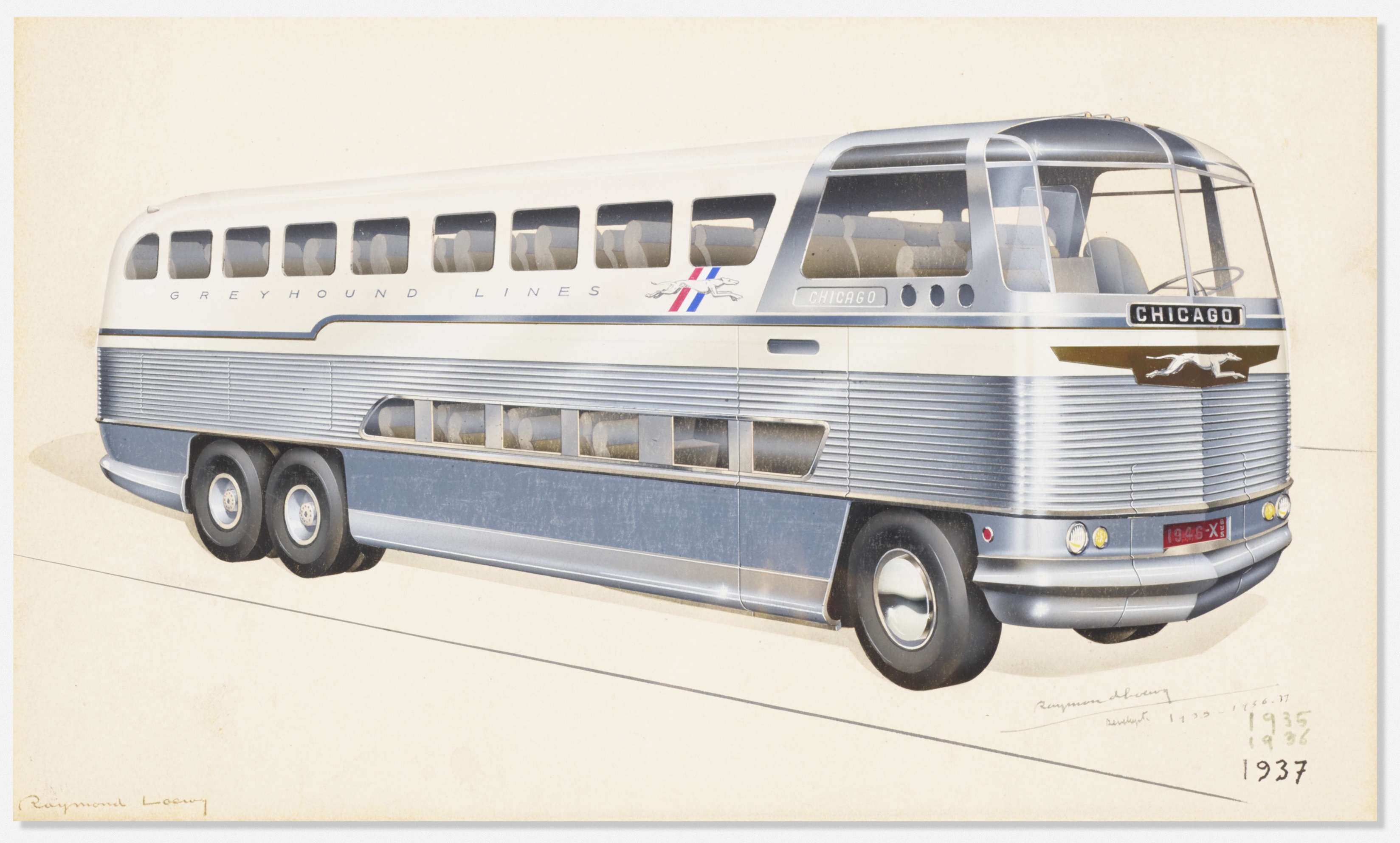
On July 9, 1947, Look magazine ran a feature article on the fastest growing form of transportation in America: intercity buses. “Bus travel, according to the sworn word of many highway fans,” the author wrote, “is the best way to make a sightseeing holiday trip.”[1] The post-war boom in bus travel was indebted, in part,...
Folding bicycles have existed in one form or another for over a hundred years – the first U.S. patent for a folding bike was issued in 1888. There has been a heightened interest in folding bicycles in the last thirty years, particularly as a means of addressing urban transportation issues. Folding bikes are easily stored...
Innovations in transportation and mobility were to become a common theme in wallpaper design. Similar images frequently appeared on bandboxes and hat boxes starting in the 1830’s. A sign of mobility themselves, these boxes were used for the safe transport and storage of men’s removable collars and hats. Early designs include historic hot air balloon...
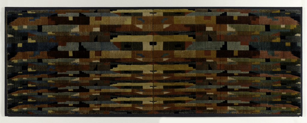
This modernist velour furnishing fabric designed in 1934 was produced in an area of northern France where weaving centers like Lille, Roubaix, and Tourcoing manufactured fabrics for use on airplanes, trains, and boats. During this era, escalating industrialization facilitated mass transportation, which led to an increased emphasis on travel. This cultural shift not only introduced...
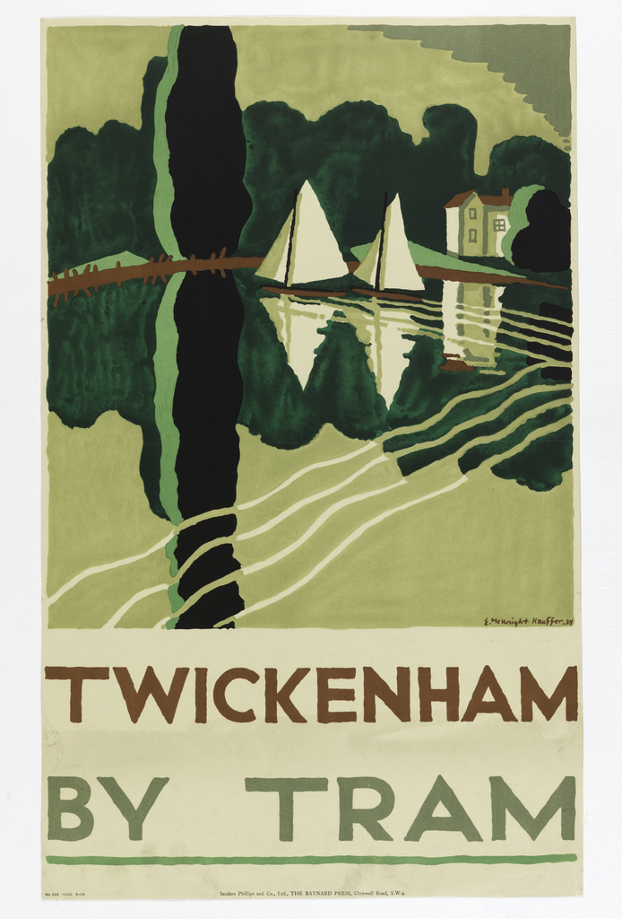
London Transport posters played an indispensable role in the field of graphic design, particularly in the 1920s and 30s. In 1908, Frank Pick assumed responsibility for London Transport’s publicity and commissioned designs from internationally known artists as well as promising newcomers. Among them, a talented American poster artist and graphic designer, Edward McKnight Kauffer (1890-1954), helped...
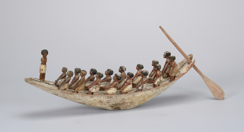
While the wooden boat model pictured here might seem like something created as a toy or a builder’s model, for the ancient Egyptians it actually was an important piece of religious and funerary equipment. Water played an important role in the ancient Egyptian’s daily lives, since the Nile River acted as a sort of ancient...
![Image features a poster for the New York Subway Advertising Company, encouraging businesses to purchase advertising space in subway stations or on trains. In the foreground, at bottom left, a single train's rail, rendered in perspective extends into a black, spiraling tunnel. At the vanishing point of the tunnel, a cluster of colorful, overlapping rectangles, meant to represent posters. Across the bottom, in black text: [New York Subway Advertising Company logo] RAILS TO SALES / SUBWAY POSTERS [a red line cuts through the center of "subway posters"]. Please scroll down to read the blog post about this object.](https://www.cooperhewitt.org/wp-content/uploads/2020/01/CHSDM-292880_01-000001-scaled.jpg)
